What's with the washed out look in new Nintendo games?

nkarafo

Member
One of the reasons i always liked the visuals in Nintendo IP games is the colors. Nice, contrasty, warm colors.

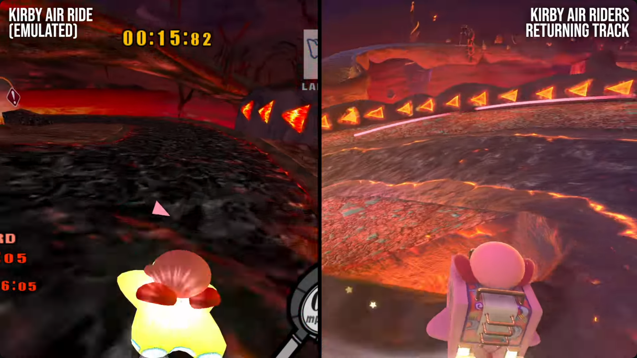
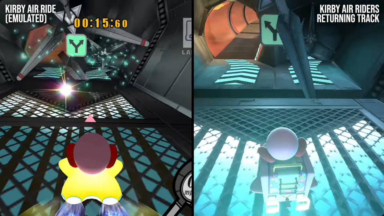
But in games like the new Kirby Air Ride, Mario Kart World and DK Bonanza, they are aiming for a more washed out, foggy look. Like they have increased gamma and reduced contrast at the same time.

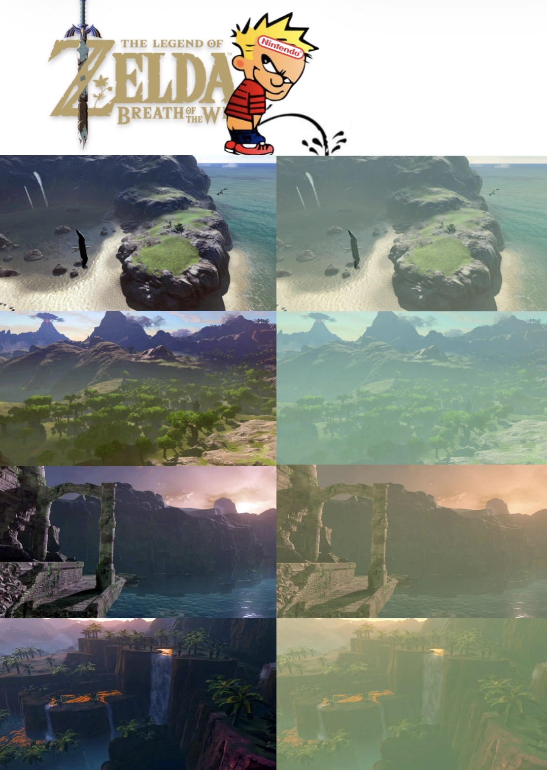
This comparison shows exactly what i mean:
6t0S2okS4jr8CYlx.png


J6oBUS74FTirTOiS.png


I really dislike this new look in Nintendo games. It's like the mid 00's overused bloom all over again.
 
Last edited:
I dunno, I think they look insanely vibrant on my OLED TV. Each game you mentioned.

Maybe they tone it down a bit because displays are so much better these days?

Though I will say that their HDR implementation is awful most of the time. Games definitely look way more washed out, ironically enough. I keep HDR off 99% of the time.
 
I agree. I noticed it and I have an LG OLED. They have definitely desaturated their latest games. It's like the poor motion on the handheld, I noticed it in 3 seconds but others still have no idea what to even look for.
 
You can't see the difference in the pictures i posted?
I mean, that's two examples. Even if they're the same tracks, I could easily cherry pick some inverse examples.

I think personal testimony is more important here. I play GameCube and N64 pretty regularly on a nice CRT—a $16,000 (in 2004) PVM actually—and those games look similarly vibrant and colorful as the games you mentioned when displayed on my LG OLED.

My point is that I don't think anything has changed with Nintendo's style. It's every bit as colorful and saturated as it's always been.

Some games do look like shit on the Switch 2 in portable mode, but that's mostly because that display sucks ass.
 
HDR issue with your tv?
edit
recorded videos while on hdr usually look like ass when uploaded to youtube in sdr
 
Last edited:
I agree. I noticed it and I have an LG OLED. They have definitely desaturated their latest games. It's like the poor motion on the handheld, I noticed it in 3 seconds but others still have no idea what to even look for.
I noticed this in Mario Odyssey in 2017. I've always loved the colorful saturated look of Super Mario Bros 3 on SNES, Super Mario World 2 and Super Mario Sunshine. Shame.
 
It's just the modern Nintendo art style. They often use a haze to add more depth to the lighting, they also often tone back the colour saturation.

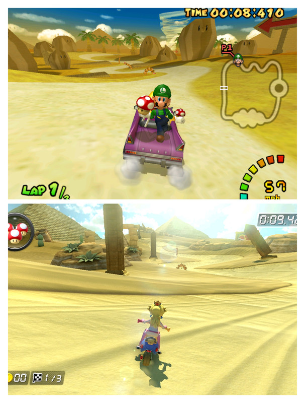
If you compare Double Dash to MK8 you'll see the same thing, Double Dash colours are way more saturated while MK8 tends to have a more muted presentation.

IMG-20251127-203813.jpg


It's all personal preference though. I think MK8 looks great.

It's not a new thing either though. I think you'll find Mario Kart, Smash Bros and 3D Mario on the Wii were all less colourful than the GameCube iterations.
 
Last edited:
Truth be told, i don't have a Switch 2 myself, all i saw is from DF videos.
A good rule of thumb is to not even make threads about perceived graphical fidelity unless you are experiencing something yourself.
Pretty blanket statement of you to assert that New Nintendo games have a washed out look when you haven't even played the latest 4 Nintendo releases (Kart World, DKB, Hyrule AoI, Kirby Air Riders).
 
Something's definitely wrong with your configuration. Every game I've played so far on the S2 looks really colorful and vibrant (on my Sony OLED).

I did have a problem where it was outputting at 1080p and I had to switch around the HDMI ports and it got fixed.
 
A good rule of thumb is to not even make threads about perceived graphical fidelity unless you are experiencing something yourself.
Pretty blanket statement of you to assert that New Nintendo games have a washed out look when you haven't even played the latest 4 Nintendo releases (Kart World, DKB, Hyrule AoI, Kirby Air Riders).
What about the pictures i posted? You can see the difference right? Does that mean whoever posted those pictures/videos did something wrong?

Most pics/videos i saw about those games look washed out. Except for this:


Nintendo's calibration setup sucks, but Vincent has your back.


Which means i'm only half wrong. The games do look washed out by default, unless you follow the steps shown in this video. And some replies here confirms this.

I would expect the DF guys to know what they are doing. My bad.

Btw the last Nintendo game i played myself was Tears of the Kingdom on emulation and that one had a bad contrast/washed out look as well (compared to other games) so there were a few graphical mods/presets to fix it, which i used and the game looked much better. It didn't have anything to do with calibration or screen settings, all other games look fine. BOTW also looked washed out at times (and used a graphics mod for that too) but not as bad as TOTK.
 
Last edited:
What about the pictures i posted? You can see the difference right? Does that mean whoever posted those pictures/videos did something wrong?

Most pics/videos i saw about those games look washed out. Except for this:


Which means i'm only half wrong. The games do look washed out by default, unless you follow the steps shown in this video.

Anyway, i would expect the DF guys to know what they are doing. My bad.

Btw the last Nintendo game i played myself was Tears of the Kingdom on emulation and that one had a bad contrast/washed out look as well (compared to other games) so there were a few graphical mods/presets to fix it, which i used and the game looked much better. It didn't have anything to do with calibration or screen settings, all other games look fine. BOTW also looked washed out at times (and used a graphics mod for that too) but not as bad as TOTK.
Even after properly setting up HDR on the Switch 2, you'll still get a mediocre output because on the majority of 1st party Nintendo games they aren't even offering proper HDR output. They are most likely doing some sort of inverse tone mapping.

It's still not as bad as having no HDR at all, but for some games you might get a better output just using SDR.
 
The Air Ride GC screenshots are emulated, if you play Air Ride on an actual GC with CRT output it will look much less saturated, that's how CRT color profiles work. It's the same when you play a game like Wind Waker on emulator vs actual hardware.

Also I don't see how it's possible to put Bananza in a list of games looking washed out, this game is almost too colorful and even garish in some worlds.

I think Air Ride looks perfect the way it is because the fast movement + heavy color contrast would be headache-inducing
 
Something is wrong with your tv configuration probably… I don't have that issue.
No, the game looks like that on default. You need to go into settings and set the brightness to -30 to look good, atleast in HDR

Im at the point where im just gonna turn off HDR on switch 2, because most of the time its really poorly implemented in games on the system
 
Last edited:
Is there a way to mitigate this on non-HDR TVs? I don't like the hard shadows with barely any color value but I think colors are not as saturated as they should overall.
 
Guess I was right, either really bad implementation of HDR or a display issue. Does the display on the Switch 2 itself even support HDR?
 
Top Bottom