• Hey Guest. Check out your NeoGAF Wrapped 2025 results here!

PS5 Home Page Refresh Live Now for Some Users

LectureMaster

Or is it just one of Adam's balls in my throat?
pyllb3z9wktg1.jpeg


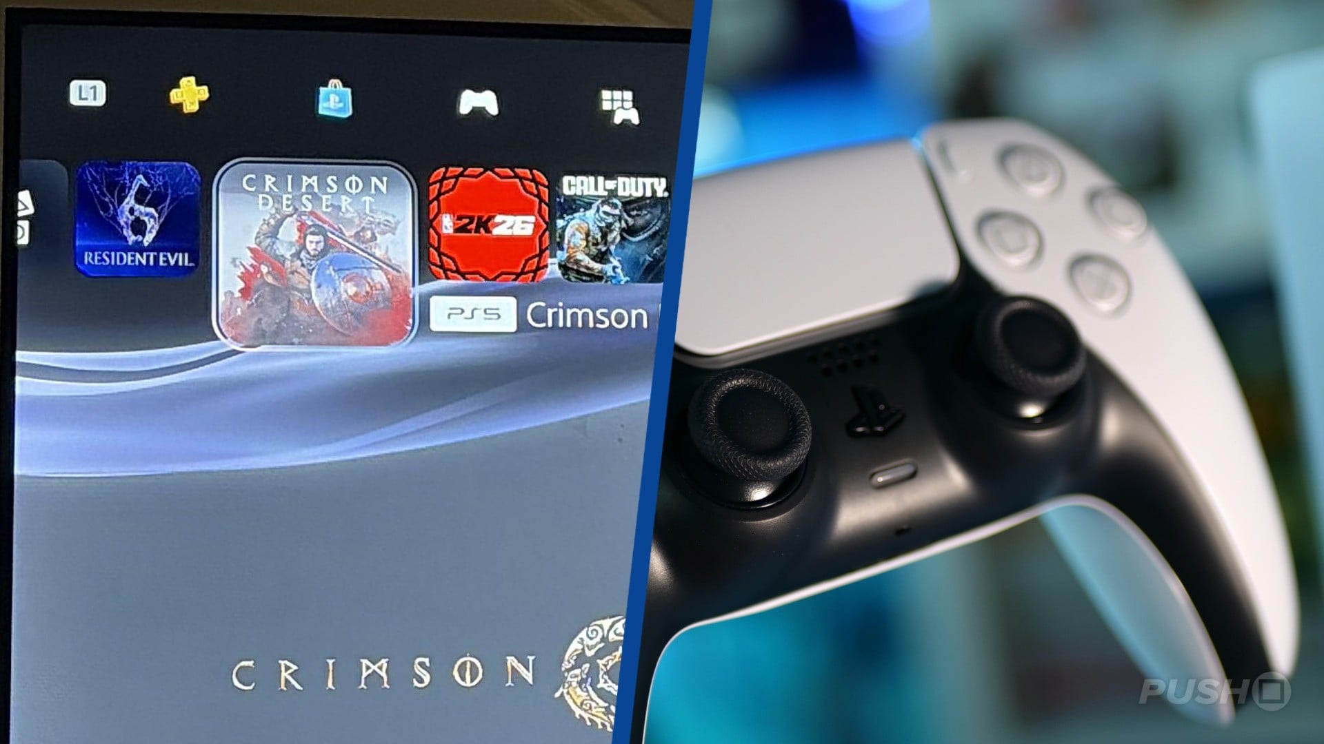
An updated PS5 home screen has gone live for certain console owners that makes some minor tweaks to the positions of your PS5, PS4 games and the PS Plus, PS Store, and Library widgets on the page.

Those with the update have had their horizontal scrolling bar now entirely filled with PS5, PS4 games. The PS Plus and PS Store tabs have been moved up to a second menu, where you can quickly switch between them and your Library and Media with L1 and R1 button presses.

Reddit user FSTGang posted a capture of the updated PS5 home page, who said they're in the firmware beta program:


The Welcome page remains at the start of your PS5, PS4 games list, but the previous toggle between your games and media apps has been replaced with the expanded options, featuring PS Plus and the PS Store. Giving you much faster access to more apps within the PS5 ecosystem, it looks to be a smart update.

We can probably expect this visual refresh to roll out to all PS5 users in the coming months.
 
I liked it until I saw the "Welcome" item is still with the games, can that be changed too? I hate how everything used to be on the one bar.
 
PS5 UI still a downgrade in comparison with PS4 UI.

A 4k screen wasted with useless information. The welcome page is another travesty page trying to not giving back PS4/PS3 missing UI.

No themes and no folders the entire generation. Anything that clean up this mess is a wellcome update IMO.
 
Last edited:
That's a great change to remove PS+ and Store from the main row and focus on instaled games. To make it more perfect it should only have games & captures there, with the option to completely disable the welcome menu.
 
PS5 UI still a downgrade in comparison with PS4 UI.

A 4k screen wasted with useless information. The welcome page is another travesty page trying to not giving back PS4/PS3 missing UI.

No themes and no folders the entire generation. Anything that clean up this mess is a wellcome update IMO.
XMB is king, they designed peak and realised they couldn't push ads so it had to change.
 
I suppose more room for game icons is always good, but the difference is small enough that I don't care one way or the other.
 
Top Bottom