Well people can print your posters without buying them directly from you but they don't..
You could simply charge a dollar and keep in updated with your works, just cropping those.
(yeah I would buy it because I suck at resizing etc)
Well actually lot of people printed my posters by their own
 But they cannot anymore, not for the new ones at least, not in good quality.
For the android app i thought about that yeah but i don't know if that would be worthy.

")


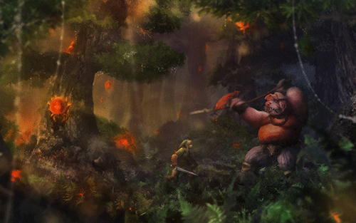
") Now i know the moblin looks a little too flat maybe now, but it was also a problem of composition. I didn't want it to took the look away from the spider.
Now i know the moblin looks a little too flat maybe now, but it was also a problem of composition. I didn't want it to took the look away from the spider.


