billy beane
Banned
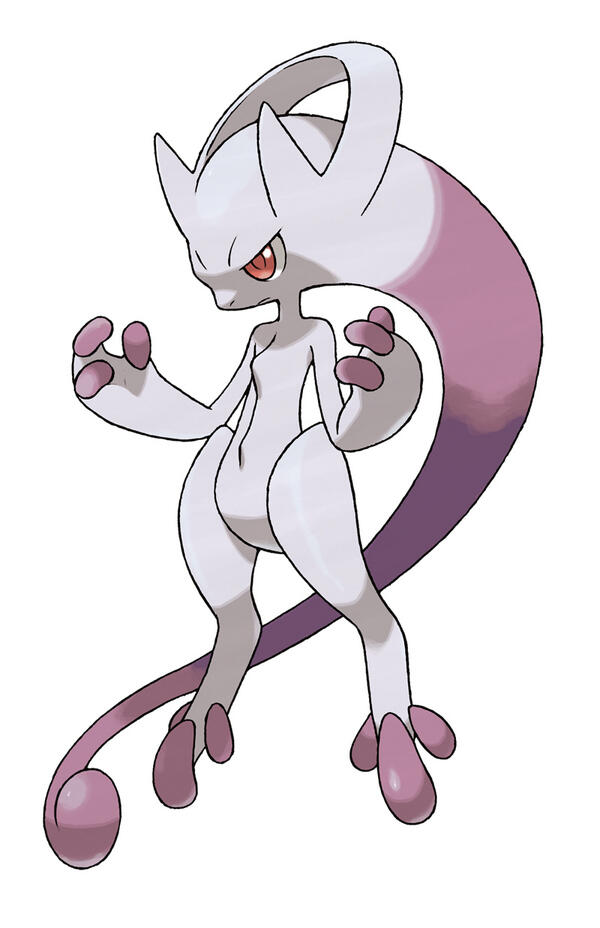
What if this game has a new form for every legendary?
Ewwwww. If it was an evolution between Mew and Mewtwo I would like it better, but that doesn't seem likely. I am disappoint.
If your only defense of new Pokemon designs is saying that the old ones were just as bad, I think the series is in trouble.
Old ones are the best because of nostalgia, new ones have some terrible designs but still has awesome ones
What's up with that penis feet?
High-quality gif?
It's OK not to like it, but to then go on to say new gen sucks and etc. is getting tiring. I know you aren't doing that though.
To be fair, this old Mewtwo sprite looks far, far worse than any rendition of Mewthree. D;
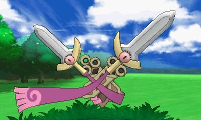
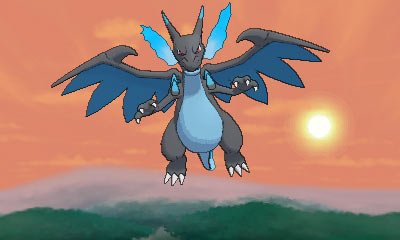
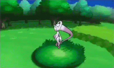
The mysteries of Pokémon X and Pokémon Y continue to grow with the unveiling of a Pokémon that is strangely familiar! It looks a lot like the powerful Legendary Pokémon Mewtwo, but not quite the same…
Agreed.
What made Mewtwo for me was that he was a clear shout-out to Giyig/Giegue from Mother 1.

With that lost, most of the appeal to him is gone.

It's not even its final forme.
If that were all you were doing, it'd be fine. However, you're insulting people because they don't agree with your narrow-minded opinion and are treating your own word as the gospel.
Take a step back, a deep breath and a chill pill. Then you can come back and make actual discussion with the rest of us.
So awesome. Might be a new Mew-based experiment and not related to Mewtwo.
So awesome. Might be a new Mew-based experiment and not related to Mewtwo.
If this is the case then I am okay with this existing.So awesome. Might be a new Mew-based experiment and not related to Mewtwo.
*hype-rising*
This looks so good - these battles will look great in 3D. October cant come soon enough !!
My favourite part:
Dude, this is all in good fun. It's fucking Pokemon designs.
It's just the "all gens had equal ratios of shitty Pokemon, here let me bring up five bad ones from Gen 1 to invalidate your whole argument about the majority of designs later" aesthetic equivalence force that can't seem to let it go.
another reason why forms in pokemon are terrible
the dumb way they spell it

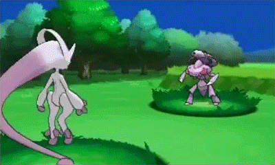
I don't know how accurate this is but it was posted on r/pokemon 4 hours before this show, and the "Mewtwo Y" turns out to look just like what was just announced. Might mean there's 1 more coming.
I don't know how accurate this is but it was posted on r/pokemon 4 hours before this show, and the "Mewtwo Y" turns out to look just like what was just announced. Might mean there's 1 more coming.
My favourite part:
Not accurate. Look at the head-tail. The real deal is mostly purple. This fan art is only half-purple.
I don't know how accurate this is but it was posted on r/pokemon 4 hours before this show, and the "Mewtwo Y" turns out to look just like what was just announced. Might mean there's 1 more coming.
WHO IS THIS NEW POKÉMON?

It really seems to be a new one.
High-quality gif?
[im/g]http://www.abload.de/img/mewthreevsgen66fn2.gif[/img]
It's OK not to like it, but to then go on to say new gen sucks and etc. is getting tiring. I know you aren't doing that though.
[/img]http://www.serebii.net/xy/1.jpg[/img] [im/g]http://www.serebii.net/xy/2.jpg[/img] [im/g]http://www.serebii.net/xy/3.jpg[/img] /img]http://www.serebii.net/xy/4.jpg[/i/mg] [i/mg]http://www.serebii.net/xy/5.jpg[/img] [i/mg]http://www.serebii.net/xy/6.jpg[/img]
I don't know how accurate this is but it was posted on r/pokemon 4 hours before this show, and the "Mewtwo Y" turns out to look just like what was just announced. Might mean there's 1 more coming.
Dude, this is all in good fun. It's fucking Pokemon designs.
It's just the "all gens had equal ratios of shitty Pokemon, here let me bring up five bad ones from Gen 1 to invalidate your whole argument about the majority of designs later" aesthetic equivalence force that can't seem to let it go.
 .
.My favourite part:
I don't know how accurate this is but it was posted on r/pokemon 4 hours before this show, and the "Mewtwo Y" turns out to look just like what was just announced. Might mean there's 1 more coming.
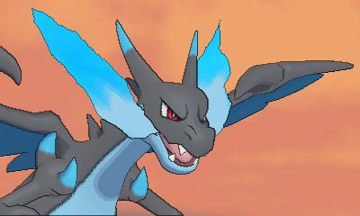
WTF IS THAT AWESOME ROBOT
wat?
It's (obviously aside the lack of colors) the best mewtwo sprite we ever had, it actually looks menacing
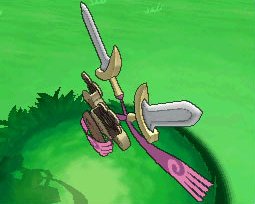
this new thing looks like his girlfriend or something
You don't even have an argument about '' majority of designs '' if you don't even show the ones you're talking about, and also try to tune out people who say that Gen 1 has bad designs