I like your Catwoman pic!Or important characters like Catwoman:

Sadly PS4 didn't have PNG option those days.
Thanks!
Oh god, I know that feeling.Had a shitload of great AC4 captures then realised it was on JPEG so i deleted them all.....
I like your Catwoman pic!Or important characters like Catwoman:
Sadly PS4 didn't have PNG option those days.
Thanks!
Oh god, I know that feeling.Had a shitload of great AC4 captures then realised it was on JPEG so i deleted them all.....
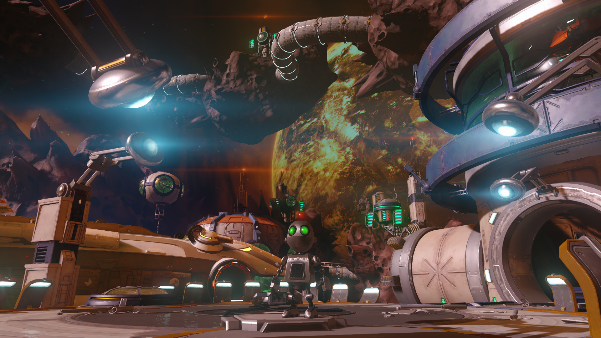
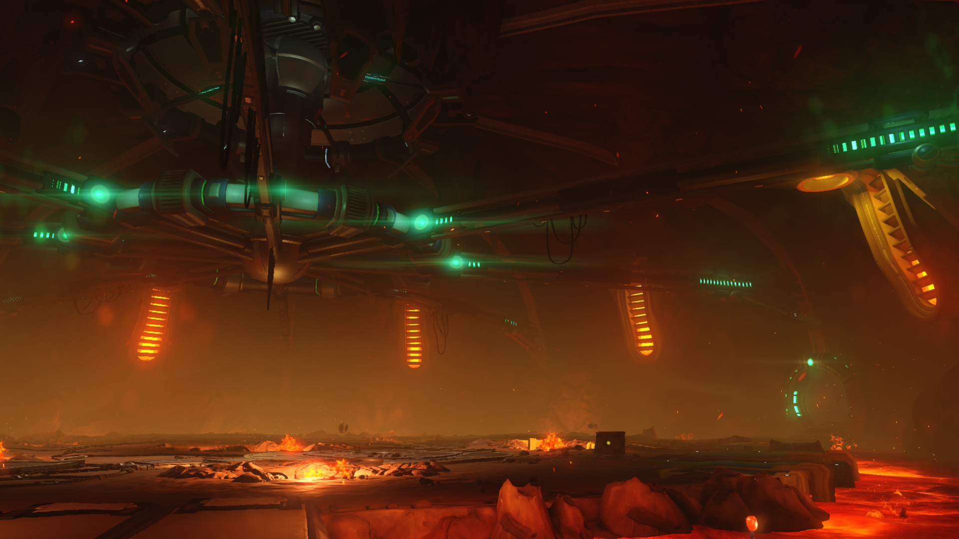
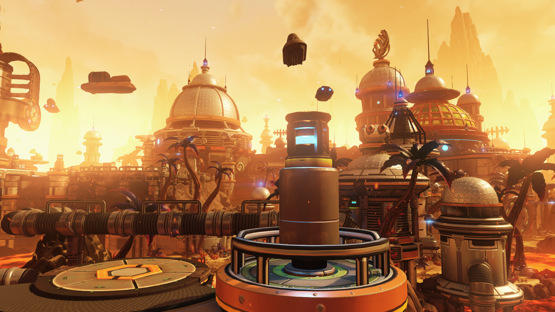
I don't know about other games, but R&C looks better in motion without a doubt!
For example this section was unbelievable in the game:

It was one of the few moments of this generation that I thought "it's a real 8th gen game". it looks great in screenshot too, but it's a lot better in motion.
Indeed, I actually think the asset quality in Arkham Knight is one of the best, if not, the best in open world games. Games like The Witcher 3 and Infamous Second Son have some relatively low res textures on the environments but in Arkham Knight, I find the asset quality to be sky high and consistent throughout. However, I dislike the heavy use of chromatic aberration and film grain. Of course, you could argue that it gives the game a soft, CG look, but I prefer sharp and clear images. I have to admit, though, that part at the very end when youArkham Knight is and will be one of the best looking games of this generation. I loved all of aspects about its graphics (alongside other things like gameplay, music, story and ...) and it had some of the best models these years.
For example this character isn't important and you see her only for seconds, but she has amazing details:

Or important characters like Catwoman:
I can't believe "It looks better in motion" is still a thing, I sit 2 feet away when I play games through my capture program and games look the same in stills as in motion, and no, I don't game on TVs anymore since it's pointless for me.
The R&C screens look beautiful no matter how they are taken, unless they are taken with JPGs of course.=p
IMO, games "look better in motion" not because they move but because you watch games on a TV set with much better colors and contrast whereas you look screenshots on a worst screen (PC or smartphones screens).
That's why a PS VITA screenshot look much better a the VITA screen than on a PC screen.
") I didn't notice it myself until I uploaded the pics.
I didn't notice it myself until I uploaded the pics.Get a decent/better PC monitorIMO, games "look better in motion" not because they move but because you watch games on a TV set with much better colors and contrast whereas you look screenshots on a worst screen (PC or smartphones screens).
That's why a PS VITA screenshot look much better a the VITA screen than on a PC screen.
")
Get a decent/better PC monitor
Even a decent/ better monitor can't match the fidelity of a HighEnd TV set in term of contrast. I don't expect a PC monitor matching my 50ST60 Panasonic plasma of 2013.
What's stopping you from using that screen as a PC monitor(See what I'm getting at here?)Even a decent/ better monitor can't match the fidelity of a HighEnd TV set in term of contrast. I don't expect a PC monitor matching my 50ST60 Panasonic plasma of 2013.
What's stopping you from using that screen as a PC monitor(See what I'm getting at here?)
(Don't use a plasma as a desktop screen btw)


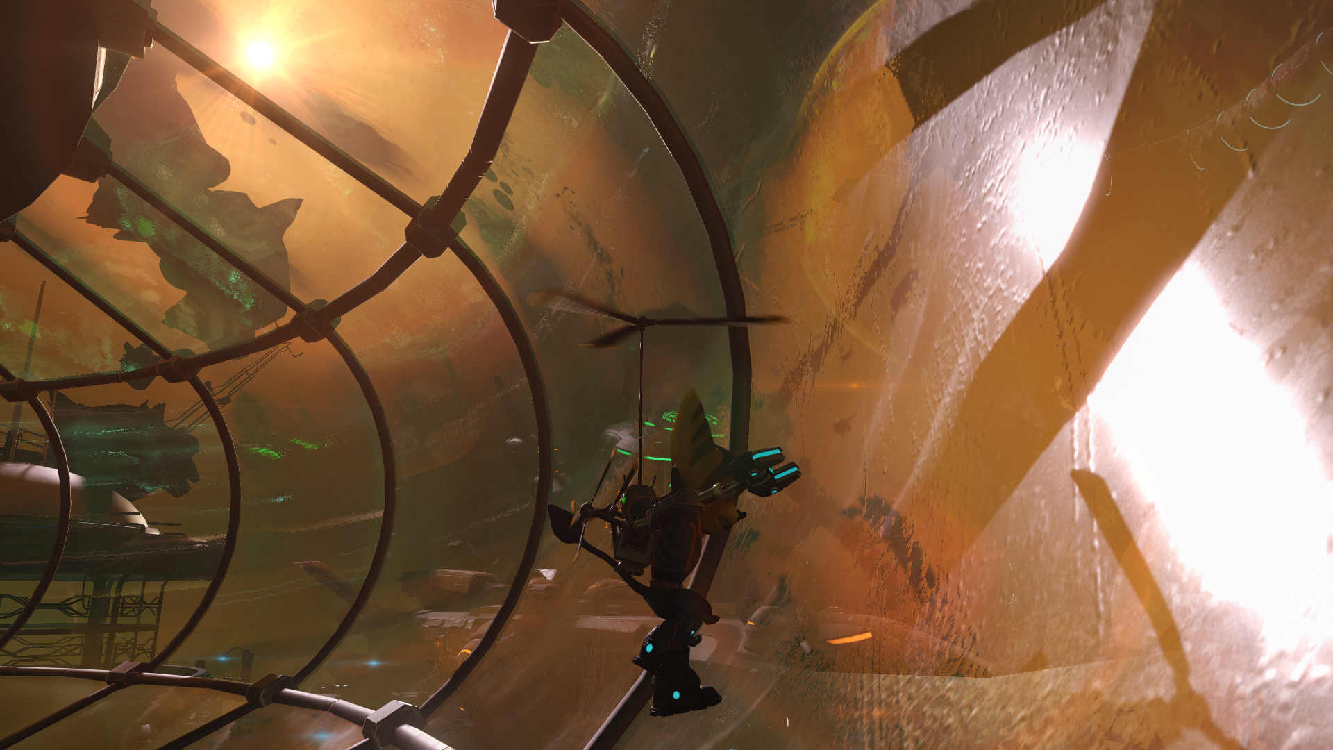
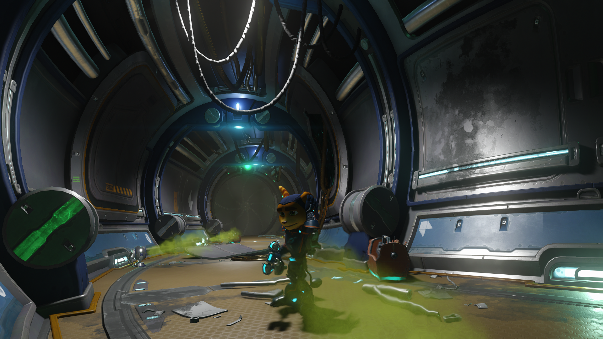
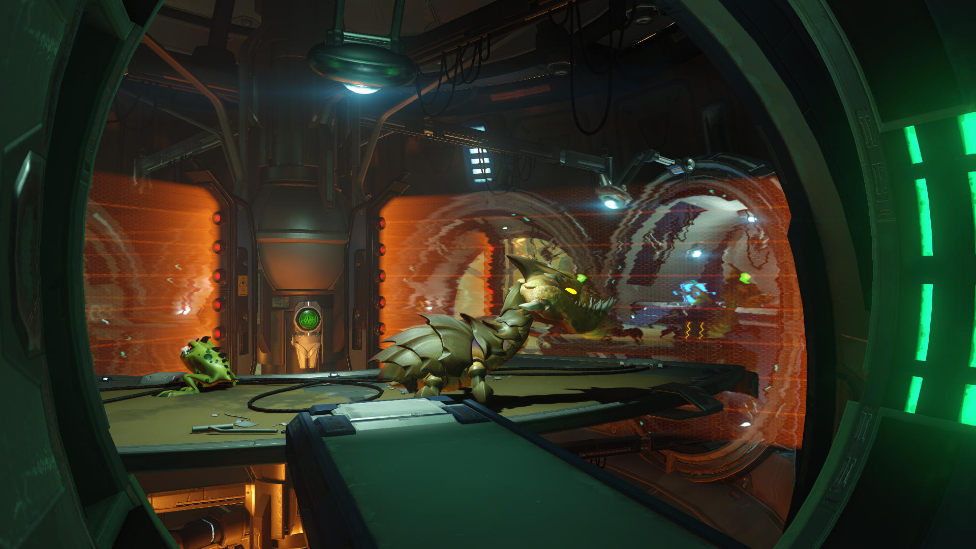
R&C looks great!
Don't mind me, just holding my gun against the while while reading the school bulletin board.

Wow, that's a nice bit of detail there, although either he's really tiny or they print on really big paper xD
It's a result of, uh, interference with the chronon... field. Yeah.
Nice screens - though I wish Codies would just add a simple photo mode with some AA, I feel like in-game screens don't do this game much justice. It's crazy gorgeous in motion - might be my favorite visuals in a racing game.