• Hey, guest user. Hope you're enjoying NeoGAF! Have you considered registering for an account? Come join us and add your take to the daily discourse.

Consoles screenshots thread (PS4/Xbone/WiiU) [Up: Thread rules in OP]

The only thing I can't stand with Infamous is the HUD, I swear it could come straight out of Last Ninja for the C64 (which was awesome for its time, mind, but that time was 1986). Kind of spoils my appreciation for the visuals.

Just been thinking this myself. Obviously they've gone with the design to maintain the douche-bro presentation but it just reminds me of the SR1 HUD or something i'd expect to see in a Tony Hawks game.
 
Beanies/hoodies should be banned from main characters.

url-17.gif
 

chadboban

Member
Thank god for the inFAMOUS screens saving this thread.

That statement is kinda insulting to the work people like Timu, Holyfridge, nbnt, xenogenesis, Neiteio, MYE, Pjsprojects and SO many others put into this thread. It didn't need "saving".

The infamous shots just added to the thread's already amazing quality, posts like yours don't.
 

Jinfash

needs 2 extra inches
That statement is kinda insulting to the work people like Timu, Holyfridge, nbnt, xenogenesis, Neiteio, MYE, Pjsprojects and SO many others put into this thread. It didn't need "saving".

The infamous shots just added to the thread's already amazing quality, posts like yours don't.

I appreciate the hard work, but I couldn't help feeling underwhelmed by many of the screens for various reasons. Chief among them are poor IQ, compression, and most importantly choice of screens. All which are very important considerations in a screen shot thread.

However, the recent batch of screens are promising, so keep them coming guys.
 

Timu

Member
I appreciate the hard work, but I couldn't help feeling underwhelmed by many of the screens for various reasons. Chief among them are poor IQ, compression, and most importantly choice of screens. All which are very important considerations in a screen shot thread.

However, the recent batch of screens are promising, so keep them coming guys.
My screens don't have compression in them.=O
 
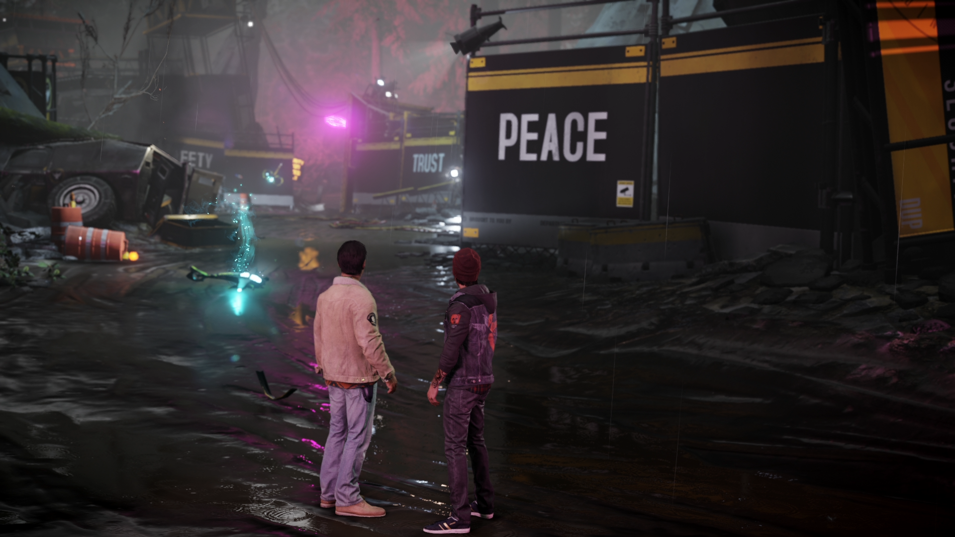
IQ in Second Son is truly pristine. Looks almost like SSAA. If I didn't know better I'd think they were bullshots. I hope their AA technique will be used in more games!
Well the IQ of the "bullshots" is still on another level, but it is really impressive. I wonder what they're using.
 
I appreciate the hard work, but I couldn't help feeling underwhelmed by many of the screens for various reasons. Chief among them are poor IQ, compression, and most importantly choice of screens. All which are very important considerations in a screen shot thread.

However, the recent batch of screens are promising, so keep them coming guys.

Looking forward to your shots!


Loving this shot, don´t know if it is the background but great pic to show off the fur. I finally bought this 2 weeks ago and love it to death, favorite game right now.
 
Can't wait to add some pics of SS when I get it this week!! Better make them good though because there will be a sea of them in here to choose from.
 

Figboy79

Aftershock LA
Really looking forward to getting my copy of Second Son this weekend. I had one of the powers spoiled for me, but I can deal with that. It doesn't matter in the end. As a diehard inFAMOUS fan, I just want the game already.
 
The only thing I can't stand with Infamous is the HUD, I swear it could come straight out of Last Ninja for the C64 (which was awesome for its time, mind, but that time was 1986). Kind of spoils my appreciation for the visuals.
The "graffiti" style doesn't really do it for me either, but there's one thing I do really appreciate about the Second Son HUD: it's pushed all the way out to the edges. I'm so glad they didn't force it into a "safe" area just to accommodate people who are rocking dat overscan. If I know how to set my TV correctly, I want the game to use the space.
 
Very, very underwhelming visually. Quite disappointed, regardless of the whole 'open world' argument.

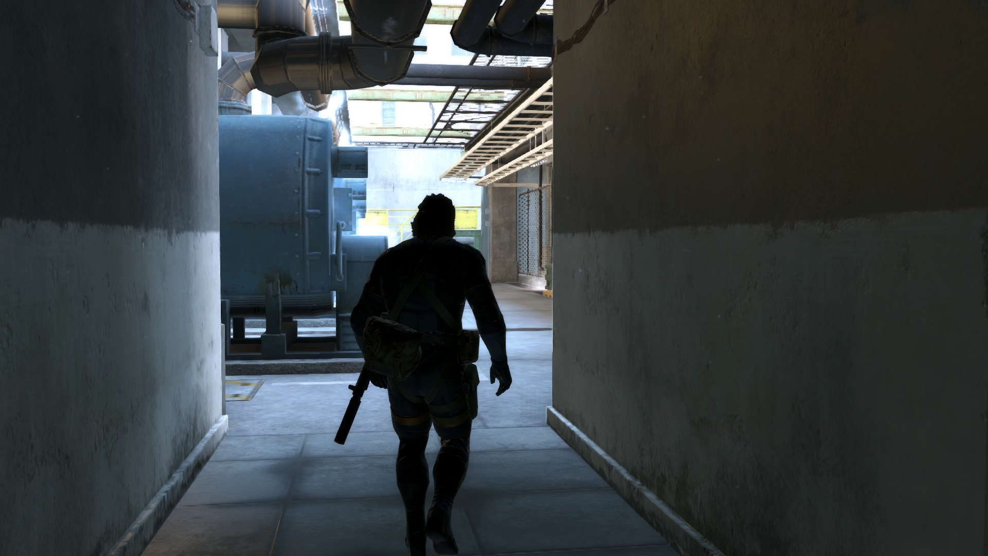
Game seems fun though.Typical Metal Gear.

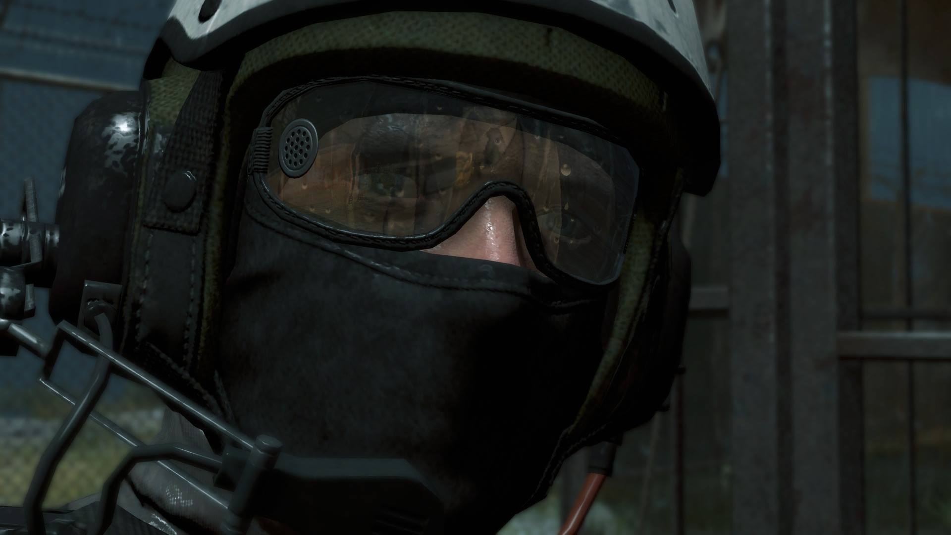
1614219_1483314161888942_236642546_o.jpg

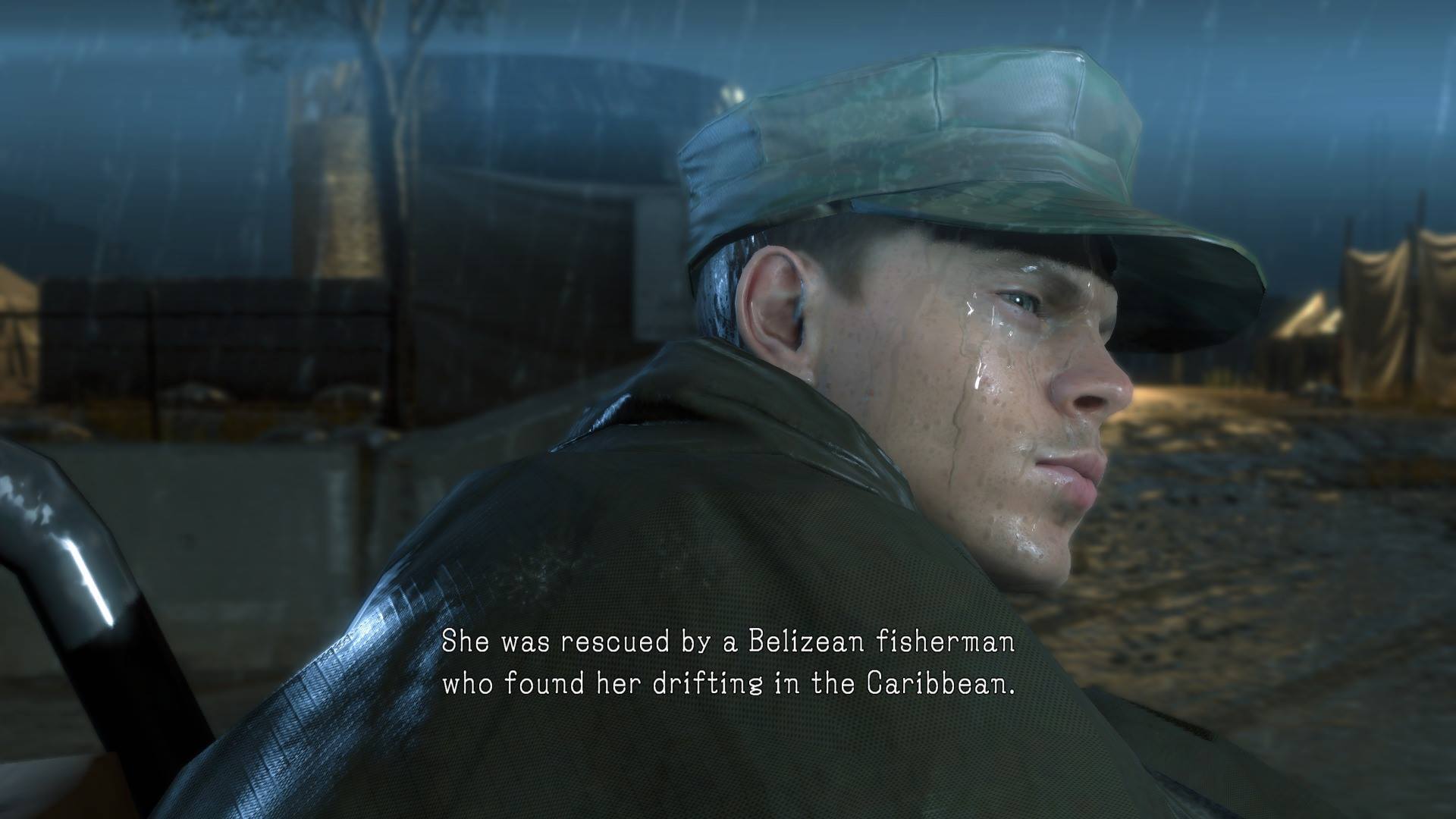
1898897_1483314335222258_1914586310_o.jpg

1909436_1483314371888921_1124221267_o.jpg
 
Next clean and oiliness.. Welcome, to the Next-Gen of oiliness and plasticity folks.

I agree
Like in 90% of the early last gen UE3 engine games, they overdo it with the shininess.
It seriously looks like every character just came from a heavy Nuru Massage™ session.
 
Is it just me or does the Main Character in SS look super imposed onto the scene in some of these screens. It's weird as he sometimes looks as though he's way too far in the foreground relative to where he's standing in the scene, as if he's hovering in front of it.

Probably just something that's happening in screenshots.
 

Blastoise

Banned
Is it just me or does the Main Character in SS look super imposed onto the scene in some of these screens. It's weird as he sometimes looks as though he's way too far in the foreground relative to where he's standing in the scene, as if he's hovering in front of it.

Probably just something that's happening in screenshots.

Yeah I'm kinda seeing a 'green screen' effect.
 

KeRaSh

Member
Wow, these Infamous SS screenshots are simply stunning.
Thanks for posting them! The Comparison between 1, 2 and 3 are real eye openers...
 
Somebody alert the mods that the thread title needs changing to Second Son Screenshots, 'cos GATDAYUM those inFamous screenies are far and away the best showcase for the graphical capabilities of the new generation of consoles so far.
 
Top Bottom