-
Hey Guest. Check out your NeoGAF Wrapped 2025 results here!
You are using an out of date browser. It may not display this or other websites correctly.
You should upgrade or use an alternative browser.
You should upgrade or use an alternative browser.
Consoles screenshots thread (PS4/Xbone/WiiU) [Up: Thread rules in OP]
- Thread starter Peterthumpa
- Start date
Quite impressed with these Knack shots as well. If only the compression was better.
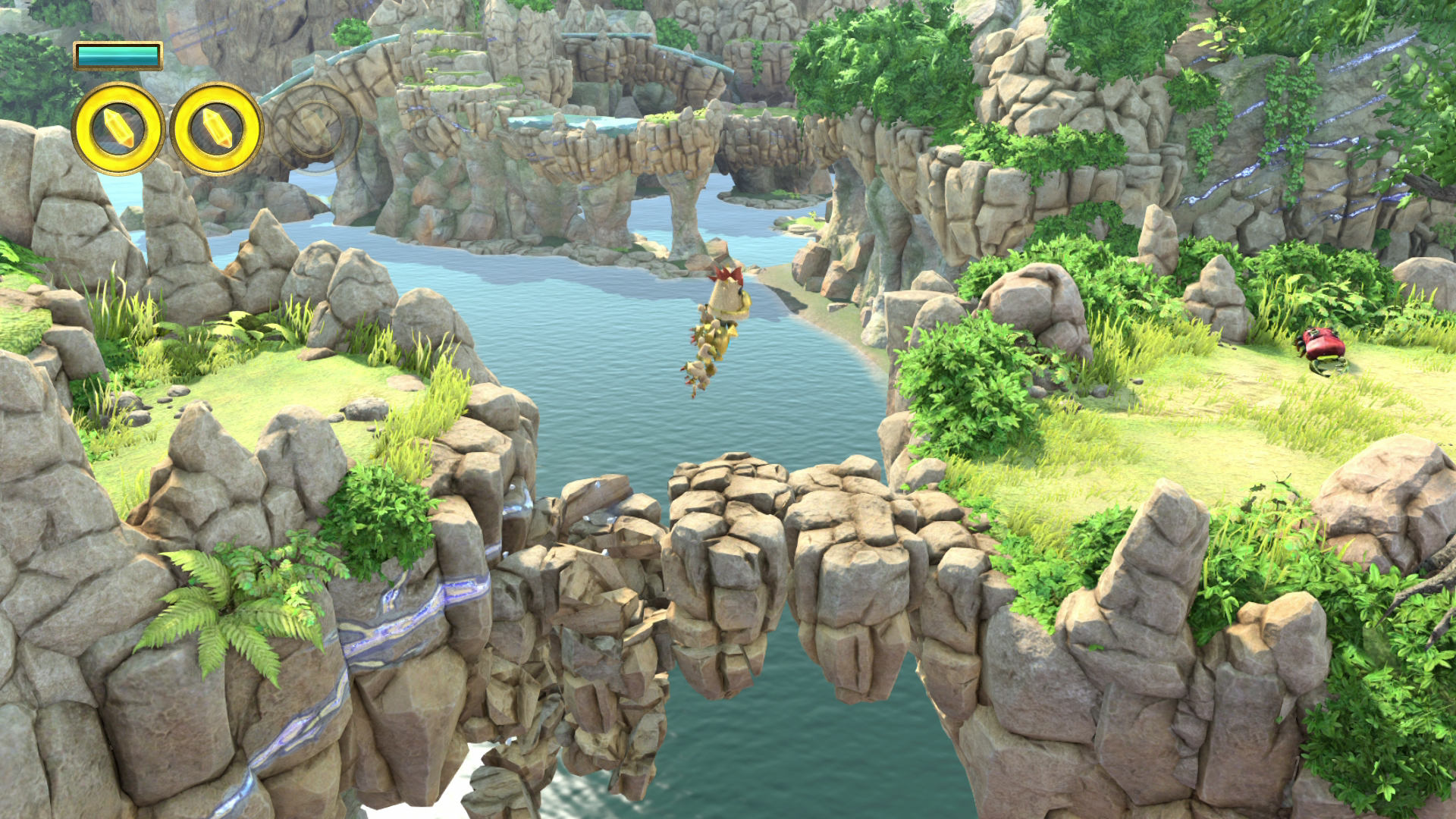
Knack looks really pretty to me, but I'm not sure. I feel like something is missing...
It's definitely colorful. But I guess I don't see that graphical personality that I've seen in other colorful games, like 3D World, Tearaway, or Lost World.
Are all the shots from early in the game? Maybe it's because I keep seeing the grass and rocks that the game looks a bit boring to me. Are there more diverse areas, maybe not as grounded in reality?
EDIT:
In, about half of the screenshots, the guys don't have shadows. Really?
nelsonroyale
Member
Best thing about knack is the lighting and environmental geomtery. Especially the rocks, the rocks look great.
I think they might have shadows, just soft shadows that are hard to see in some screenshots and because of the lighting. They are in shadow in that screen, so it could that?
I think they might have shadows, just soft shadows that are hard to see in some screenshots and because of the lighting. They are in shadow in that screen, so it could that?
abstract alien
Member
Can you post PS4 captures directly to image hosting sites like Wii U? I don't have a facebook account.
Well, considering how good the screens are sometimes, 2 sometimes isn't enough.=pDid Sethos get banned in this thread?
Also, unlike the more established screenshot threads; there are two many post with an excessive number of bad screenshots.
You don't have to indiscriminately dump everything in here you know.
Posting two of the best screenshots in a single post makes the thread livelier and keeps in on the first page.
EDIT:
In, about half of the screenshots, the guys don't have shadows. Really?
They are in the shadow.
What's the appeal of Wind Waker? I'm not one to ruin anyone's fun but I've never liked the cel shaded look. Is it just love-it-or-hate-it? I much prefer Ocarina of Time, even though the style is dated.
I can't see how any sports game will look better than those NBA 2K14 shots.
I can't see how any sports game will look better than those NBA 2K14 shots.
What's the appeal of Wind Waker? ...I've never liked the cel shaded look.
I think you know the answer to your own question.
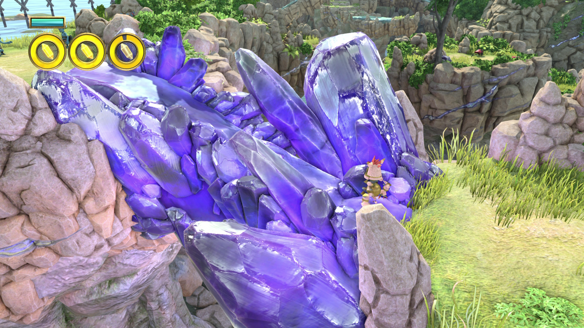
I really like how the crystal looks in this screenshot.
Nintendo Land looks good in those screenshots but it has never looked that good for me in motion for some reason.
that just looks like average looking game footage to me
cyen
Member
Those KZ screenshots look pretty great but tbh if you already play on a beefy pc you will find that pics inline with crysis 3 or BF4, wich is pretty great considering the price point of a PS4 compared to a high end pc.
If you come only from lastgen offerings (360\ps3) im sure the game will blow your mind graphically.
Can´t wait to get me a ps4, but hearing all the problems from QA thread i will probably wait a little until they iron out those problems.
If you come only from lastgen offerings (360\ps3) im sure the game will blow your mind graphically.
Can´t wait to get me a ps4, but hearing all the problems from QA thread i will probably wait a little until they iron out those problems.
flipswitch
Member
I really like how the crystal looks in this screenshot.
I like the ambient occlusion and is that global illumination?
...the appeal is that it's cel shaded? I'm not following. I don't love it since it removes all depth of field and makes some things look 2D while others are 3D, but I know someone must love it because of X - I just am curious what that X is.I think you know the answer to your own question.
The_Intruder
Member
I'm really surprise how Assassin's Creed IV looks on WII U, sharp, clean with decent textures, it seems ubisoft have done a good port.
I'm really surprise how Assassin's Creed IV looks on WII U, sharp, clean with decent textures, it seems ubisoft have done a good port.
Much... much better than what they did with 3.
http://www.neogaf.com/forum/showpost.php?p=90217055&postcount=1607
ShellyDeKiller
Member
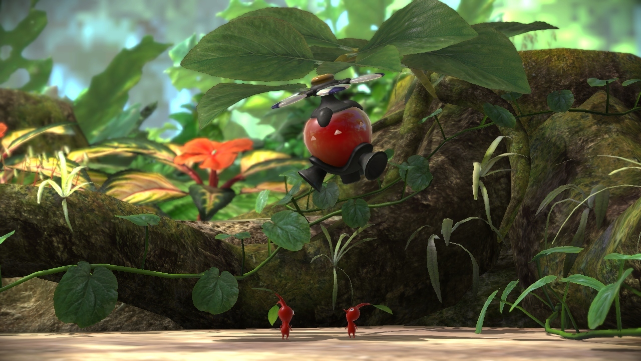
Pikmin 3
...the appeal is that it's cel shaded? I'm not following. I don't love it since it removes all depth of field and makes some things look 2D while others are 3D, but I know someone must love it because of X - I just am curious what that X is.
Are you asking what's the appeal of the game, or what's the appeal of the visuals?
Because if you're asking the appeal of the visuals and start off by saying "by the way I have a fundamental disinterest with it's art style" then you know why you don't like it.
If you're asking what's the appeal of the game, it's a huge open world with a ton of awesome side quests and a really surprisingly interesting story and great combat and fantastic visuals and it's got a great sense of humor and it's incredibly creative and the dungeons are fun and it's probably one of the best Zelda games of them all, either in the top 2 or top 3.
Sorry, should've specified - what is it about the visuals that is appealing? I know (and don't care) why I don't like it; I'm genuinely trying to understand why other people look at the same screenshots and like it.Are you asking what's the appeal of the game, or what's the appeal of the visuals?
Because if you're asking the appeal of the visuals and start off by saying "by the way I have a fundamental disinterest with it's art style" then you know why you don't like it.
I really like how the crystal looks in this screenshot.
Yeap, texture work is impressive. Captures the look of scratched, broken, clipped and scathed crystal/corundum really well.
Flower


MAN they put in a lot more grass. Thank the lawd for crossplay, for the day I eventually get a PS4.
OverturePT
Member
Sorry, should've specified - what is it about the visuals that is appealing? I know (and don't care) why I don't like it; I'm genuinely trying to understand why other people look at the same screenshots and like it.
It just looks good to many people. It's appealing, it's crisp, it's smooth, it's colorful and when in motion the animations are pretty good and Link also has quite a few facial animations (while being idle and stuff) that really bring him to life in a cartoony, interesting way.
That's fair, thanks for humoring me. I suppose looking at it more in motion might help the effect.It just looks good to many people. It's appealing, it's crisp, it's smooth, it's colorful and when in motion the animations are pretty good and Link also has quite a few facial animations (while being idle and stuff) that really bring him to life in a cartoony, interesting way.
EatChildren
Currently polling second in Australia's federal election (first in the Gold Coast), this feral may one day be your Bogan King.
Wind Waker's art holds up brilliantly as evident by Dolphin, but Wind Waker HD isn't just the GCN engine ported over. They did add more modern effects the GCN was incapable of rendering, like proper real time shadow casting from everything and ambient occlusions. Throwing in modern effects helps raise the bar when throwing it against PS4 games.
Fucking love the object motion blur in Shadow Fall and Knack. Looks really good. Can't wait for more games to start using object motion blur instead of cheaper effects we're used to.
Fucking love the object motion blur in Shadow Fall and Knack. Looks really good. Can't wait for more games to start using object motion blur instead of cheaper effects we're used to.
Robert J. Sullivan
Member
It's absolutely absurd something like this even needs to be said, as if we're talking politics or religion.
that's the sad truth unfortunately, sometimes i wonder if console/pc warriors even read some of the shit they write
nelsonroyale
Member
Wind Waker's art holds up brilliantly as evident by Dolphin, but Wind Waker HD isn't just the GCN engine ported over. They did add more modern effects the GCN was incapable of rendering, like proper real time shadow casting from everything and ambient occlusions. Throwing in modern effects helps raise the bar when throwing it against PS4 games.
Fucking love the object motion blur in Shadow Fall and Knack. Looks really good. Can't wait for more games to start using object motion blur instead of cheaper effects we're used to.
Yeah, it is really noticible in Knack and looks excellent up close, especially when knack assimilates new parts.
Ok but this feature + DOF are the nightmare of a competitive gamer.Fucking love the object motion blur in Shadow Fall and Knack. Looks really good. Can't wait for more games to start using object motion blur instead of cheaper effects we're used to.
Killzone Shadow Fall

Take away the compression, and it does seem like the in-game models are exactly the same as their previously released high quality renders after all. If anything the skin looks better realised in the actual game. Might be better sub surface scattering, or just the lighting differences.

EatChildren
Currently polling second in Australia's federal election (first in the Gold Coast), this feral may one day be your Bogan King.
Ok but this feature + DOF are the nightmare of a competitive gamer.
I suppose that's the benefit of PC then.
EDIT: One thing I will say is that Shadow Fall, like Crysis 3, seems to use some surprisingly lower resolution textures than I'd expect on parts of character clothing, and makes up for it by overlaying a much higher detail bump map to highlight stitching in the fabric and what not.
Dictator93
Member
Anyone here have a capture card and a hoooked up PS4?
Still looking for loss-less captures for the upcoming thread I am making about tech.
Really could use a helping hand!
Still looking for loss-less captures for the upcoming thread I am making about tech.
Really could use a helping hand!
Stallion Free
Cock Encumbered
The screenshots are disappointingly blurry coming out of the PS4. Hope they tweak that later on.
Whoever decided that Twitter and Facebook would be the default export options made a terrible call.
Jaded Alyx
Member
Anyone here have a capture card and a hoooked up PS4?
Still looking for loss-less captures for the upcoming thread I am making about tech.
Really could use a helping hand!
There's a few shots in this thread already.
Dictator93
Member
There's a few shots in this thread already.
They have to be very specific and not jsut "cool" looking ones. But yeah, hence my posting
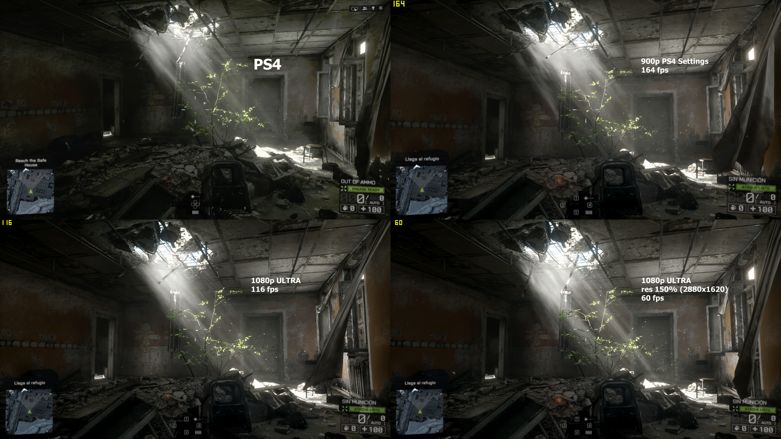
OK, I just took a couple shots.
Here's the same area on my PC.
This first shot is taken with a mix of High and Ultra settings which produces 60 fps here. All Ultra produces 39 fps with just FXAA.

This second shot was taken with the same mix of settings with two exceptions; I used 200% resolution scaling mixed with 2x MSAA. This is the result. As you can see it looks nowhere NEAR as clean as the shot the PC shot posted above. The framerate? 9 fps. Yes, nine frames per second and I can't even touch that other PC shot.

The PS4 shot is definitely not as clean but I think it compares quite favorably especially considering how consistent its performance is. On my PC I still get plenty of jitters and hitching while playing that kind of drive me nuts (very very subtle but quite annoying). Most PC gamers wouldn't be bothered by it I'm sure but it bothers me.
PS4
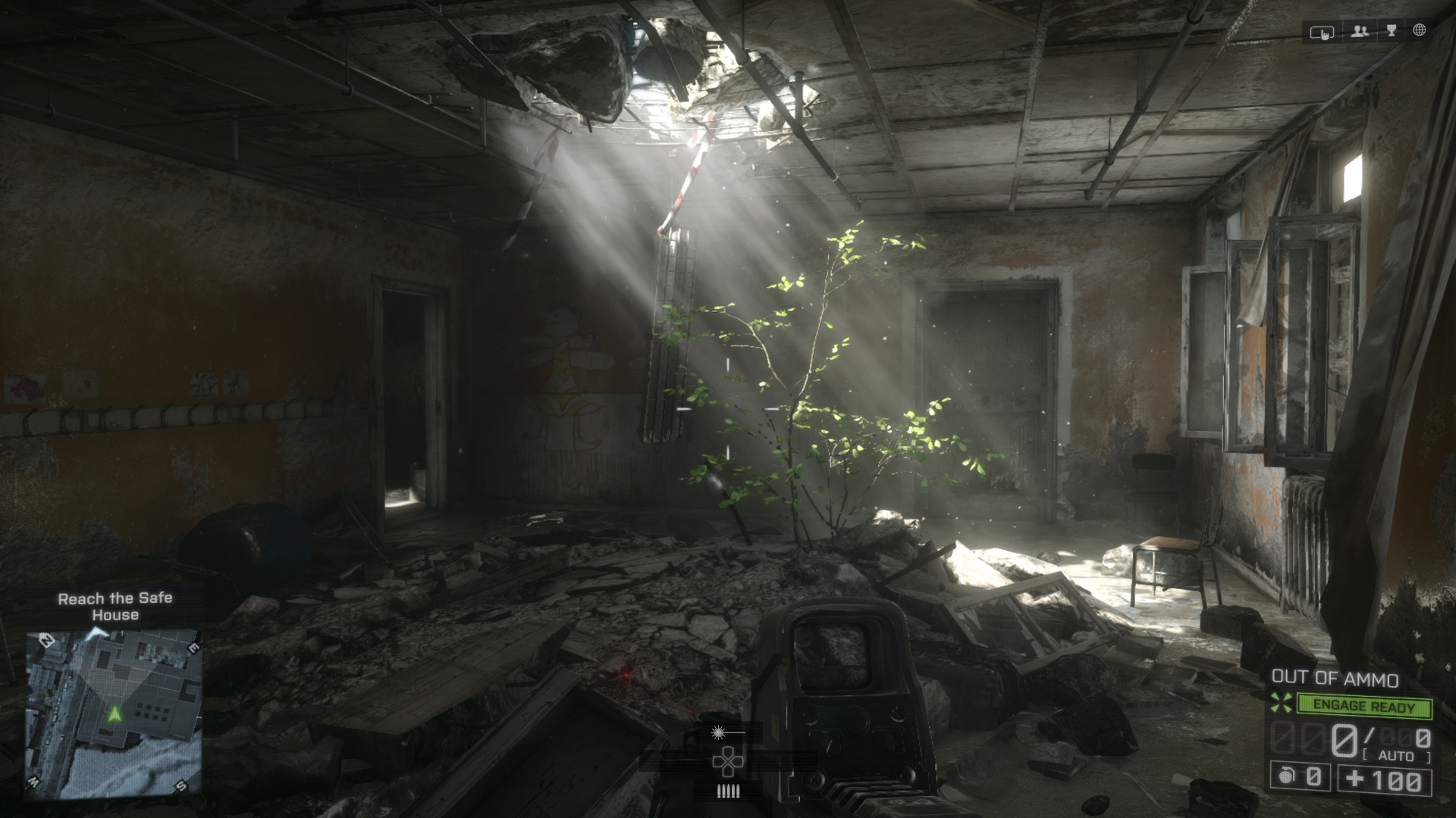
Interestingly, when alt-tabbing between the shots, the PS4 shot has more geometry detail than my PC shots.
This is a challenging shot, though, as the vegetation is bathed in light which makes it more prone to aliasing even when using super high-end settings for image quality. I'm not even confident that the other PC shot is achievable in game. It looks like it was captured at a higher resolution along with maximum settings and then downscaled with a good image editor.
A comparisson I just make in my computer (ultra means ultra, so msaax4 is applied).
Your framerate is not an axiom.
Stallion Free
Cock Encumbered
A comparisson I just make in my computer (ultra means ultra, so msaax4 is applied)
And you aren't missing geometry or texture details either lol.
And you aren't missing geometry or texture details either lol.
Dark10x screenshots don't have those dynamic clothes in the ceiling. I don't know the reason. PS4 shot is good enough, but using same settings in pc version achieve a absurdly high framerate. That small room with volumetric light is one of the most demanding scenes in the game in terms of performance.
Sylverstone14
Member
This isn't a screenshot and it's not 1080p, but it is 60fps.

Also 6 megabytes

Anyone here have a capture card and a hoooked up PS4?
Still looking for loss-less captures for the upcoming thread I am making about tech.
Really could use a helping hand!
Yea, don't use these one's. Compression is essentially removing macro detailing. Wait for some proper captures, preferably png.

Low quality screens do not do this game justice, I could spend all day staring at the skin and basketballs in this game.
Damn! Is that NBA2K14?
Haven't played a basketball game since the PSone days, but I've seen a couple of videos from this and I'm actually thinking of picking it up even though I never play sports games that aren't arcade-like.
EatChildren
Currently polling second in Australia's federal election (first in the Gold Coast), this feral may one day be your Bogan King.
That small room with volumetric light is one of the most demanding scenes in the game in terms of performance.
It's crazy how hard my framerate tanks looking at that tree.
Dark10x screenshots don't have those dynamic clothes in the ceiling. I don't know the reason. PS4 shot is good enough, but using same settings in pc version achieve a absurdly high framerate. That small room with volumetric light is one of the most demanding scenes in the game in terms of performance.
I'm just curious so that I could put this theory to bed, you've got an Nvidia card right? Or is it AMD?
It's crazy how hard my framerate tanks looking at that tree.
I was wondering why my frames dropped on that part. Is that our first look at volumetric lighting going foward? Did Crysis 2/3 or Battlefield 3 have it?
Wind Waker is unreal. Still the GOAT
You're God Damn Right.


