-
Hey, guest user. Hope you're enjoying NeoGAF! Have you considered registering for an account? Come join us and add your take to the daily discourse.
You are using an out of date browser. It may not display this or other websites correctly.
You should upgrade or use an alternative browser.
You should upgrade or use an alternative browser.
Does anyone actually prefer ClearType text in XP?
- Thread starter Fatalah
- Start date
- Status
- Not open for further replies.
It looks a little weird at first... but leave it on for a few days. You wont want to go back.
Haha, this sounds like a fun prank, but I'll give it a go. Things look just a tad blurry right now.
Mister Zimbu
Member
Thanks for reminding me; I forgot to enable it last time I installed Windows.
I always thought things looked alot better with it enabled.
I always thought things looked alot better with it enabled.
Ok, so I might have changed my mind on not liking the way it looks, but why the fuck does it slow down my system? Stuff like scrolling and moving windows around is choppy. Dubya Tee Eff?
Also, am I crazy for whatever reason being reminded of Macs by this font? For some reason it just looks Macish...
Also, am I crazy for whatever reason being reminded of Macs by this font? For some reason it just looks Macish...
i've never turned it off since i first installed windows xp oh so many years ago. one of the greatest features ever added to Win XP IMO.Fatalah said:I usually have it turned off, but I just turned it on. It always seemed too blurry to me. I feel like I'm going blind. Maybe it takes some getting used to?
What do you guys do? Cleartype or not to cleartype?
God's Hand
Banned
I hate ClearType. It makes the text blurry. I prefer the sharp look.
dem
Member
Slightly better, but now bold fonts, ESPECIALLY verdana look like a blurry mess. Back to standard for me.
It's funny though, the font that World of Warcraft uses is EXTREMELY sharp, no blurriness looks awesome. I was actually blown away how much sharper text was in that game when I got my new LCD monitor.
It's funny though, the font that World of Warcraft uses is EXTREMELY sharp, no blurriness looks awesome. I was actually blown away how much sharper text was in that game when I got my new LCD monitor.
VictimOfGrief
Banned
ClearType makes everything look blurry. Those who enjoy, I'm not paying your medicare in 40+ years when you need glasses because of it. :lol
Fragamemnon
Member
Cleartype is great for LCDs.
No point of it on a CRT, though, IMO.
No point of it on a CRT, though, IMO.
cloudwalking
300chf ain't shit to me
I have a CRT monitor. I prefer it greatly over the standard setting, but maybe that's just because I've gotten used to it. It doesn't make a whole lot of difference, just smooths things out a bit.
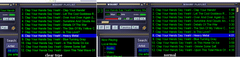
No cleartype:

Cleartype:

No cleartype:
Cleartype:
Look at those screenshots. I know our eyes can perceive things different and it's all about what you 're used too but I don't see myself EVER getting use to that antialiasing ClearType does. Horrible.
*which is ironic becuase I use 2XSAI in my emulators which does pretty much the same thing.
*which is ironic becuase I use 2XSAI in my emulators which does pretty much the same thing.
Thank you for this thread Fatalah.
This was activated on my Dad's machine and he forgot how to activate it, so I've been trying to alter system fonts on my machine to simulate the effect and of course it's all been in vain.
Now that I know what to do, no XP machine is safe in my hands")
This was activated on my Dad's machine and he forgot how to activate it, so I've been trying to alter system fonts on my machine to simulate the effect and of course it's all been in vain.
Now that I know what to do, no XP machine is safe in my hands
Keyser Soze
Member
The quick red fox owns all!
JoshuaJSlone
Member
I don't think with something with such small details to it a format like JPEG is decent for comparison, so I made a few GIFs. I like how ClearType takes away just a bit of the harshness, but it's always a bit freaky when I zoom in on a screen capture and it seems to break apart before my eyes.


EDIT: Another decent example from MS's website. I guess it makes sense that if there's something like italics there to help jag up the letters, ClearType will seem even better in comparison.

EDIT: Another decent example from MS's website. I guess it makes sense that if there's something like italics there to help jag up the letters, ClearType will seem even better in comparison.
JoshuaJSlone
Member
Sometimes darker, sometimes lighter. I believe the explanation for this would be that as long as it's only using two colors, it can only make quite discrete changes in letter thickness. However, if one brings in anti-aliasing tricks one can give something the appearance of being, say, 0.3 pixels thicker or thinner, so it will seem a bit different than what we were previously used to.RedDwarf said:First time trying it. It seems like some text is lighter in shade
Actually, that's a decent idea for yet another comparison image. Notice how on the left, there's a clear change in thickness from 13 to 14 and from 22 to 24, whereas on the right it's more gradual. Or how everything below 8 is lighter, but with a more identifiable shape.

Yeah, same phenomenon. It definitely makes a visual difference. Looking at that comparison image it seems the "increased fatness" is most noticeable at 11-13, at least with Times New Roman.I prefer without Cleartype because letters don't appear as 'fat'. Know what I mean?
Tenacious-V
Thinks his PR is better than yours.
Hellz yeah I use it! Makes everything nice and smooth baby! Smoooooooth..!
Things look nice and clean.
Things look nice and clean.
Dice
Pokémon Parentage Conspiracy Theorist
I've used it since I got XP, it's great.
That's my favorite band.Fatalah said:Maybe my videocard is too old. My computer is from '99...nvidia riva tnt2pro
michael000
Banned
Lol sad, cleartype is what my monitor looks like when i don't wear my glasses :lol
pestul said:Everyone's eyes must be seriously different (20/10 Vision).. cause I can't stand it. Then again, I actually approve of low H frequencies like 60Hz too, because I can't stand the blurring in anything over 75Hz (I use this just in case i'm killing my eyes).
In all seriousness, the real issue with cleartype text is that it has chromatic abberation; i.e. the color at the edge of the text isn't actually black or a shade of gray, but either a blue, green, red; people can pick up on this difference easily, even if they can't identify what it is.
On the otherhand, it provides a smoother more natural looking shape, which reduces some amount of eyestrain, making the words easier to read. Some people won't like it because they're not used to it, while others might even find it easier to read solely black text, even with the aliased edges.
Some people actually have monitor resolution so high that it doesn't matter; i.e. they need to increase the size of their font or risk degrading their eyesight...
and finally, the higher the frequency with CRT monitors, the better for the eyes; freqs of 75hz below have visible flickering (you can even see it at 75hz if you look out of the corner of the eye), which in turn can cause you to keep your eyes open longer than you would normally; less blinking, more strain, dryer eyes, nausea, etc.
LCD monitors have a constant projection of light on the otherhand, so in terms of that, they're not too bad. But the ghosting and other issues can be troublesome with LCD monitors.
well cleartype works best on higher resolutions, and there are utilities you can download that will allow you to 'tweak' how much cleartype smooths out the font.miyuru said:I prefer without Cleartype because letters don't appear as 'fat'. Know what I mean?
While true, the 80s generation was putting up with like 36Hz 8hrs a day and I'm pretty sure they're doing okay. I think the PC age is still a huge longitudinal study in the making. Looking back, we haven't really been using computers for so long. Perhaps we're all doomed to sterility/blindness/brain cancer and we don't even know it yet.Zaptruder said:and finally, the higher the frequency with CRT monitors, the better for the eyes; freqs of 75hz below have visible flickering (you can even see it at 75hz if you look out of the corner of the eye), which in turn can cause you to keep your eyes open longer than you would normally; less blinking, more strain, dryer eyes, nausea, etc.
Also for the record.. I have a hard time using AA in games on my PC because of the blurring it causes too. I certainly can't use over 4xAA or the sharpness of textures is totally gone.
pestul said:While true, the 80s generation was putting up with like 36Hz 8hrs a day and I'm pretty sure they're doing okay. I think the PC age is still a huge longitudinal study in the making. Looking back, we haven't really been using computers for so long. Perhaps we're all doomed to sterility/blindness/brain cancer and we don't even know it yet.
Also for the record.. I have a hard time using AA in games on my PC because of the blurring it causes too. I certainly can't use over 4xAA or the sharpness of textures is totally gone.
Well, it shouldn't be doing that; so either your video card sucks or your just fucked in the head.
For most people, the smoother the image is without arbitary jagged elements, the closer to a natural image it represents... which is a good thing.
it should be clarified, the image isn't blurry, it's aliased, which is completely different. blurry implies that the text looks out of focus, which it isn't at all. again, this depends what resolution you are running at and how sharp your monitor can handle that resolution.
aliasing tricks the brain into 'filling in the dots', giving the text the appearance of a much higher resolution than it actually is. if your monitor doesn't have good focus or you run at a low resolution (anything below 1024x768 is horrible for me), then cleartype's usefulness will decrease for you. IMO it doesn't matter if it's CRT or LCD to see its benefits. a sharp looking CRT at 1024 or 1280 resolution still makes cleartype look pretty.
that said cleartype does look much better IMO on my 17" LCD than my 17" CRT at the same resolution.
- Status
- Not open for further replies.