• Hey, guest user. Hope you're enjoying NeoGAF! Have you considered registering for an account? Come join us and add your take to the daily discourse.

Official TEKKEN 6 "Who needs a FADC? We got RAGE!" Thread

Doomshine said:
It's tough to come up with a general catchphrase for Tekken.

Dorya!?

...of tossing relatives into volcanoes?

What else is there that's recognizable as Tekken? Besides hurr durr juggles.

THE KING OF IRON FIST HYPE THREADS
 

GrayFoxPL

Member
AAK said:
Trust me I can empathize with you so much it isn't even funny.... It took me nearly 3 hours just to finalize the design for my headers....Just would't be satisfied:

ei7frb.jpg


It looks like 5 minutes worth of work but I just couldn't settle on a font or design :/

But don't worry it's no rush, we got time. Appreciate the effort regardless :D.

I love the old school Kazuya glove and font.

Doomshine said:
It's tough to come up with a general catchphrase for Tekken.

Dorya!?

...of tossing relatives into volcanoes?

What else is there that's recognizable as Tekken? Besides hurr durr juggles.

I'm the strongest in the universe!

Excellent!

Tekken killed my mother!

If you really wanna go out and confuse shit out of everyone use "Rave Wars" instead of Tekken.

btw I wonder how many players now where Avoidingthepuddle comes from.
 

Sayah

Member
AAK said:
Trust me I can empathize with you so much it isn't even funny.... It took me nearly 3 hours just to finalize the design for my headers....Just would't be satisfied:

ei7frb.jpg


It looks like 5 minutes worth of work but I just couldn't settle on a font or design :/

But don't worry it's no rush, we got time. Appreciate the effort regardless :D.
Wow, that looks amazing. First time ever I'll be actually anticipating a thread. :p
As far as the photoshop, I can now understand what you must have gone through. Photoshop is no joke. You need to have taken a class in it or something. I'm assuming it becomes easier once you figure everything out, though. My banner is progressing. Hopefully I'll have it done soon.
 

Sayah

Member
Doomshine said:
It's tough to come up with a general catchphrase for Tekken.

Dorya!?

...of tossing relatives into volcanoes
?

What else is there that's recognizable as Tekken? Besides hurr durr juggles.
Haha, I like that.
 

SUPARSTARX

Member
Shiet, I'm trying to get back into some Tekken 6.

Give me all the Law stuff from a beginner level. Poke strings, punishes, and good !b and W combos.
 

Sayah

Member
Tekken |OT| of Tossing Relatives into Volcanoes (by DoomShine)
Tekken |OT| of Tekken spelled backwards is Nekket (by MightyKAC)
Tekken |OT| Anti-Aging Secret Inside (reference to Heihachi)
Tekken |OT| of Bob chop those veggies (or) CHOP CHOP CHOP CHOP
^^^^^^^^
Use these as inspiration to create more. Of course, I'm not very creative with mines but still wanted to try.
 

AAK

Member
Dammit... I'm crazy, I have 97.6 Mb of gifs for this OP.... What the hell is wrong with me :/ And I still had some content left to cover, meh. I think I'm just gonna stop now and just clean what I have for now and put a "coming soon" message under the headings for those things I have left.

|OT| of Mishimadness (Return of Top tier Mishima's)
|OT| of Arcade Purity (Striving to retain the arcde culture)
|OT| of Tag Assaulting _____ (Can't think of anything beyond that)
|OT| of Netsu FEVER! (How netsu in Japanese translates to fever in English)

Meh, my creativity is piss poor as well :p
 

Sayah

Member
New Harada interview.

More twitter posts:
Harada_TEKKEN Katsuhiro Harada
SFxTK & TTT2 is not release yet. We should PR this two title. RT@HollowSage How long do we have to wait before we see some gameplay of TxSF?

Harada_TEKKEN Katsuhiro Harada
I'll consider Life meter+1. BUT, I don't want to add the meter excessively. RT @AndreyENG Do you plan on adding Meters and Supers on TKxSF?

Seems like you may be right about TxSF AAK. TTT2 and SFxT will be the main attractions for fighters next year.

And on another somewhat related note, SFXT boxart revealed.
 

AAK

Member
MightyKAC said:
How about |OT| of Tag Assaulting Wild bears, Killer robots, and Hot Fighting MILFS

Yo, I really like that! But I suggest to keep things in line with the wacky Tekken cast, how about we replace MILFs with planks of wood to represent Mokujin? :D

As I write this OT I keep adding more and more things to increase clarity... it's too much now LOL. But I plan to have this up in 3 days hopefully :) How's the banner lookin Sayah?
 

Sayah

Member
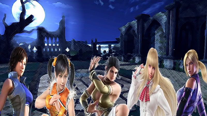
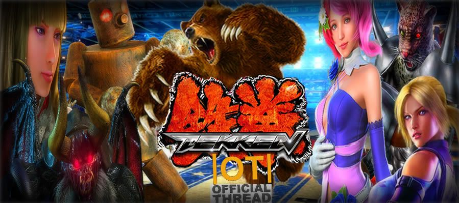
Here is a sample of how it could work. Used a filtered moonlit wilderness stage and added Tekken girls. I was just messing around to get some ideas going. This, of course, isn't how the final will look like at all.

banner.jpg


Now, for the final banner, should I use a specific stage as a background or something else entirely? Should I use character art or screenshots or CG shots from trailers? Also, do I need to put any wording such as "Official NeoGAF Tekken Thread?"
 

AAK

Member
Yo, that's cool, what I had in mind was similar to how the tekken official site did it:

top_aou.jpg


Just a simple abstract background with some characters on it, and a cool stylized TEKKEN font in the middle. And in the middle like say where the ENTER sign is, we could just put the Neogaf symbol there. But I'm giving you full creative freedom :D. If anyone else wants to chip in their ideas feel free to.
 

Sayah

Member
Well, I've created another sample.

tekkenbanner5.jpg


Tomorrow, I'll work on having the Tekken logo in the middle and positioning the characters around it. Hopefully, that turns out well.
 

AAK

Member
Alright, that`s looking good :) Only minor suggestion I have is to keep the proportions of all the characters equal. Everyone looks fine, it`s just that Lili is taking a bit disproportionately larger than everyone else which makes it look kinda out

EDIT: lemme rephrase it, it isn't about the proportions, but the amount of space she's getting, sorry for being unclear :)

Actually, if you could take a request, if you could include Mokujin, True Ogre, and Kuma as well that would just be FANTASTIC, it would go well with the thread slogan MightyKAC recommended :D
Here's a good source image of T.Ogre:
7_m.jpg
 

Sayah

Member
AAK said:
Alright, that`s looking good :) Only minor suggestion I have is to keep the proportions of all the characters equal. Everyone looks fine, it`s just that Lili is taking a bit disproportionately larger than everyone else which makes it look kinda out

EDIT: lemme rephrase it, it isn't about the proportions, but the amount of space she's getting, sorry for being unclear :)

Actually, if you could take a request, if you could include Mokujin, True Ogre, and Kuma as well that would just be FANTASTIC, it would go well with the thread slogan MightyKAC recommended :D
Here's a good source image of T.Ogre:
7_m.jpg
Awesome. Starting work on the new one right now. :)
 

Sayah

Member
LOL, thanks. I found a pretty amazing design for Kuma but don't see any Tag 2 character designs for Mokujin. Guess I'll have to use his design from Tekken 5 or 6.
 

Sayah

Member
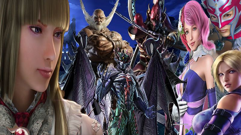
At first, I didn't know what to do but now there's just so many ways of arranging this banner. Was hoping to add more characters in but it's already kind of overwhelming with the few I have in it already.

tekkenbanner111.jpg
 

AAK

Member
I'm sorry to ask this of you, but is it possible to make the banner a little bit wider and shorter?

The resolution is 800 x 450, can we extend it to 900x400? (Only reason I ask is so that the length is in sync with the headings I did for the thread)

And that way maybe we can have a bit more space and spread the characters out a bit more?

As for the place of the Neogaf hype part, nothing wrong witht he bottom, I'll take your judgement for that :)

EDIT: and here is a higher res version of Kuma, maybe it'll look less pixelated with this?
http://i53.tinypic.com/akcz9s.jpg
 

MightyKAC

Member
AAK said:
Yo, I really like that! But I suggest to keep things in line with the wacky Tekken cast, how about we replace MILFs with planks of wood to represent Mokujin? :D

As I write this OT I keep adding more and more things to increase clarity... it's too much now LOL. But I plan to have this up in 3 days hopefully :) How's the banner lookin Sayah?
Awww c'mon, what's more whacky than a judo-throwing Aikido cougar? :D
 

MightyKAC

Member
A new revision and 2 new thread titles for consideration.


Of Iron fists, Wooden Warriors, and Red Hot Netsu!!!

Of Wild Bears, Boxing Kangaroos, and Judo Cougars!!!

Of commiting first Degree Tag Assault And Battery!!!
 

Sayah

Member
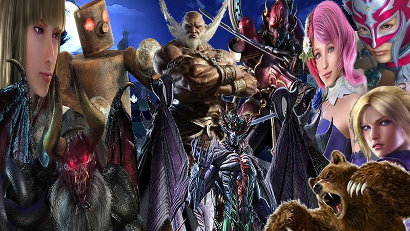
Nice new suggestions Mighty. Also, AAK, I've made the image 900X400. That Kuma image you posted was also the same as the one I used earlier. Not sure why it's blurry despite the detailed quality. Hopefully, it looks better now, though. Let me know which of the following effects you like the best and also, if there's any further changes (even minor), please do tell. I want this to be perfect. :p
Original
Effect 1
Effect 2
Effect 3
Effect 4
Effect 5
Effect 6
 

MightyKAC

Member
Sayah said:
Nice new suggestions Mighty. Also, AAK, I've made the image 900X400. That Kuma image you posted was also the same as the one I used earlier. Not sure why it's blurry despite the detailed quality. Hopefully, it looks better now, though. Let me know which of the following effects you like the best and also, if there's any further changes (even minor), please do tell. I want this to be perfect. :p
Original
Effect 1
Effect 2
Effect 3
Effect 4
Effect 5
Effect 6
Awesome graphic Sayah, that one screams "Iron fists, Wooden warriors and PISSED off Polar Bears" to me :).

If I were to choose, I'd say I'm more partial to #2 or #7 as far as added effects go.

Edit: Now that I look at it on my home computer instead of my iPhone I definitely prefer #6
 

MarkMan

loves Arcade Sticks
I'll be in Japan for the launch of TTT2 in arcades. I'll also cover all of the Tekken related news from Toko Game Show! Follow me for hype and delivery!
 

Doomshine

Member
MightyKAC said:
A new revision and 2 new thread titles for consideration.


Of Iron fists, Wooden Warriors, and Red Hot Netsu!!!

Of Wild Bears, Boxing Kangaroos, and Judo Cougars!!!

Of commiting first Degree Tag Assault And Battery!!!
I like this format.

Of Iron Fists, Tag Assaults and Netsu Fever!

...maybe too much focus on tag, but you get the point.
 

AAK

Member
Yo, Effect 2 is looking real cool. Effect 7 can be improved but how about having the effect on the characters only and leaving the Tekken logo and |OT| Font w/ no effects? (Maybe even combine effects 2 and 7?

And Hey, it's my main character!


Raonak said:
I've been out of the loop- what's the latest tekken news?

Wait for a bit, the |OT| will be up on the gaming section soon. Maybe even today?
 

Sayah

Member
AAK said:
Yo, Effect 2 is looking real cool. Effect 7 can be improved but how about having the effect on the characters only and leaving the Tekken logo and |OT| Font w/ no effects? (Maybe even combine effects 2 and 7?

And Hey, it's my main character!


Wait for a bit, the |OT| will be up on the gaming section soon. Maybe even today?
MightyKAC said:
Awesome graphic Sayah, that one screams "Iron fists, Wooden warriors and PISSED off Polar Bears" to me :).

If I were to choose, I'd say I'm more partial to #2 or #7 as far as added effects go.

Edit: Now that I look at it on my home computer instead of my iPhone I definitely prefer #6
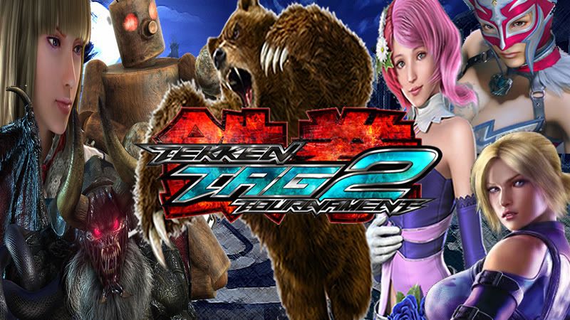
Thanks fellas. Here is a combinations of effects 2 and 6 without any sort of effects put on the logo or the OT symbol. Also, Jaycee looked awkward when I spaced out the characters (her picture had her lower body missing, lol) so I replaced her with Armor King instead.
 

Sayah

Member
MarkMan said:
I'll be in Japan for the launch of TTT2 in arcades. I'll also cover all of the Tekken related news from Toko Game Show! Follow me for hype and delivery!
I didn't know you ran SDTekken. Wow.
 

MightyKAC

Member
Sayah said:
Thanks fellas. Here is a combinations of effects 2 and 6 without any sort of effects put on the logo or the OT symbol. Also, Jaycee looked awkward when I spaced out the characters (her picture had her lower body missing, lol) so I replaced her with Armor King instead.

Make it a bit less "fuzzy" and I think you may have a winner.
 

MightyKAC

Member
Sayah said:
How about this? I turned the fade effect down and also reworked the Tekken logo.
I think it looks good, personally.

Edit: although you might want to change the color of the "Official Thread" lettering. The grey blends into the background and makes it hard to read.
 

AAK

Member
It's looking better and better :), I echo KAC sentiment about the coloring of the font, a lighter color would be more visible.

By the way i dunno if it's still possible but what would it took like if the Moonlit wilderness wasn't touched up and left as it was?
 

Sayah

Member
Is there already a gif of Alisa and Panda cheering? If not, can someone make one? It should be at the end of this video. Need to have it ready for this threads creation. :p
 

AAK

Member
Here you go!

itRzfVS2Xqf2w.gif


But you know what, how about just ditching writing Official thread and just leave it as |OT| And lowering the |OT| so that it doesn't obstruct the Tekken Logo.
 

AAK

Member
And with that I am SATISFIED! :D Unless you wanna add some more things to it or if others have any complaints, we can use that hopefully.

Thanks again for putting the work into this ;)
 

Sayah

Member
No problem. I had fun doing it, lol. I had ditched Photoshop and used Adobe FireWorks instead which is a whole lot easier and better for this job. Then, I put in the effects using photobucket. So glad I did this. Now gonna put Adobe Fireworks on my resume. :D

If there's any other changes someone wants to suggest, I'll put those in as well. I like the look of the arena stage better than moonlit wilderness as well.
 

AAK

Member
Finally FINISHED it...Damn I spent tooo much time on this...
damn you zlatko for tricking me into doing this! :p
I think I'll upload it all tomorrow. Hope it'll help GAF embrace the series.

I hope formatting it won't be too difficult :/
 
Top Bottom