If someone makes an NES sticker to go over the front it could look better.
I wonder if you'd be able to take it apart, take out the turbo buttons and just slap the vinyl-y sticker off a regular controller over it. I think the Dpad and the buttons line up. Someone asked if they'd be able to shove the wireless controller's guts in an OEM shell and he said you'd probably have to "mill out the back to fit the battery" or something like that and the buttons should line up fine.
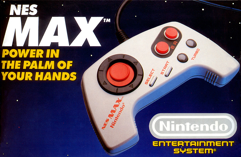
Yeah, with those handles... totally. The max I think is much smaller than what this is going to be, so I think the retrozone controller will be more comfortable to hold. I was just holding the MAX earlier today (
while giving it the stink eye), I really don't like how small it is and the layout, although I guess probably all video game
thingies were made for "youngerns" back then.
I'm coming around to the design. The images in this post show why. NES controllers were always boxy, and the extra real estate here just seems like it might just give you a little more grip without massively changing the fundamental feel of the OG controller. It's the lack of any color that makes it look really cheap, or like a prototype. And the buttons look just slightly off ... but they might feel just fine.
It's actually growing on me too. I was thinking about how I hold my controller while playing Super C earlier vs. how I would "naturally" hold it. Like, if I were to hold it just to hold it or while playing Dragon Warrior or something, it'd look like that pic I posted with the gaps between the controller and my palms. When I play Super C though, my hands are pressed up against the sides of the controller from being tense, making them parallel to each other. I'm guessing that's not good for my wrists.