'The Eclipse'. This is the event that all our heroes have been striving to prevent, the promised day where Father will turn all 50 million citizens of Amestris into energy for his grand philosophers stone. Suffice to say, this is essentially the spectacular climax of the series (although, of course, it will go on for a few more episodes). Essentially it represents the triumph of the antagonist over our protagonists, along with the extinction of 50 million peoples lives. As such you'd think that they'd work really hard to make it look impressive. However that is sadly not the case.
http://i835.photobucket.com/albums/zz278/Jexhius/FMAB6018.png
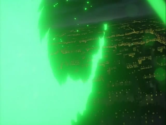
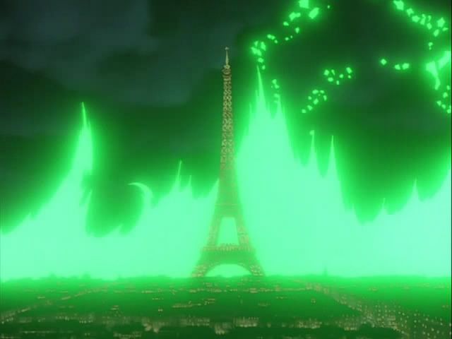
So what's wrong with it, exactly? Well, despite the scale and enormity of what's being presented to the audience it somehow feels rather visually dull. It doesn't help that the only two colours they use to depict this sequence are red and black which don't really work for me because the red looks more like neon pink. I feel that robbing the world of it's natural colours distances us from the events that are going on in them because it doesn't look as real anymore. It looks like everyone's stuck in a nighclub with bad lighting.
It also really overstays it's welcome. I don't know how long the sequence is in the manga, but in the anime it goes on for over five minutes. Like many episodes that take place over the course of this single day, this episode is filled with padding shots, shots that linger far too long, and a variety of 'unnecessary' shots that seem to exist solely to waste as much time as possible. They're so desperate to pad out the time here that they use the same shot twice over the course of the sequence. Firstly
here and then
here .
The cinematography for the whole sequence really boring and forgettable. It doesn't feel like any thought went into shot construction and there was zero camera movement. This led to a lot of really stale shots where the camera would look straight at a chunk of road, or whatever, and then jitter a little bit. It doesn't track the action, or survey the scene, or look at the event from any interesting angles. It's really flat and lazy. Here's one location that we linger on for a bit:
http://i835.photobucket.com/albums/zz278/Jexhius/FMAB6014.png
http://i835.photobucket.com/albums/zz278/Jexhius/FMAB6016.png
as you can see the camera is just plopped onto the ground so that it can observe the event. It sits there dispassionately while the disaster unfolds and doesn't really bring us closer to the actual people that are suffering, well, unless they're one of the main characters.
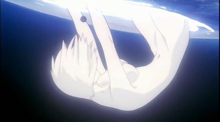
They do a pretty bad job of depicting scale too, which is extremely disappointing considering that the most impressive part of this sequence should be the giant body of Father reaching up the sky and grabbing 'God'. However, because there aren't a lot of shots where we can directly compare the size of Father to, say, a city or a mountain, we don't get a good 'feel' for his vast size. I guess the closes we get to that is this shot:
http://i835.photobucket.com/albums/zz278/Jexhius/FMAB6027.png
but it's just about the only one that I can see. Other shots like
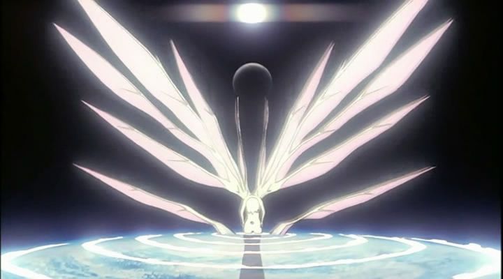
this one don't completely obfuscate how large he has become because he takes up so much of the shot. Sure, we can see he's big compared to, say, the planet, but it's much more effective to have large things compared to compared to other large things we see in our every day existence e.g. tall buildings. Without some really small things to compare him to directly, e.g. a human being, we don't get the same 'wow' factor that we should.
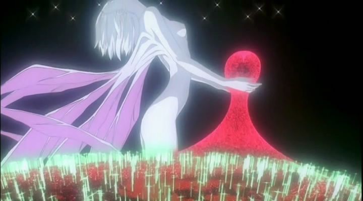
I must say, I don't really approve of all these wavy arms that stick out of the city in
this shot I think they just look rather silly and they aren't menacing in the slightest. Finally, I'd like to say that this extreme long-shot of Father is kind of pointless because I can't really see what's going on.