Eiknarf
Banned
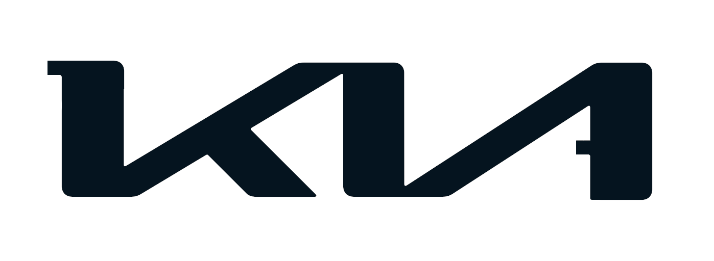
For months, I thought there was a new automobile manufacturer out there. Some car company called KN.
Then I find out it's KIA, which was odd because I had leased two KIA SUVs just prior to that! So they changed their logo... their branding. Maybe not so smart.
Here's a before and after.

I waited a year to let it sink in, yet it still sucks because it looks like a backwards N, as in Nine Inch Nails.

What do YOU think of it?
Then I find out it's KIA, which was odd because I had leased two KIA SUVs just prior to that! So they changed their logo... their branding. Maybe not so smart.
Here's a before and after.
I waited a year to let it sink in, yet it still sucks because it looks like a backwards N, as in Nine Inch Nails.
What do YOU think of it?