https://twitter.com/realDonaldTrump/status/880175585418465284
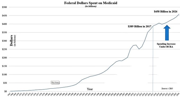
Heres the problem: Its incredibly misleading.
You cant just look at raw dollar figures spent on a given program. Even with no changes to current law, inflation and population growth increase tax revenues, increase the federal budget, and cause programs to cost more in raw dollars.
So what would this chart look like if we superimposed Medicaid spending under current law? Like this:
/cdn.vox-cdn.com/uploads/chorus_asset/file/8769595/chart.png)
The Senate bill begins to phase out the Medicaid expansion in 2021 and cuts the rest of the programs budget too. The Senate bill would end the Affordable Care Acts expansion of Medicaid to millions of low-income Americans. This program has provided coverage to more Americans than the private marketplaces
It would also cut the rest of the public insurance program. Better Care would also limit government spending on the rest of the Medicaid program, giving states a set amount to spend per person rather than the insurance programs currently open-ended funding commitment.
More here
https://www.vox.com/policy-and-politics/2017/6/28/15890750/trump-medicaid-chart-fix
Lock if old
