Which was Apple’s best OS aesthetic?

Which aesthetic is/was your favourite?


  • Total voters
    48
We're a week away from WWDC25 where we're expected to see MacOS, iPadOS and iOS have their first big change to visual design since the move to flat design with iOS7 in 2015.

So which is/was your favourite visual style?

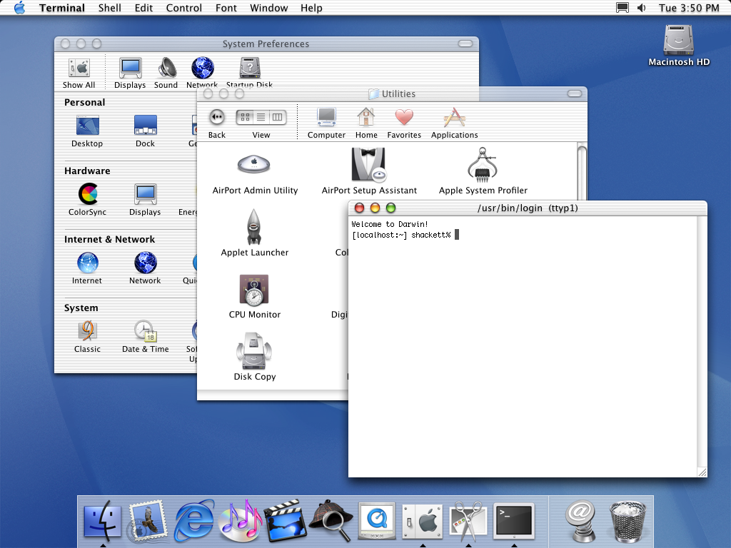
Platinum (1983-2000)
Characterised by black outlines, minimal shading and a lot of flat grey, this style inspired Windows 3.0 to Windows 2000
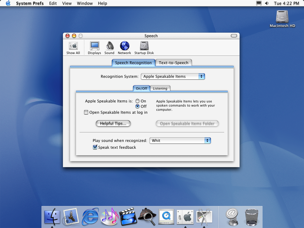
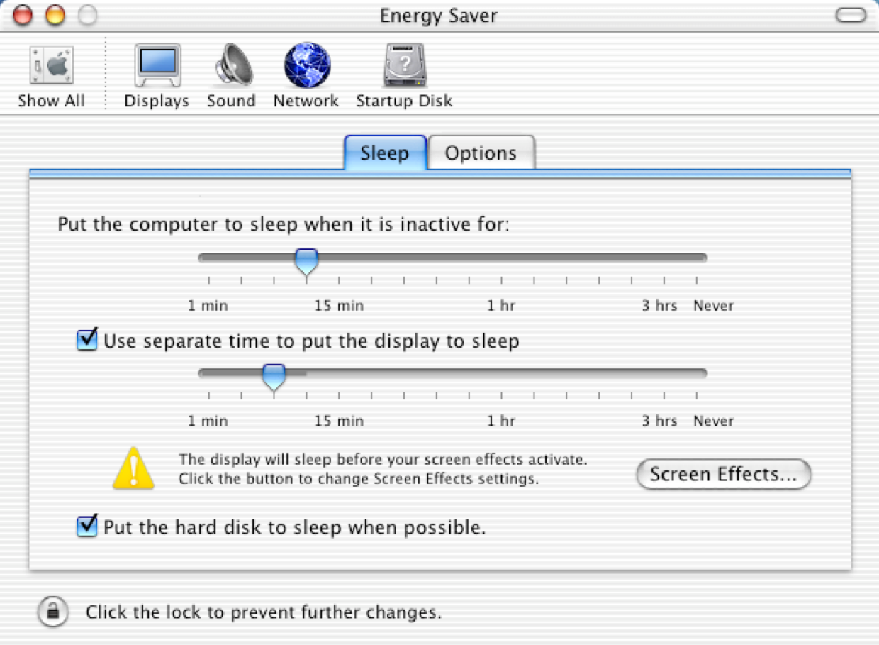
VsEQVVA.png


Aqua (2001-2007)
Characterised by glossy, deep and transparent attributes, Steve Jobs said it was so good "you'd want to lick it". Also inspired Windows XP.

HwwGGqY.png


Skeumorphism (2007-2014)
Introduced with the first iPhone, this aesthetic added textures to create a feeling of realism to accompany the move to touch interfaces.

R1fuoUM.png


FQszmdp.png


Minimalism (2015 - 2023)
Designed by Johnny Ive and loosely following the minimal trend started by Windows 8, this aesthetic stripped away anything deemed "unnecessary"

Oq7LXO6.png


9XaC2IF.png


Liquid Glass (2024 - )
Introduced with the Apple Vision Pro, this aesthetic focuses on depth, layered transparencies and increased roundedness

SSmic3L.jpeg


Ku5lmxN.jpeg
 
Last edited:
imagination jerking off GIF


J/k

I picked platinum. There's something charming about those old school OS.
 
Last edited:
My favorite so far is the current one. I never did like the skeuomorphic version. I didn't need my notepad app to look like a notepad. But I think some people did.
 
I voted for Aqua

While I've become a little nostalgic for the 80s/90s grey look as interfaces have become more colourful I must say at the time I couldn't wait to see the move to MacOS 10 and Windows XP with their gorgeous, glossy aesthetic.

Aqua complimented to the 1998 iMac and 1999 iBook so well, the perfect synergy of hardware and software.

 
Platinum came around Mac OS 8, the previous versions were mostly greyscale in colour. For Aqua, I preferred the brushed metal Finder that came in OS X Panther, rather than the Pinstripe appearance which you could argue was Apple's bridge into skeuomorphism.
 
Skeuomorphism era was when I got my first Mac and iOS devices so I actually still enjoy that style very much. Especially Mac OS back then looked so good and still does. I'm very intrigued to see where Apple will be going with 'Glass' and what we'll be seeing from them when it comes to AR glasses and future VR. I really hope we get to see exciting stuff. The upcoming foldable will likely also be lickably good, but it's the glasses that I'm most interested in as it will change everything, again. Welp, time to reread the Steve Jobs biography.
 
Last edited:
Old Aqua would look fresh today with updated icons.

10-1-Puma-Command-Tab.png


10-1-Puma-System-Preferences-Speech.png


10-2-Jaguar-System-Preferences-Energy-Saver.png

Completely agree, this exact style but with modern icon shapes.

And that fucking Sherlock icon needs to go, stuck out like a sore thumb back then. Seriously, who thought tweed would would sit nicely alongside ANYTHING else in that dock.
 
Last edited:
I like what the AVP (lol) interface looks like but as of now it's too early and only in one device I've never used. So maybe that will end up being my favorite, but I voted Skeuomorphism. It got a bad rap around the iOS 6 days for being "dated" but then iOS 7 came out and was just a mess. The Ive OS design that came after lost a lot of usability.
 
Last edited:
I love the current iteration and I also really like the visionOS aesthetics, so with rumors that the next OS is a complete redesign and is leaning heavily on visionOS I'm really curious to see where they're going.

The icons are going to be round instead of square and Apple is going to push it as innovative, mark my words.
 
I'm really starting to not like Apple anymore. I can't make my own posts, so I have to post it other posts. But I really don't like Mac anymore. The dock, the menu bar, the red X doesn't fully close apps. It all really sucks to me. The biggest one is you have gaming on Windows and barely if at all on Mac.
 
Aqua for that nostalgia era when they rose up, skeu was decent, minimalism (and everything other brand/OS that followed it) sucks, just deprives it of any style or feeling.
 
Aqua for that nostalgia era when they rose up, skeu was decent, minimalism (and everything other brand/OS that followed it) sucks, just deprives it of any style or feeling.

One of the biggest issues with flat design is buttons, I started using computers with Windows 95, so for me buttons should always appear raised.

Back then you could have a grey button on a grey panel and you could clearly identify it, with flat design the button needs to be a different colour, and then it's not clear whether it's a button or not.

bG3r9nM.jpeg
 
Aqua. Back then I was a completely (young) stupid PC fan boy, hated macs, but even then I still thought the UI was gorgeous.

Now I work in both Mac and PC, love both, and wish we could go back to a HD version of Aqua.
 
Never had a mac before my M1 mini, Aqua by far. I hate flat design and new style icons that I constantly have to double-check what they are. I don't have much hope for Monday in terms of getting out of minimalism and flat design, but hopefully they'll update/remove a lot of obsolete UX stuff from the deskop OS.
 
Aqua with skeuomorphism a close second. Aqua still had a lot of skeuomorphic design to be fair.

Aqua is amazing though, everything looks like tasty fruit gushers.
 
Last edited:
For the moment I picked aqua until I see more what Glass can look like.
I feel Glass can be good but we haven't really see much outside of VisionOS that I don't care about.
 
WWDC time!!! Woot woot. Maybe we will get something worthwhile this year.

I will say, in recent years iOS and macOS have become bloated and remind me of android. Too complex for its own good.
 
Liquid Glass is the full name of the new glassy design

Icons are now the same across iOS and MacOS

3D buttons are back, flat design is dead!

YmFKLA1.jpeg


NIVVbXq.jpeg
 
Last edited:
Is this guy real? He's like an Ai. I mean I know he's a real person, he's just so fake, and that's saying a lot comparing to the other presenters. He's so punchable. In all fairness, I'd act the same if I got paid as much as he does.

YmfHCug.jpeg
 
Apple have a great reputation for design but flat corporate minimalism is boring and soulless while skeuomorphism is just ugly.
 
Top Bottom