Topher
Identifies as young

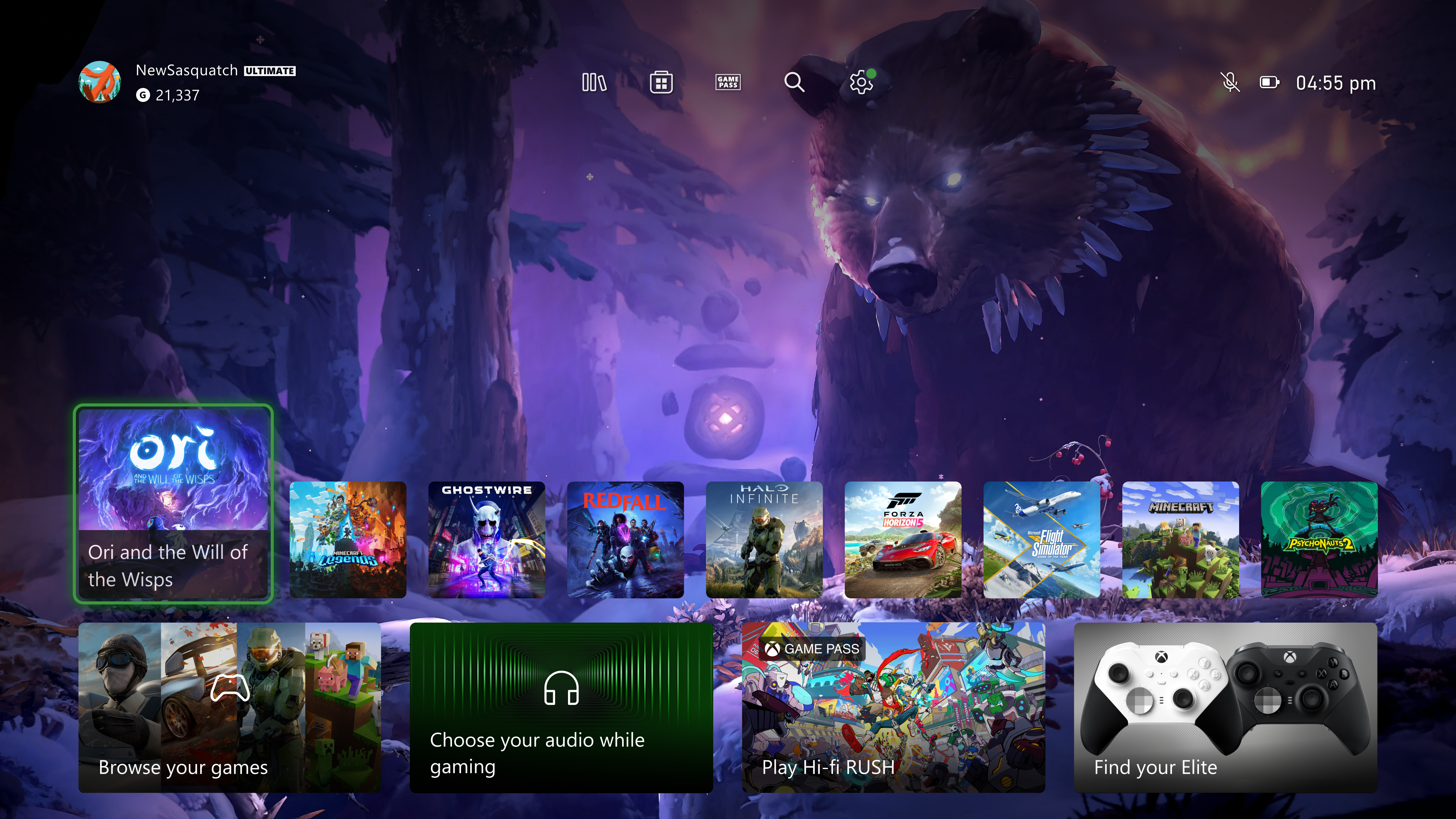
Starting this week, users in the Alpha Skip-Ahead and Alpha rings will be able to preview a new version of their Home experience. This updated design incorporates the feedback we've heard from you along with all the learnings from our earlier experiments.
As we mentioned when we paused our experiments last month, we heard you tell us that the changes to the top of Home felt crowded and didn't leave enough space for you to enjoy your background. So, we designed hundreds of options, then refined with prototypes and finally user-tested in our Research labs until we found one we hope you'll love. It balances the experience, accessibility, function, and the needs of our community. We are excited to hear what you think!
This new version of Home:
We've also updated the tile that opened "My games & apps" (the first tile in the second row), to let you know when there's something new or needs your attention. As the experience is not final, you may see updates either from your library or the Microsoft Store. For example, if there are items from your wish list on sale, you may get an update that shows up on your Home in that tile.
- Provides easy navigation to your library, the Microsoft Store, Xbox Game Pass, search, and settings at the very top of your Home by introducing a new quick access menu.
- Simplifies the layout and makes more space for you to see your background by reducing the size of some of the tiles and moving them to the bottom of the screen.
- Adds a responsive game art feature to update the default background and show off the beautiful art associated with each title when you hover over the tiles.
We want to thank all the selected Xbox Insiders who have taken part in the experiments for the feedback you've shared with us. Your feedback is a key part of our process, and our team will continue to work hard to tweak and grow these experiences based on what we hear from you.
How to get Xbox Insider support and share your feedback
If you're an Xbox Insider looking for support, please join our community on the Xbox Insider subreddit. Official Xbox staff, moderators, and fellow Xbox Insiders are there to help. We always recommend adding to threads with the same issue before posting a brand new one. This helps us support you the best we can! Don't forget to use "Report a problem" before posting—the information shared in both places helps us understand your issue better.
Thank you to every Xbox Insider in the subreddit today. We love that it has become such a friendly and community-driven hub of conversation and support.
For more information on the Xbox Insider Program follow us on Twitter at @XboxInsider and this blog for release notes, announcements, and more. Keep an eye on future Xbox Insider Release Notes for more information regarding your Xbox Update Preview ring.
If you'd like to help create the future of Xbox and get access to new features download the Xbox Insider Hub on your Xbox Series X|S or Xbox One. Share with us what your dream gaming community looks like and help shape the future of gaming!

Xbox Insiders – Your Feedback Shapes the New Home Experience - Xbox Wire
Starting this week, users in the Alpha Skip-Ahead and Alpha rings will be able to preview a new version of their Home experience. This updated design incorporates the feedback we’ve heard from you along with all the learnings from our earlier experiments. As we mentioned when we paused our...
 news.xbox.com
I like the look of that
Edit:
Last edited:


