For the new page
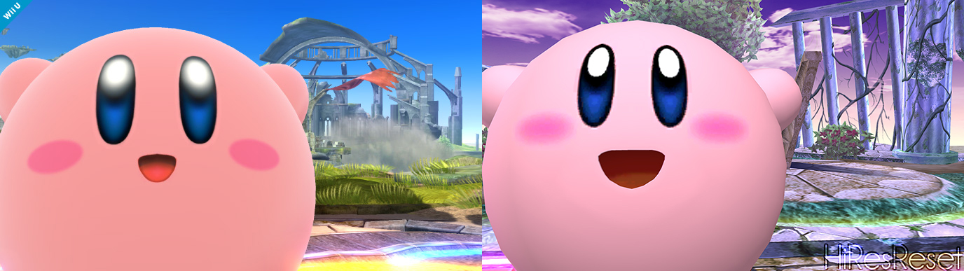
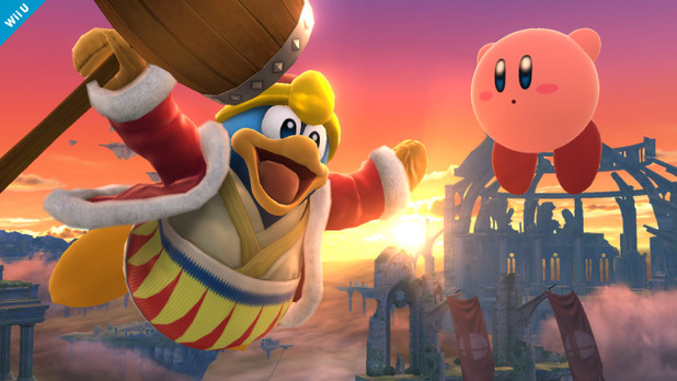
New Kirby is so ROUND!
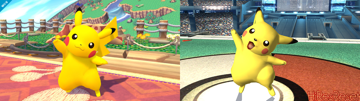
New Pikachu looks a lot better.
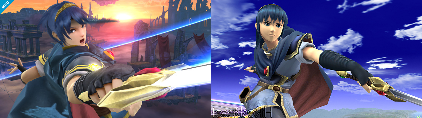
Old Marth is sort of a joke in comparison.
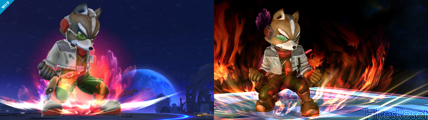
In some ways I might like old Fox better?
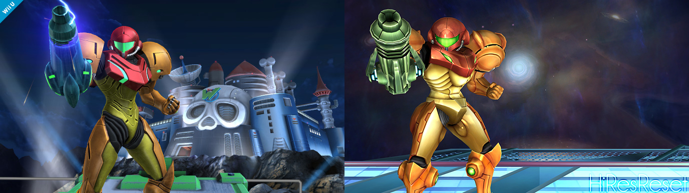
I like the design of new Samus a lot.
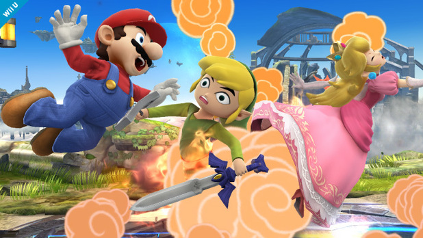
I've been making these to post on my Tumblr daily but I should share some newer ones here too.
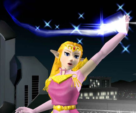
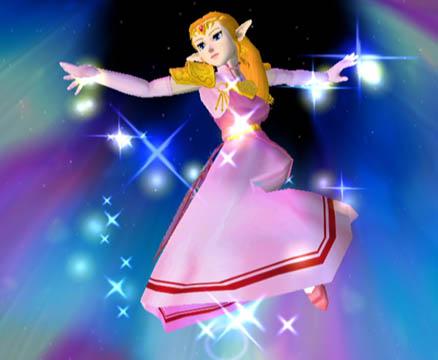
There are some areas where the difference is pretty hugely noticeable.
New Kirby is so ROUND!
New Pikachu looks a lot better.
Old Marth is sort of a joke in comparison.
In some ways I might like old Fox better?
I like the design of new Samus a lot.