Is he going to sell it as a print? :O
Please do.
Is he going to sell it as a print? :O
Is he going to sell it as a print? :O
He's more relevant than Mega Man. In fact he's one of the few mascot characters left that still is relevant. His design is fine.The more I look at the evolution of Sonic the more I realize that it was probably in Sega's best interest to just have stuck with classic Sonic when the made generations rather than to constantly update him. It just seems likes he's a 90s era fad trying everything he can to stay relevant.
You're going to need to be specific than make general statements.The more I look at the evolution of Sonic the more I realize that it was probably in Sega's best interest to just have stuck with classic Sonic when the made generations rather than to constantly update him. It just seems likes he's a 90s era fad trying everything he can to stay relevant.
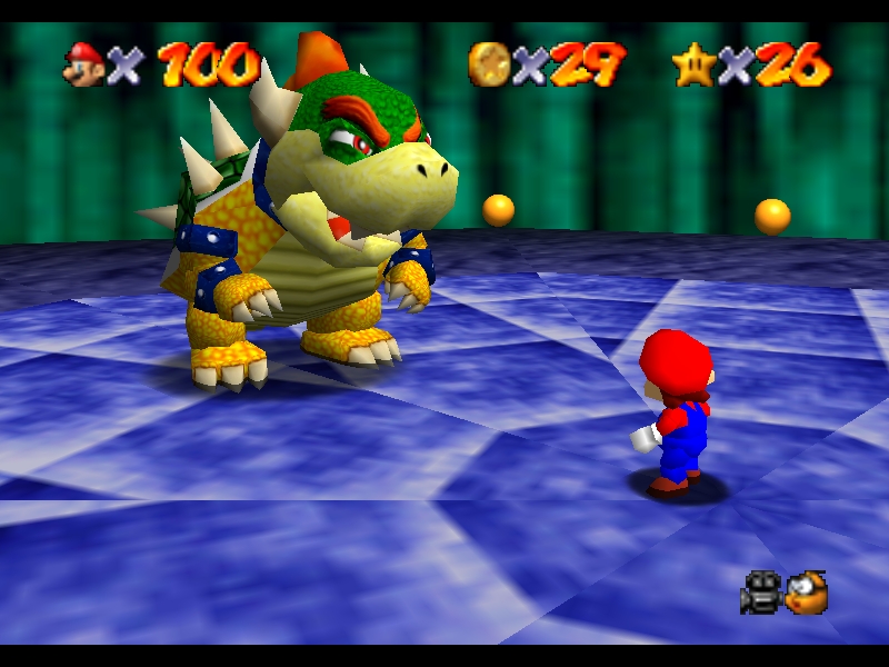
wow that zelda and mario comparison
He's more relevant than Mega Man. In fact he's one of the few mascot characters left that still is relevant. His design is fine.
Sonic Boom is a Western-only spinoff. Sonic Team will continue developing the mainline games with the regular character designs.For example the new Sonic Boom title looks more like a Banjo Kazooie game than a traditional Sonic title, signs that rather than trying to stay true to the franchise they are going in all sorts of different directions.
I edited this in my previous post:Sales are actually steadily decreasing, and there would not have been a need to do the Sonic Boom redesign. Mega Man is not relevant anymore because he was not designed to bring in new audiences, to do that, they split the franchise into different series rather than constantly changing his appearance and gameplay to draw in new crowds. For example the new Sonic Boom title looks more like a Banjo Kazooie game than a traditional Sonic title, signs that rather than trying to stay true to the franchise they are going in all sorts of different directions.
I edited this in my previous post:
Sonic Boom would be like the Mega Man X series to the Mega Man games.
That's not true. It is just western-only spinoff like Ryce said. It is to tie in with the cartoon of the same name. It isn't even being released in Japan.I thought I had read an article (or maybe it was a youtube summary of the new info on Sonic Boom) that depending on how well this series does they are leaning towards making this the official Sonic from here on out?
That's not true. It is just western-only spinoff like Ryce said. It is to tie in with the cartoon of the same name. It isn't even being released in Japan.
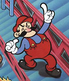
Donkey Kong

Mario Bros.

Super Mario Bros. (SMB2/Lost Levels used the same design and color scheme)

Super Mario Bros. 3 (SMW used the same design)
Super Mario 64

Super Mario Sunshine (noteworthy here the shorter sleeves)

New Super Mario Bros. (which also is his current design)

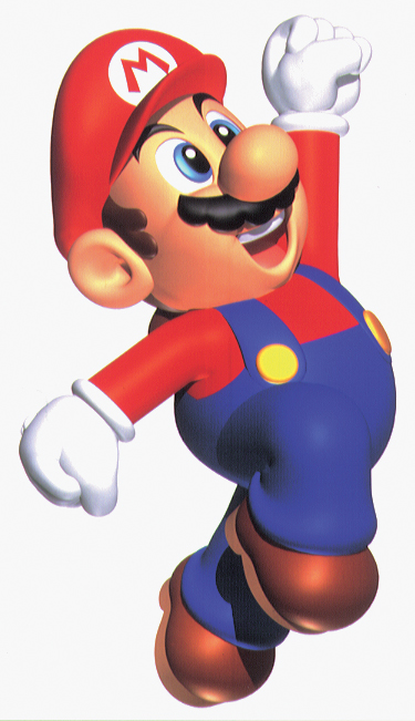
Super Mario 3D World (including this as it is his latest appearance)
They finally updated the image with Little Mac!

*Mario stuff*
Sometimes I feel like I'm the only person that not only doesn't hate Modern Sonic's design, but actually prefers it to Classic Sonic's look these days. I know I'm obviously not the only one, but man the people who have an irrational hatred for Modern Sonic and act like that design is a cardinal sin are fucking loud and obnoxious.
Classic Sonic was really cute in Generations and it was fun to have that design back for a bit, but it also definitely cemented my opinion that Modern Sonic's design is more refined and has a broader contemporary appeal. SEGA wasn't wrong in redesigning him over the years.

I don't really feel too strongly about any of the Sonic designs, modern or classic. They're all fine.
Except Sonic Boom's design, that one is terrible.
Sometimes I feel like I'm the only person who not only doesn't hate Modern Sonic's design, but actually prefers it to Classic Sonic's look these days. I know I'm obviously not the only one, but man the people who have an irrational hatred for Modern Sonic and act like that design is a cardinal sin are fucking loud and obnoxious.
Classic Sonic was really cute in Generations and it was fun to have that design back for a bit, but it also definitely cemented my opinion that Modern Sonic's design is more refined and has a broader contemporary appeal. SEGA wasn't wrong in redesigning him over the years.
Do any of you play Project M during the week? Maybe I should go in the IRC more often...
Do any of you play Project M during the week? Maybe I should go in the IRC more often...
People definitely play on the weekends. Probably on weekdays too.
I personally like Modern Sonic's design the most, followed by Classic, then Sonic Boom Sonic (whose design I don't mind).

wii fit trainer, rosalina, fox, bowser, and samus are the best.
Hey Girl Hey! Love it.I made this at like 4am last night with some of the possible female newcomers. I wanted to make something Smash-related, and Miiverse doodles can only go so far for hype.
Here's hoping we see at least one of these ladies playable. I didn't include any FE ladies since there's no 3D renders of them - my pick is Anna, since she's a recurring character, but Robin, or Lucina would be cool too.

After watching the NCL puppet Cat Mario & Peach video, I want the Cat Power-Up or the Puppets to appear in Smash, somehow.
The idea of Fox in a catsuit is amazing.I've wanted that ever since 3D World came out.
If not, hopefully someone on Deviantart or wherever can draw everyone in cat suits.
I've wanted that ever since 3D World came out.
If not, hopefully someone on Deviantart or wherever can draw everyone in cat suits.
I've wanted that ever since 3D World came out.
If not, hopefully someone on Deviantart or wherever can draw everyone in cat suits.
oh god
*cringes*
The idea of Fox in a catsuit is amazing.
Nah Wolf in a catsuit would be hilarious.
Nah Wolf in a catsuit would be hilarious.
I get the whole animal-in-a-catsuit thing, but I think Ganondorf in a catsuit would be more humorous.