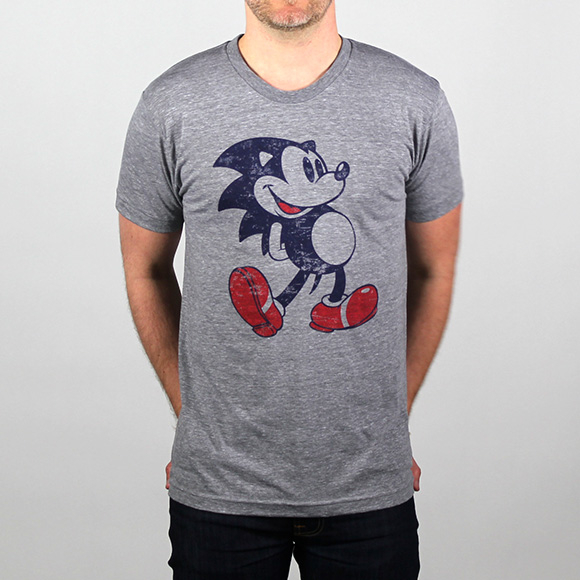
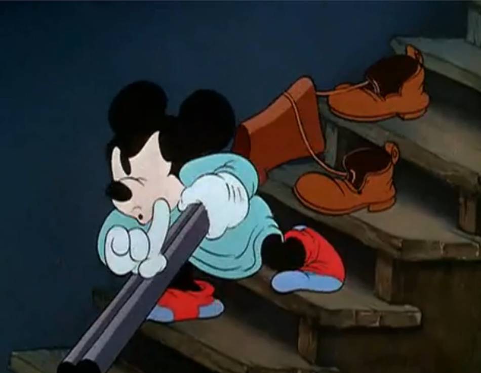
Mickey Mouse + Felix the Cat = Sonic

What the fuck?

Squitter's the best animal buddy. How can you hate a spider decked out in sneakers?
Retro's only crime with their DKC's is making Rambi the only playable animal buddy. I want my goofy 90's as fuck spider to shoot vikings with webs while I run around in Nike sneakers and I want it now.
 
Surprised not posted yet.
qXxPCgB.jpg
 
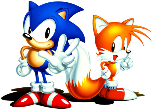
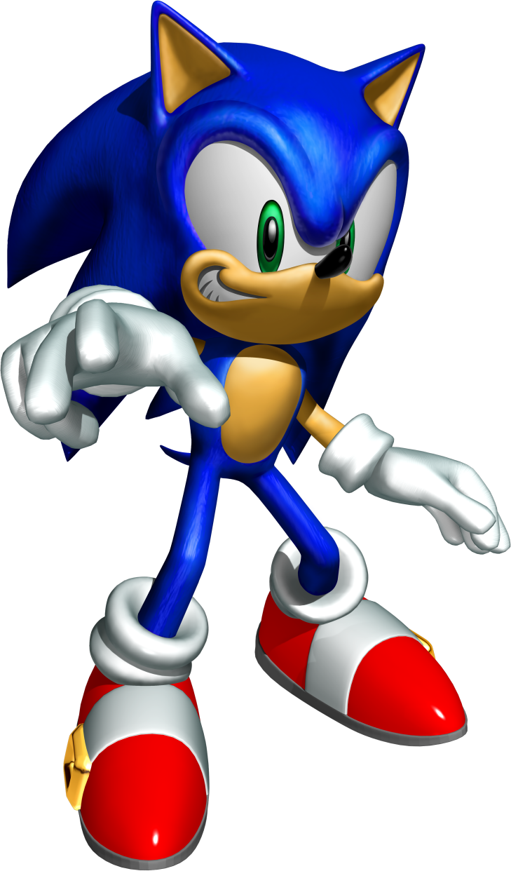
I'm going to go full fanboy here. I don't think Sonic ever looked better than this piece of promotional art. The peak and the end right here.

cKmo4nj.jpg


They made him look a little too angry in the American art and the post-Adventure art is just a big shmozzle.
 
My personal favorite Sonic design is the one in the post Sonic 06 last gen era and before the Boom reboot.

transparent_cool_sonic_render_by_sonicandshadow104-d573muu.png


I don't think there's a more perfect modern redesign of a character. Keep the character fresh for years.

They did away with the grin, made the spiked a bit shorter and tight it up and it looks better than better. A testament to the great design is that people only complained about green eyes after like 10 years. Which is to this day the dumbest thing I've ever heard.
 
My personal Sonic design is the one in the post Sonic 06 last gen era and before the Boom reboot.

transparent_cool_sonic_render_by_sonicandshadow104-d573muu.png


I don't think there's a more perfect modern redesign of a character. Keep the character fresh for years.

They did away with the grin, made the spiked a bit shorter and tight it up and it looks better than better. A testament to the great design is that people only complained about green eyes after like 10 years. Which is to this day the dumbest thing I've ever heard.

I like this design too, I have no real complaints about it. I liked Classic Sonic's design in Sonic Generations better, though.
 
The old sonic was great character design, especially if you keep in mind video games weren't that far ahead and it's a result of low budget development (compared to today's huge AAA budgets). Definitely a remarkable feat, definitely inspired (or created out of) those older characters, but they gave him some 'tude too.
 
My personal Sonic design is the one in the post Sonic 06 last gen era and before the Boom reboot.

transparent_cool_sonic_render_by_sonicandshadow104-d573muu.png


I don't think there's a more perfect modern redesign of a character. Keep the character fresh for years.

They did away with the grin, made the spiked a bit shorter and tight it up and it looks better than better. A testament to the great design is that people only complained about green eyes after like 10 years. Which is to this day the dumbest thing I've ever heard.
I still prefer the 'classic' design but yeah, Unleashed onwards 'modern' Sonic is perfectly fine, at least visually. The way they animate him in Lost World in particular bridges the difference between him and the Genesis style pretty nicely too IMO.
 
My personal Sonic design is the one in the post Sonic 06 last gen era and before the Boom reboot.

transparent_cool_sonic_render_by_sonicandshadow104-d573muu.png


I don't think there's a more perfect modern redesign of a character. Keep the character fresh for years.

They did away with the grin, made the spiked a bit shorter and tight it up and it looks better than better. A testament to the great design is that people only complained about green eyes after like 10 years. Which is to this day the dumbest thing I've ever heard.

Although I mostly agree, since key parts like face and proportions nailed it, they still have to fix ears and spikes. Spikes are too ballooned and collide in a weird way between head and back.
 
I like this design too, I have no real complaints about it. I liked Classic Sonic's design in Sonic Generations better, though.

I really didn't like Modern Sonic until Unleashed, from there on he looks pretty good. His model in Smash 4 is probably one of the best he's ever had, he looks really good in that game.


I still much prefer his classic design though. Classic Sonic made the transition to 3D well (at least in generations lol), but still looks best in 2D. I think it's a timeless design.


Characters like Mario have gone through changes, but it was a far more subtle transition.
I think Mario's current design is his best.
 
It was weirds from the beginning. The core of fanfiction/original creations is about creating an idealized something, even at the risk of that something being awful

Sonic was the MechaGodzilla, the imperfect clone of Big Boss. The abomination wrought of Sega's desperation for something better, faster, more attitude-er than Mario. He had everything, which made him ripe for corruption by his impending fandom. After all, he was exactly what kids wanted. That pandering set into motion Sonic's never ending torment: to never be satisfactory, always requiring the true Sonic loop of becoming irrelevant, being torn down and restructured, only to be ripped apart before getting a chance to fully heal and adjust by both his creators and the fans.

Sonic is his own creepy fanfiction. His own "OC do naht stealz." His own shitty friend.

Somehow he's still not as tryhard as Crash Bandicoot, though.

Well, maybe now he is.
 
you mean successor? Ristar is at least 3 years younger than sonic

No, he means precursor. Sonic was originally a rabbit who used his ears to grab things:

gdEKmYh.png


Sonic team shelved the grabbing mechanic, but then brought it back later on for a game called Feel:

EUXcKq7.jpg


Feel, obviously, became Ristar.
 
I'm going to go full fanboy here. I don't think Sonic ever looked better than this piece of promotional art. The peak and the end right here.

cKmo4nj.jpg


They made him look a little too angry in the American art and the post-Adventure art is just a big shmozzle.
I really like the stock art for Sonic 3-era stuff

s3-bginfo-summaryimg1full.jpg
 
you mean successor? Ristar is at least 3 years younger than sonic

Ristar developed from an idea originally put forward during design talks for the character who would later become Sonic the Hedgehog.[8][9][10] Yuji Naka, head of Sonic Team, recalled in 1992:

At first we used a character that looked like a rabbit with ears that could extend and pick up objects. As the game got faster and faster, we needed to come up with a special characteristic to give our character some power over his enemies. I remembered a character I had thought about years ago who could roll himself into a ball and slam into enemies. Hedgehogs can roll themselves into a ball, so we decided to go from a rabbit to a hedgehog.[11]

Some years later, the game starring that rabbit-type character was developed separately from Sonic, and eventually evolved into a prototype called Feel.[12][13] The rabbit resemblance in Feel was already lessened somewhat in the prototype, as the character no longer used his ears, but rather his arms.[14] After some changes in the main character, and going through several names, that game eventually became what is now known as Ristar. The name also went through further changes during development of the Western versions, going from Ristar the Shooting Star to Dexstar, and finally to Ristar.

Back in late 1994, Sega was originally pitching Ristar to be the successor of Sonic the Hedgehog.[15] However, the game never received a ton of exposure or sales, mainly due to being released just three months prior to the Sega Saturn, Sega's newest video game console, overshadowing it.[16][17]

So Ristar was more of a spin off from early Sonic designs, but he still pre-dates the 'hog.

Source

Edit: I see someone already answered this. Oh well, more gaming history info to chew on!
 
Right behind you.

It was really interesting to find out the inspiration and to see the in-between designs between classic and Adventures sonic, but yeah... a Sonic thread came to it's logical conclusion once a gain.

yeah, the people who aren't sonic fans should probably stop littering topics with these posts intended to show how "sick" sonic fans are.
 
My personal favorite Sonic design is the one in the post Sonic 06 last gen era and before the Boom reboot.

transparent_cool_sonic_render_by_sonicandshadow104-d573muu.png


I don't think there's a more perfect modern redesign of a character. Keep the character fresh for years.

They did away with the grin, made the spiked a bit shorter and tight it up and it looks better than better. A testament to the great design is that people only complained about green eyes after like 10 years. Which is to this day the dumbest thing I've ever heard.

It's a shame that a lot of today's kids got into Sonic via his PS2 & Xbox debut: Sonic Heroes:


Just a poor, cheap artstyle.
 
Top Bottom