Apple announces Apple Watch

Status
Not open for further replies.
It's pretty clear that it can. When they say it uses Siri, that means the entire package of what Siri can do, including touch-free activation. There's no need to elaborate further.

Definitely not.
Siri works hands-free on iOS only when the phone is charging.
If it works at any given time on the Apple Watch, that is still to be seen. And that is a huge difference.
 
Conversation I had with my brother who is not very tech savvy but basically buys anything Apple yesterday about the Apple Watch went as follows:

Brother: I want that Apple Watch.
Me: Why? It's pretty expensive.
Brother: Really? How much is it?
Me: Starts at $350.
Brother: Oh...what does it do?
Me: ...
Brother: No, really. What does it do?
Me: It hooks up to your phone so you don't have to keep pulling it out.
Brother: I need my phone? What can it do without my phone?
Me: Tell time?
Brother: Couldn't I just use my phone for that?

So yeah...I fully expect this to take off just because it's Apple. I think there will be a lot of first generation owners having buyer' remorse though.
 
terrible

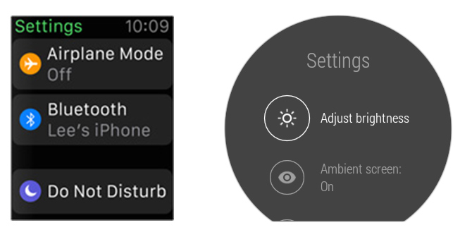
settings.jpg


if you told me this was fan made by a 7 year old blind kid with WordArt, i'd believe you more then i would believe this is an actual shipping screenshot from an Apple device.

To me it's the android wear screenshot that looks like it was done in MS Paint. Its been said before in this thread, but the apple watch screens look so much better on the watch face itself.

It's almost like someone threw this comparison together with an agenda? /s
 
Conversation I had with my brother who is not very tech savvy but basically buys anything Apple yesterday about the Apple Watch went as follows:

Brother: I want that Apple Watch.
Me: Why? It's pretty expensive.
Brother: Really? How much is it?
Me: Starts at $350.
Brother: Oh...what does it do?
Me: ...
Brother: No, really. What does it do?
Me: It hooks up to your phone so you don't have to keep pulling it out.
Brother: I need my phone? What can it do without my phone?
Me: Tell time?
Brother: Couldn't I just use my phone for that?

So yeah...I fully expect this to take off just because it's Apple. I think there will be a lot of first generation owners having buyer' remorse though.

"Wake up sheeple!" Right? I really hate this attitude.
 
I like the idea of a method of payment on my wrist, but at the same time, I picture myself being assaulted and robbed because of it. I think they look cool. If I used my phone more and was heavy into social media I could see myself getting one (or an Android watch).
 
This watch reminds me of the first iPhone in a lot of ways. It's not really a looker and the OS looks pretty gross but I guess in the coming years we will see major improvements.
 
To me it's the android wear screenshot that looks like it was done in MS Paint. Its been said before in this thread, but the apple watch screens look so much better on the watch face itself.

It's almost like someone threw this comparison together with an agenda? /s


Good god


You're far too gone man
 
You're both too far gone. The Android one looks very basic, but also clean, the Apple one looks very Samsung-y, which is weird. The whole interface seemed full of good ideas, but not quite fully baked. Emphasising the Digital Crown, then hardly using it in the demo had me scratching my head. Scrolling lists and pinch to zoom using multitouch makes far more sense. Yes it obscures the content - but only for a fraction of time. I'm reserving judgment until I've had a play on one.

giphy.gif


The interface does look better in the larger context of the design.

rG1thKI.gif

KsjTUyr.gif


The Milanese loop does make me slightly horny.

anigif_enhanced-18512-1410386347-7.gif
 
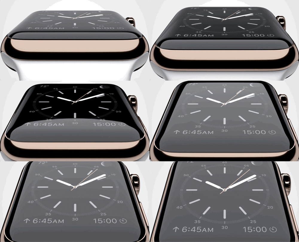
It looks a lot less cluttered on the watch itself. Its pretty clever how the glass wraps around the watch so you dont really know where the screen ends. This lets designers use all the space available in the screen without having to worry about padding. Of course, it looks the best if the background is black.

Like look at the shots of the UI on the watch. Looks far less cluttered and a lot prettier. Hell, the thick black border makes it look really spacious and airy.

If you take the screenshot by itself, then yeah it looks cluttered. But its a disservice to show the literal screen itself without taking the watch face into account for such a small device.

ED3gnMA.png
e96cwsZ.png
7wSDYfQ.png
PLMfxUF.png
9HgSWxg.png
0agKiNC.png
Ic5e336.png

You're both too far gone. The Android one looks very basic, but also clean, the Apple one looks very Samsung-y, which is weird. The whole interface seemed full of good ideas, but not quite fully baked. Emphasising the Digital Crown, then hardly using it in the demo had me scratching my head. Scrolling lists and pinch to zoom using multitouch makes far more sense. Yes it obscures the content - but only for a fraction of time. I'm reserving judgment until I've had a play on one.

giphy.gif


The interface does look better in the larger context of the design.

rG1thKI.gif

KsjTUyr.gif

Those are renders and glamour shots. In the real world, on the actual devices, the AppleWatch display just doesn't look that good:


The Milanese loop does make me slight horny.

anigif_enhanced-18512-1410386347-7.gif
Yeah, the bands look nice, clever touches with the magnets etc (hope Apple doesn't charge an arm and a leg for them).
 
Your car doesn't alert you? My car will start beeping when the car is on the and the key fob is removed. It would be hard for my wife to get out of the car, drive off, and me not notice that I don't have the key.

It does warn me, but I don't need the fob in the car - I just leave it in my pocket (or my wife in her bag). As long as it is inside the car the engine will run. So in this case by the time it warns me, I'm already moving (for a short distance..)
 
You're both too far gone. The Android one looks very basic, but also clean, the Apple one looks very Samsung-y, which is weird. The whole interface seemed full of good ideas, but not quite fully baked. Emphasising the Digital Crown, then hardly using it in the demo had me scratching my head. Scrolling lists and pinch to zoom using multitouch makes far more sense. Yes it obscures the content - but only for a fraction of time. I'm reserving judgment until I've had a play on one.

...but do we need that at all? On a watch?
Touch is better, but isn't our voice stil MUCH better, when the ambient noise doesn't impede that?
If I can do that on my watch, I probably can on my phone, too. But a simple "Give me directions to X" or "Call Y" is a way cleverer shortcut, imo.
 
Yeah, the bands look nice, clever touches with the magnets etc (hope Apple doesn't charge an arm and a leg for them).

Ho ho! It's Apple, of course they will!

...but do we need that at all? On a watch?
Touch is better, but isn't our voice stil MUCH better, when the ambient noise doesn't impede that?
If I can do that on my watch, I probably can on my phone, too. But a simple "Give me directions to X" or "Call Y" is a way cleverer shortcut, imo.

Siri's on the Watch too isn't it?
 
next year, if I see someone I know walking around with this slick little piece of tech I'll be a bit jealous. that's half the battle right there.
 
Funny, I showed my wife this link and just said, "hey, heres some different shots of the Apple watch"

She wants the watch more now.

Hmm...

Daringfireball said:
Gruber linked:
Apple Watch ‘Too Feminine and Looks Like It Was Designed by Students’, Says LVMH Executive ★
The Telegraph said:
Jean-Claude Biver, who heads the French group’s luxury watch division, said the US tech giant had made “some fundamental mistakes” designing the Apple Watch.

“This watch has no sex appeal. It’s too feminine and looks too much like the smartwatches already on the market,” Mr Biver said in an interview with daily Die Welt.

“To be totally honest, it looks like it was designed by a student in their first trimester,” added Mr Biver, who heads up the brands Tag Heuer, Zenith and Hublot.
“PC guys are not going to just figure this out. They’re not going to just walk in.”
 
I find the aluminum cases with the plastic bands to be an awful looking combo

the stainless steel with some of the nicer leather straps (with lugs) or the steel mesh, make it look a bit nicer.

screen edge being visible will be really dependant on lighting source. similar to current phones. sometimes you can see the edge on a black iphone between bezel and screen - like in the bright sun or with bright overhead lights. and sometimes it appears seamless.

look like the same deal with this revision of the watch. i would imagine it’s a design goal to make it appear more seamless in more lighting conditions in later revisions.
 
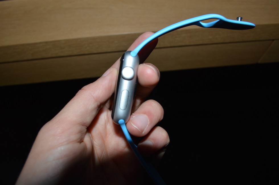
Damn, I have to say those pictures look terrible. I really liked the Apple Watch design, but had no idea you could see the edges like that. Also, seeing it held sideways, it looks kind of big/clunky. Whole thing looks like cheap/plastic. :(

Got tricked with the glamour shots.
 
lol.

quarter past moon.

I think that view is shown when you swipe around to get the moon phases in the future. the time is temporarily hidden.
 
I also don't understand this at all:

Ic5e336.png
What's wrong with that? I think it's pretty cool to be able to pan around a mosiac of photos, zooming in wherever you please. Sure, it's not a practical way of browsing or displaying photos, but the physical size of a watch face is never going to offer a good solution (until high-quality nano-projectors or expandable screens become a reality), so you might as well make it fun.
 
I think the pictures app is perhaps an example of Apple not being sure what people will use this for. A lack of focus for the introduction of the device so they’re tossing in all sorts of ideas.

maybe someone will want to see a 1.5” pic of someone instead of taking out their phone. maybe someone will want to zoom around the pictures with the wheel. I dunno, throw it in there.
 
What's wrong with that? I think it's pretty cool to be able to pan around a mosiac of photos, zooming in wherever you please. Sure, it's not a practical way of browsing or displaying photos, but the physical size of a watch face is never going to offer a good solution (until high-quality nano-projectors or expandable screens become a reality), so you might as well make it fun.
Alternatively, not do it at all.
 
They probably want you to be able to see images for emails and MMS, also your photos watch face, so they needed the function, so just decided to add a gallery. I don't see the problem.
 
Aside from the screen edges the way lights reflect on the screen's curve sucks ass, here like on the new iPhones.
Curved edges screen look like crap.
 
It does warn me, but I don't need the fob in the car - I just leave it in my pocket (or my wife in her bag). As long as it is inside the car the engine will run. So in this case by the time it warns me, I'm already moving (for a short distance..)
Weird. Mine will beep the second it leaves the car. It would be impossible for me to drive forward without it beeping first because the second she stepped out it will beep before she even got to close the door. I just leave it in my pocket too but there's no way I could drive off without the car telling me the fob is no longer in the car.
 
Status
Not open for further replies.
Top Bottom