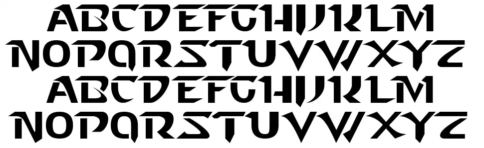
I've seen some hideous fonts in games throughout my years, specially for japanese games that have been localized, but today I've found one that really grinded my gears:


The game is Stranger of Sword City, for the Vita. It's coming out March 2016 and it's been one of my most anticipated games, but when I saw that font... Who thought that was a good idea?
The game is Stranger of Sword City, for the Vita. It's coming out March 2016 and it's been one of my most anticipated games, but when I saw that font... Who thought that was a good idea?

")


 E.
E.