-
Hey Guest. Check out your NeoGAF Wrapped 2025 results here!
You are using an out of date browser. It may not display this or other websites correctly.
You should upgrade or use an alternative browser.
You should upgrade or use an alternative browser.
Hideous text fonts in games
- Thread starter Shizuka
- Start date
Ludger Kresnik
Member
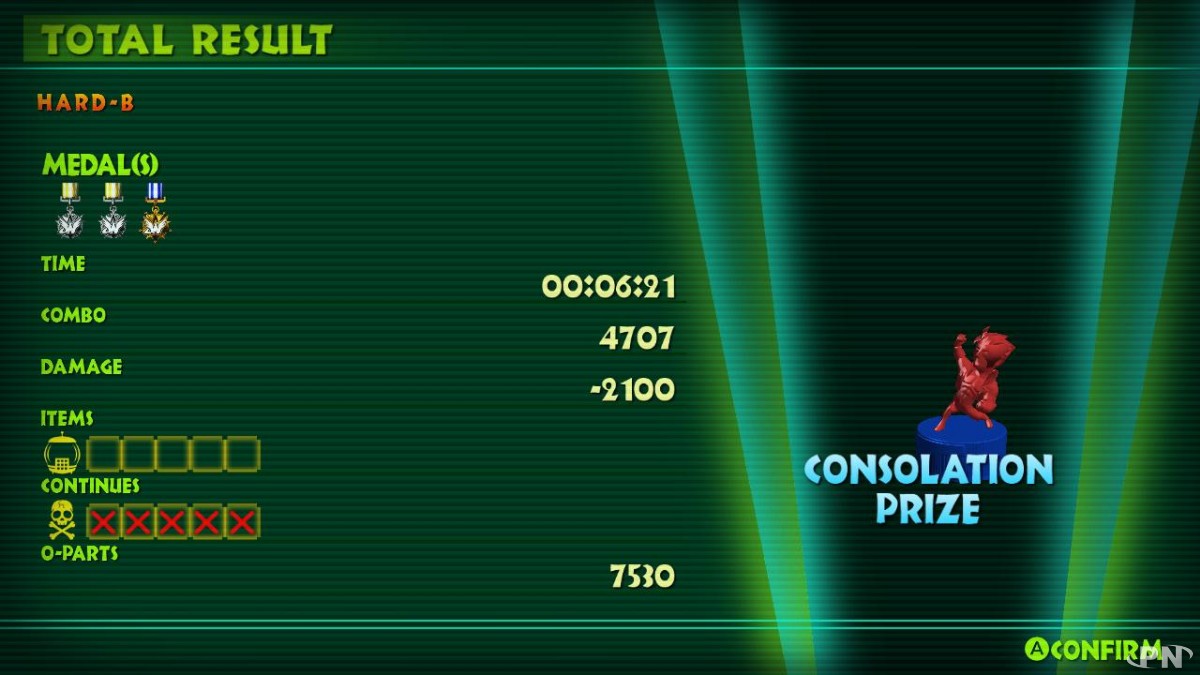
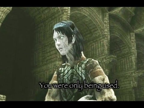
I hated W101's interface.

I actually kinda dig how that's almost a 1:1 copy of the Bayonetta results screen, only uglier.

SomedayTheFire
Member
What?You made it less legible.
According to a response on the PS blog post for Stranger of Sword City, the font should be getting fixed for release.
"The screens here are from an early build of the game. (I couldnt wait!) I believe the font alignment should be getting updated to show letters with a descender properly.Keep an eye on the official website for updates.
It looks like the PR wanted to create some buzz by sharing the first english screenshots for the game, but the build was so early that it sparked negative reaction from people. At least there's a lesson to learn there.
chaobreaker
Member
Not exactly hideous, but I thought the font for MH3U (3DS) was a pretty bad pick for the super low res display of the device.

MH4U font on the other hand is pretty much god-tier.
Yeah, it was pretty bad. Jamming Latin script in text boxes that were mean to fill Japanese characters will almost always be a recipe for disaster on portable systems.
Most egregious example of this I can think of was the Mega Man Battle Network series.

Japenese developers really need to make their games more localization friendly in that aspect.
GifGafIsTheBestGaf
Member
the witcher 3 font size was so bad at launch, it improved a bit but imo not an ideal size yet /consoles
I feel like this should be posted here: Silent Hill HD Collection's Worst Offense
Lol have to agree. Bigger != more legible.What?


MissDeviling
Member
Thank you. The new Pokemon games have pretty atrocious font and UI compared to previous games. Just really sterile and not pleasing. Was not a fan at all.The newest Pokémon games.

Why would they do this? Why would they change the iconic font from previous games? The new font looks cheap as hell.
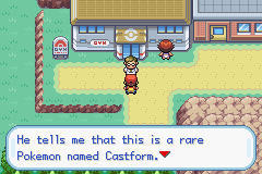
FRLG was my favourite for text:
FF mobile games and Type-0 HD also had sterile, generic word-processor font:

Much preferred Type-0's fan traslation's font choice:

Tacorona72
Member
This right here. Recently re-downloaded MH3U for 3DS and as soon as I saw the font and size, I went straight back to MH4U. Just couldn't do it.Not exactly hideous, but I thought the font for MH3U (3DS) was a pretty bad pick for the super low res display of the device.
MH4U font on the other hand is pretty much god-tier.
TheEndOfItAll
Neo Member
Final Fantasy IX's funny is part of the reason I disliked it. After the seriousness of FFVIII, I thought FFIX to be a bit sillier in its antics, and the font reflects that. Can't do screenshot right now.
Persona 2 I agree it's not aesthetically pleasing, but given that you work for a print magazine, it almost looks appropriate.
I actually don't mind the FFVI mobile font. It looks clean like the Amano art next to it.
Persona 2 I agree it's not aesthetically pleasing, but given that you work for a print magazine, it almost looks appropriate.
I actually don't mind the FFVI mobile font. It looks clean like the Amano art next to it.
GKSilKamina
Member
Wild Arms 2
I enjoyed the PS1 Wild ARMs games, but FUCK their font choice. My eyesight is terrible and fonts like that don't make my gaming life any easier.
M a n , t h a t r e a l l y i s t h e w o r s t . You've got the weird spacing AND the elevated letters thing. Blech.

Coreda
Member
I've seen some hideous fonts in games throughout my years, specially for japanese games that have been localized, but today I've found one that really grinded my gears:


The game is Stranger of Sword City, for the Vita. It's coming out March 2016 and it's been one of my most anticipated games, but when I saw that font... Who thought that was a good idea?
It looks like a technical issue with the assets rather than the typeface but I could be wrong. If it was converted to a sprite and the descenders (anything below the baseline, g/y/j/etc) weren't taken into account during the process such characters may have been inadvertently fitted in the area between the baseline and the ascenders rather than from the acenders to the descenders, shifting those characters upward. Given it was a Japanese developer that wouldn't surprise me.
It looks like a technical issue with the assets rather than the typeface but I could be wrong. If it was converted to a sprite and the descenders (anything below the baseline, g/y/j/etc) weren't taken into account during the process such characters may have been inadvertently fitted in the area between the baseline and the ascenders rather than from the acenders to the descenders, shifting those characters upward. Given it was a Japanese developer that wouldn't surprise me.
The developer fixed that issue for the final release.
Blood Bowl on Xbox 360. A mixture of fonts, the main culprit being including Times New Roman in italics, on screen and in menus.
But everything was italicised, so there was no sense of what was supposed to be important and what wasn't.
https://www.youtube.com/watch?v=9mF2s9NuFq0
But everything was italicised, so there was no sense of what was supposed to be important and what wasn't.
https://www.youtube.com/watch?v=9mF2s9NuFq0
Cymbal Head
Banned
Well if a thread had to get necroed, this was a good one for it.
Hentailover
Member
THat was a neat oldy to skim through. So far I've seen nearly every single font ever created mentioned as hideous in this thread. I start to suspect gaf of 2015 simply hated reading and they needed excuses XD

The Albatross
Member
Crackdown the thread?
Crackdown the thread.
They were using Arial for fuck's sake.
Nothing wrong with Arial. If you're on WIndows, gaf defaults to Arial. It's a good clear font that every system supports and tests well for usability and visual impaired.
*edit*
oh this post is from 2 years ago...... NM
Zombie James
Banned
I hacked the game to fix that font because I hated it so much.

I actually really like the before font. I wish someone would patch the SNES version with it.
ZombiePlatypus
Member
Not necessarily in-game, but I loathed the default logo PS3/Spiderman font.