Not sure if anyone else commented, but that does seem pretty dang busy. However, I do usually like really chill sticks myself and from what I can tell the style that you are aiming for is a bit busy, so that might be what you want
")
. I think the funky bit for me is that while I like how you tried to match the button gradient to the background gradient it still is a bit off. The BG gradient starts top left and proceeds to the bottom right over the whole area of the stick. Meanwhile the button gradient starts half way over and runs pretty much left to right over a much smaller area of the stick. The look is a bit odd to me with the two misaligned gradients and having the hot red and yellow buttons sitting in the middle of the cool green and blue background area.
So personally I would possibly either try to tweak the BG image a bit to line up with the buttons (i.e. have it run bottom left to side right, extend the red area out to the button start point, and have the gradient run red -> blue quickly over the same area of the buttons) or keep the image and have the buttons just match the colors of the BG image that they are currently over (just flow them green to blue to match the areas they are currently over). Just my two cents though, I'm no designer.

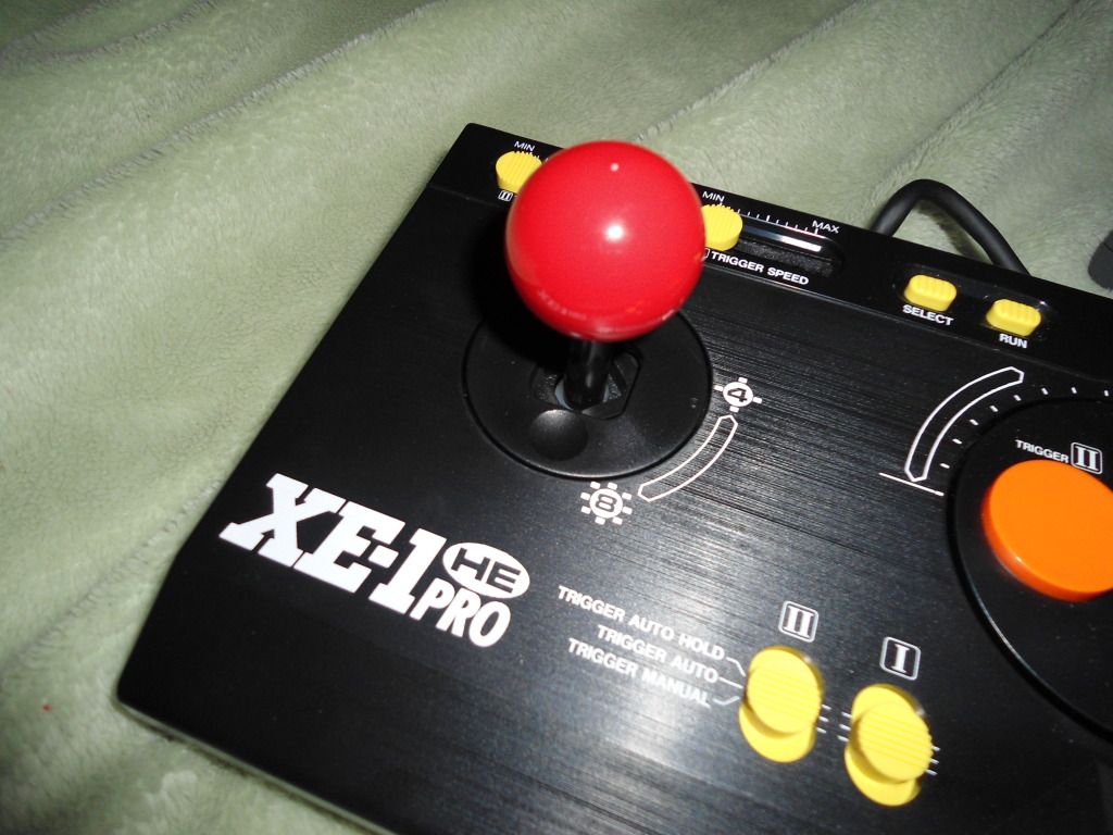
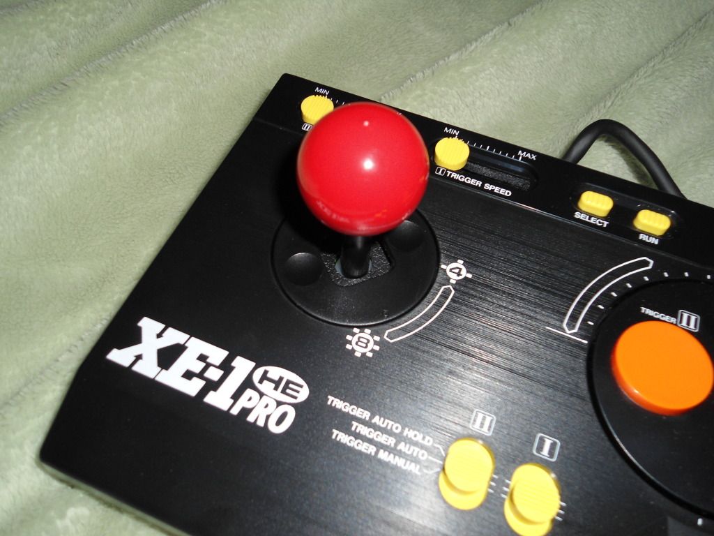
 So I got the KOF stick instead