• Hey Guest. Check out your NeoGAF Wrapped 2025 results here!

Show us Your Mobile Homescreen!

Status
Not open for further replies.
Still pretty stock from when I got GS3...I should do some more edits but lazy lol

gNY3M.jpg


H0kz1.jpg
 
Just got my Verizon GS3 a week ago. I love the screen so much. Still on the fence about having switched from iOS. I would love to start customizing it. Some of the screens people have posted are really nice looking.

 
I know this is extremely nerdy but I wanted to share


Looks simple enough, but the background is actually animated, and the Majora's Mask clock is actually giving the real time, the same for the moon widget which shows the current moon phase (which would be cool if it used the moon of the game, if I ever feel bored I might just make such widget). All of them are free in Google's Play Store.
 
Device is HTC One X with Android Revolution HD 9.1.0 Custom ROM (like stock only with ICS 4.0.4 and Sense 4.1 instead of ICS 4.0.1 and Sense 4.0).
WP ist the Skyrim live Wallpaper from the Tegra store IIRC. It's got animated snowflakes and Dovakhiin breath ;)

Lockscreen:
2012-08-31_22-02-300qjib.png


Homescreen:
2012-08-31_22-02-25hako1.png
 
I decided to make some dock icons to match the style of the app drawer icon in the stock ICS/JB launcher:


Turned out pretty nice, I think!

The icons are based on the ones from the MetroStation icon pack, but remade from scratch (except for the phone part of the phone icon) to look like they really fit in with the app drawer icon. The MetroStation icons have way too thick circles around them, so just using them as they are didn't look very good.

To actually create the custom shortcuts (as I'm using the stock JB launcher and not a custom one where that functionality is built in) I used Desktop Visualizer. Works great!
 
bb_home1tmdmd.png


Wheeeee. And of course it looks sharper on my Blackberry's tiny screen. All RIM hate aside, I actually like the Bold 9930.
 
Well I'll go ahead and post mine. The layout was shamelessly stolen from someone on androidforums, but I made it my own.

Nova Launcher
Icons are Metrostation
Clock is SimiClock
Day of the week is Minimalistic Text
Background: "Nighthawks"
 
Well I'll go ahead and post mine. The layout was shamelessly stolen from someone on androidforums, but I made it my own.

Nova Launcher
Icons are Metrostation
Clock is SimiClock
Day of the week is Minimalistic Text
Background: "Nighthawks"

Yeah, those are the icons I'm talking about. The circles around them are too thick (which is of course because they are actually WP7-style icons) for them to look really good like that, next to the app drawer icon. And that's why I did what I posted above.
 
Yeah, those are the icons I'm talking about. The circles around them are too thick (which is of course because they are actually WP7-style icons) for them to look really good like that, next to the app drawer icon. And that's why I did what I posted above.

Oh cool, I hadn't read your previous post. Yeah, I had noticed the difference between the app drawer circle and the Metro icons, but for whatever reason I like having the middle icon be slightly different. Nice work on your icons though. :)
 
iYMRIQMTDpEFj.jpg


ihzCoM9elU6Nv.jpg


I haven't changed it in forever, but threads like these always make me want to. And yes I have tons of voicemails I never listen to.
 
Oh cool, I hadn't read your previous post. Yeah, I had noticed the difference between the app drawer circle and the Metro icons, but for whatever reason I like having the middle icon be slightly different. Nice work on your icons though. :)

Yeah, I can definitely get wanting the app drawer icon to look different from the rest, but I don't like how the Metro icons are just a bit different. That extra circle line thickness looks off to me. But to each his own!
 
Well I'll go ahead and post mine. The layout was shamelessly stolen from someone on androidforums, but I made it my own.

Nova Launcher
Icons are Metrostation
Clock is SimiClock
Day of the week is Minimalistic Text
Background: "Nighthawks"

Question for anyone using the Metrostation custom icons, how are you guys getting such specific colors?

I've tried using a hex code to get a light blue but it won't take and since I don't wanna do every color manually, I just stick with black and white icons

Is there a guide or something out there with the right hex codes?
 
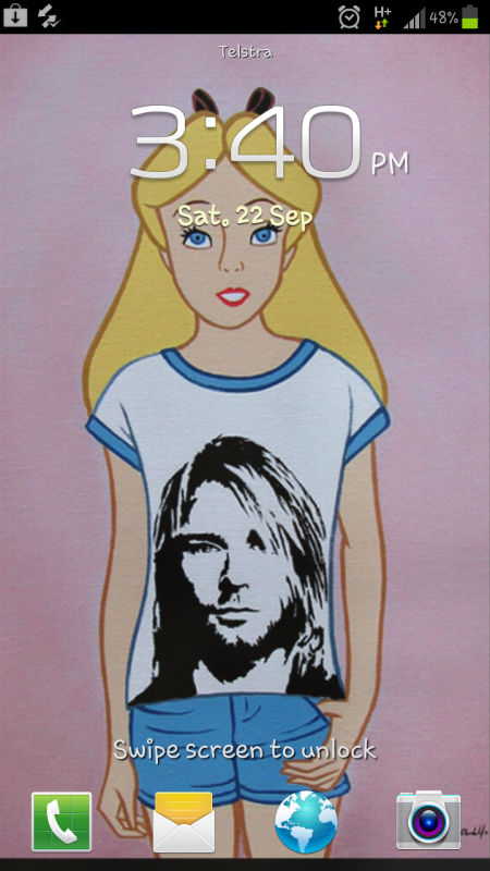
Got this using an app called foneclay:

beauuuutiful! [img][/QUOTE]

Wow, I prefer iOS than Android, but damn, those kind of customization are amazing. I saw, on mycolorscreen, an iconed version of Times Square, it's gorgeous: [url]http://mycolorscreen.com/2012/08/30/times-square-iconed/[/url]

I'll show my iPad:

[QUOTE] [img]http://i.imgur.com/UuaPc.jpg

It's a charming building I saw in Ibiza town, the theme is Breeze HD, I made the top bar transparent and removed some redondant informations. But there's more! I use a folding animation to unlock the screen, useless but I like it ;)

 
bo17k.jpg


Inspired heavily by one I saw at MyColorScreen, but with a personal touch. Actually looking to replace the UCCW clock with something a little more...grey. Finding decent skins is a bit of a minefield though, unless you fancy trawling through the huge xda thread.
 
Here is what I'm currently using.

hwLBYl.jpg
PSDTjl.jpg


7ZZ25l.jpg
vxQ0Bl.jpg


ywfLYl.jpg


The theme is called aycon. I use it on the iPad as well so I spare you those pics.

You can download the lockscreen here and the homescreen here.
 
I like to keep things simple.

AOKP Jellybean latest nightly build
Nova Launcher (latest beta)
MIUI icon pack
"grass" wallpaper from Wallbase


Slightly annoyed that Beyondpod doesn't have an icon, but meh.
 
lockscreen
2pbiul.png


homescreen
9jhUll.png


widgets screen
OCCEyl.png


bookmarks screen
VUWkFl.png

(ahh the joys and miracles of flash)
QV3tJl.png


Galaxy Nexus Verizon LTE 4G Unlimited
Paranoid Android 2.0
Jellybean 4.1.1
Apex Launcher
 
Status
Not open for further replies.
Top Bottom