-
Hey Guest. Check out your NeoGAF Wrapped 2025 results here!
You are using an out of date browser. It may not display this or other websites correctly.
You should upgrade or use an alternative browser.
You should upgrade or use an alternative browser.
Monolithsoft WiiU trailer - X (Takahashi x Tanaka x Sawano, Xenoblade x/multiplayer?)
- Thread starter SolidSnakex
- Start date
- Status
- Not open for further replies.
Smiles and Cries
Member
Why is Skyrim being used as a comparison? The 2 look nothing alike.
muted color vs balanced color that is all.
If the video image quality was like this trust me my tone would not have been this negative.
I may love Xenoblade's color palette a whole lot but that above image is not bad at all it is what I call balanced.
The colours in Skyrim look 'dudebro brown'. yet X is a heck of a lot more colourful.
try to stay focus on discussing the game and not be so personal... 'Irrational You, Unfortunate You' are very condescending as if I should not have a right to an opinion as much as anyone else here.
I don't see how "it's unfortunate that X's art doesn't please you" is condescending. It's not, and I certainly didn't want to come off that way. And when I said it was painting your opinion of X in an irrational way, I meant that you were making way too many comparisons to Xenoblade.
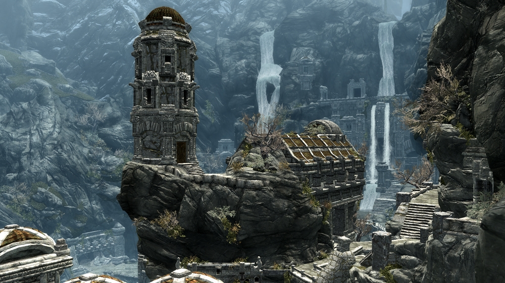
Here is the same color Palette in Skyrim of Xbox 360
If the video image quality was like this trust me my tone would not have been this negative.
I may love Xenoblade's color palette a whole lot but that above image is not bad at all it is what I call balanced.
I'm sorry, but the two aren't even remotely alike.
Why is Skyrim being used as a comparison? The 2 look nothing alike.
He's using that image as an example of what he considers a balanced aesthetic. In other words, the colors, graphics, and art style blend together, creating a cohesive environment. Cohesion is an important element of immersion. That is where the comparison between Skyrim and X ends.
He is saying X's art, color palette, and graphics don't work well together. In other words, Skyrim's style works for Skyrim, X's style doesn't work for the game X is trying to be.
muted color vs balanced color that is all.
I don't think Skyrim has muted color though, it has a narrow color pallet.
He's using that image as an example of what he considers a balanced aesthetic. In other words, the colors, graphics, and art style blend together, creating a cohesive environment. Cohesion is an important element of immersion.
He is saying X's art, color palette, and graphics don't work well together.
Oh I see, well that's rather bizarre.
Smiles and Cries
Member
The colours in Skyrim look a lot more 'dudebro brown' than they do in X.
and if that what X is going for then it should match that Skyrim balance. What bugs me is I see gray but I don't see black

the color is muted, they are going for that Skyrim palette
they are going for that Skyrim palette
What makes you think that? X has its own unique visual identity. The comparison really is quite bizarre.
and if that what X is going for then it should match that Skyrim balance. What bugs me is I see gray but I don't see black
the color is muted, they are going for that Skyrim palette
I hear X's vibrancy is upped when watching the trailer via the eShop.
and if that what X is going for then it should match that Skyrim balance. What bugs me is I see gray but I don't see black
But the character is wearing black.
and if that what X is going for then it should match that Skyrim balance. What bugs me is I see gray but I don't see black
yeah it's like the contrast is cranked down or something
and if that what X is going for then it should match that Skyrim balance. What bugs me is I see gray but I don't see black
the color is muted, they are going for that Skyrim palette
I agree. The Fantasy RPG genre compliments a brighter hue. The hue is what is offsetting about X. It would greatly benefit from a bit of pop.
sublimit
Banned
Smiles and Cries i also love color in my games (just look at my avatar) and i think X also has lots of color.From the clear blue sky to the reddish sunset i saw lots of color in that short trailer.
It's just that it's not as saturated as Xenoblade's colors were since this time they are obviously aiming for more realism,but still i think it's evident from the trailer that the general art direction remains the same.Just a bit more realistic.")
It's just that it's not as saturated as Xenoblade's colors were since this time they are obviously aiming for more realism,but still i think it's evident from the trailer that the general art direction remains the same.Just a bit more realistic.
Smiles and Cries
Member
He's using that image as an example of what he considers a balanced aesthetic. In other words, the colors, graphics, and art style blend together, creating a cohesive environment. Cohesion is an important element of immersion. That is where the comparison between Skyrim and X ends.
He is saying X's art, color palette, and graphics don't work well together. In other words, Skyrim's style works for Skyrim, X's style doesn't work for the game X is trying to be.
thanks you understood all of my babbling
Smiles and Cries i also love color in my games (just look at my avatar) and i think X also has lots of color.From the clear blue sky to the reddish sunset i saw lots of color in that short trailer.
It's just that it's not as saturated as Xenoblade's colors were since this time they are obviously aiming for more realism,but still i think it's evident from the trailer that the general art direction remains the same.Just a bit more realistic.
There is a serious lack of lighting if X is aiming for realistic art direction.
Oh well. I don't want to ruin this thread for people who are genuinely excited for this game. The game looks cool and I'm doing it disservice by nitpicking the graphics. I think I'm just sick of seeing that liftoff GIF in every thread lol. I'm out!
thanks you understood all of my babbling
I understood what you said, but I still don't agree with it. Anyways, I'll drop it, I guess.
and if that what X is going for then it should match that Skyrim balance. What bugs me is I see gray but I don't see black
the color is muted, they are going for that Skyrim palette
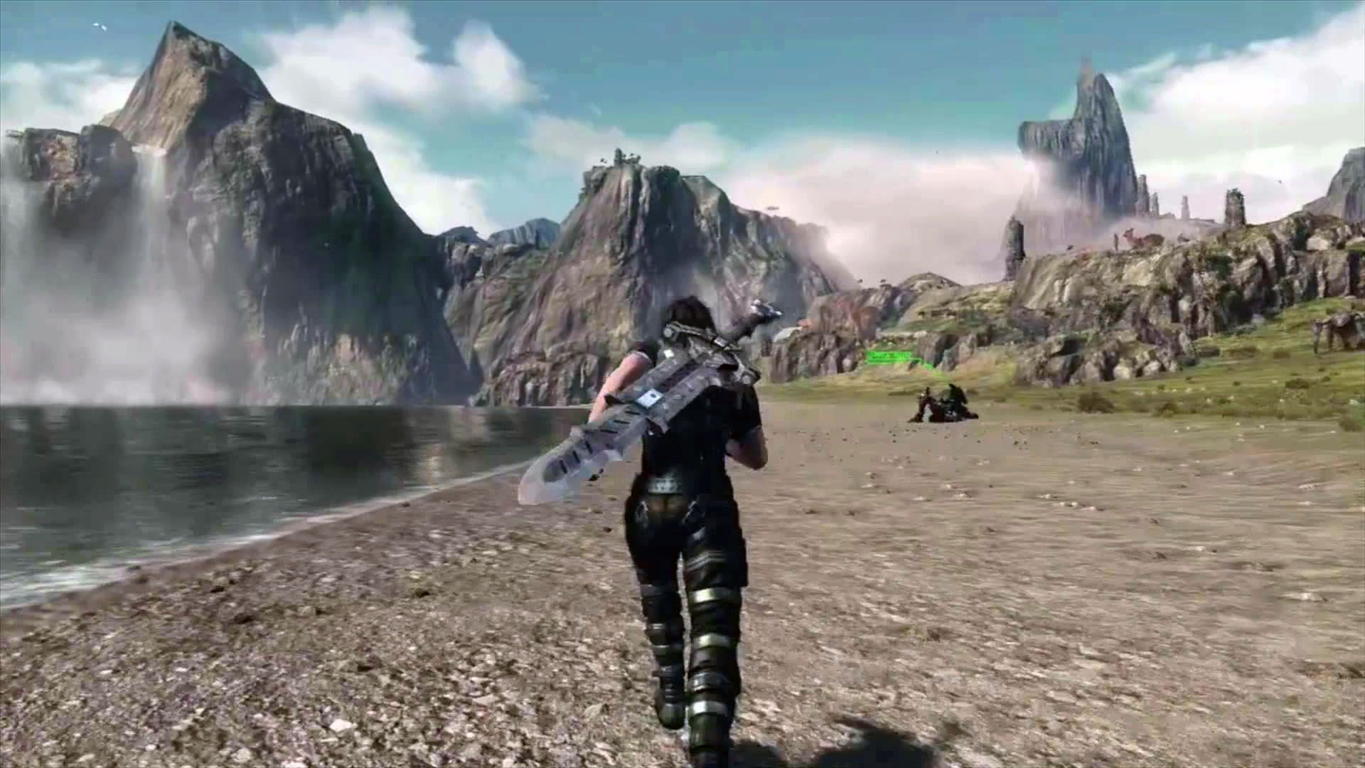
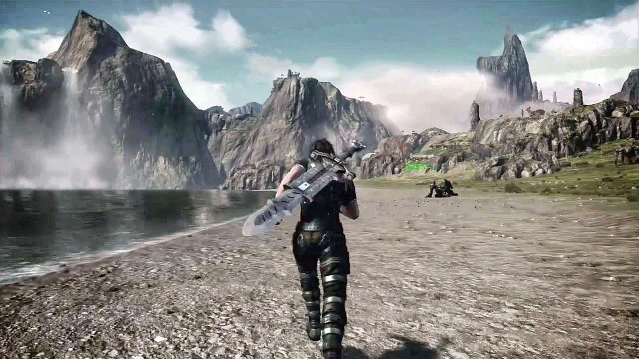
Okay, this pic is terrible. I just watched the 1080p trailer again and it's nowhere near this grey.
SniperHunter
Banned
i hate those numbers on screen, whats the point of having them? do the japanese loving super fast mental arithmetic? it kills the immersion
i hate those numbers on screen, whats the point of having them? do the japanese loving super fast mental arithmetic? it kills the immersion

and if that what X is going for then it should match that Skyrim balance. What bugs me is I see gray but I don't see black
the color is muted, they are going for that Skyrim palette
Where the hell did you get this pic from? It's horrible.
It's likely just poor video encoding imo. Just needs more contrast and deeper blacks. But yea, colour wise it does look a little stale. Lacking depth and vibrancy.
EDIT: Here's the same shot but with Photoshop auto colour/contrast/tone. Much better.
Okay... so... those two vs an ACTUAL screenshot taken at 1080p of the same scene with no alteration:
Notice how it's not all blurry and shit.
i hate those numbers on screen, whats the point of having them? do the japanese loving super fast mental arithmetic? it kills the immersion
I love them. It keeps the charm of seeing how much damage you've done. I also love how they float upwards.
Okay, this pic is terrible. I just watched the 1080p trailer again and it's nowhere near this grey.
That's my pic, I believe. I have my video player change the "temperature" of the video to a "cold" one. Though, it wasn't meant to serve in a discussion about color palettes, but instead to show off landscapes, so don't beat me up too much, please.

MisterHero
Super Member
They should calculate damage with an on-screen abacus
That'd be funny
That'd be funny
Smiles and Cries
Member
Smiles and Cries i also love color in my games (just look at my avatar) and i think X also has lots of color.From the clear blue sky to the reddish sunset i saw lots of color in that short trailer.
It's just that it's not as saturated as Xenoblade's colors were since this time they are obviously aiming for more realism,but still i think it's evident from the trailer that the general art direction remains the same.Just a bit more realistic.
I don't mind that, disappointed I won't get my color fetish but I just want to see some balance to what they are going for. And yeah there is that skybox the sky seems to have kept the same shifts at sunrise and sunset.
It's likely just poor video encoding imo. Just needs more contrast and deeper blacks. But yea, colour wise it does look a little stale. Lacking depth and vibrancy.
This is all I am saying, so I will keep hoping for that balance.
I'll also like to point out that this video ended with a black screen with a huge RED X painted on it.
I have not been able to capture one that is not blurry but that X has paint texture to it, it kinda gives clues that the encoding is not the best quality we can get. So a new video will help.
I wonder how many people work at Monolith Soft? Nindendo should beef them up in manpower and maybe have two teams working on different projects at the same time.
Their products don't exactly sell millions of copies.
Smiles and Cries
Member
Horrible quality screen capture, but another more colourful or contrasty edit.

I don't even need it to be that extreme
this one is closer to what I would expect it to look like since it is not touched up right? (still needs a little more black)


This shot reminds me of Makna Forest at night. Similar enemy, the giant orange mushroom, the turquoise purple stuff in the background.
It's a shame that the eshop trailer is poor quality as well though, Nintendo seems to do this kind of shit a lot. Releasing poorly captured trailers for their games. A number of the E3 trailers for games last year had the same issues going on with IQ.
Smiles and Cries
Member
am I the only one who LOVE that Sword?
yeah I agree needs a little black... I don't get why someone would not see this has TINT set to some extreme level
Still too musky and subdued imo. Just looks washed out. In a, this is not properly calibrated sense. Not to be mistaken with an intentional aesthetic decision.
yeah I agree needs a little black... I don't get why someone would not see this has TINT set to some extreme level
I don't even need it to be that extreme
this one is closer to what I would expect it to look like since it is not touched up right? (still needs a little more black)
Right, 0 editing was done from that. I snapped the screenshot at 1080p on youtube, in .png format, and uploaded it.
yeah I agree needs a little black... I don't get why someone would not see this has TINT set to some extreme level
I know what the game originally looks like. I have the trailer playing right in front of me on the game pad. I made that screencap to show off landscapes and not argue about color balances or whatever. So using that pic (which had its temperature altered because of my personal preferences) in this discussion when it concerns color palettes is certainly inappropriate.
If you want a "properly calibrated" look at the game, go watch the trailer on the eshop on your television or gamepad. Everything's sharper and brighter, and if you're going to make further criticisms of the game's color, do it based on that. (But if you're still discontent after watching it there, I don't know what to tell you. The game's color scheme isn't going to change dramatically from that if at all. :/)
Silent_Ocarina
Member
I'd still like to be the colors just slightly more vibrant. I have no artistic talent and this took maybe ten seconds, but I think this is a little better. It's just my opinion, though.

abstract alien
Member
It's likely just poor video encoding imo. Just needs more contrast and deeper blacks. But yea, colour wise it does look a little stale. Lacking depth and vibrancy.
EDIT: Here's the same shot but with Photoshop auto colour/contrast/tone. Much better.
This is much better for my tastes.
This shot reminds me of Makna Forest at night. Similar enemy, the giant orange mushroom, the turquoise purple stuff in the background.
It's a shame that the eshop trailer is poor quality as well though, Nintendo seems to do this kind of shit a lot. Releasing poorly captured trailers for their games. A number of the E3 trailers for games last year had the same issues going on with IQ.
Oh man, awesome. I guess this explains the drawings of mushrooms the artists at Monolith Soft were sketching!
FWIW here are some caps from the eshop trailer that was posted here the other day. The quality is a bit better than the youtube version.


sublimit
Banned
am I the only one who LOVE that Sword?
No you are not the only one.I love its design,looks very industrial.
FWIW here are some caps from the eshop trailer that was posted here the other day. The quality is a bit better than the youtube version.
Yeah, I'm just really not seeing where the "color balancing" issues are coming from. It looks spectacular to me and doesn't clash with the game's graphical style.
Here's an awful video I recorded off my TV, having fiddled with the contrast/brightness/colour levels. Obviously there are some issues like crazy pink sky but I think it gets the point across that it's probably just a badly encoded video, and you can "fix" the drabness simply by messing with your TV a little bit.
Smiles and Cries
Member
I know what the game originally looks like. I have the trailer playing right in front of me on the game pad. I made that screencap to show off landscapes and not argue about color balances or whatever. So using that pic (which had its temperature altered because of my personal preferences) in this discussion when it concerns color palettes is certainly inappropriate.
If you want a "properly calibrated" look at the game, go watch the trailer on the eshop on your television or gamepad. Everything's sharper and brighter, and if you're going to make further criticisms of the game's color, do it based on that.
I already had my say on the eShop trailer... It is clearer than the 720p on that Nintendo has on youtube. Seriously I am way passed the color thing... I am just trying to see what Monolith's true goal is for this area of the game is. I doubt the end product will be this washed out.
I just watched it again two times the guy running near the shore his suit is indeed a lovely shade of back but you can still see at other points where his suit is washed out to a duller dark gray.
I am on a 720p Plasma so maybe I am missing out because I don't have 1080p so I can only make a gamepad judgement and the color is even grayer on my gamepad then my 50" Panasonic.
My take is that gray tint is from the video not the game so in the end all this talk is really pointless.
Unless you really want that gray film overlay on this game to be the final look.
Couple of things i'm wondering about, and I want some opinions.
1. If you look at this

if you look to the left at the beginning and the far right at the end of the pan, it looks like it might have ocean on both sides which may suggest its an island/peninsula. If so do you think this might be so that you can't go too far on your mech?
2. If this is a sequel to Xenoblade do you think the former party members will be playable or just npcs/cameos?
3. Since your mech seems to have finite fuel, will you have to head back to a base/town on foot or can you will your mech teleport to a refuelling station when you go to a base?
1. If you look at this
if you look to the left at the beginning and the far right at the end of the pan, it looks like it might have ocean on both sides which may suggest its an island/peninsula. If so do you think this might be so that you can't go too far on your mech?
2. If this is a sequel to Xenoblade do you think the former party members will be playable or just npcs/cameos?
3. Since your mech seems to have finite fuel, will you have to head back to a base/town on foot or can you will your mech teleport to a refuelling station when you go to a base?
bobbychalkers
Member
I actually made some gifs from the Eshop trailer. I'd post them (behind a link of course) but I don't know of any image hosts that are insane enough for 20mb gifs. They look awesome though.
My take is that gray tint is from the video not the game
Okay, I'm not seeing any "gray tint". Like, at all on both the game pad or my television screen. Sorry dude, just not seeing where you're coming from. And the video can't be all that "washed out", because the more vibrant evening colors (pinks, reds, purples, and oranges, for instance) come through very well.
Smiles and Cries
Member
No you are not the only one.I love its design,looks very industrial.
YAY!
Here's an awful video I recorded off my TV, having fiddled with the contrast/brightness/colour levels. Obviously there are some issues like crazy pink sky but I think it gets the point across that it's probably just a badly encoded video, and you can "fix" the drabness simply by messing with your TV a little bit.
yeah I am messing with my settings now too
You can still love X and still see the damn TINT needs a fix guys, it's not a crime.
MisterHero
Super Member
1. Most likely. It's easier to have a continent rather than land that vanishes into the horizon.Couple of things i'm wondering about, and I want some opinions.
1. If you look at this
if you look to the left at the beginning and the far right at the end of the pan, it looks like it might have ocean on both sides which may suggest its an island/peninsula. If so do you think this might be so that you can't go too far on your mech?
2. If this is a sequel to Xenoblade do you think the former party members will be playable or just npcs/cameos?
3. Since your mech seems to have finite fuel, will you have to head back to a base/town on foot or can you will your mech teleport to a refuelling station when you go to a base?
2. I think it'll be vague cameos in the far future, but I really want a direct sequel.
3. It can probably gather ether from its immediate surroundings
I thought the destruction of the gods + the weakening of Entia blood would lead to the depletion of ether, but one character was using ether to heal
abstract alien
Member
Here's an awful video I recorded off my TV, having fiddled with the contrast/brightness/colour levels. Obviously there are some issues like crazy pink sky but I think it gets the point across that it's probably just a badly encoded video, and you can "fix" the drabness simply by messing with your TV a little bit.
That looks pretty delicious.
- Status
- Not open for further replies.