Topher
Identifies as young
Microsoft says its new Xbox Cloud UI is the 'foundation' for new Xbox experiences.
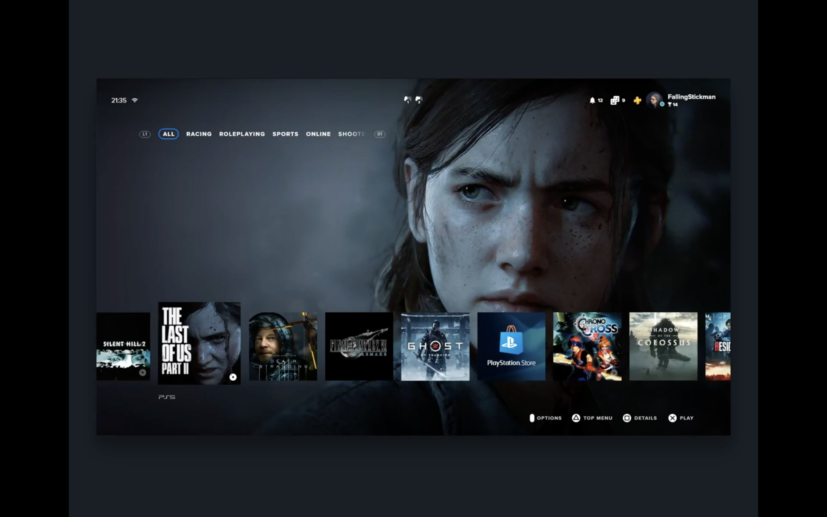
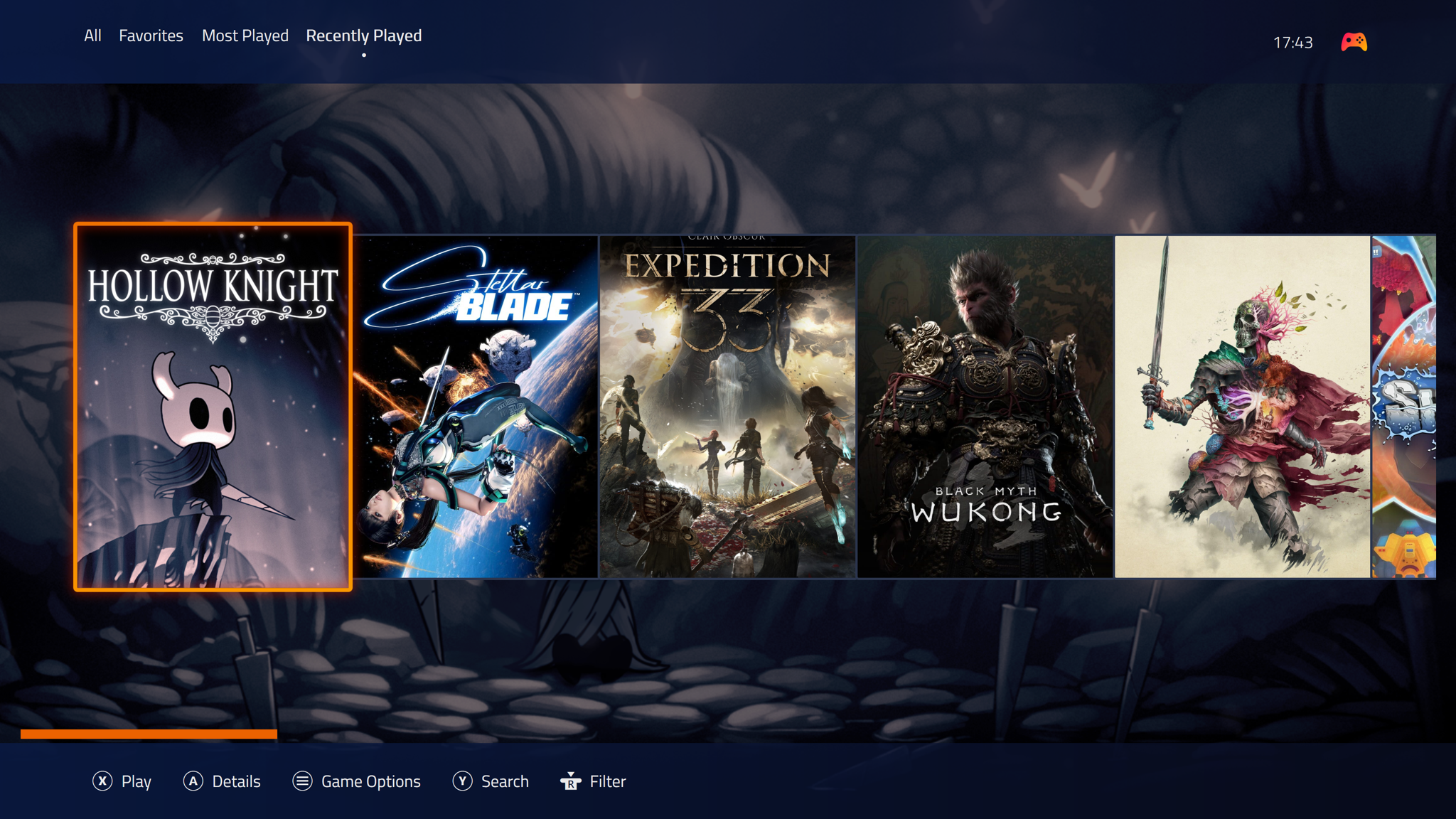
Microsoft has started testing a refreshed web experience for Xbox Cloud Gaming that looks even more console-like. Xbox Insiders can now try out the preview UI, which includes updated navigation features, plenty of new animations, and a refreshed design. It all feels like a teaser of what's to come for Xbox consoles in the years ahead.
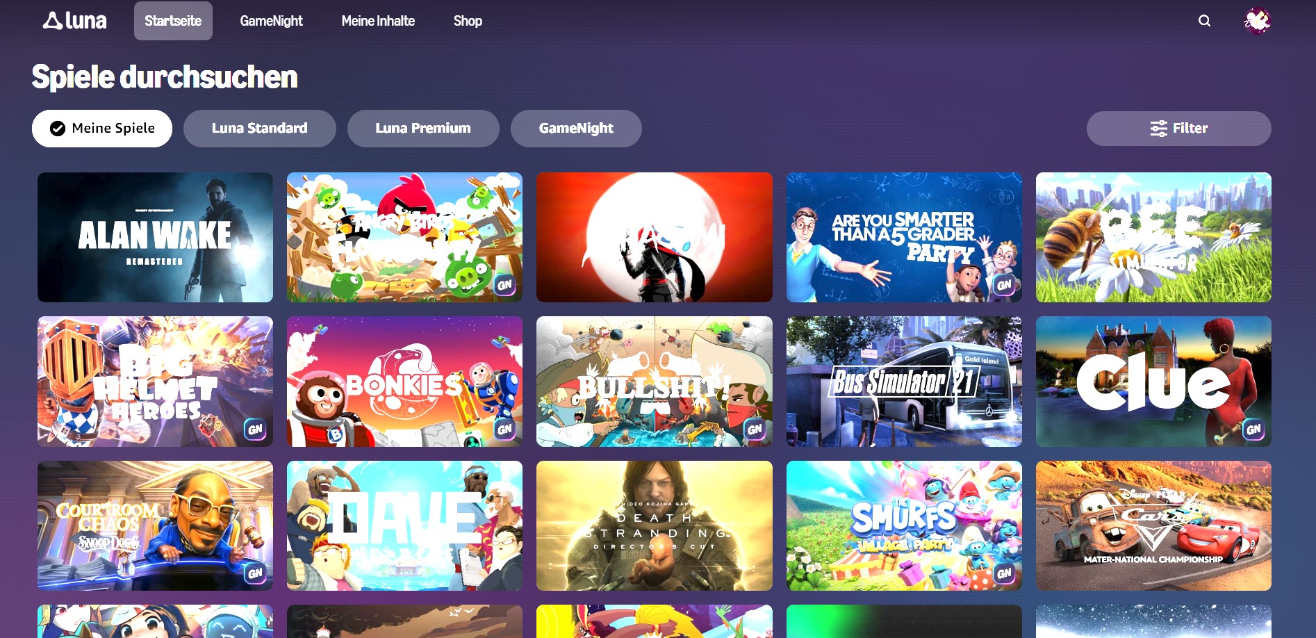
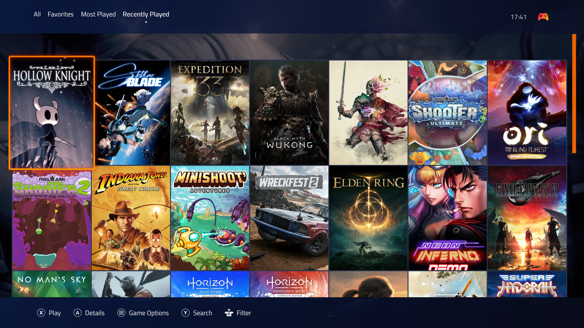
The existing Xbox Cloud Gaming interface got its last major overhaul nearly two years ago, when Microsoft added the social features and UI you'd normally find in the Xbox dashboard. This new design makes that existing UI feel even closer to an Xbox console, thanks to a variety of new animations, a new library section, and a rounded design.

New animations include a sliding dashboard interface that glides into view, an animated Xbox icon that lights up and changes shape, and improved navigation between the different parts of the dashboard. These subtle changes greatly improve the Xbox Cloud Gaming navigation experience, which currently feels like a web app loading each section.
"We're testing a refreshed web experience for Xbox Cloud Gaming that lays the foundation for accelerating our ability to build new experiences for players," says Patrick Siu, principal product manager at Xbox. "This preview is a first look at our new web interface on your browser and lets you try the updated design and product flow before it is rolled out broadly."


The mention of this new UI being the foundation for "new experiences" certainly sounds like Microsoft may well use this new design in a future Xbox console. In the meantime, I'm hoping it also takes this interface and puts it inside the Xbox app on PC, which is in much need of navigation and animation improvements.
Microsoft is looking for feedback on this new Xbox Cloud Gaming UI, before it rolls it out to everyone in the coming months. If you want to try it out you can head to the new https://play.xbox.com/ site and enable the preview features toggle from the settings menu.
I see some differences from this and the current Xbox app, but really....nothing crazy
Microsoft has started testing a refreshed web experience for Xbox Cloud Gaming that looks even more console-like. Xbox Insiders can now try out the preview UI, which includes updated navigation features, plenty of new animations, and a refreshed design. It all feels like a teaser of what's to come for Xbox consoles in the years ahead.
The existing Xbox Cloud Gaming interface got its last major overhaul nearly two years ago, when Microsoft added the social features and UI you'd normally find in the Xbox dashboard. This new design makes that existing UI feel even closer to an Xbox console, thanks to a variety of new animations, a new library section, and a rounded design.
New animations include a sliding dashboard interface that glides into view, an animated Xbox icon that lights up and changes shape, and improved navigation between the different parts of the dashboard. These subtle changes greatly improve the Xbox Cloud Gaming navigation experience, which currently feels like a web app loading each section.
"We're testing a refreshed web experience for Xbox Cloud Gaming that lays the foundation for accelerating our ability to build new experiences for players," says Patrick Siu, principal product manager at Xbox. "This preview is a first look at our new web interface on your browser and lets you try the updated design and product flow before it is rolled out broadly."
The mention of this new UI being the foundation for "new experiences" certainly sounds like Microsoft may well use this new design in a future Xbox console. In the meantime, I'm hoping it also takes this interface and puts it inside the Xbox app on PC, which is in much need of navigation and animation improvements.
Microsoft is looking for feedback on this new Xbox Cloud Gaming UI, before it rolls it out to everyone in the coming months. If you want to try it out you can head to the new https://play.xbox.com/ site and enable the preview features toggle from the settings menu.
I see some differences from this and the current Xbox app, but really....nothing crazy


")