You are using an out of date browser. It may not display this or other websites correctly.
You should upgrade or use an alternative browser.
You should upgrade or use an alternative browser.
2014 High-Res PC Screenshot Thread of the Last Hope for Image Quality
- Thread starter Stallion Free
- Start date
Wake Up Freeman
Member
Bornstellar
Member
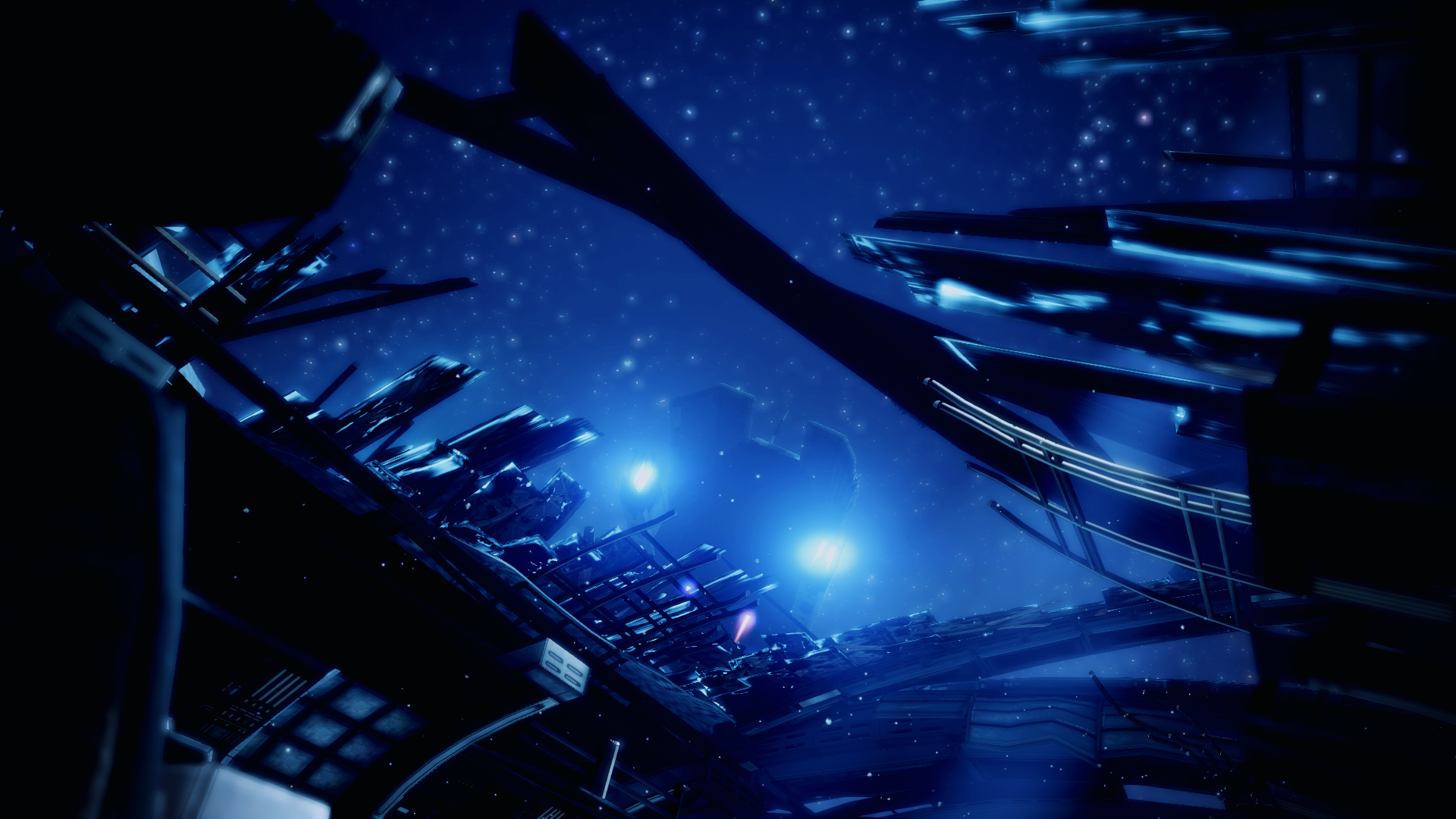
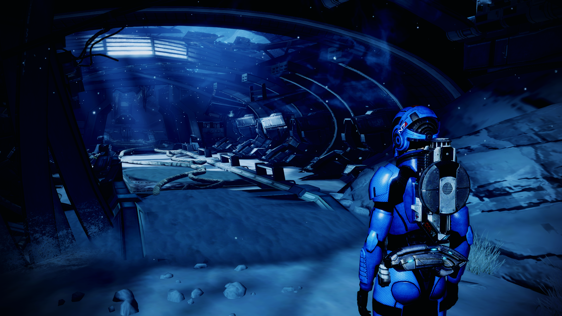
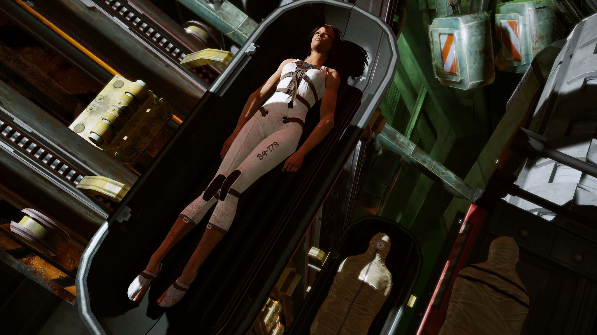
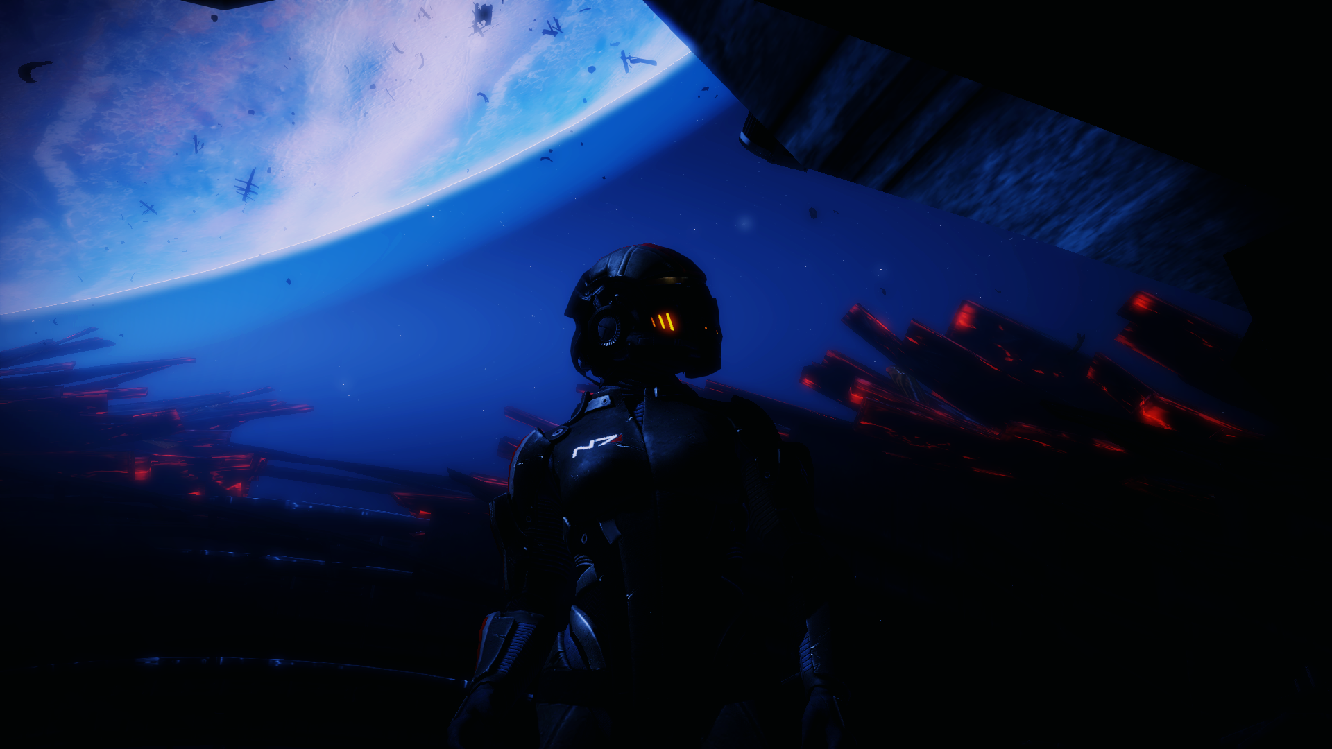
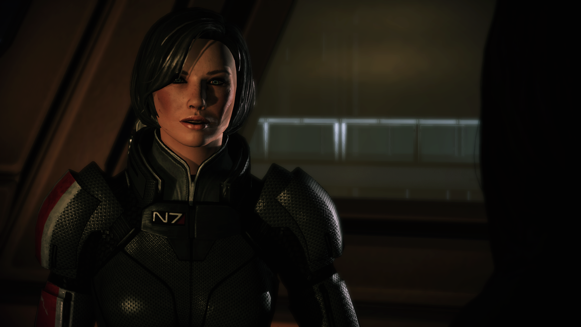
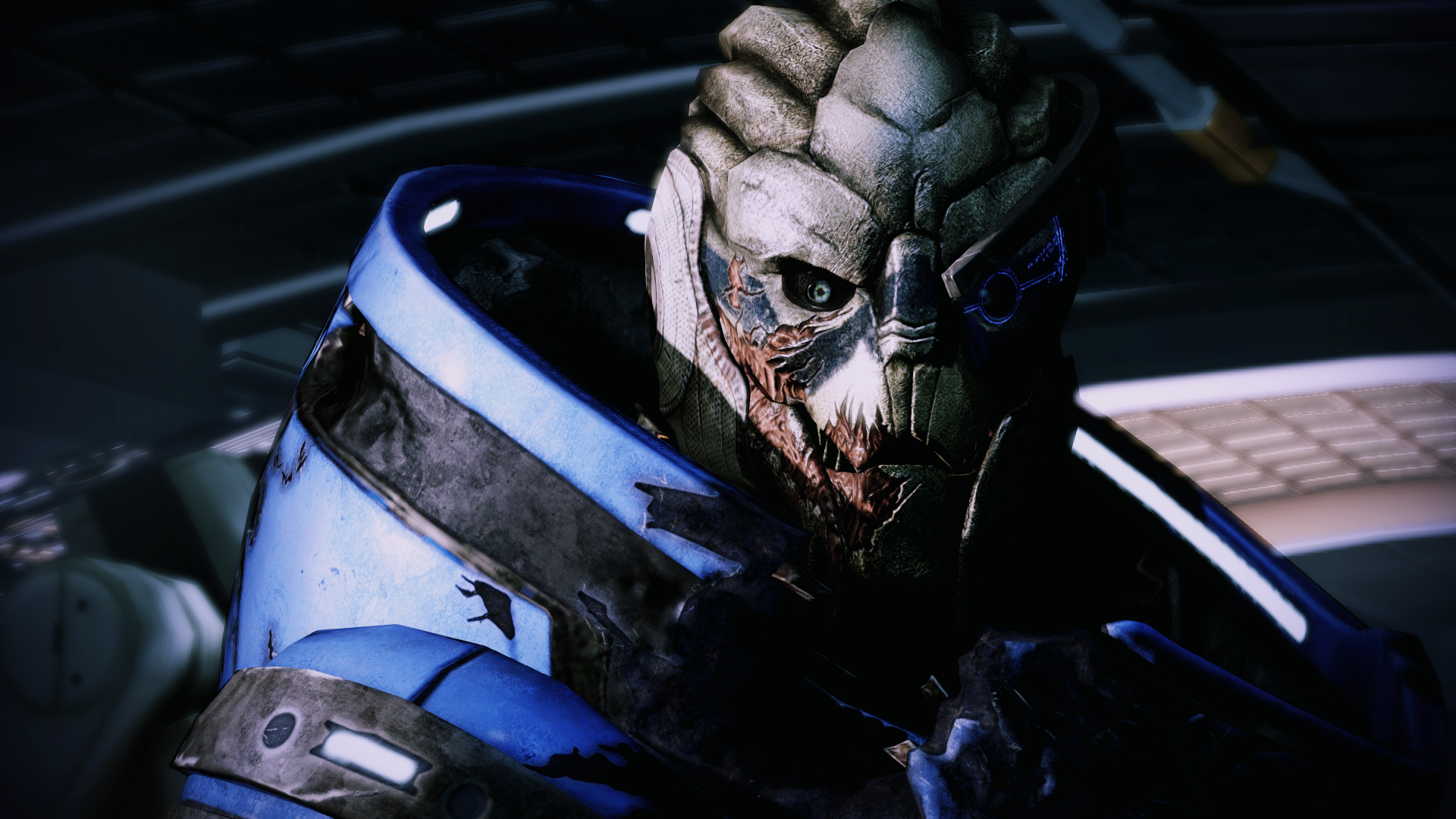
Resuming a trilogy run. Sorry about the aliasing, forcing through NVidia inspector doesn't seem to be working so it's just smaa from the cinematic enb. Also, I need to edit the coalesced ini for freecam and HUDless shots.


Bornstellar
Member
The Janitor
Member
Very nice lighting balance. Can you post a copy of your DoomConfig.cfg file?
Sure. I think it's mostly maxed out default settings though
https://www.mediafire.com/?wx0txoede36sbnk
jim2point0
Banned
Stallion Free
Cock Encumbered
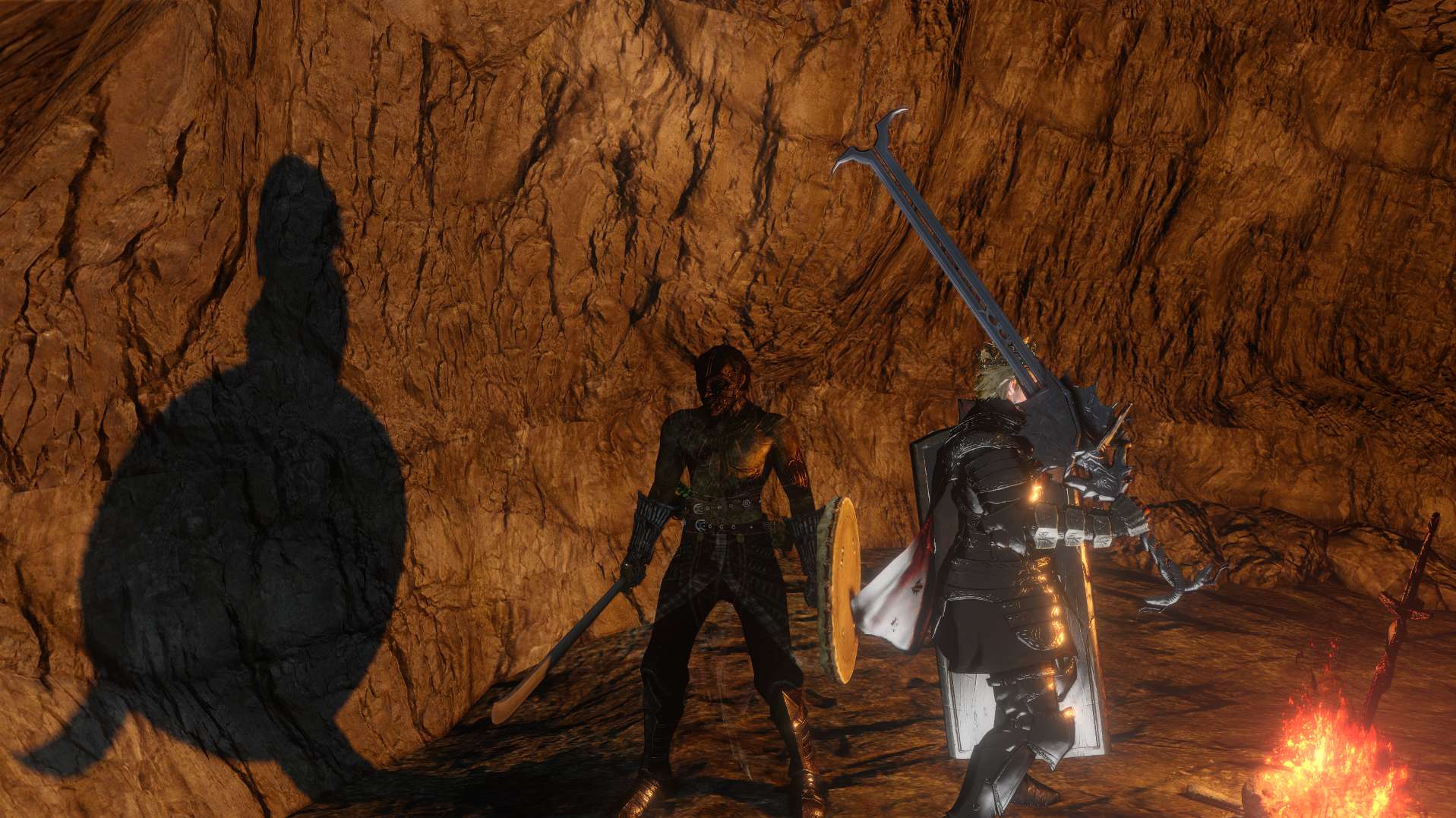
So that means more DS2 shots from you? Yes please.
jim2point0
Banned
Maybe some day. My problems are....
1. There is no time freeze for this game, and I really want to be able to capture action and\or moments that would otherwise be impossible without it.
2. Beyond a certain point in the game, the ENB I was using didn't help improve the look of some areas and I'm crap at tweaking it myself. I do want to see the DLC though.
Maybe some day. My problems are....
1. There is no time freeze for this game, and I really want to be able to capture action and\or moments that would otherwise be impossible without it.
2. Beyond a certain point in the game, the ENB I was using didn't help improve the look of some areas and I'm crap at tweaking it myself. I do want to see the DLC though.
Which areas? There are some end point areas that i think are the best looking sections in the game.
Chance Hale
Member
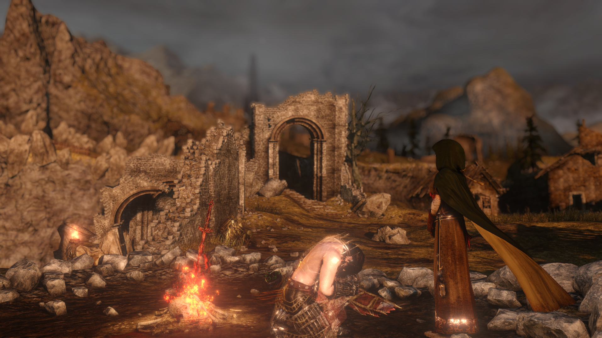
I wish all games could be so easily downsampled, the robe looks so sharp!
It's weird how inconsistent the game is. Can look so flat in some areas but then you have Majula which looks gorgeous. Even the armors are inconsistent, you can see the bottom of the robe reacting to the sunlight but many just don't see to shine like they do in the other games.
Certainly a cray amount of detail in most of the armor though, whatever set this guy is using looks really nice.
Auto-Reply
Member
How do you like the gameplay? I'm on the fence for some time now, bought it on a sale and did not start it yet.
Auto-Reply
Member
Auto-Reply
Member
littlegrasshopper
Member
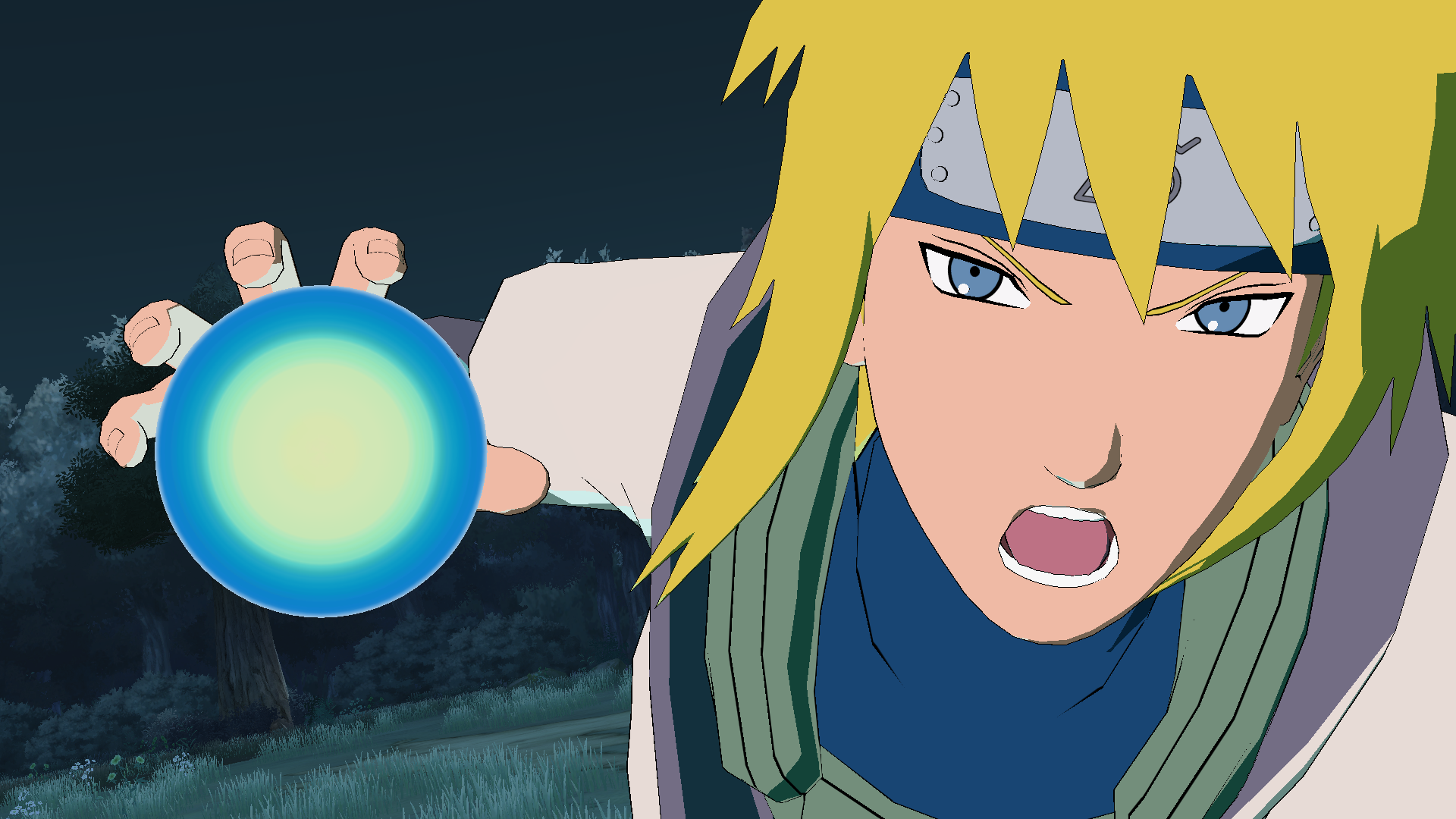
That shot looks amazing! How did you remove the hud? I need to stop pushing this game off and beat it already. How far into the 4th war does this game go/end at?
Holy shit! *claps*
crazyturtle
Member
that self shadowing is really impressive same goes for that skin shader
bonus points for it not looking like a plastic doll
I guess I really do have to get this game at some point. Damn you animu!Also you can remove the background on the character select screen to get great high res versions of each of the rendered characters.


I wish all games could be so easily downsampled, the robe looks so sharp!
It's weird how inconsistent the game is. Can look so flat in some areas but then you have Majula which looks gorgeous. Even the armors are inconsistent, you can see the bottom of the robe reacting to the sunlight but many just don't see to shine like they do in the other games.
Certainly a cray amount of detail in most of the armor though, whatever set this guy is using looks really nice.

The sun or light reflecting off stuff is genuinely just a developer choice. You can use GeDoSaTo to dump textures and edit the specular texture for every piece of armor. If an armor looks dull and flat in that sense, it's because the developers didn't want it to be crisp and shiny.
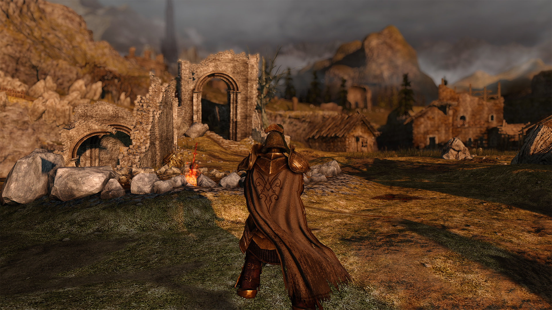
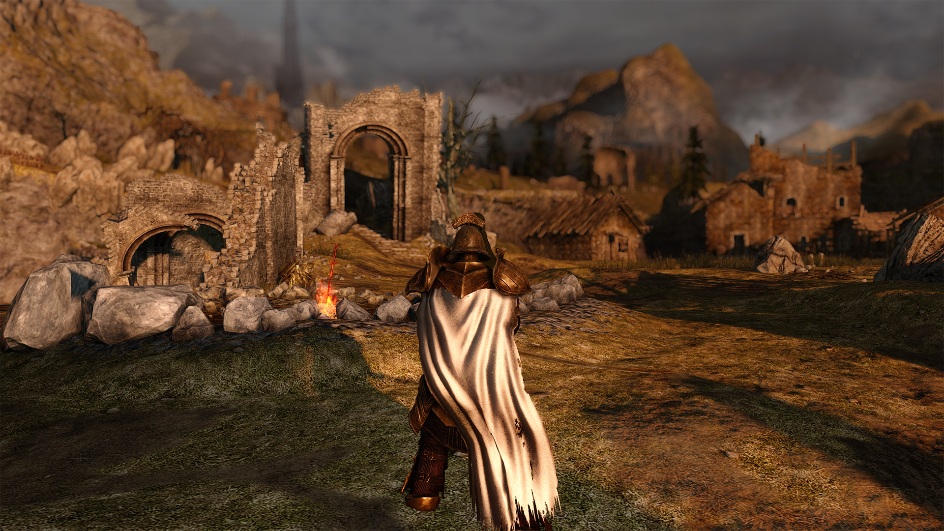
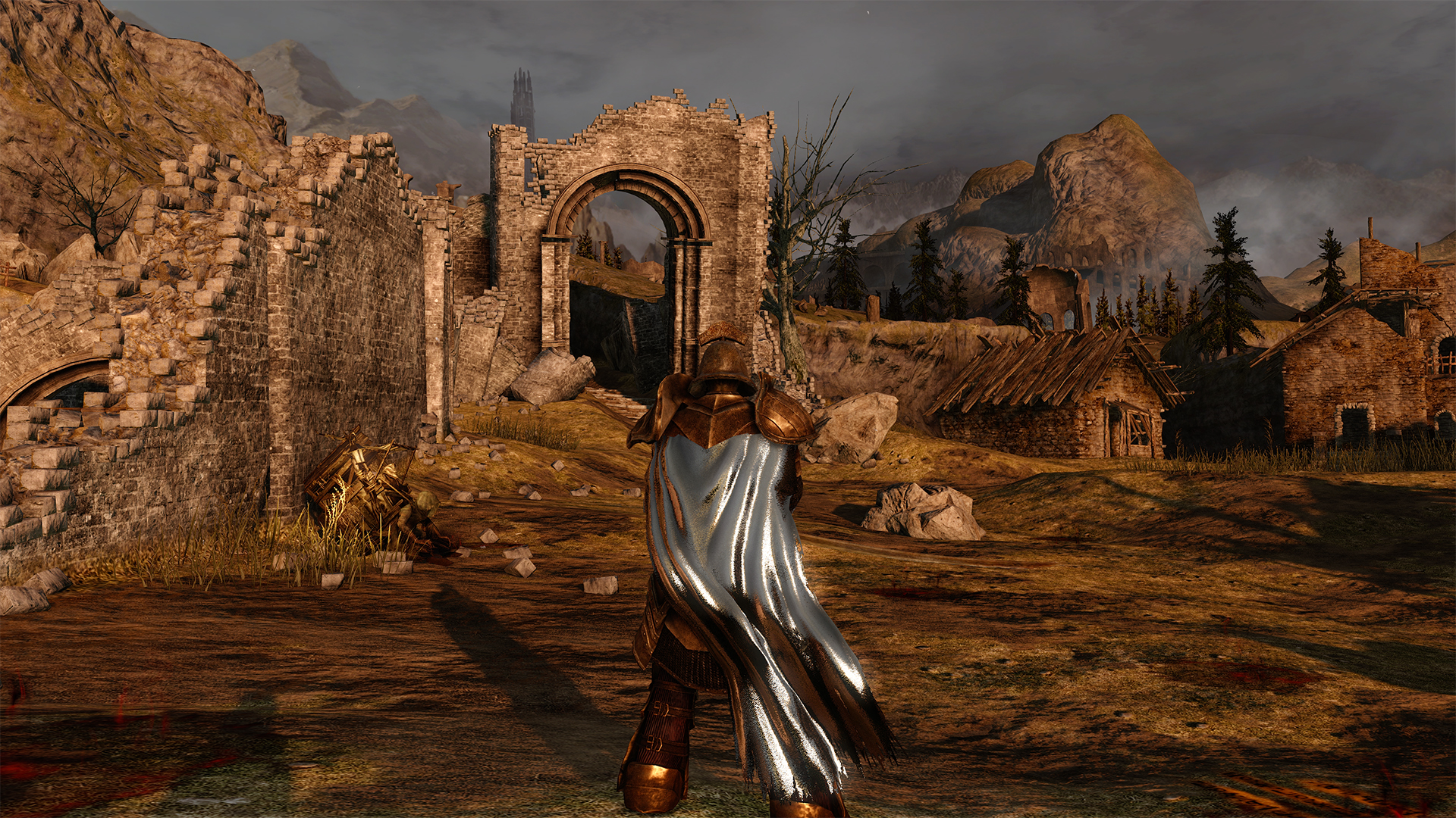
Here's an example.
Vanilla
Brightened
Pure white
You can do that as simply as taking the specular texture and raising the brightness of it. The closer to white something is, the more reflective it is. So you can be garishly shiny if that's what you desire!
I guess I really do have to get this game at some point. Damn you animu!
It's pretty great!
That shot looks amazing! How did you remove the hud? I need to stop pushing this game off and beat it already. How far into the 4th war does this game go/end at?
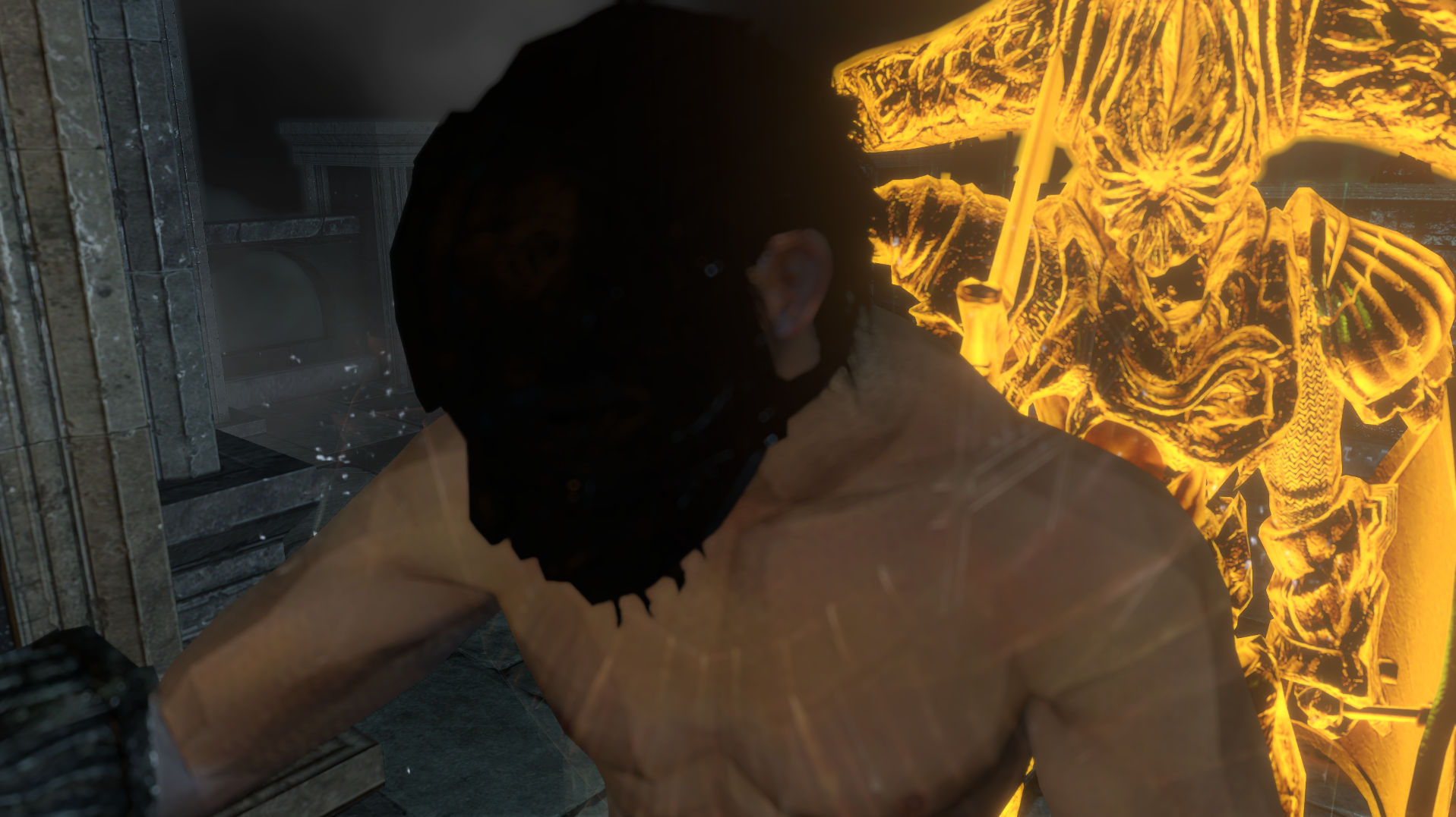
Check my post in the GeDoSaTo thread on it. The HUD can't be universally removed so far, and the above screenshot is using a specific weird version of removing the HUD that doesn't render the HUD, doesn't render the post processing they do, and also doesn't render a lot of special effects (stuff like light energy balls, etc etc).
This is what the game looks like normally, downsampled, no HUD, post processing still applied.
There's a bit of a softening and a blur applied to everything which is unfortunate.
Also, I don't know how far the game goes through. I've only gotten past the first mission because I've been trying to figure out the PSHash stuff
PhilGPT
Member
Chance Hale
Member
The sun or light reflecting off stuff is genuinely just a developer choice. You can use GeDoSaTo to dump textures and edit the specular texture for every piece of armor. If an armor looks dull and flat in that sense, it's because the developers didn't want it to be crisp and shiny.
Here's an example.
Vanilla
Brightened
Pure white
You can do that as simply as taking the specular texture and raising the brightness of it. The closer to white something is, the more reflective it is. So you can be garishly shiny if that's what you desire!
Not really what I meant though, in the first Dark Souls all of the armor seemed to react to the light as you moved about without looking "garish". In Dark Souls 2 a lot of things just look really flat. Similar to how in Drangleic Castle 50% of the rooms are nothing but gray slabs. In the screenshots you posted the design of the cape becomes hidden so I imagine you are kidding?
It's like how when you go near a campfire the shadows will react in near ways that aren't present anywhere else but maybe the pirate cove.
King Radical
Member
GTA IV. My personal screenshot masterpiece.


Not really what I meant though, in the first Dark Souls all of the armor seemed to react to the light as you moved about without looking "garish". In Dark Souls 2 a lot of things just look really flat. Similar to how in Drangleic Castle 50% of the rooms are nothing but gray slabs. In the screenshots you posted the design of the cape becomes hidden so I imagine you are kidding?
It's like how when you go near a campfire the shadows will react in near ways that aren't present anywhere else but maybe the pirate cove.
Nope wasn't kidding. The design is hidden simply because it was a quick rush job to give an example.
And I don't mean to say that all specular highlights are garish, just that the examples I provided were specifically showing off how garish it could be. Saying "it can be as garish as you'd like!" was meant as a joke.
If you're talking about just in general, lighting is fairly flat then yes you're right, but I don't really know how much better Dark Souls was in that respect. I guess I'm not sure what specifically you're talking about, or if you're just speaking of the visuals overall.
Overall, I think that yeah, the game doesn't look absolutely stunning, but I do think it is an upgrade over the original. On top of that, with the inclusion of ENB and GeDoSaTo, I find the game can end up looking pretty incredible.
Chance Hale
Member
Nope wasn't kidding. The design is hidden simply because it was a quick rush job to give an example.
And I don't mean to say that all specular highlights are garish, just that the examples I provided were specifically showing off how garish it could be. Saying "it can be as garish as you'd like!" was meant as a joke.
If you're talking about just in general, lighting is fairly flat then yes you're right, but I don't really know how much better Dark Souls was in that respect. I guess I'm not sure what specifically you're talking about, or if you're just speaking of the visuals overall.
Overall, I think that yeah, the game doesn't look absolutely stunning, but I do think it is an upgrade over the original. On top of that, with the inclusion of ENB and GeDoSaTo, I find the game can end up looking pretty incredible.
I haven't played with ENBs at all so I should probably do that. I was just talking about some of the armors, even the metal ones, seeming to not have highlights where all of them did in the first Dark Souls. As in you walk out into the sun and the armor looks exactly the same as it did in the dark. There are moments where the second game is in another league but then you get to the Bastille, Alda's Keep or Drangleic Castle where there is no lighting what so ever and it's just gray room after gray room. The first game certainly had ugly areas, but nothing as boring and lifeless as parts of Dark Souls 2. It just contrasts really hard against the unbelievable Dragon Aerie or the Cove.
TheVampire
Banned
TheVampire
Banned
Bornstellar
Member
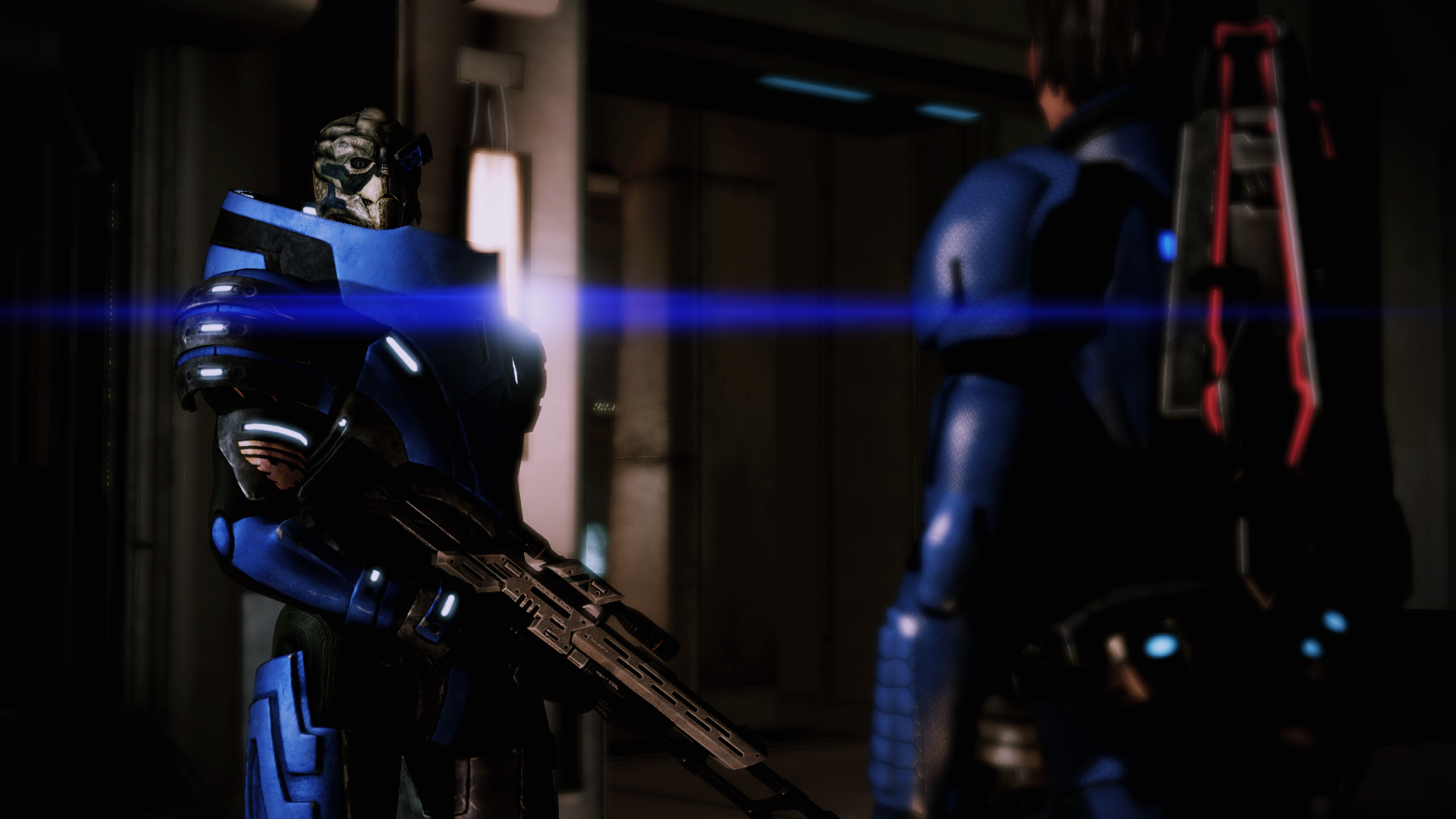
Anybody have any tips on how to get better IQ with ENB in ME2?


Bornstellar
Member
Spazznid
Member
Anybody have any tips on how to get better IQ with ENB in ME2?
Downsample.
GeDoSaTo, although I don't know if it works with ENB, is my go to.
Speaking of which...
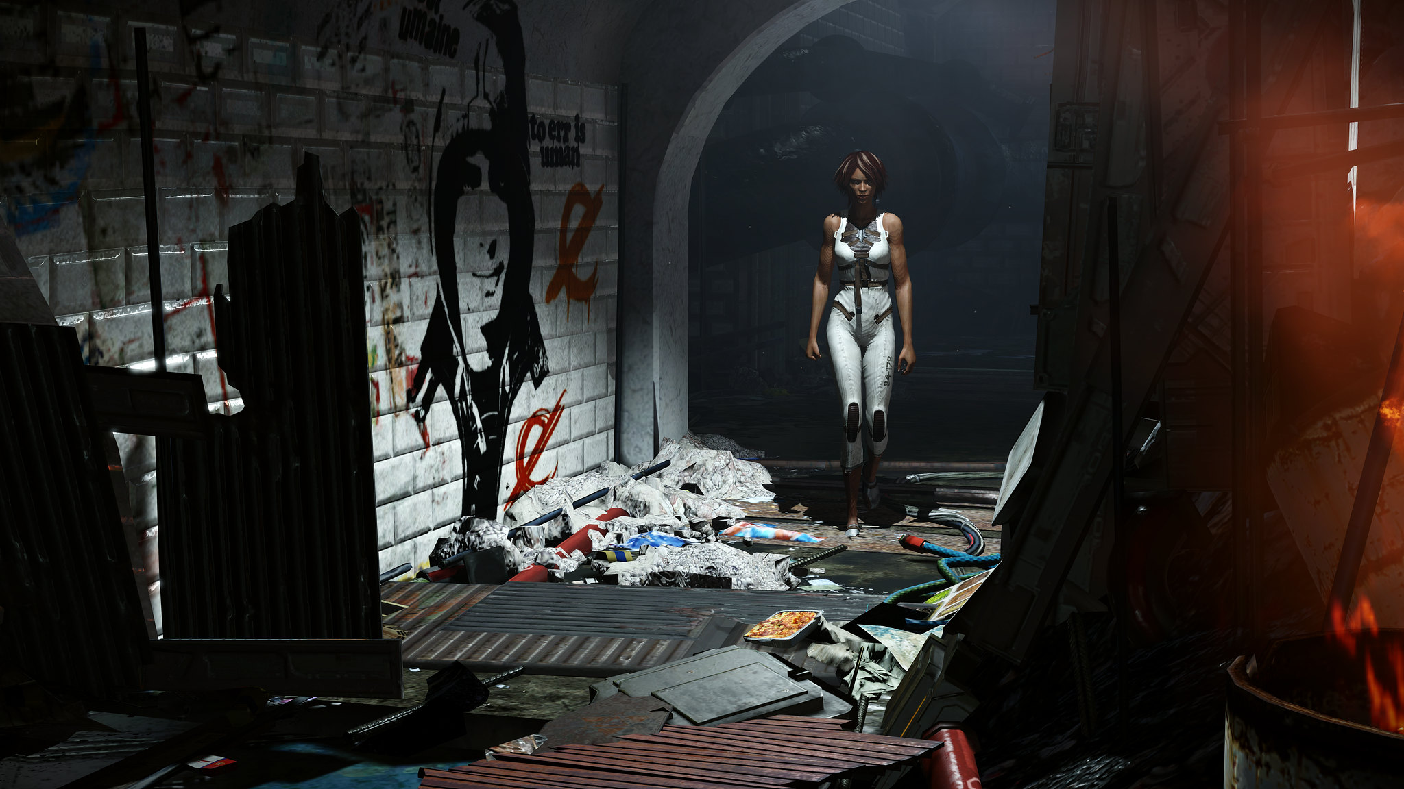
I haven't done a Triptych in a while!
Using the timestop and GeDoSaTo for no-hud is godly.
jim2point0
Banned
Ooo, I just realized how useful GeDoSaTo could be to remove the combat hud from Remember me. That was always tricky.
Spazznid
Member
Ooo, I just realized how useful GeDoSaTo could be to remove the combat hud from Remember me. That was always tricky.
Yup, been playing with it and it's wonderful!


Ooo, I just realized how useful GeDoSaTo could be to remove the combat hud from Remember me. That was always tricky.
Oh shit yeah.
Everyone who takes Remember Me screenshots, you should go back to it again with GeDoSaTo.
More Remember Me is absolutely always welcome.
AnyoneInCherno
Member
AnyoneInCherno
Member
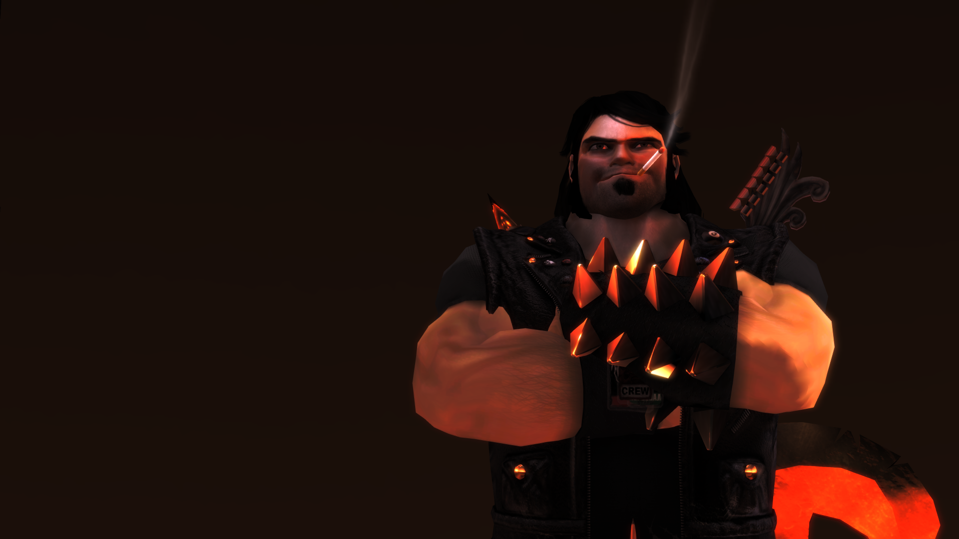
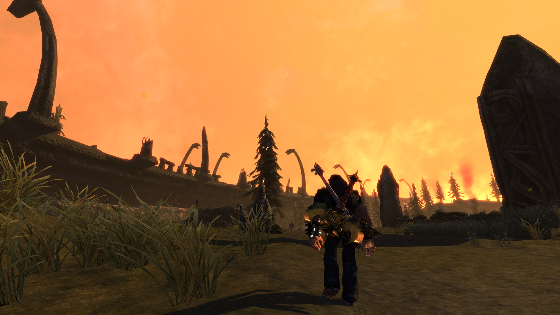
I played it before on 360 but didn't get all that far into it so this is my first time in a long while playing it again. Playing it again I am really enjoying it and its art design, the main gripe I have at this point, albeit a very minor one, is the dialogue being corny at times but I guess it adds to the overall humour of the game. The gameplay itself though is quite enjoyable, I really like exploring the open world and performing solos to gain followers or summon the vehicle hasn't gotten old yet. The combat is mostly hack and slash with not a whole lot of variety, there are new combos to unlock and other unlockables that Ozzy will sell to you but I'm not sure that they add a whole lot more to the combat. I'm not yet up to the arena combat section where you have to do some managing of your team and fighting at the same time and I don't remember it well enough from on console to really say but I don't think I played much further than that on console and that may have been the reason (hopefully not) but I'll see.How do you like the gameplay? I'm on the fence for some time now, bought it on a sale and did not start it yet.
My impression so far is a good one, I'm definitely enjoying it and the humour is nice too. It might be worth trying out especially since you already have it and double especially if you are a fan of some of the artists that make appearances in the game.
Bornstellar
Member
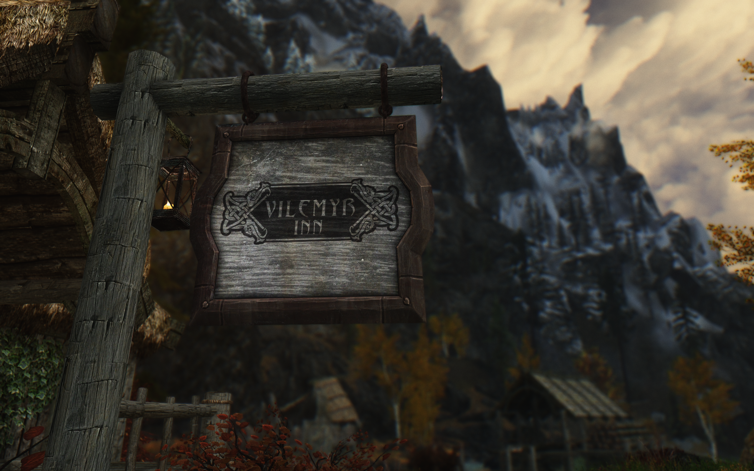
Looks like you are using NLA for the ENB, but what are you using for the grass / ground cover?
AnyoneInCherno
Member
Looks like you are using NLA for the ENB, but what are you using for the grass / ground cover?
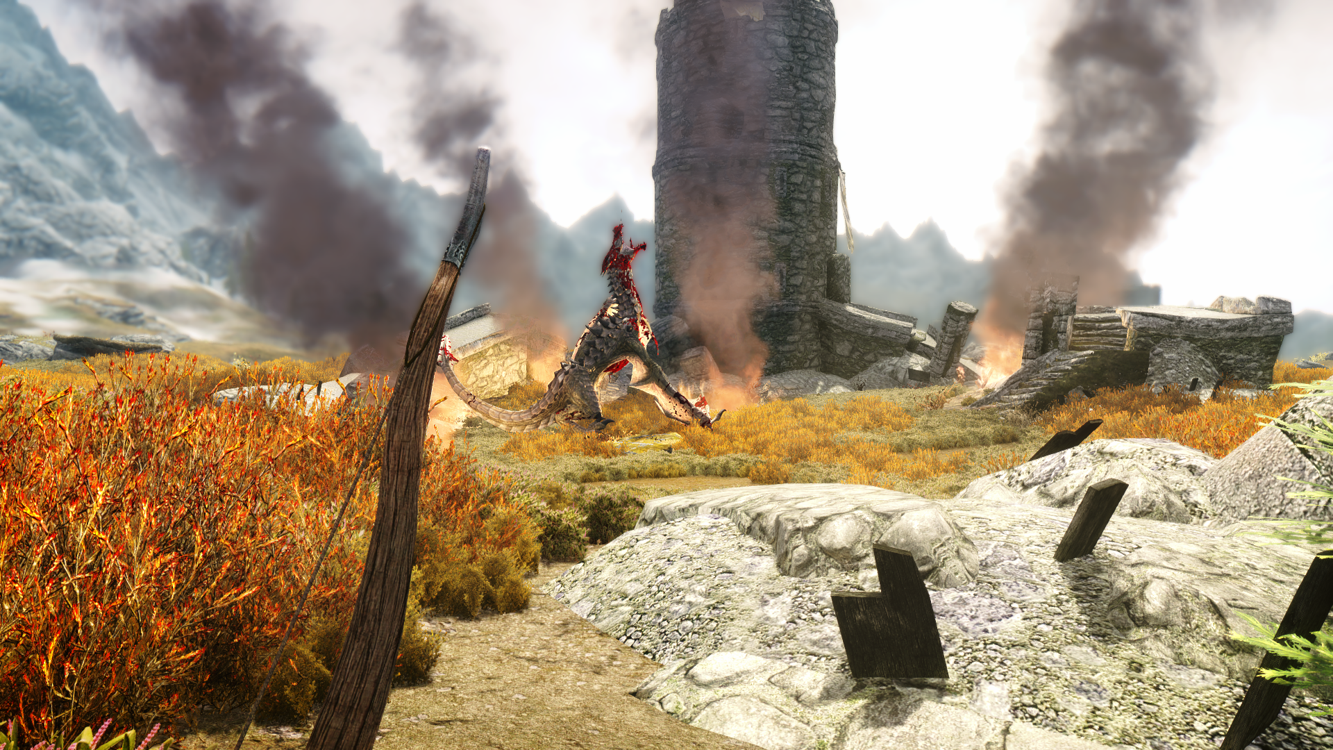
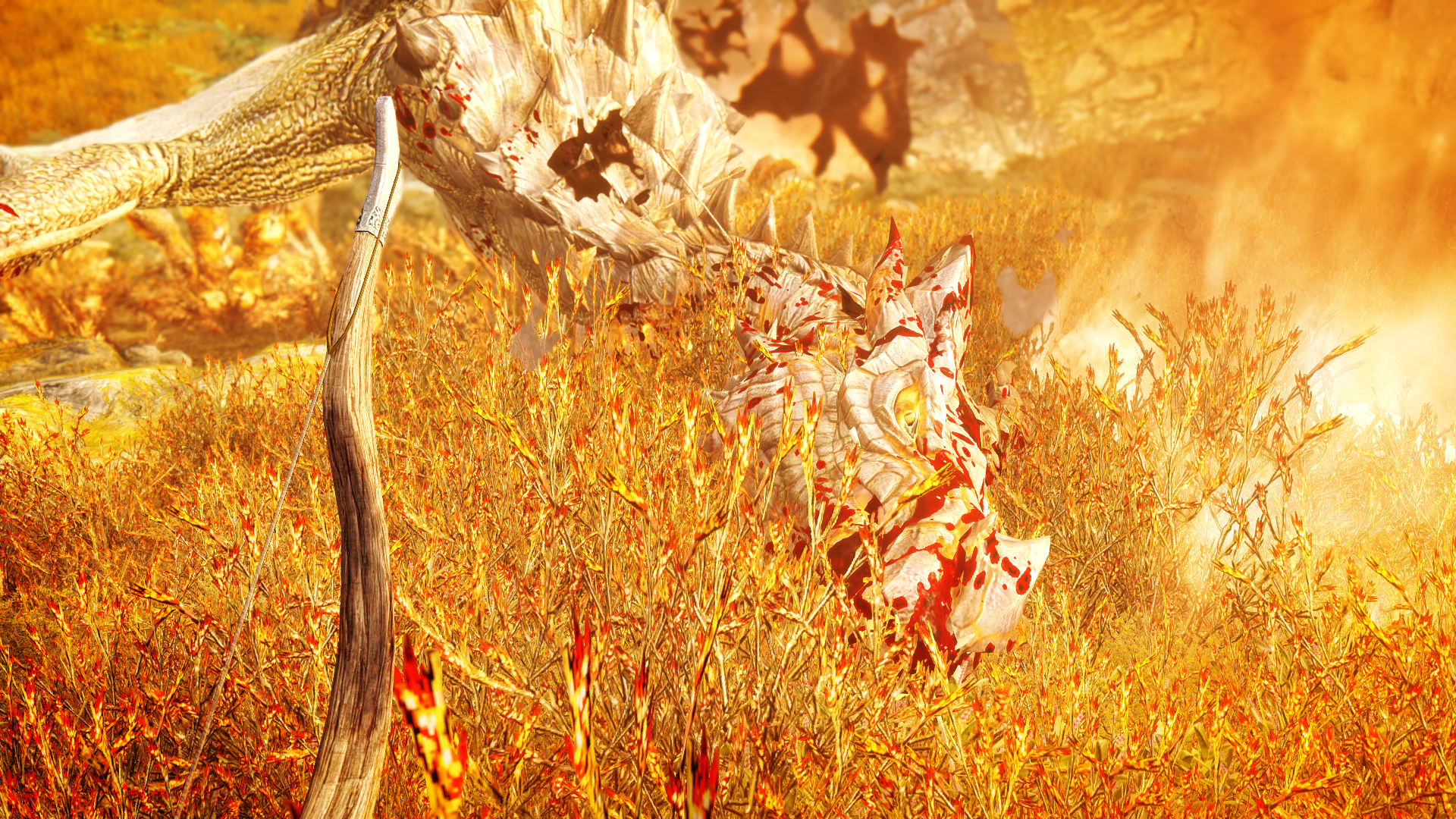
It's a modified version of NLA, but yep, well spotted! I installed the very first grass mod I found, as I'm going to rebuild my Skyrim mod list very soon so I don't really care too much about performance issues and incompatibilities at the moment. Anyway; the grass mod I chose is SkyRealism - Grass. There are probably better ones out there but I'll wait until I've got enough time to sort all my mods out again to find a different grass mod.
Don't use Unique Groundcovers, the performance hit can be quite bad if you've got an old-ish CPU. Looks good but absolutely not worth it, unless you're only going to be taking screenshots.
Spazznid
Member
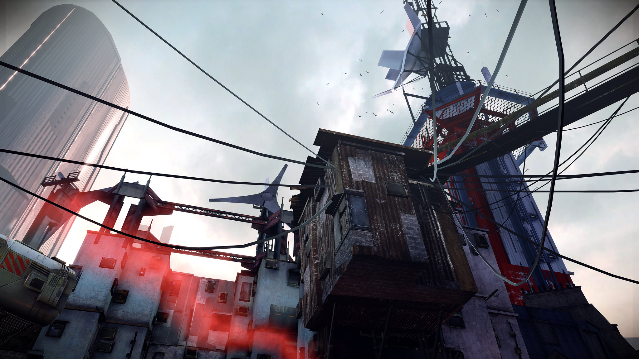
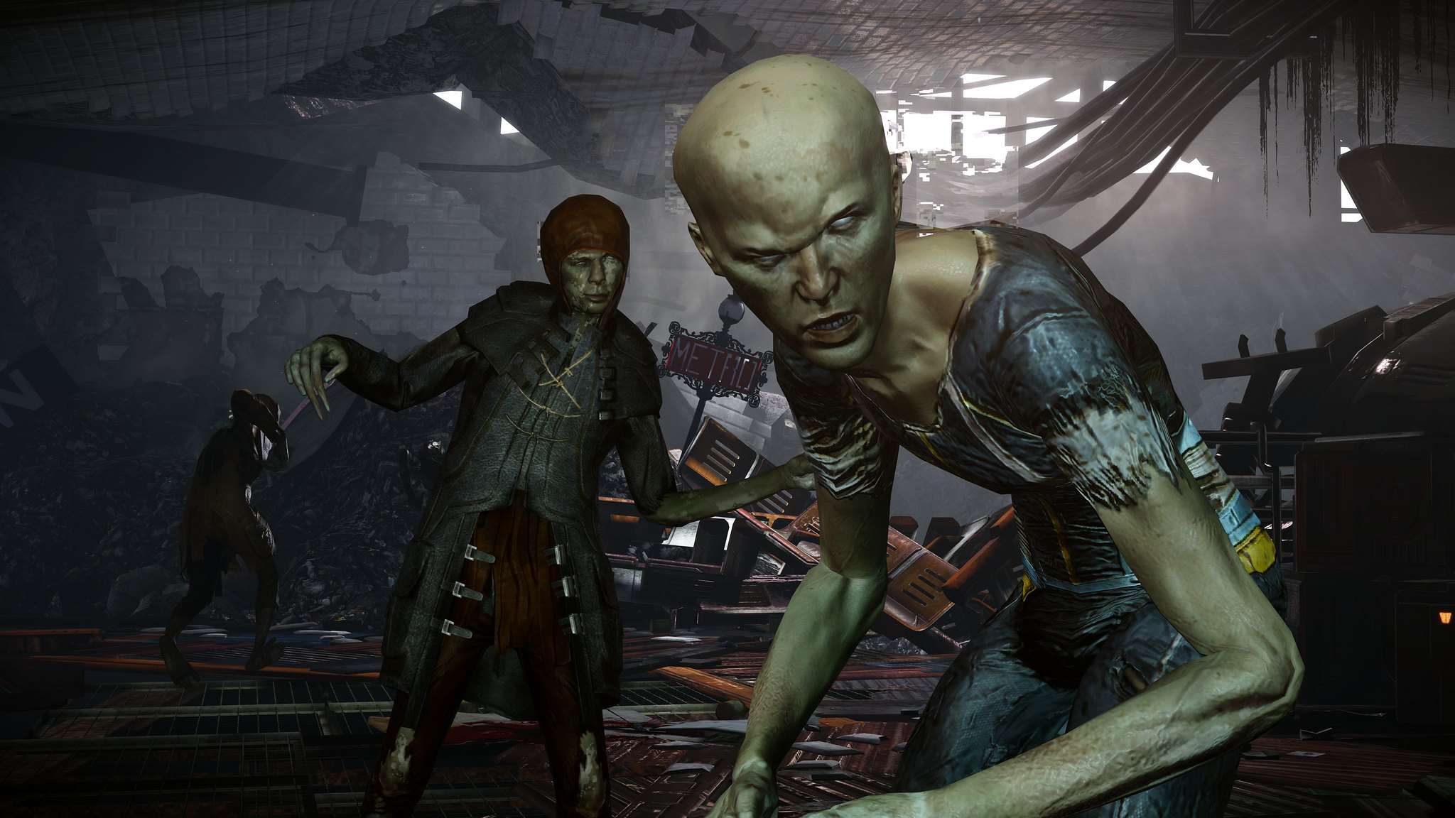
If someone could come up with a fix for the shadow banding, I honestly think Remember Me would be the best looking UE3 game of all time.
AnyoneInCherno
Member
How did you get your character's skin looking like that? Mind sharing your ENB's SSS settings?

