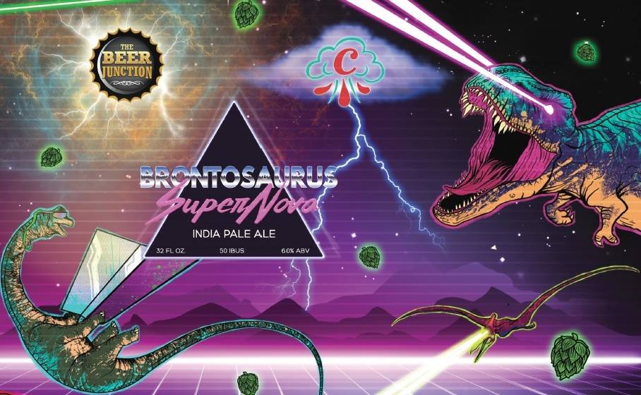
I like the variety of clean styles vs. gaudy art vs. fine art vs. whatever they feel like doing.
I think Modern Times cans / bottles have their own personality too; I think the design aesthetic they are going for is to look like a baseball uniform. The font, the simple color coded lines, the MT logo looking like something you'd see on a baseball hat, etc. It does look a bit "mass market" but it is a craft beer, their aesthetic just happens to be homey.
There's styles I like that also annoy me, like Omnipollo's completely useless bottles lol. Have to look up on the internet and find the bottle style to see what kind of beer it is half the time as the info is sparse or sometimes not there at all.
Hm I never thought about the baseball aspect, but you're right, there is that aesthetic there. Yeah Omnipollo's are a bit silly, but now you've made me remember that my local used to get some distribution of them, but haven't seen any in a couple years.

On the other end of the spectrum are Clown Shoes whose labels are terrible and amateur hour.
I think the market is also getting to a point that "craft brewery" is starting to lose some of its meaning. I don't worry about the "industry" much, but are breweries that get regional or national distribution still craft? Is it more about the attitude and the intent? For instance, Stone has gotta be the biggest "craft" brewery there is, but they still seem a bit daring. A brewery like Golden Road on the other hand seemed designed from the start to go big. Their labels are clean, well-designed, and inoffensive, and I could easily imagine Golden Road commercials on TV. They have some great beers, and I've met the owner a few times and she's rad, but the vibe of the brewery seems more mainstream focused.
On a sidenote, I'm seeing Founders here now even in chain grocery stores. Never even seen them here before last year. Did they get bought out or get a national distribution deal?


