Confidence Man
Member
It's blurry because it's upscaled. Seeing it alongside Infamous it's really obvious, feels like my eyes are constantly trying to focus.
Is this blurry?(excuse the DOF in the background)

It's blurry because it's upscaled. Seeing it alongside Infamous it's really obvious, feels like my eyes are constantly trying to focus.
Damn, those buildings:/
I know.:/Damn, those buildings:/
How do you get images of infamous at 5760x3240?
He does create a reflection, but there are many items in the game that use pre-baked reflections, like some puddles and windows, where he doesn't show up. But there are real-time reflections used for streets/pavement all over the place, where every item in the game world is reflected. It's subtle though, and the wetter the pavement the more you see it.The only fault or nitpick I have with the visuals in inFamous, is that your character doesn't create a reflection. Anywhere. He has a basic shadow but when standing in wet roads that are reflecting cars, street lights etc, he is just casting a shadow.
Even early in the game there's a mirror (or mirrored fish bowl or glass I can't recall) and he has no reflection at all.
I don't know if it's to do with some of the visual trickery they've created or not but it would help the (very slight) cutout look he has.
ya ive never played Ryse (or own a Xbone) but I really find it blurry in every shot I see


Is this blurry?(excuse the DOF in the background)

But at least the flowers look great!!!=OMake the characters as low poly as possible. Put all the polys you can into the flowers circling the arena. the hell
Yes, it's real time, the objective on the top right of the screen gave it away.=p:O
This is in real time? Because it doesn't look blurry at all, unlike the other ones.
But at least the flowers look great!!!=O
Yes, it's real time, the objective on the top right of the screen gave it away.=p
But at least the flowers look great!!!=O
Yes, it's real time, the objective on the top right of the screen gave it away.=p
Yeah I can see that happening more in the future.What makes it look almost real are the eyes. Crytek really nailed them. That pixar/avatar experience really helped.
I want to see more games that render eyes correctly in the future.
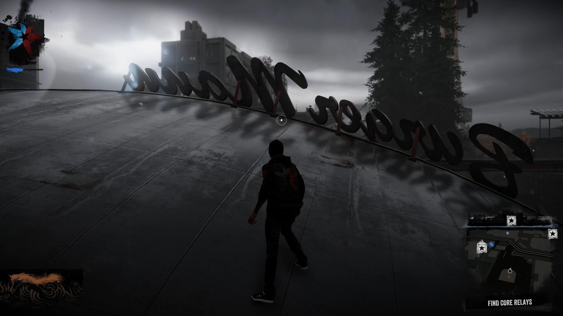
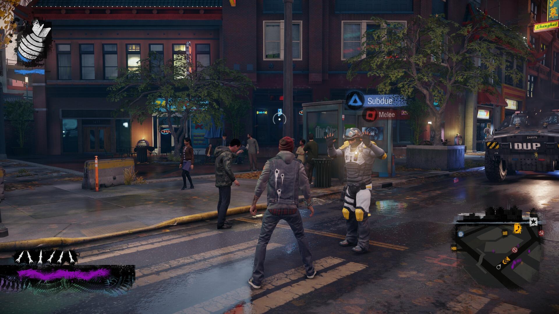
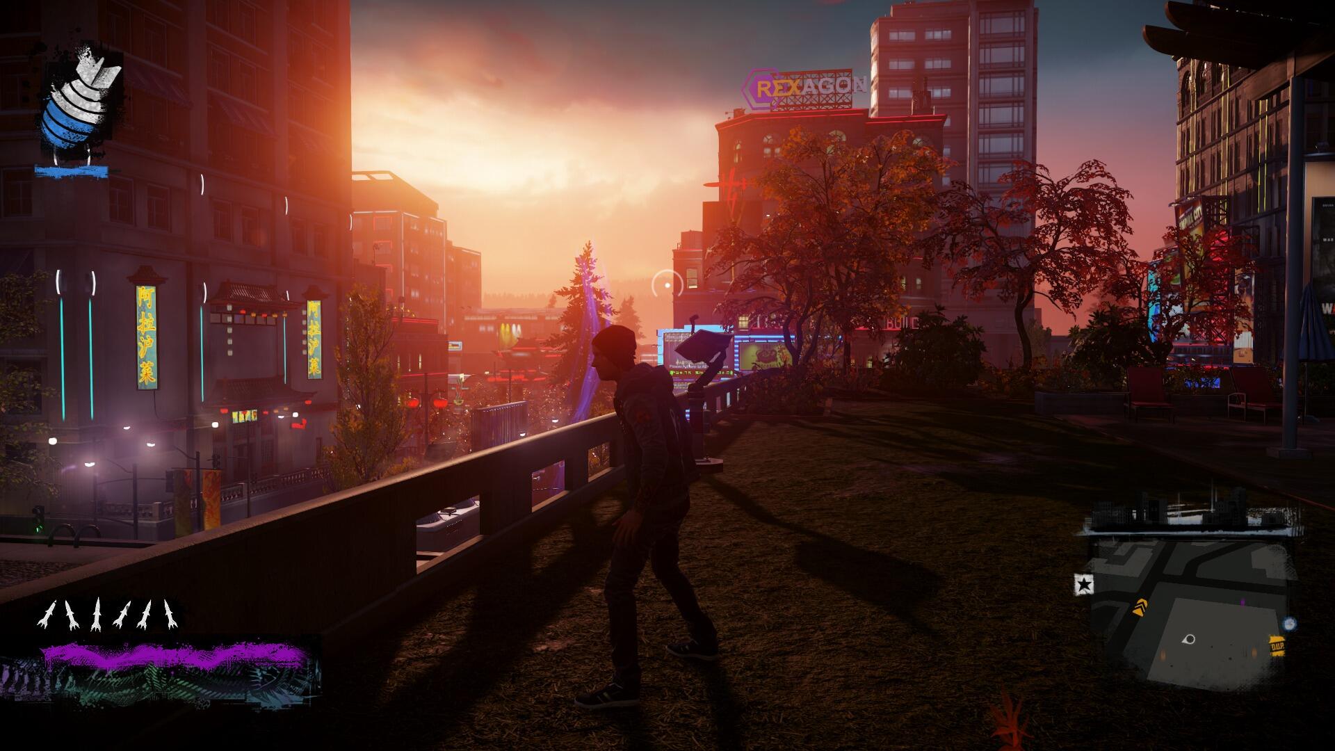
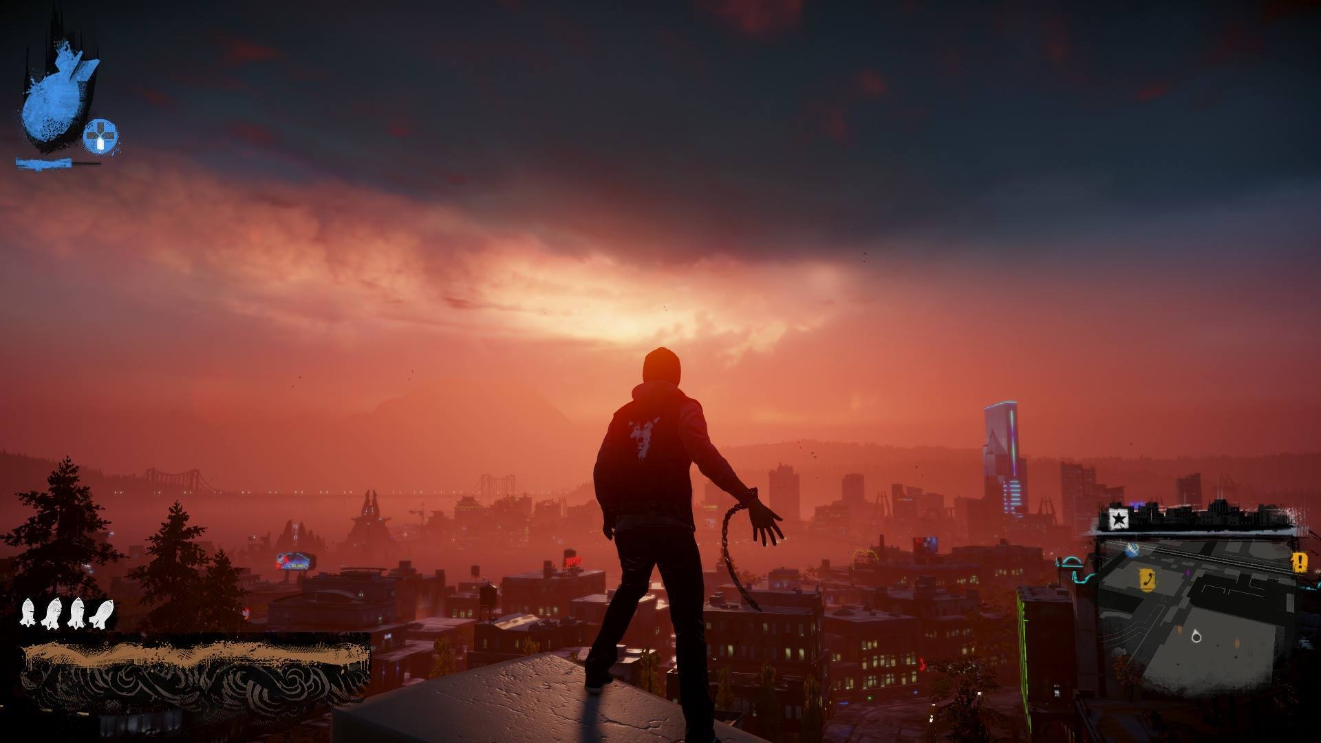
Isn't anyone going to post any inFamous: Second Son screenshots?
Jeeze, the only thing I'm gettin from all these Infamous screens is crushed-to-hell blacks. Does the game actually look like that, or is it just the way these screens are being captured?
Isn't anyone going to post any inFamous: Second Son screenshots?
Probably not a good idea to view them on the Xbox one browser
.
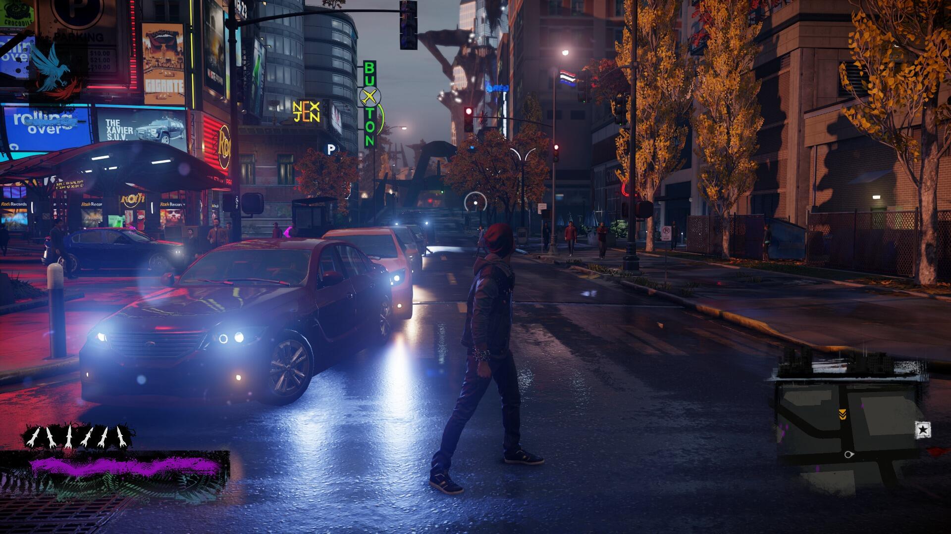
I went through my captures of Infamous Second Son on my PS4 and was mortified to find that I have taken HUNDREDS and HUNDREDS of screenshots. My goodness. I must be pressing the share button every minute that I'm playing.
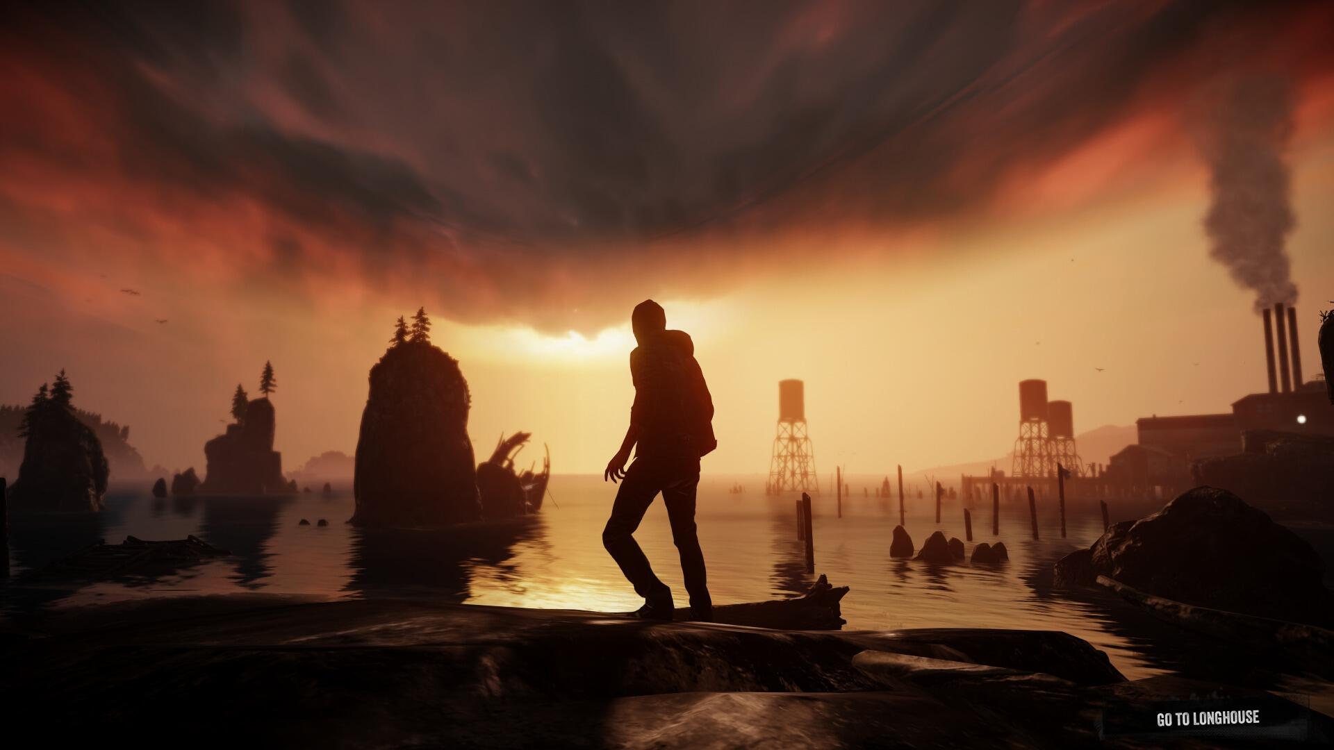
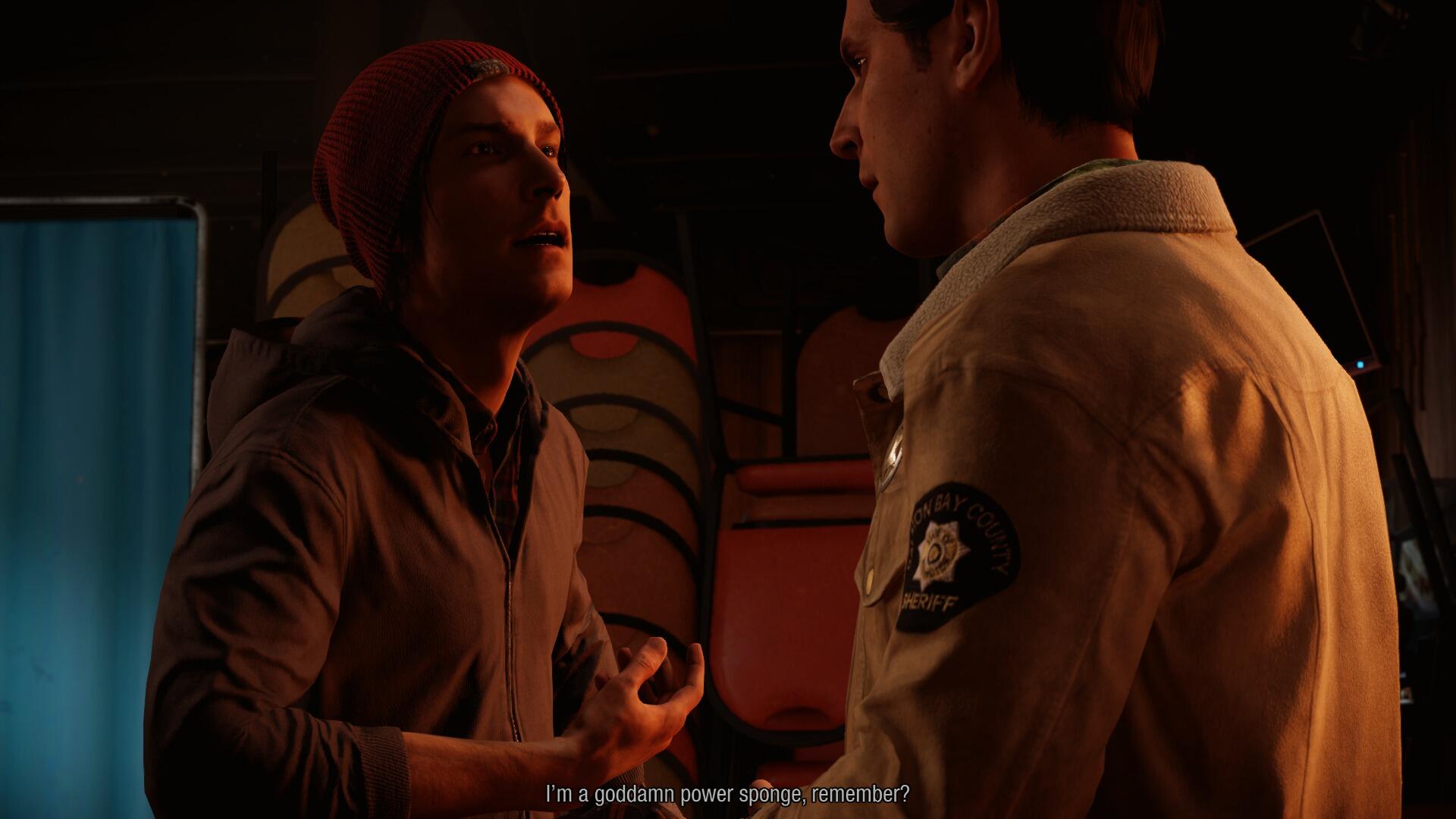
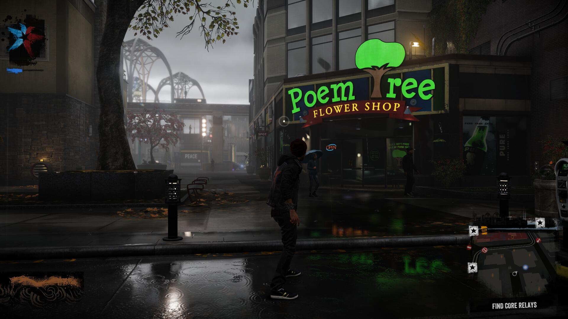
ronsimmons.gifProbably not a good idea to view them on the Xbox one browser

What is this ?. is it a reference to something or completely meaningless ?, or could it be anything to do with future dlc ?

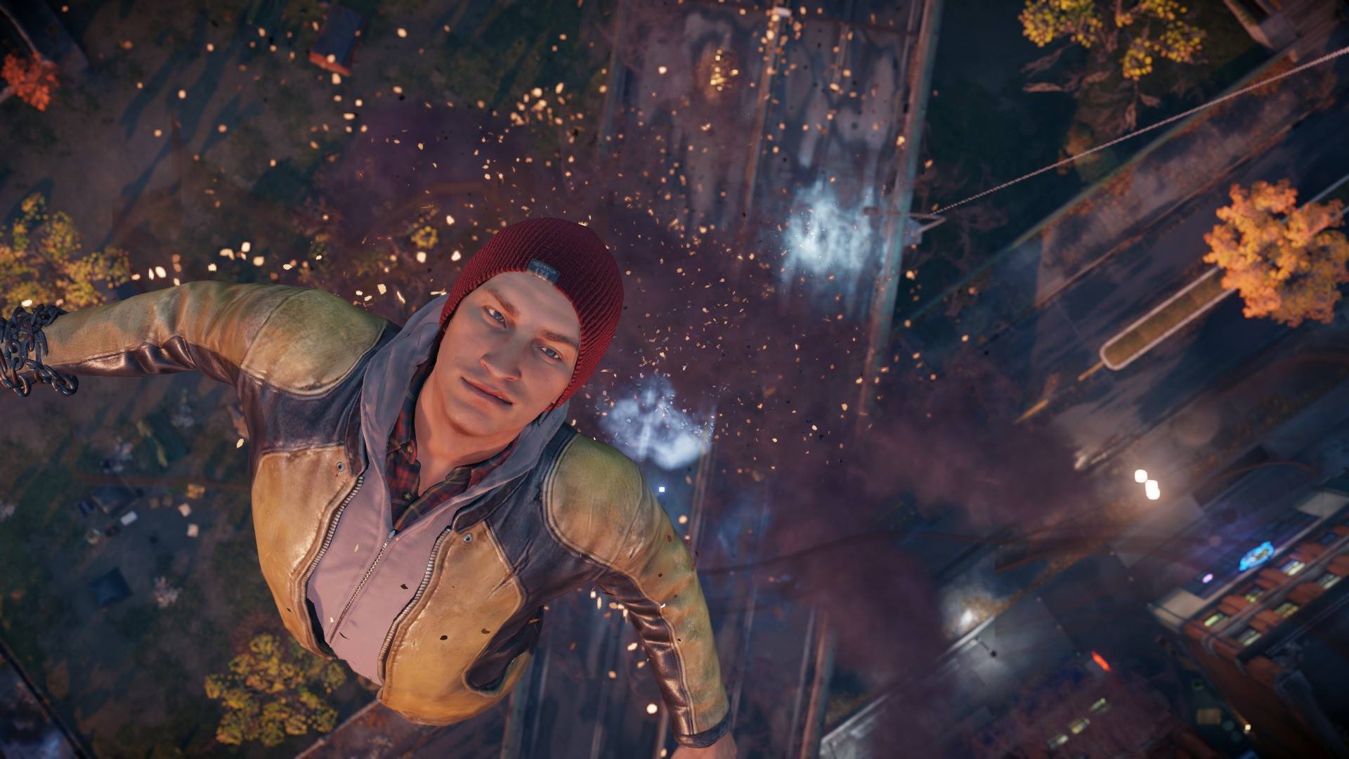
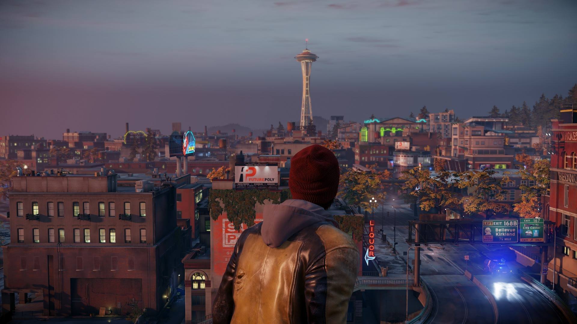
InFamous SS is gorgeous but weirdness like the light from the headlights magically going through the car in front of it is going to become more and more noticeable as fidelity and realism increase.


I hope Sucker Punch puts out an update eventually to where you can turn off the HUD.. it's kind of a hassle doing the HUD removal trick over and over. Here are just some regular shots.
