Phreakuency
Banned
Not the best looking game but decent enough. Bit disappointed in the gameplay so far. Or lack of. Nearly up to Chapter 4 and there's been maybe a few minutes of gameplay and a handful of fights :/
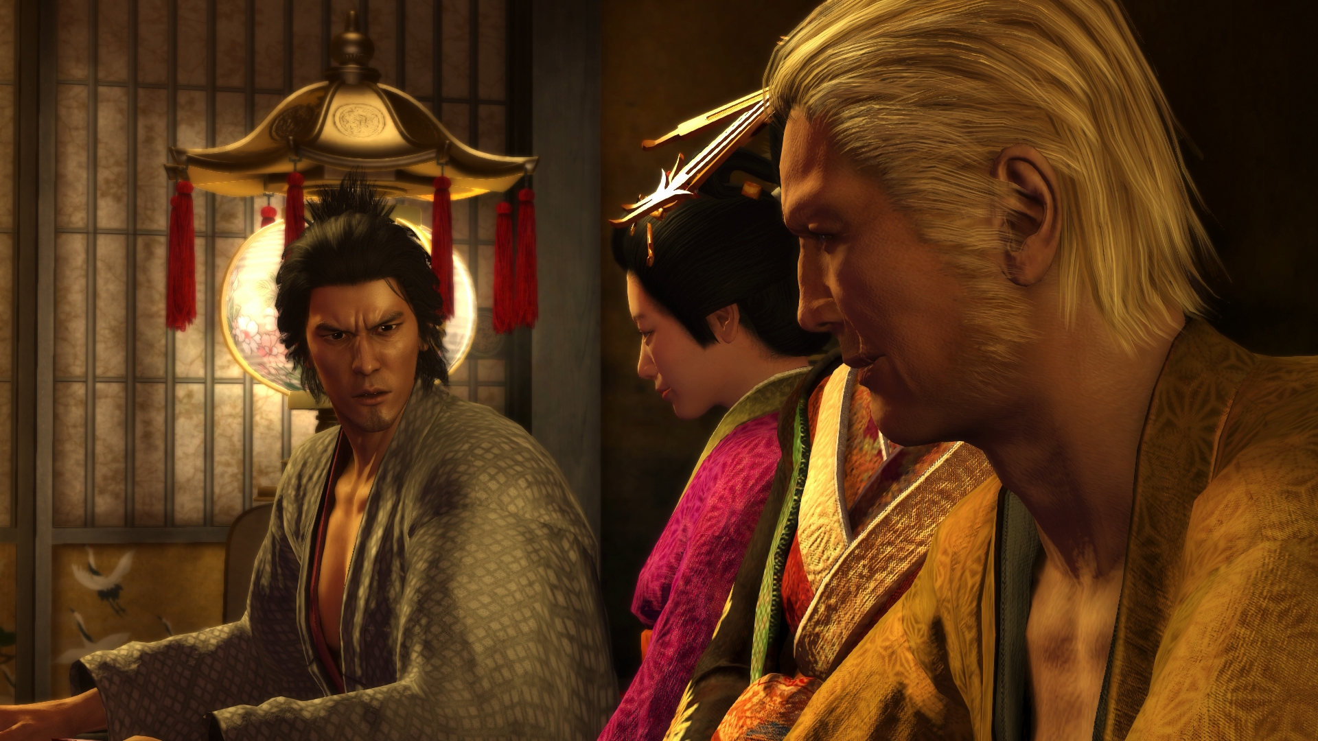
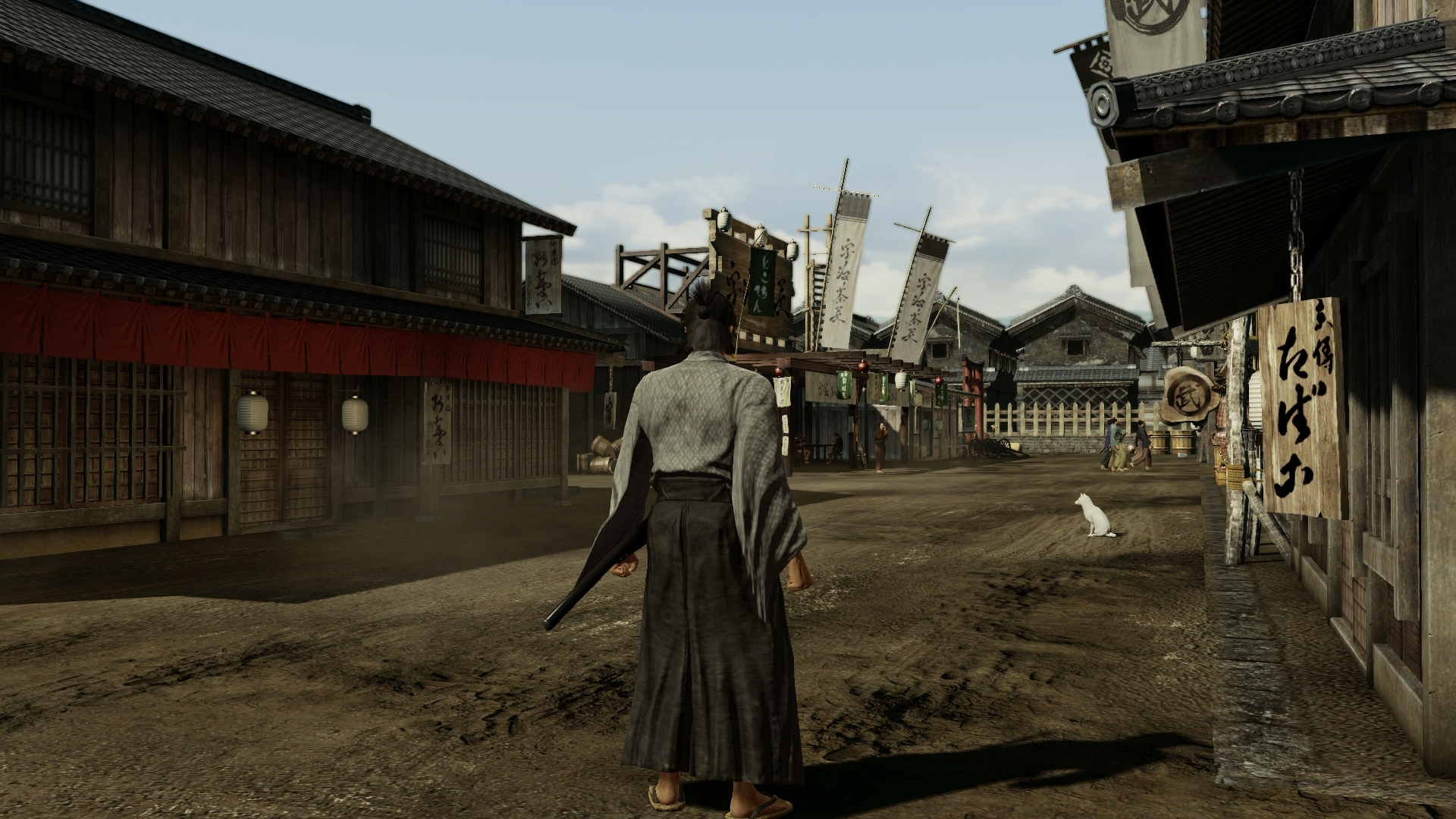
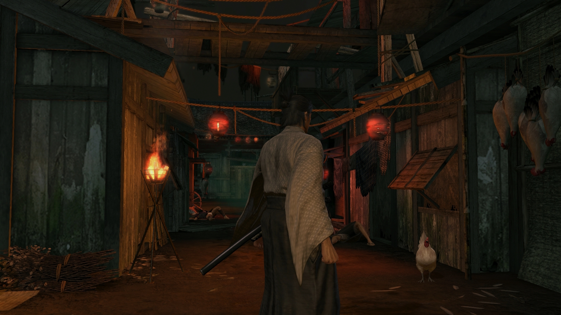


Not bad, but it's really blurry compared to Second Son due to being 900p and not 1080p.
It looks really good for a 900p game though.
This has become the infamous SS thread lately.
Fair enough, I think it is pretty damn consistent grpahically, and definitely more impressive overall than the two you mention.
You can't be serious... SM3DW, compared to this game ? You may like its art better and it's okay, but technically, it's not even close...
I'd have to disagree. Second son looks incredible more so than the two you mention. It's hard to look at those games after seeing second son.
... SM3DW? I can kind of understand someone thinking KZ is better looking, but come on now.
I disagree on both though, I think SS is easily the best looking next-gen game around right now.
Yeah I don't agree with SM3DW or KZ either. I think Ryse or Crysis 3 are still kings for me personally.
Crappy Samsung 3d non smart tv by the looks of it.
I wish the PS4 came with some kind of calibration software.
This shot is crazy blurry. I don't know why but Ryse has never impressed me visually.


Second Son is a mixed bag, graphically. Faces and character models are insane, great particles, but some of the buildings look crappy, and the foliage isn't fantastic. Still, for an open world game, it looks incredibly good.
Shadow Fall and SM3DW still kings.
I prefer full over limited.About the TV discussion, do you recommend to put RGB on FULL?
Right now it's on automatic on my PS4, does it mean the PS4 detects by itself what's my TV support or is it just another word for LIMITED?
I have to admit that Infamous does not look as good as those pics you are posting on my TV, i guess maybe it's not calibrated or maybe my model is too old (it's LG LCD without 3D or smart TV that we bought in 2010 or so but it does support 1080P), but the image on my TV is a little blurry compared to those screens.
I think he is referring to buildings effected by LOD like the ones in this image:Don't know if I must take your post seriously concerning the buildings, but just in case it is, I totally disagree...
I have both games you mentionned and I really don't get where you want us to go with them...
Some buildings ? Crappy ?! Come on, they all look perfectly realistic, and if you have found crappy buildings it's probably because IRL there are too crappy buildings, so it would be because of their design, but not for their pure assets which are definitely "next gen". Materials are properly rendered for all of them for what I saw, and heavily detailed...
For my part, I think buildings in ISS are the best I've ever seen in my player lifetime, and they are certainly what I prefer the most in term of visuals in SecondSon (after the wet effect meanwhile)...
A statue of Lenin in Seattle? I thought Americans hated communism?!
Second Son is a mixed bag, graphically. Faces and character models are insane, great particles, but some of the buildings look crappy, and the foliage isn't fantastic. Still, for an open world game, it looks incredibly good.
Shadow Fall and SM3DW still kings.
I prefer full over limited.
It typically picks the default setting of what's best for your TV/monitor.Automatic on PS4 means limited?
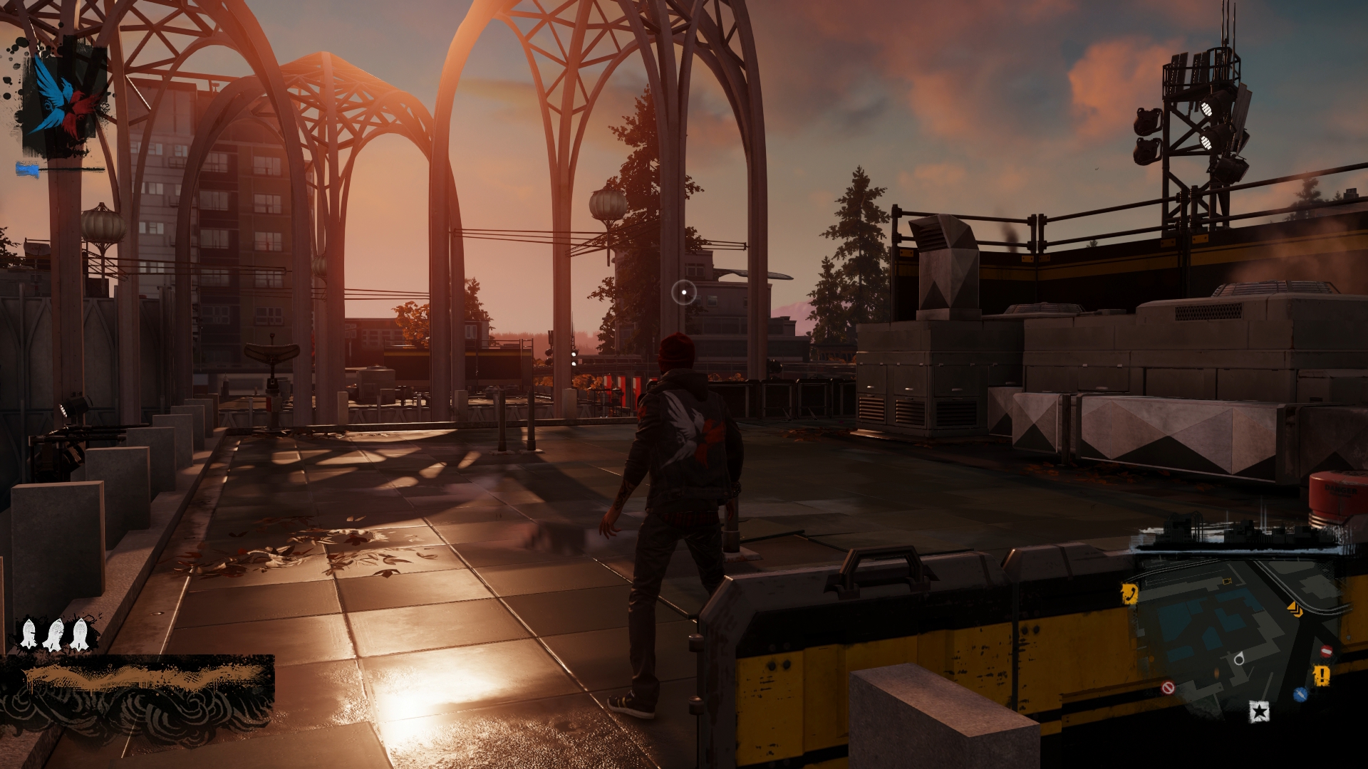
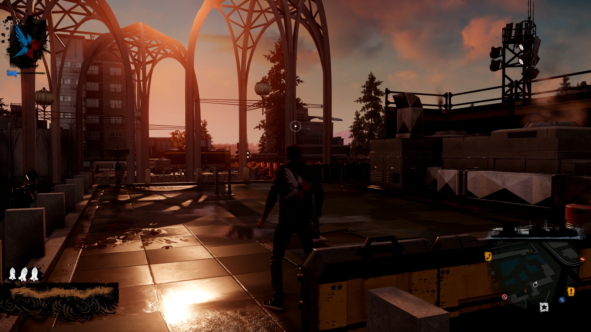
I think he is referring to buildings effected by LOD like the ones in this image:
Cant believe ive taken 100+ shots of this game already and still going
Some crappy old left overs:

crappy
You can't be serious... SM3DW, compared to this game ? You may like its art better and it's okay, but technically, it's not even close...
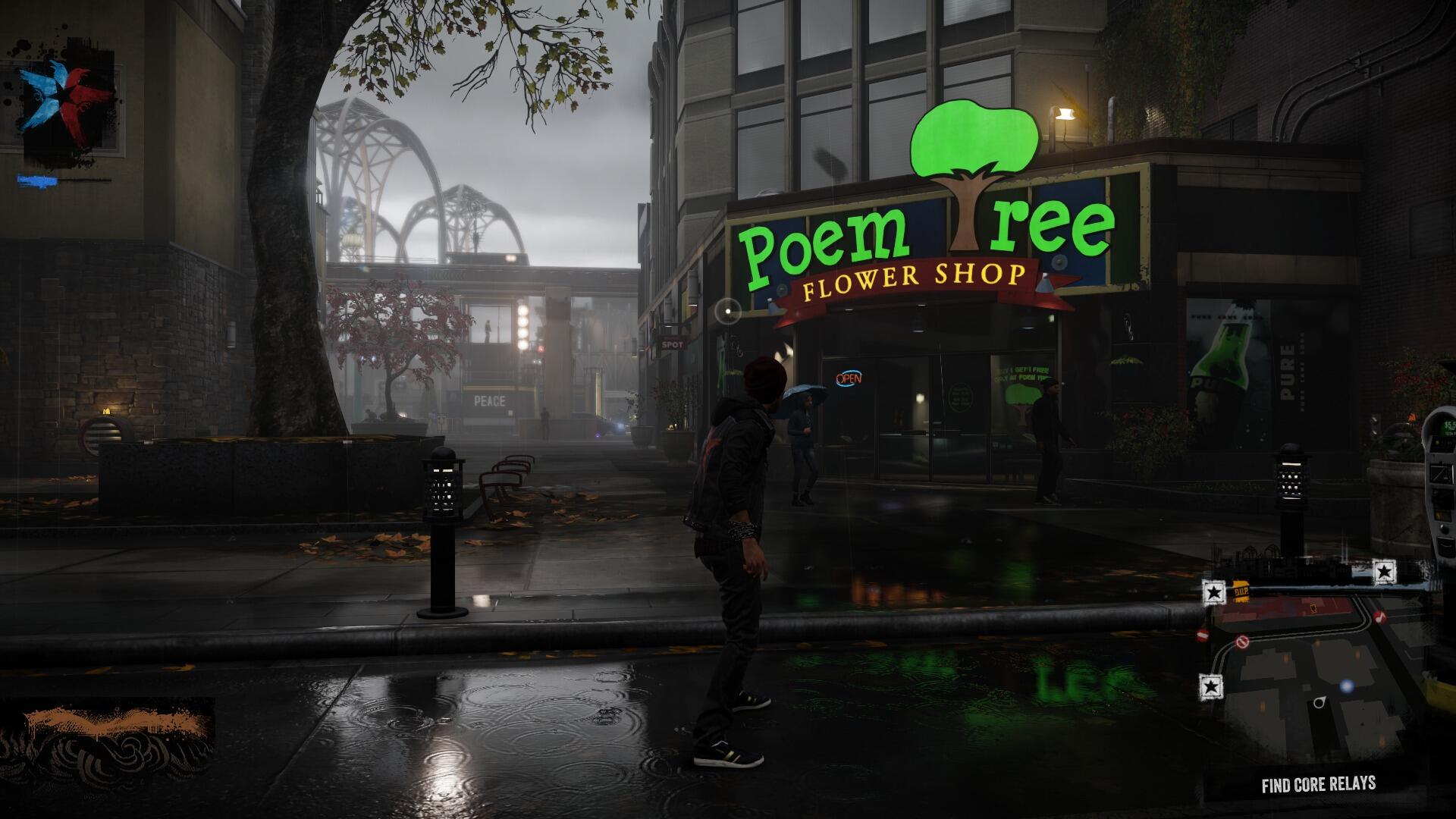
^realtime puddle reflection (pedestrians are mirrored when walking by)
^ like the last two shots


^ like the last two shots
have to correct myself on this one. after playing some more and some closer observation it becomes pretty clear that building reflections are merely cubemaps. that gets pretty obvious when you watch shop signs dislocating under different angles. stuff on the street (mailboxes) and NPCs are reflected correctly though.
"Hey Link, see you in Smash Bros. sometime soon!"

Sonic: the blue blur, the fastest thing alive... but can he outrun the Cucco?

Something about that Link stare...

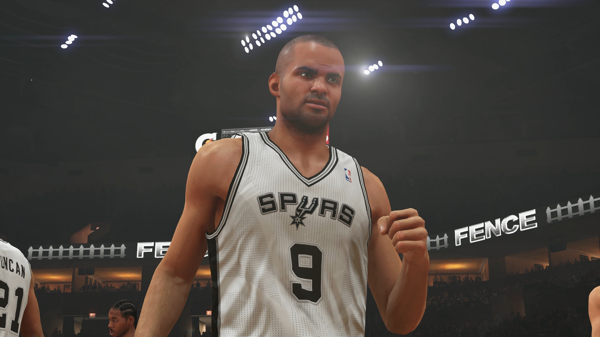
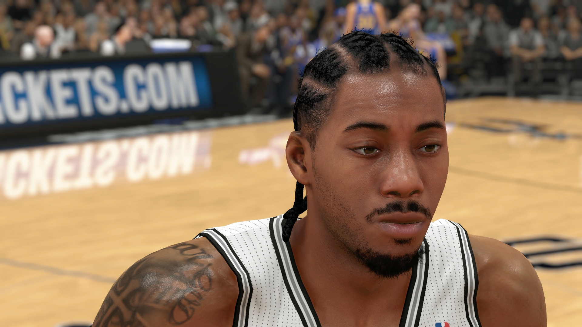
You can't be serious... SM3DW, compared to this game ? You may like its art better and it's okay, but technically, it's not even close...
3D World has a lock 60 fps, so it trumps SS!
I wish Nintendo didn't cheap out on hardware, EAD would annihalate the competition on equal hardware.
3D World has a lock 60 fps, so it trumps SS!
I wish Nintendo didn't cheap out on hardware, EAD would annihalate the competition on equal hardware.
I hate graphic wars. I know this has been said countless times but can't we just enjoy the games for what they are?
Lovely compression but figured I'd share:
Question to PS4 owners using capture cards...what's the best HDMI splitter that removes HDCP protection?
Thanks in advance.
Question to PS4 owners using capture cards...what's the best HDMI splitter that removes HDCP protection?
Thanks in advance.
This thread is actually about the graphics, though.
This thread is actually about the graphics, though.
But people are arguing about something something that is totally subjective. There's really no point in that. What looks great some one person looks like ass to another. Arguing about the details is a futile gesture at best because it's those details that make up the scene in the first place. If people like the look of SMG over Second Son, then what would be the point of even arguing about their taste? That's like arguing over whether or not Melville is better than Rice. There's really no future in it.


