You are using an out of date browser. It may not display this or other websites correctly.
You should upgrade or use an alternative browser.
You should upgrade or use an alternative browser.
Consoles screenshots thread (PS4/Xbone/WiiU) [Up: Thread rules in OP]
- Thread starter Peterthumpa
- Start date
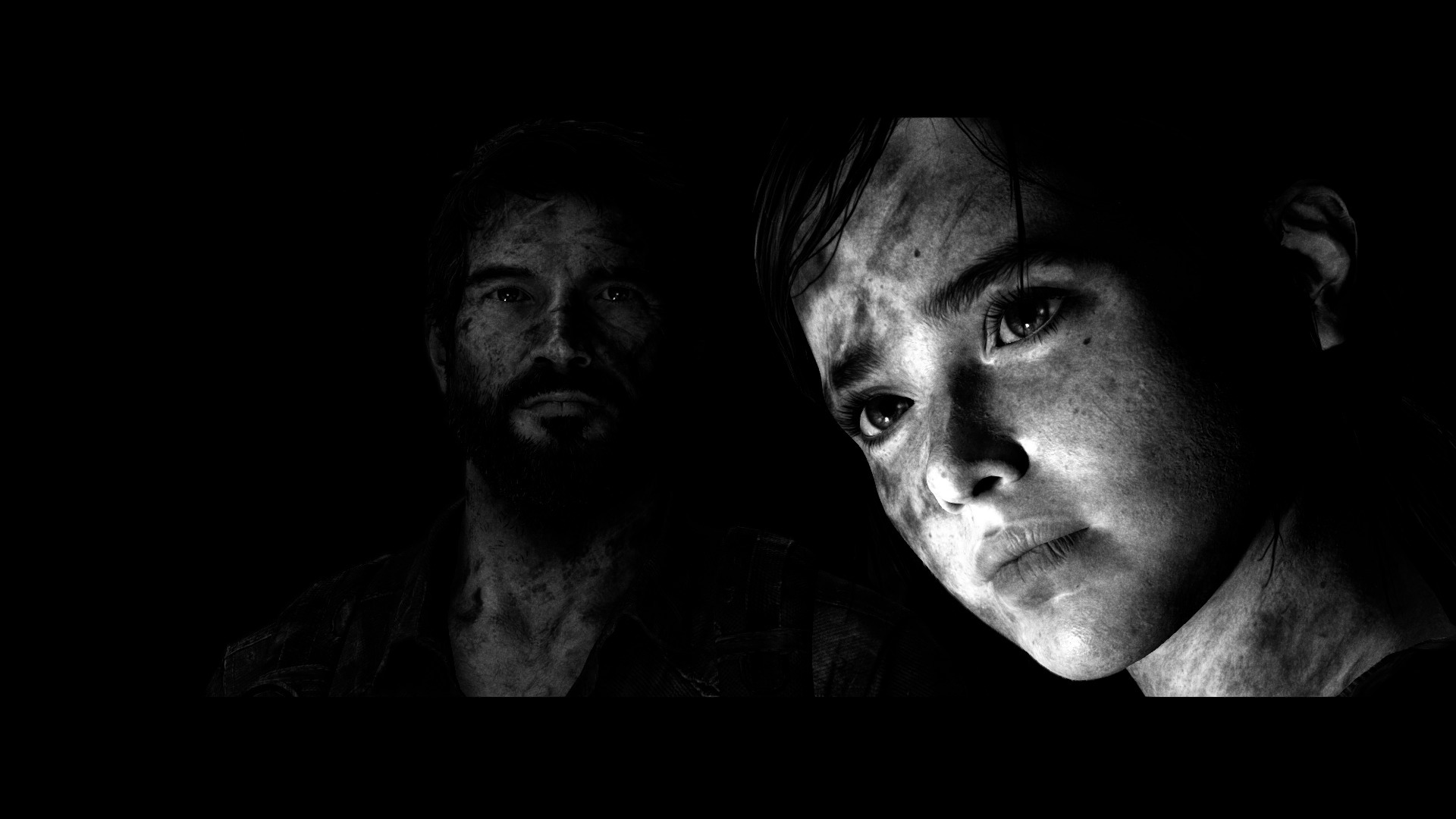
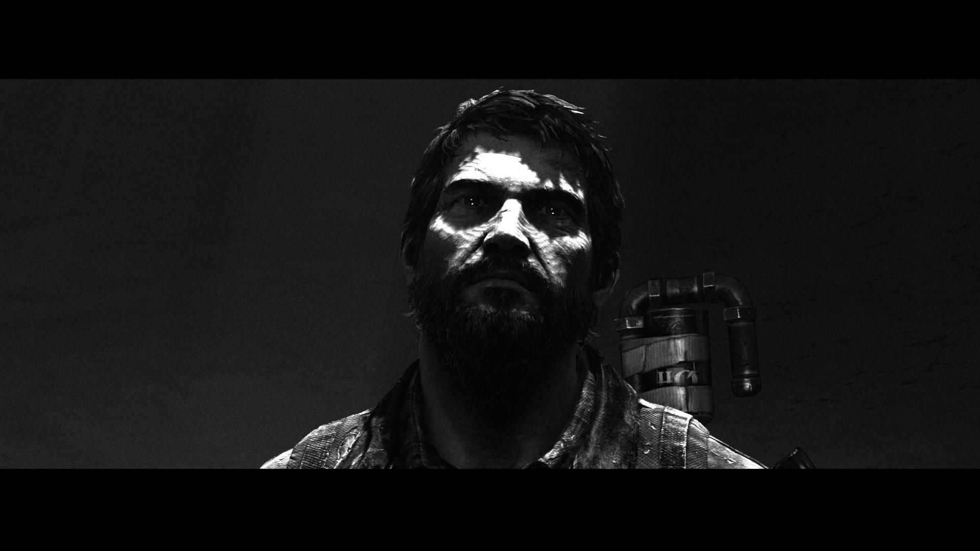
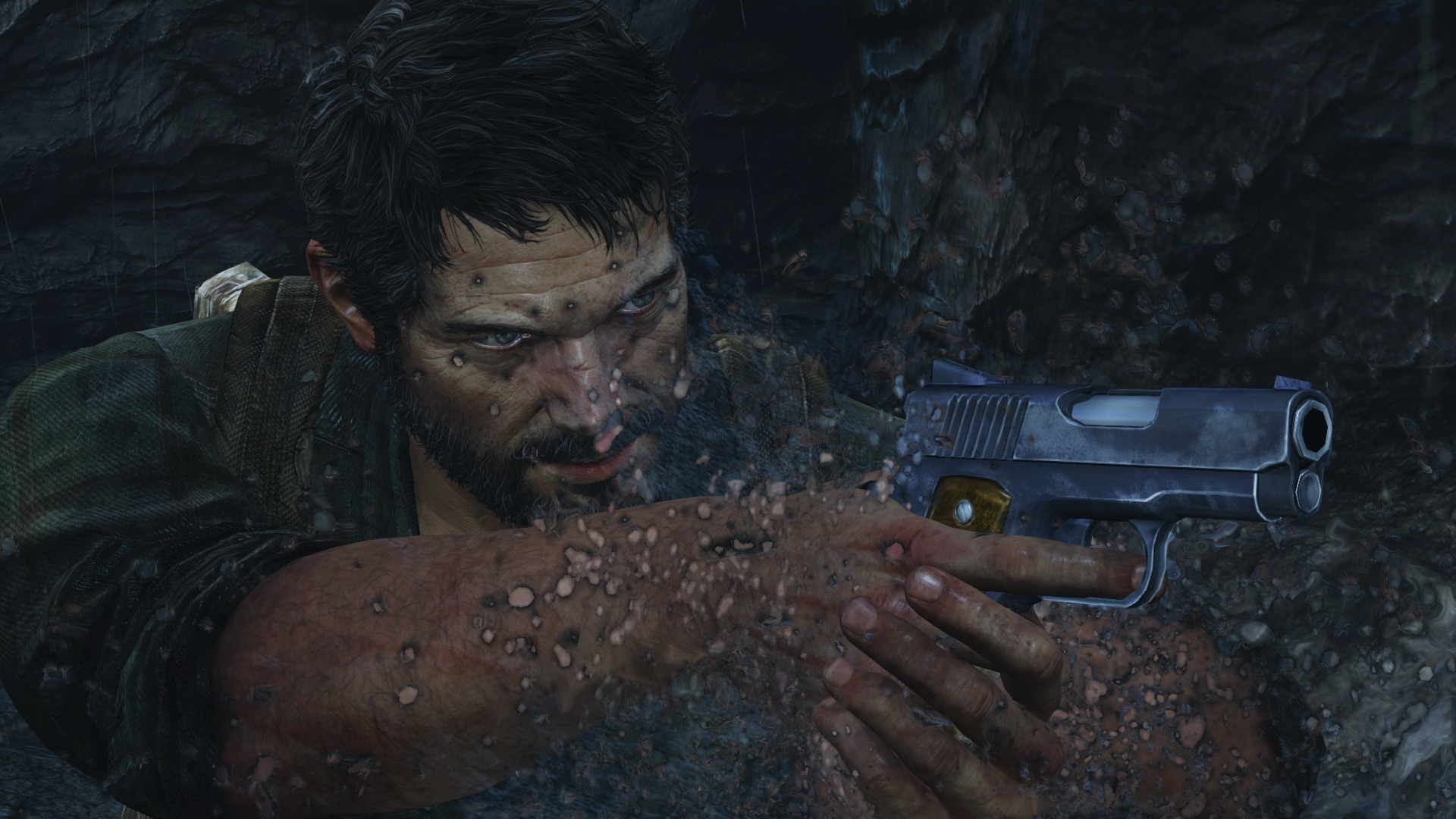
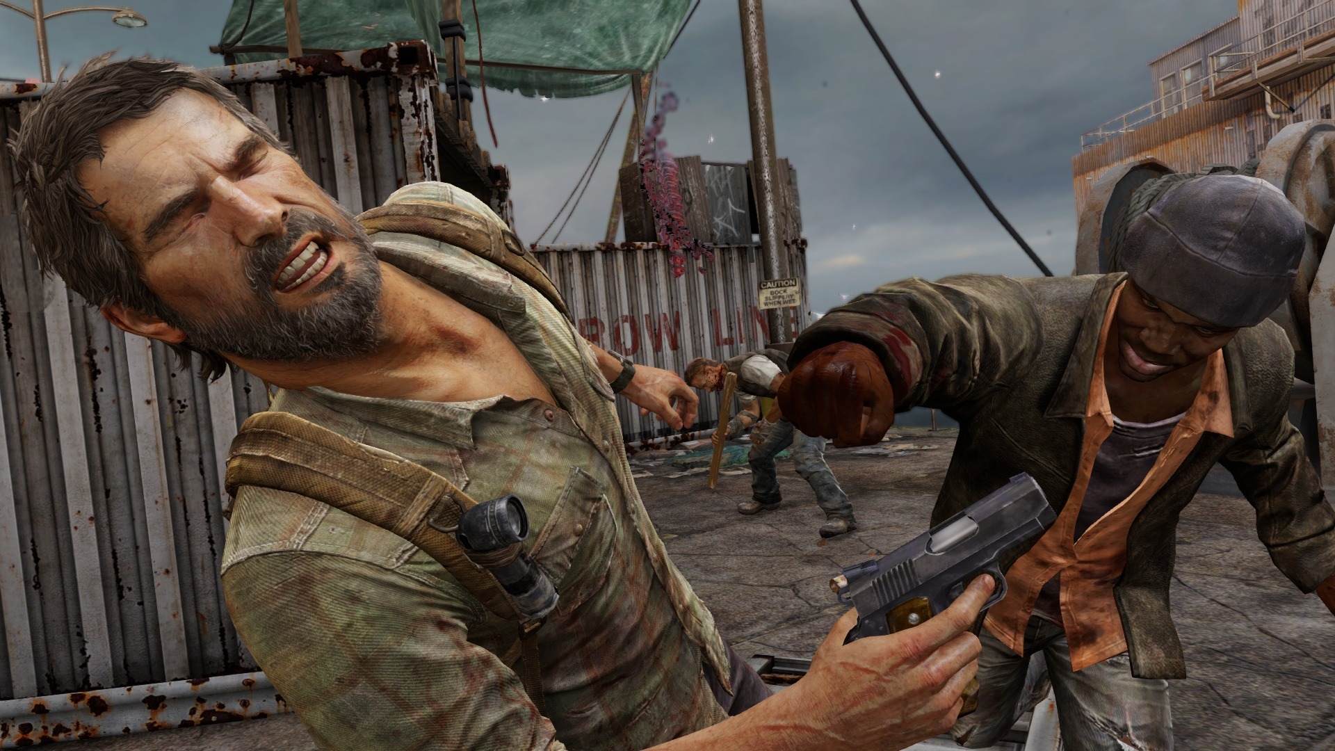
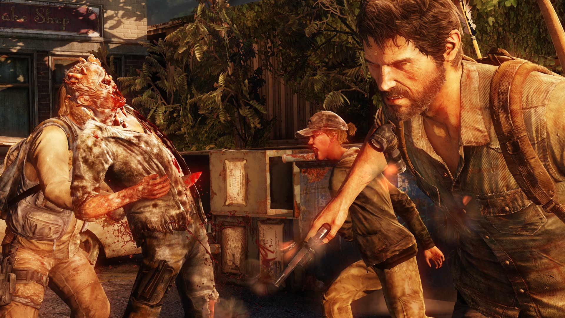
Played through it on PC but was curious to see how it looked on PS4 and rented it from GameFly. Looks nice to my eyes, just needs better AA:


Excellent.
Love this shot.
It looks better than most of my PS4 library.Kojima must have been trolling when he said they intentionally downgraded the graphics for PT.
It looks miles ahead of Metal Gear and most next gen games. Really the only problem I have with it is the shimmering.
That is a desktop image if I've ever seen one.
N7Commander95
Member
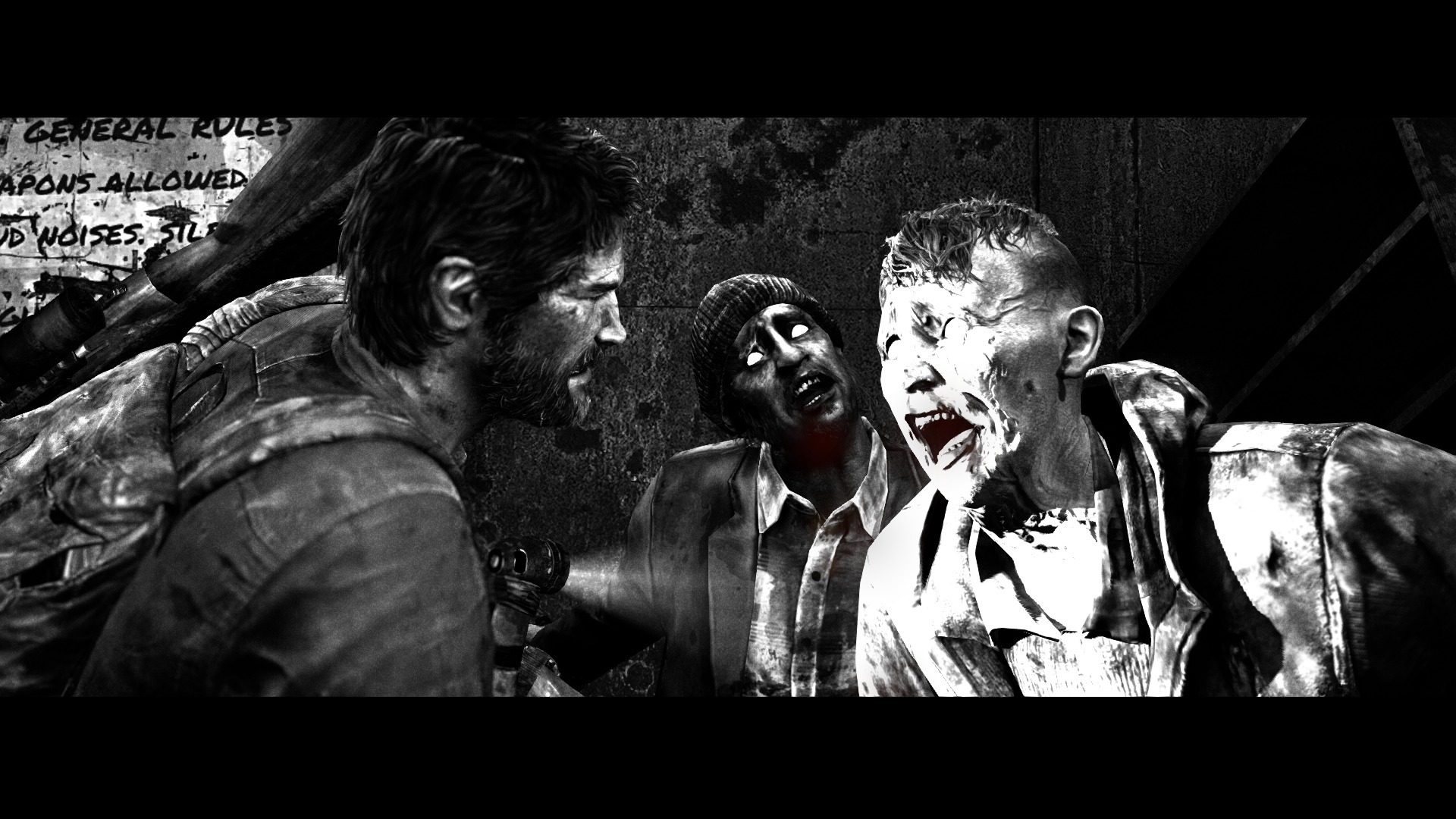
I agree with the Last of Us comments,
Other than Joel's character model, I'm not really feeling it. The artstyle is still strong, but I just don't think the environments hold up nearly as well as the character models.
No PT, flipping heck, that looks amazing.
Other than Joel's character model, I'm not really feeling it. The artstyle is still strong, but I just don't think the environments hold up nearly as well as the character models.
No PT, flipping heck, that looks amazing.
Dont agree at all with the LOU comments. The attention to detail is second to none. No room is the same, even every office desk is unique. Granted a lot of people will consider this "art" , but to me it is part of what makes this game beautiful, detailed and such. It was "next gen" when it came to PS3 already according to my taste.
Cant wait to see U4
Cant wait to see U4
Summer Haze
Banned
Dont agree at all with the LOU comments. The attention to detail is second to none. No room is the same, even every office desk is unique. Granted a lot of people will consider this "art" , but to me it is part of what makes this game beautiful, detailed and such. It was "next gen" when it came to PS3 already according to my taste.
Cant wait to see U4
I agree. I don't understand how anyone can say that the game hasn't aged well. A quick look in the official photomode thread shows that it has. Sure, there are a few last-gen textures here and there...but I'd say, overall, it could pass for a PS4 game. Easily.
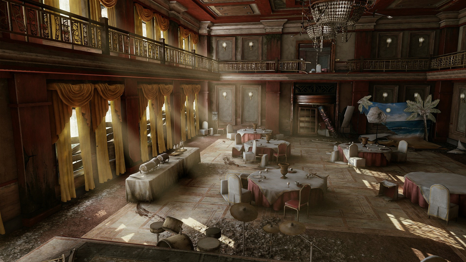
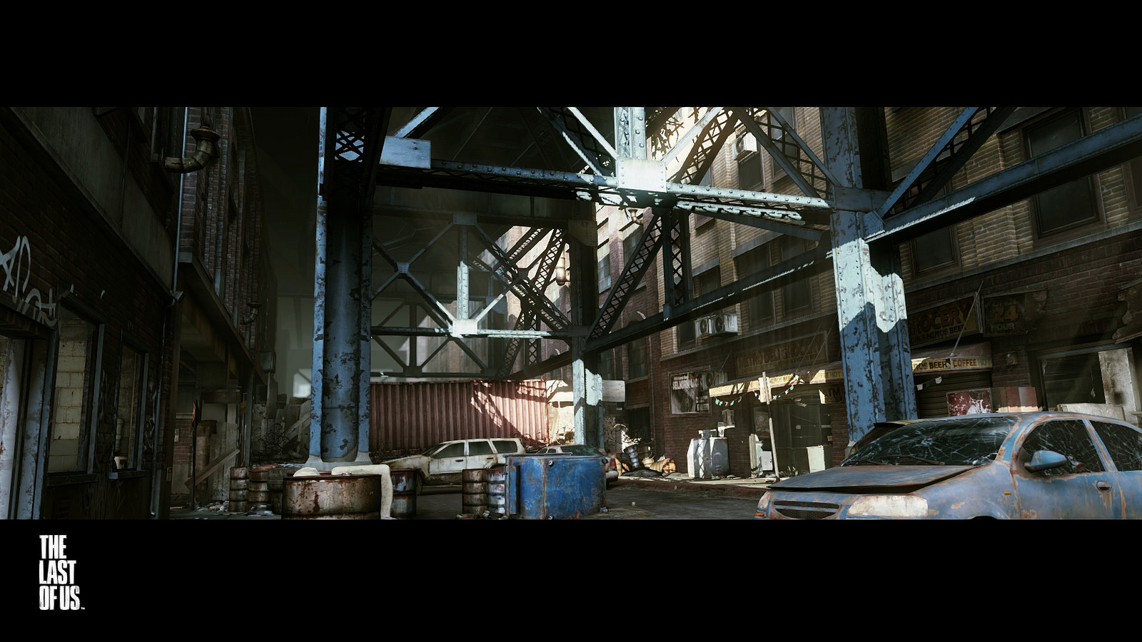
Morrigan Stark
Arrogant Smirk
Yup. I don't get it either, it looks as good, and even better than some PS4 games.I agree. I don't understand how anyone can say that the game hasn't aged well. A quick look in the official photomode thread shows that it has. Sure, there are a few last-gen textures here and there...but I'd say, overall, it could pass for a PS4 game. Easily.
Pjsprojects
Member
Played through it on PC but was curious to see how it looked on PS4 and rented it from GameFly. Looks nice to my eyes, just needs better AA:


Excellent.
Looks good! I posted some shots in ultra for the pc screen shot thread but everyone seemed to think the games ugly,don't get that at all.
I find it to be inconsistent graphically from what I seen, it looks good but bad at times with low res textures, and I don't like the film grain, but overall it's a decent looking game.Looks good! I posted some shots in ultra for the pc screen shot thread but everyone seemed to think the games ugly,don't get that at all.
Hispanicguy
Member
It was an amazing looking game on the PS3, on the PS4 it's still very much a PS3 game. It's not ugly but the improvements in the PS4 version really make the limitations of this PS3 game stand out. It's difficult to complain about it though but people do need to remember that it isn't actually a remake of the game.Are some of you trolling with the "TLOU hasn't aged well" comments?
drifter444
Member
Forza 5. God I just love looking at these cars!


Pjsprojects
Member
Forza 5. God I just love looking at these cars!


Both stunning shots chap. Every game should have photo mode!
Forza 5. God I just love looking at these cars!


Very nice indeed, that second shot in particular reminds me of an old wallpaper I sometimes use as a background:Both stunning shots chap. Every game should have photo mode!
Few more shots (some depth of field) before I return it to Gamefly:


Agreed, the low res textures can bring it down at times but I think the overall art direction looks nice.I find it to be inconsistent graphically from what I seen, it looks good but bad at times with low res textures, and I don't like the film grain, but overall it's a decent looking game.
Thanks. If interested in checking them out, I put together an album of some of the better shots I managed to capture during my PC playthrough: https://www.flickr.com/photos/116461475@N06/sets/72157646521481585/Looks good! I posted some shots in ultra for the pc screen shot thread but everyone seemed to think the games ugly,don't get that at all.
Pjsprojects
Member
Xbox one - Forza 5


SolidusDave
Member
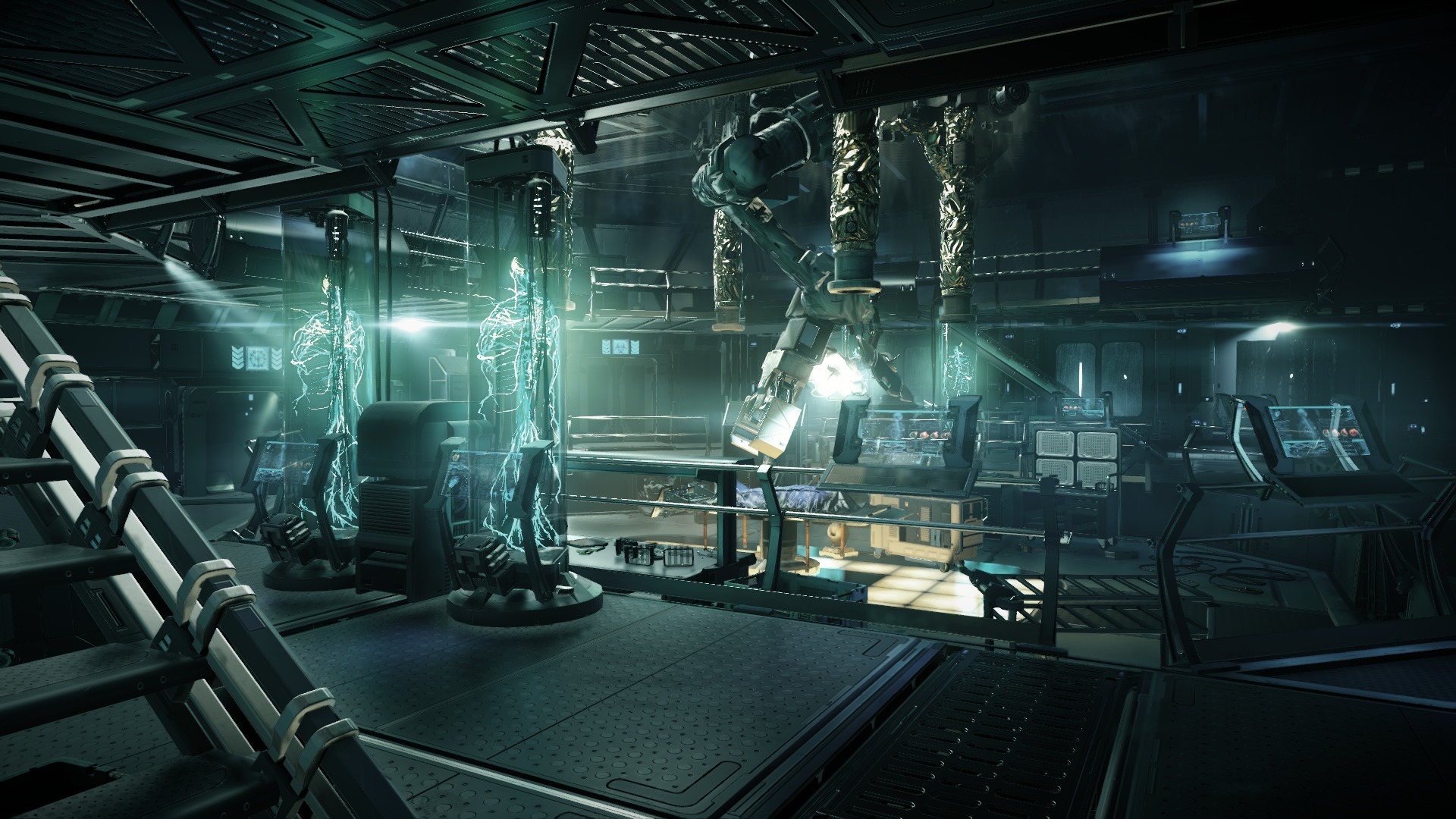
Any Surgeon Simulator screens ?
Here are some, but I'm not far in the game yet... it's hard!


SolidusDave
Member
UncleLeo!?
Banned
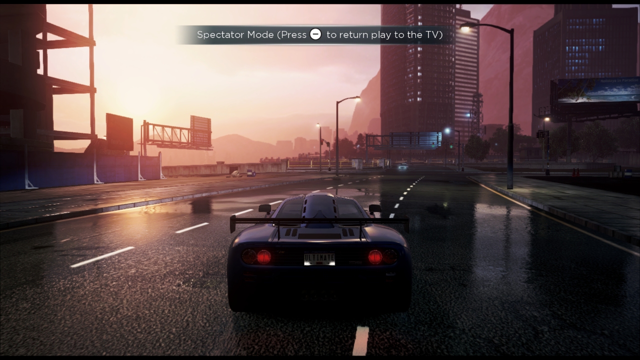
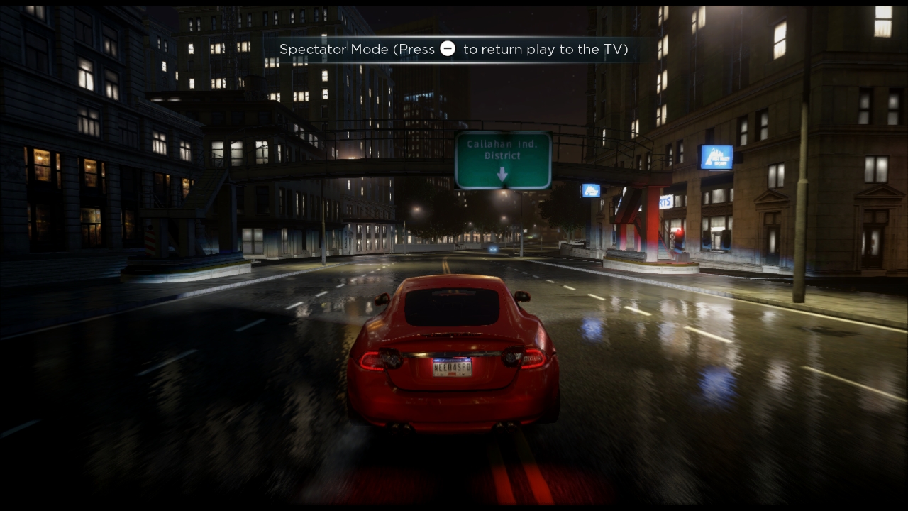
Can we get some more Ryse into this thread?
I would do it again, but I'm busy with other games now.=OCan we get some more Ryse into this thread?
ChoklitCow
Member
StreetsAhead
Member
I forgot that this game is already out in Japan.
Pjsprojects
Member
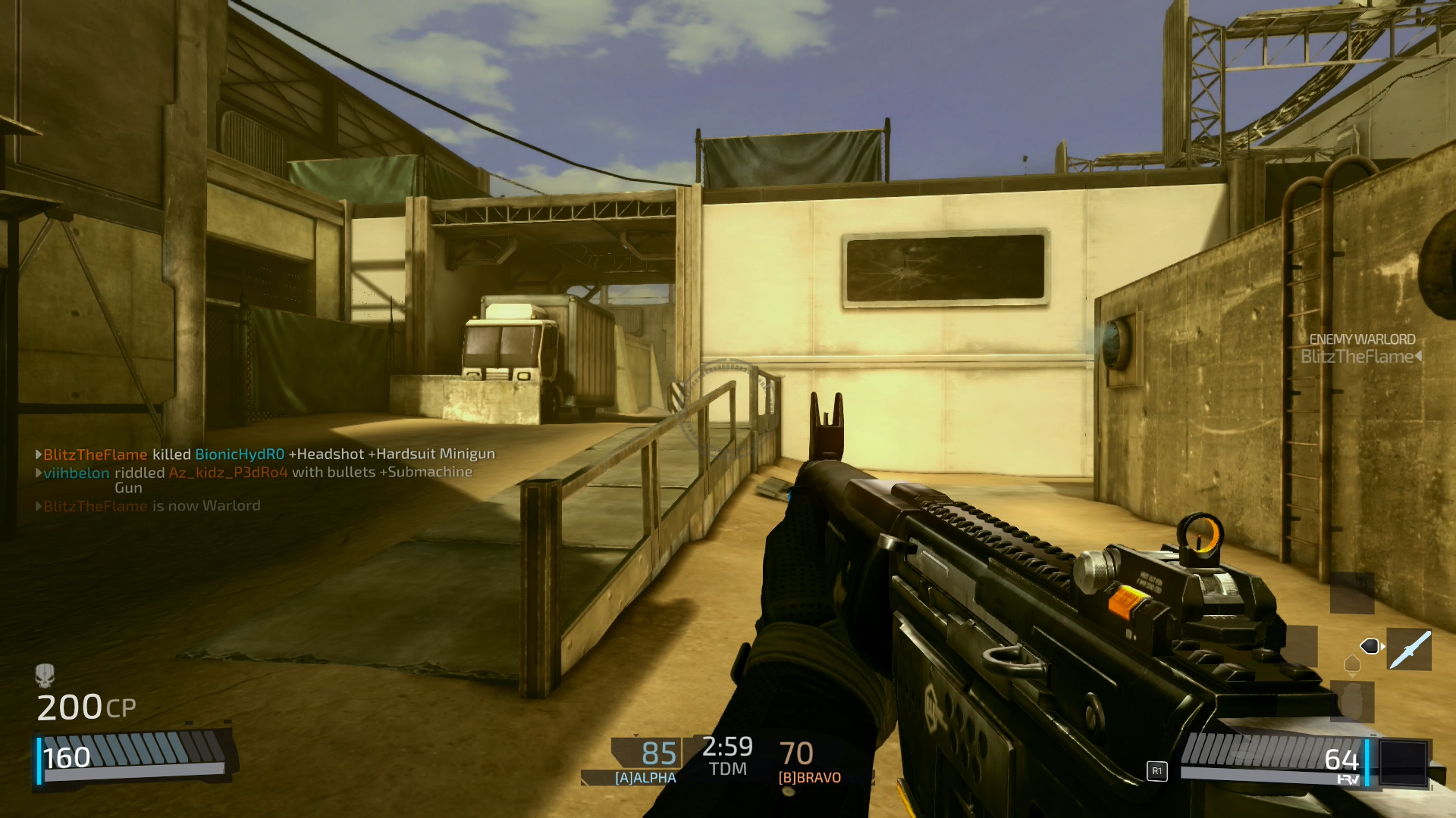
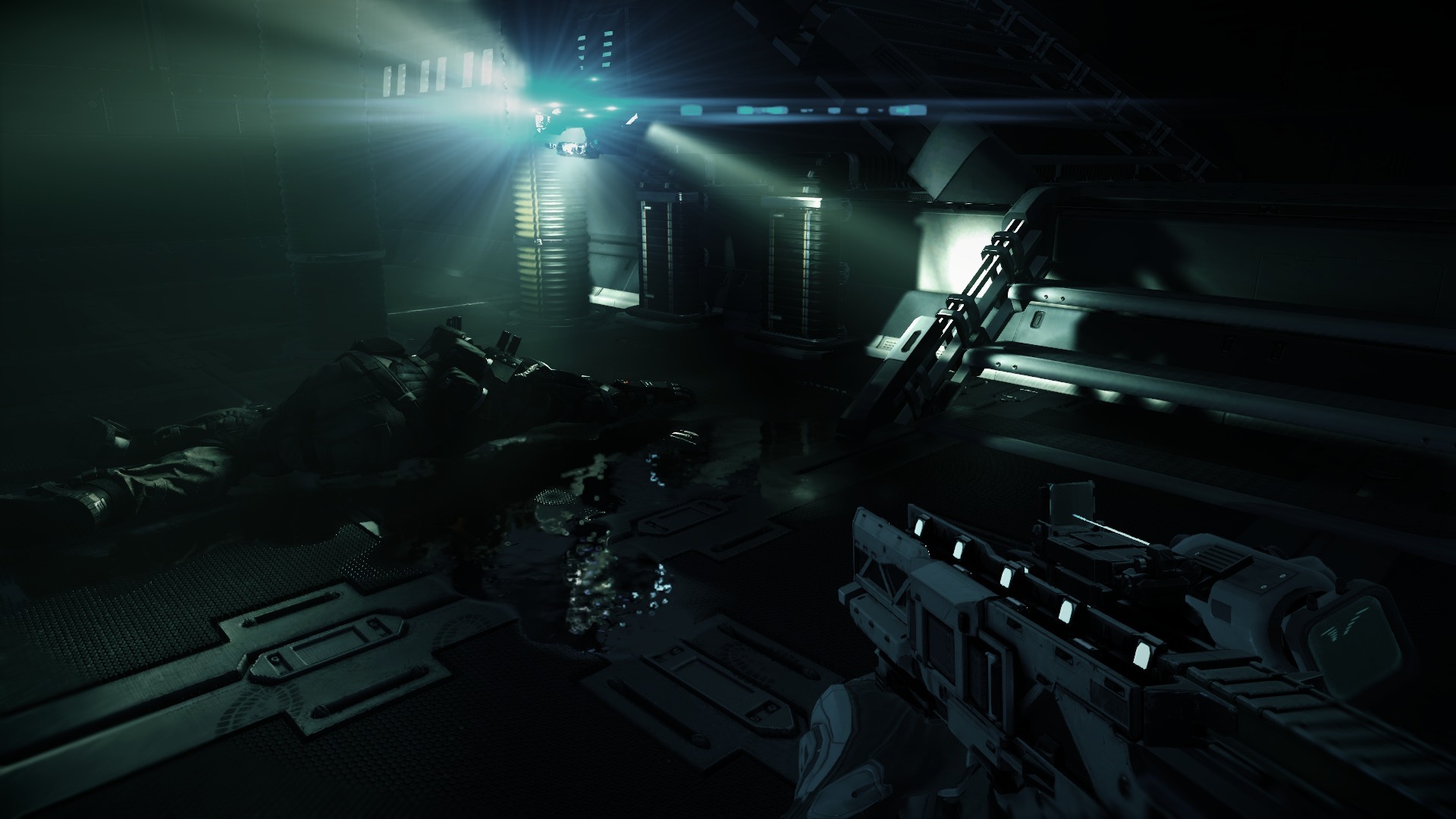
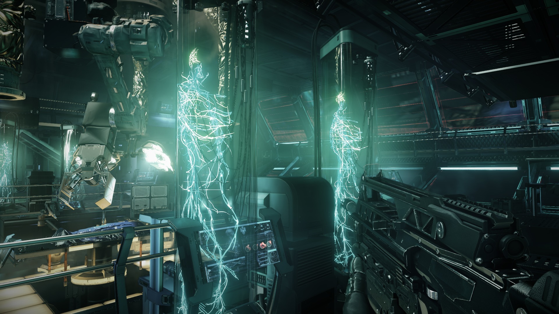
PS4 - Killzone Shawdowfall multiplayer


shinobi602
Member
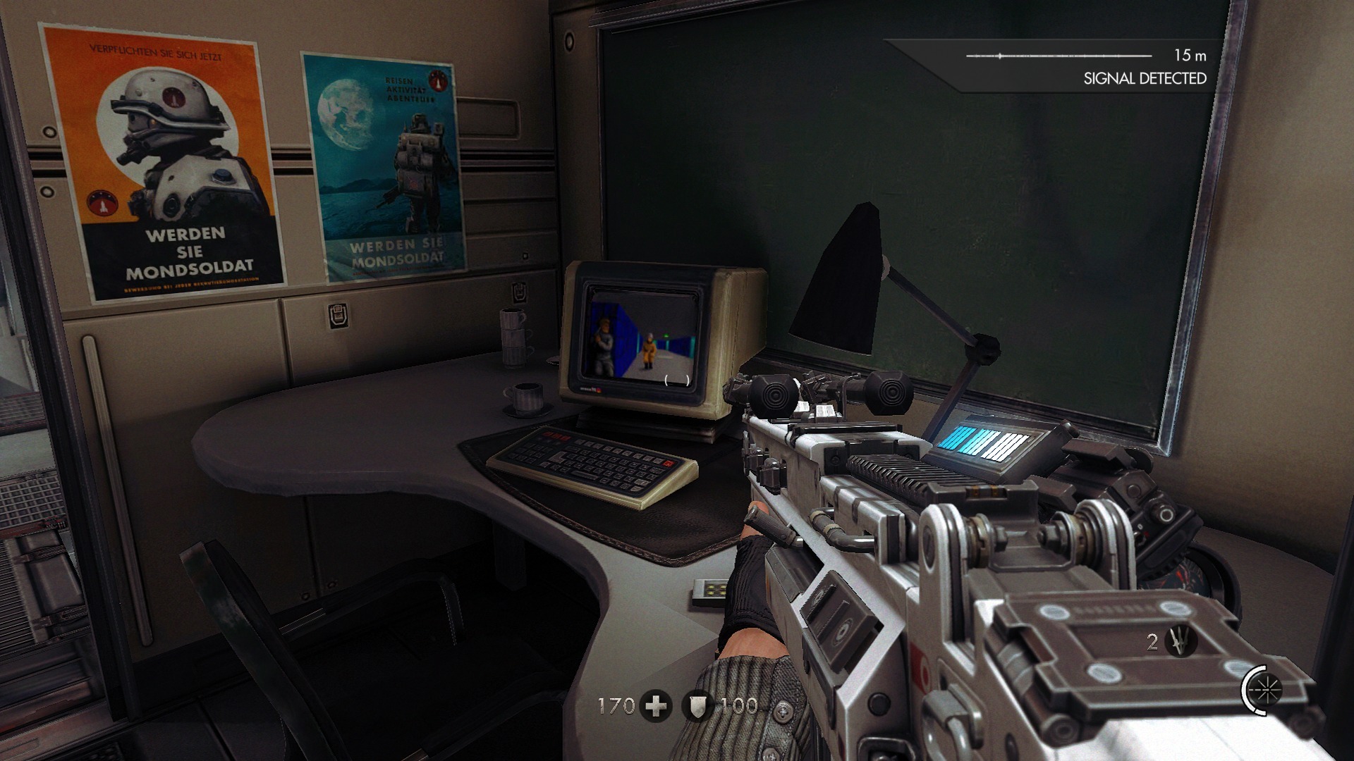
Wolfenstein: The New Order (PS4)


StreetsAhead
Member
Hyrule Warriors (Wii U)


FreshCakes
Banned
Jimmyfenix
Member
Here are some, but I'm not far in the game yet... it's hard!


Nice!
Hispanicguy
Member
inFAMOUS: Second Son


This game is beautiful.


This game is beautiful.
Summer Haze
Banned
inFAMOUS: Second Son

This game is beautiful.
Fucking wow. I've plat'd this game and it still amazes me when I see screenshots of it.
-------------------
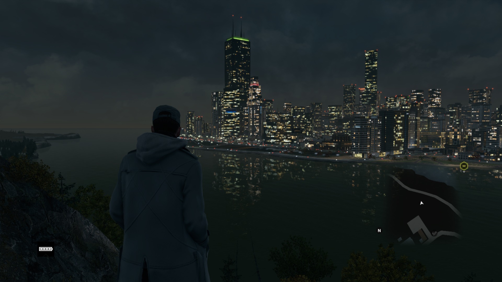
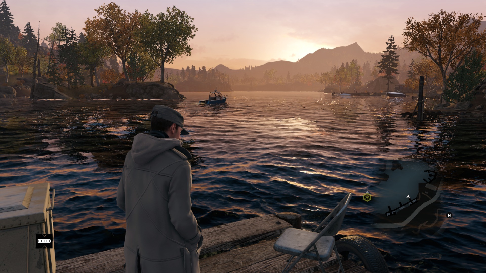
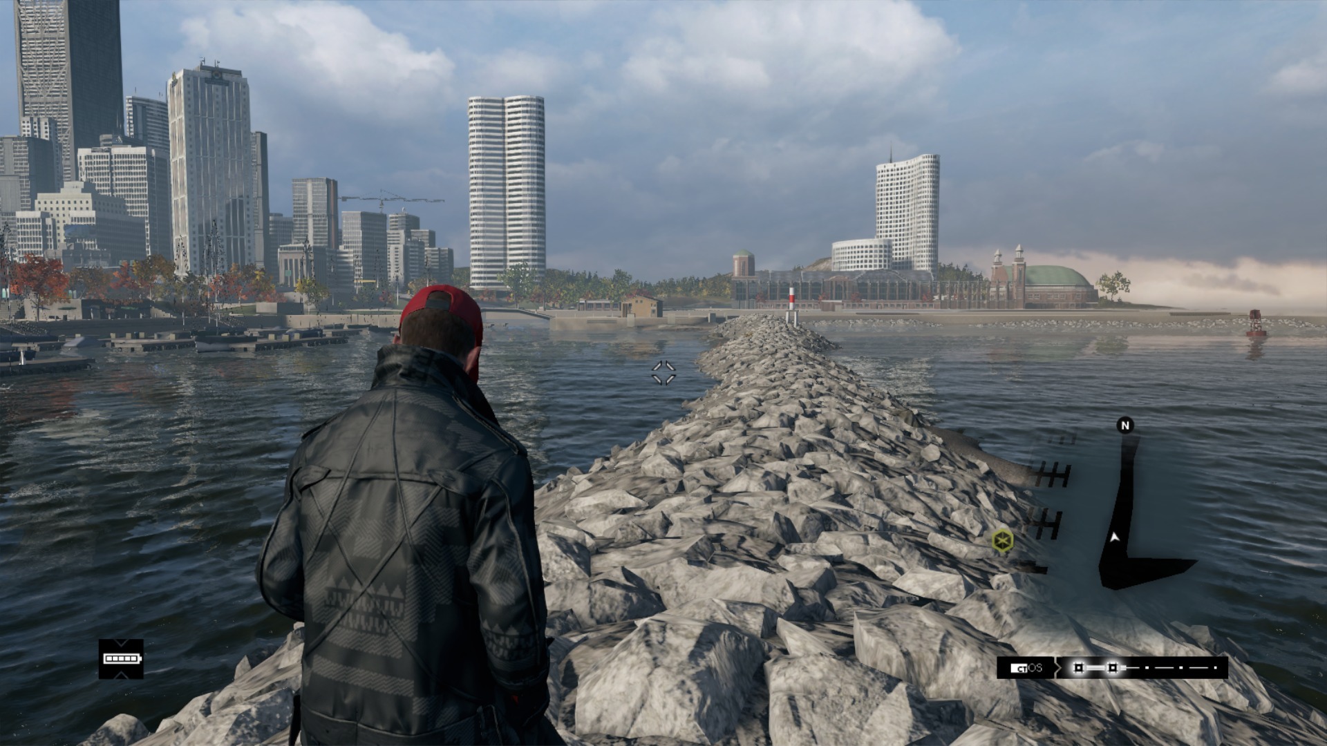
I saw someone above mention the HUD in Watch Dogs and it reminded me that WD has the worst mini-map placement I've ever seen in a game. Completely obtrusive.
Caayn
Member
Not only the mini-map everything is placed too far inwards towards the middle. It's like the game doesn't keep overscan/underscan in mind when drawing the hud. That said it didn't really bother me during my playthrough, but it's something that I want see fixed for WD2.I saw someone above mention the HUD in Watch Dogs and it reminded me that WD has the worst mini-map placement I've ever seen in a game. Completely obtrusive.

