You are using an out of date browser. It may not display this or other websites correctly.
You should upgrade or use an alternative browser.
You should upgrade or use an alternative browser.
Consoles screenshots thread (PS4/Xbone/WiiU) [Up: Thread rules in OP]
- Thread starter Peterthumpa
- Start date
Haha you could tell me that was an Assassins Creed game and I wouldn't question it.
Not criticizing, just funny.
But then if you played it you would know better. Not a knock on AC, either. But this is a completely different animal.
Aside from the aliasing and rough shadow detail around the circular window, this looks brilliant.
The shadowing is good quality and seems to be rendered pretty accurately in the game. According to some tech details Shin'en shared, they seemed pretty happy with the level of quality they were able to achieve. I believe what you are seeing are very subtle God-ray effects as the rays of light interact with the woodwork (an example of atmospheric light scattering, iirc). More and more AAA games are trying to employ this effect dynamically these days.
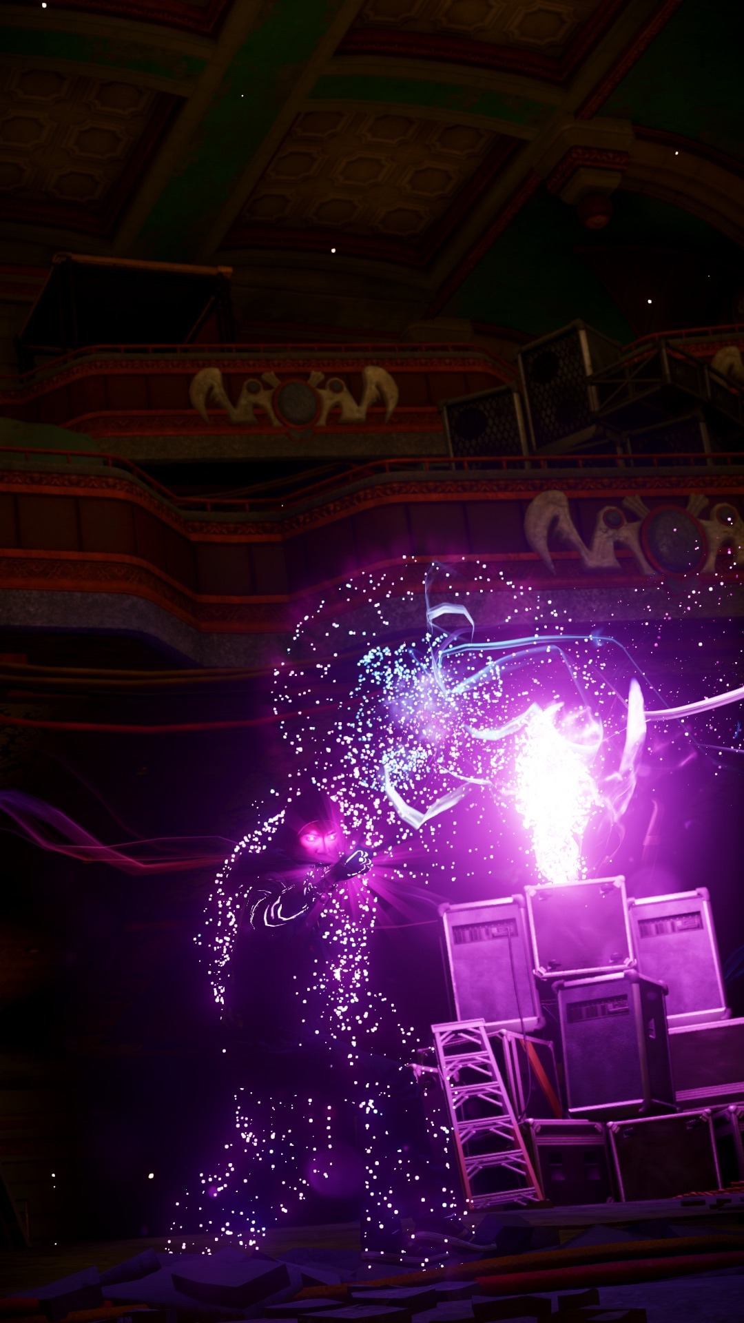
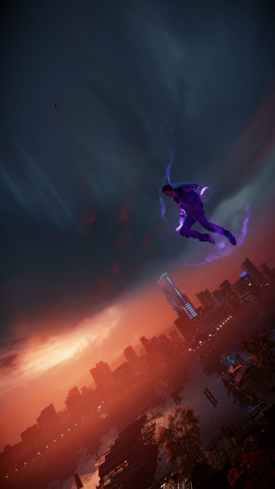
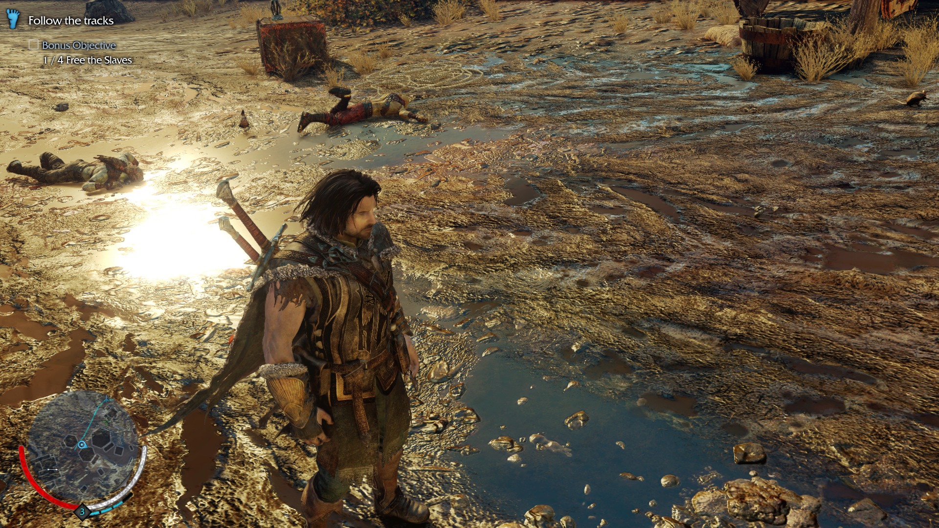
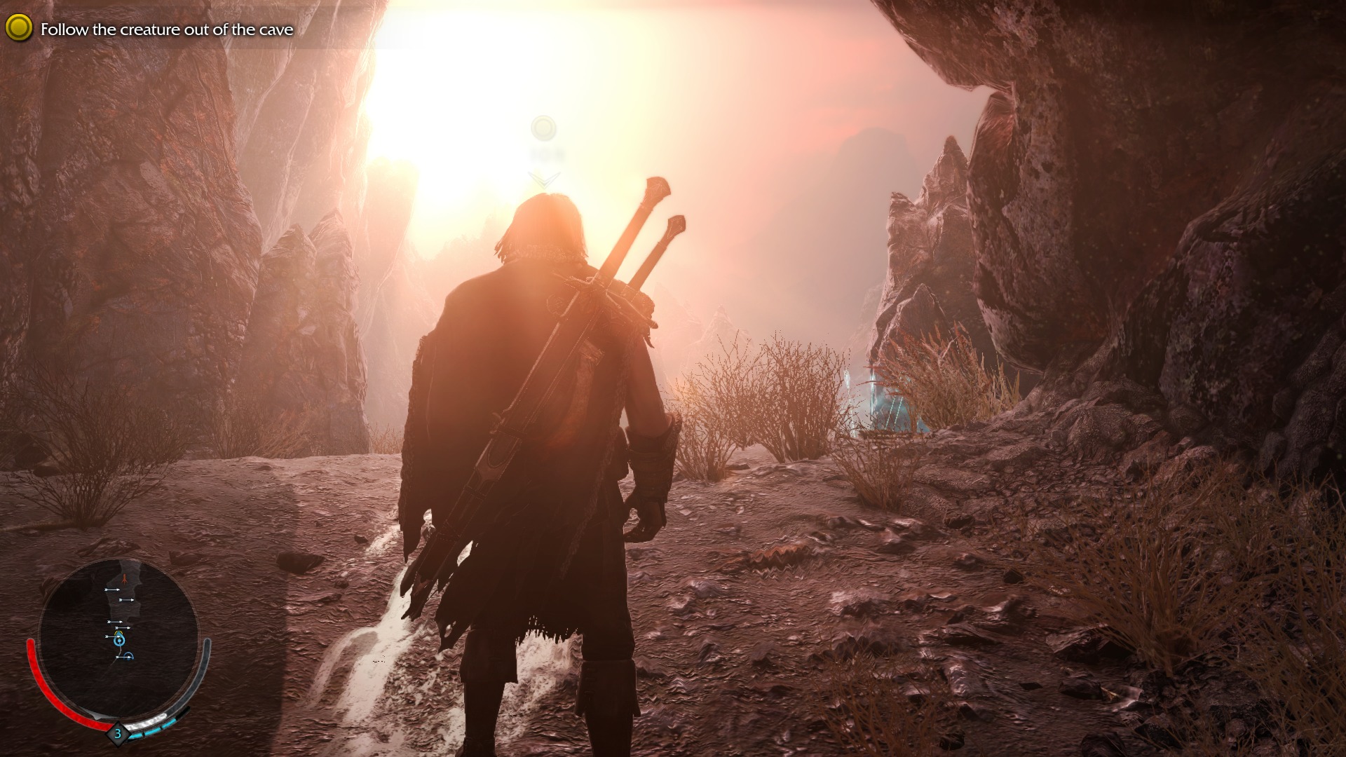
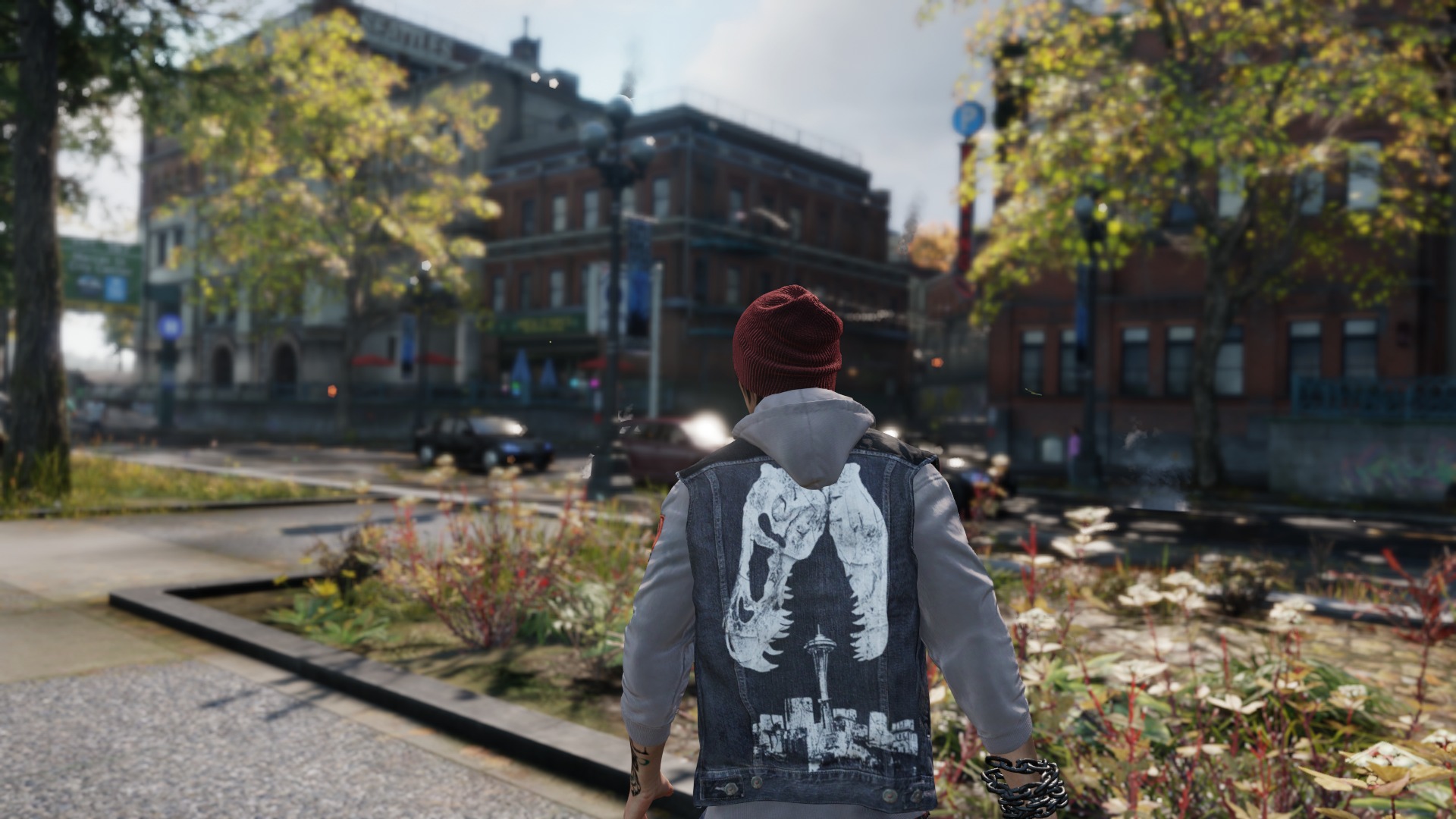
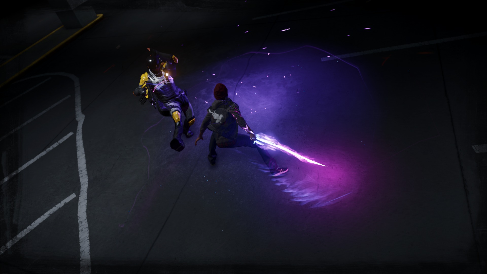
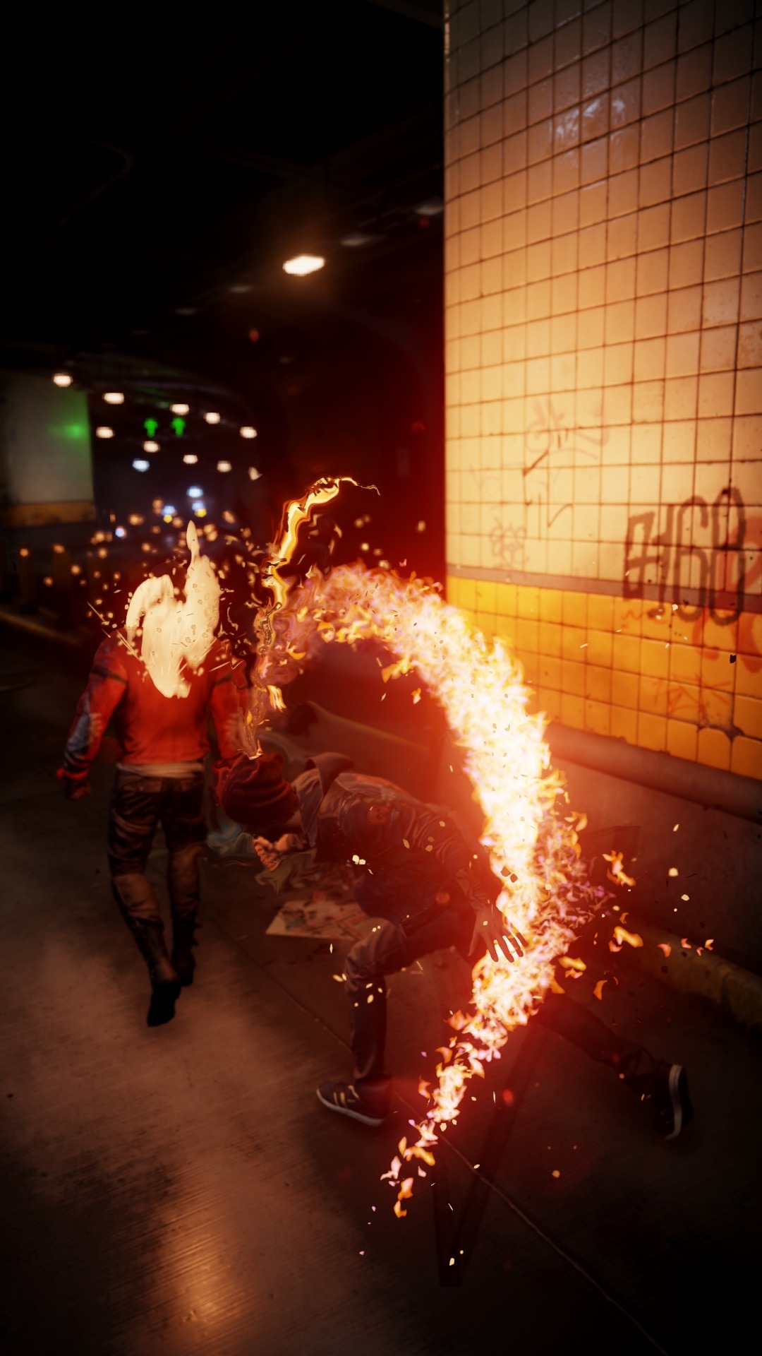
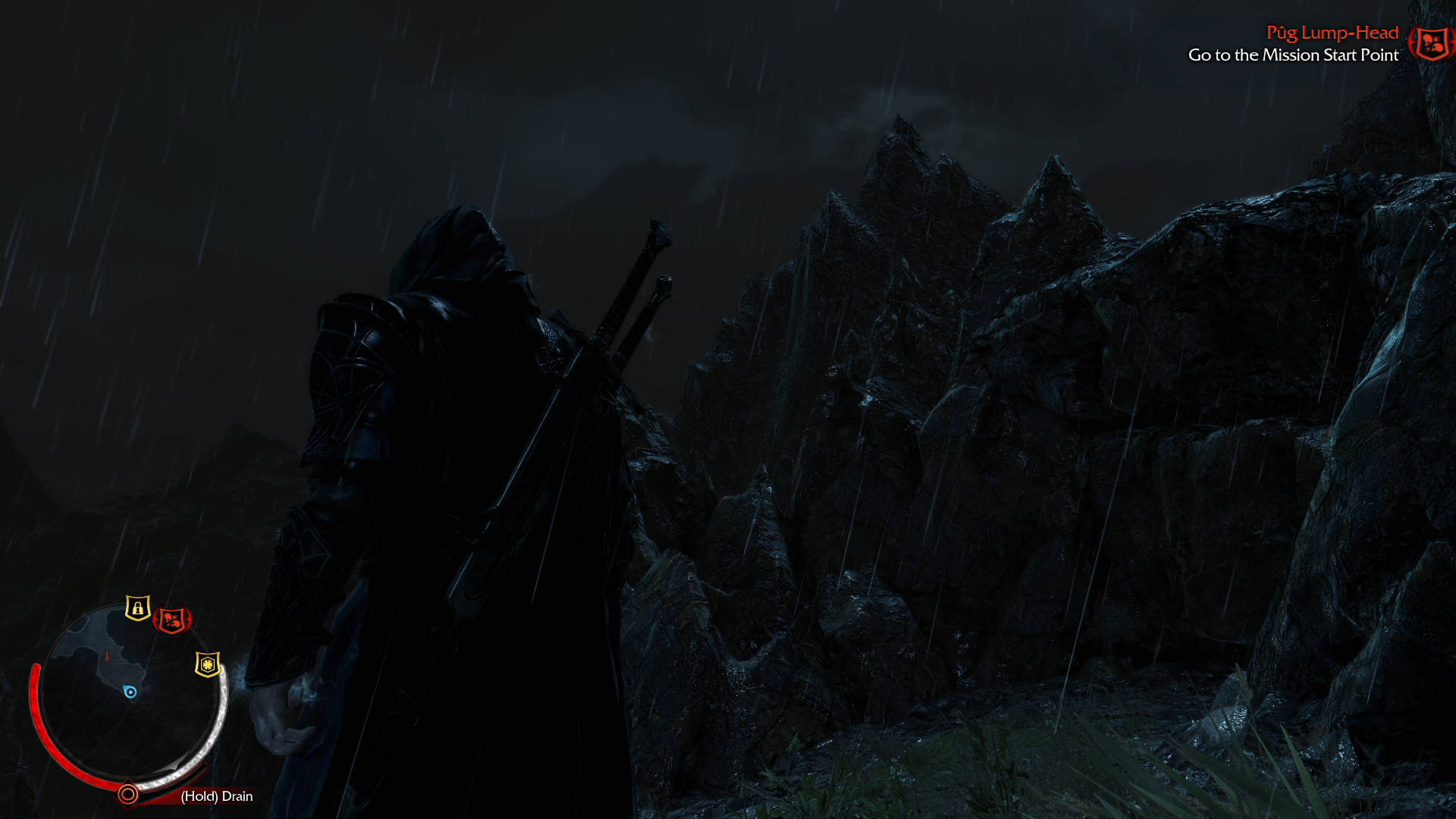
Edit: I might get weak for this but; I think Infamous: SS - despite being impressive technically - is a pretty mediocre looking game, aesthetically. Really unappealing palette and boring art. To me, it's just not that beautiful to look at. I'm glad Shadow of Modor entered this thread, because it justifies everything I felt about ISS. SOM, is perhaps a tad less technically impressive, but the artwork and palette chioce makes such a dramatic difference in these pics. What a gorgeous looking game!
(For the record, I feel the same way about Drive Club(nay) and Forza Horizon 2(yay), and I'm anxiously waiting for that contrast to be demonstrated in this thread)
Looks like I have to get that dlc soon. Fetch is looking awesome and there is something truly special about unending light speed.
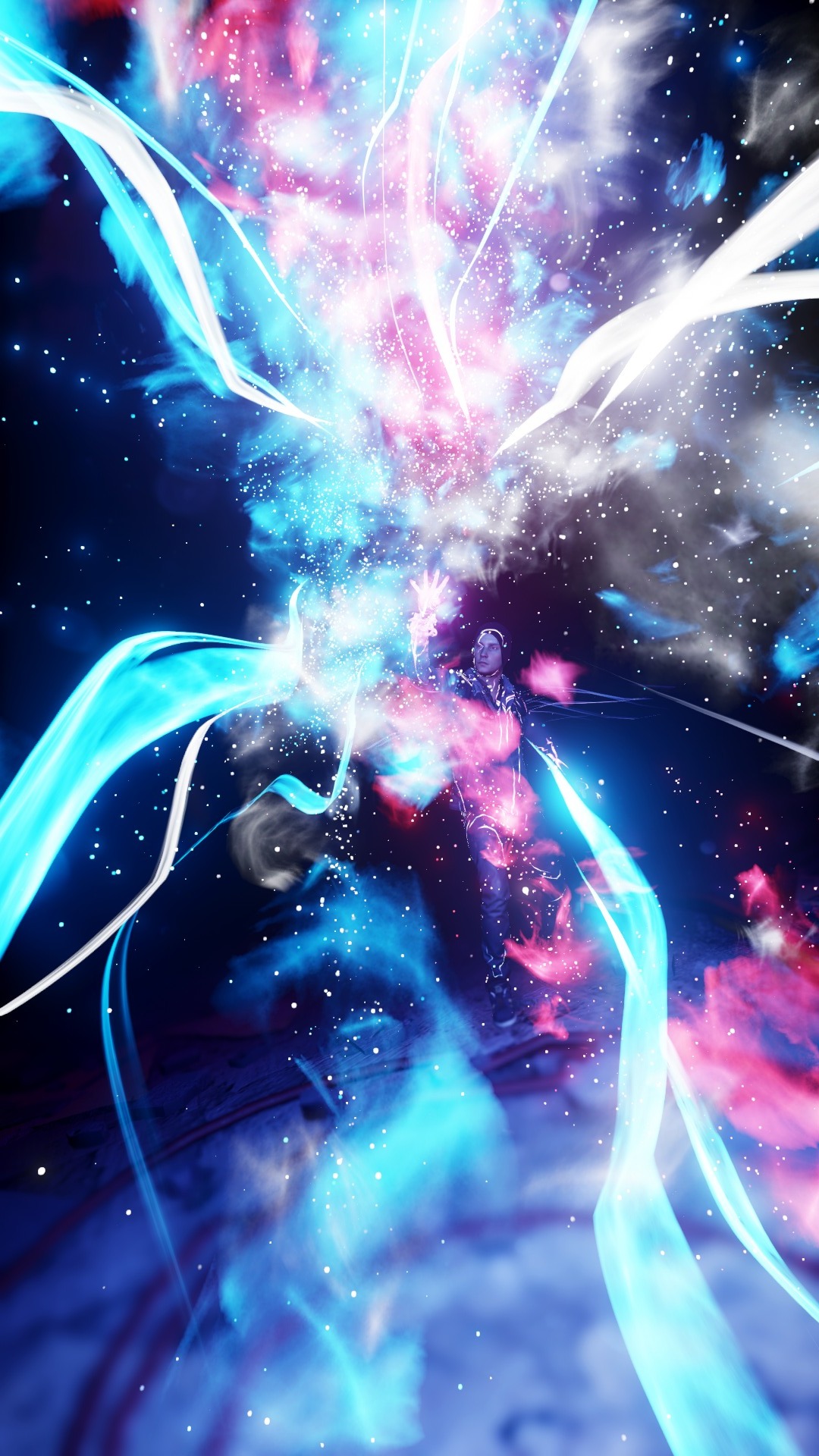
Wow, I don't own a PS4 but this still looks like the best looking game of the gen so far.
Jonneh3003
Banned
Yes, it's an import.


I get the feeling the screens I'm taking are a little... I don't know how to put it. :x
How is the game anyway?
Screenshot while standing? Step your game up SA.HW snip
Shin-Ra
Junior Member
It just looks like low-res pre-baked ambient occlusion to me.The shadowing is good quality and seems to be rendered pretty accurately in the game. According to some tech details Shin'en shared, they seemed pretty happy with the level of quality they were able to achieve. I believe what you are seeing are very subtle God-ray effects as the rays of light interact with the woodwork (an example of atmospheric light scattering, iirc). More and more AAA games are trying to employ this effect dynamically these days.

AO looks a bit heavy in general but only has rough artefacting around that window.
The Shogun
Banned
The Last of Us Remastered


It just looks like low-res pre-baked ambient occlusion to me.
AO looks a bit heavy in general but only has rough artefacting around that window.
Ah ok, seems we were focusing on different areas of the image.
Net_Wrecker
Member
ResidentDante
Member
Net_Wrecker
Member
ResidentDante
Member
Summer Haze
Banned
This looks great.
Zenaku
Member
How is the game anyway?
I'm really enjoying it so far. The graphics look wonderful in motion, lighting from the torch is nice, with the dynamic shadows it casts making me look twice now and then. It's been a while since playing IV, but I feel the game is a little harder too, in the way ghosts move, and the damage they can deal and take.


xenogenesis
Member
Shadow of Mordor PS4


Oh man, great pics. Can't wait until I get to the Sea of Nurn. Dat vegetation.
ResidentDante
Member
Amazing shot, looks almost real.
AntiFacebook
Member
Damn you nintendo and your region lock policy.
xenogenesis
Member
If this game had some AF it wouldn't look too bad (at night-time anyway).


Net_Wrecker
Member
And suddenly it's a postcard landscape


Summer Haze
Banned
Shadow of Mordor PS4

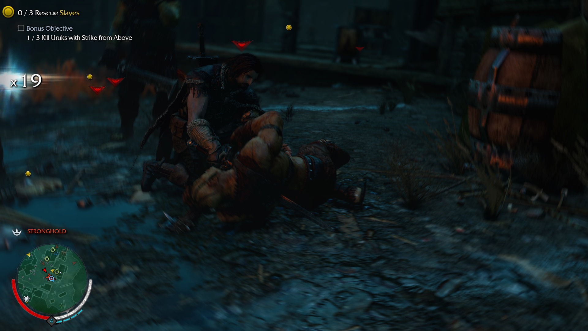
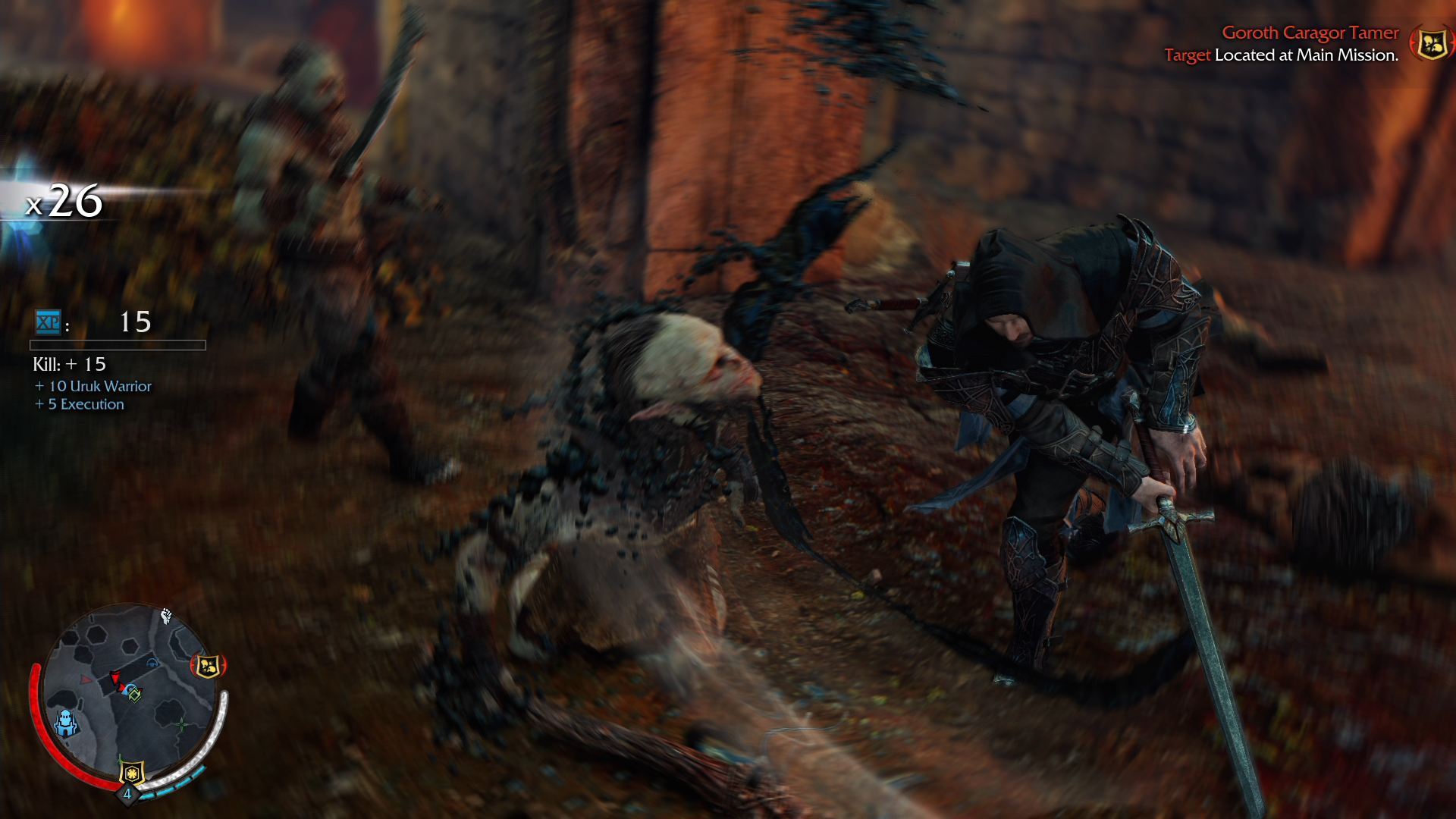
Holy shit...that blood, those fingers, that creased hood! This game's visuals are impressing me more than I thought they would.
Net_Wrecker
Member
Holy shit...that blood, those fingers, that creased hood! This game's visuals are impressing me more than I thought they would.
It's impressing me more now after 20 hours than it did when I started.


game looks pretty slick, 'specially for wii u. what a shame.
If this game had some AF it wouldn't look too bad (at night-time anyway).


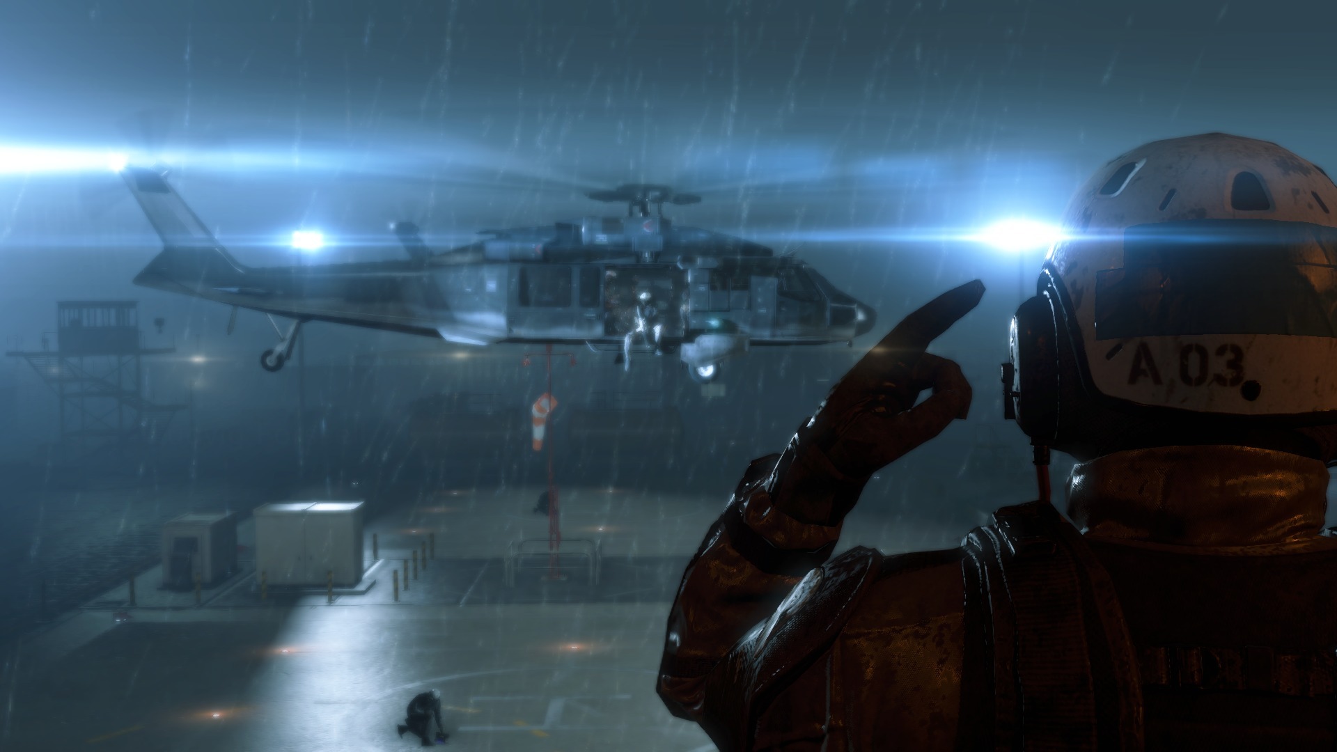
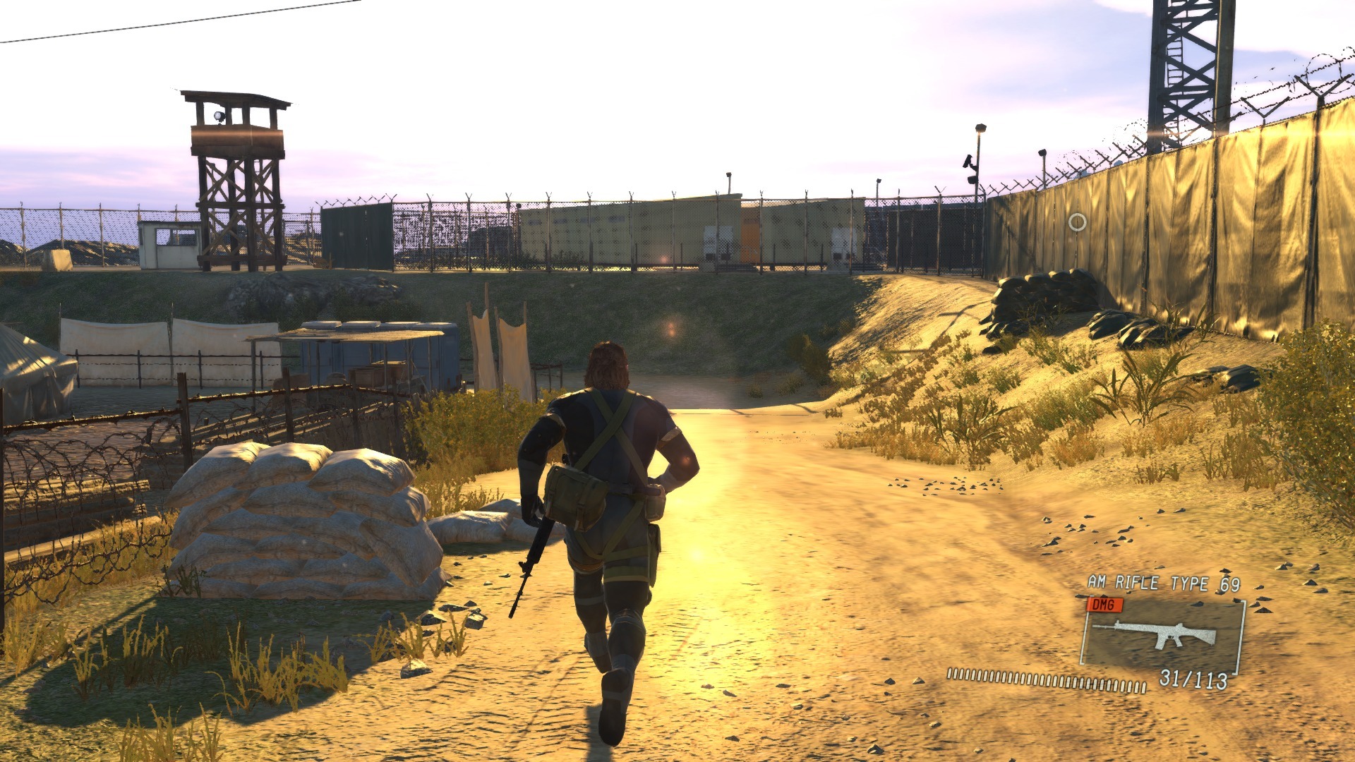
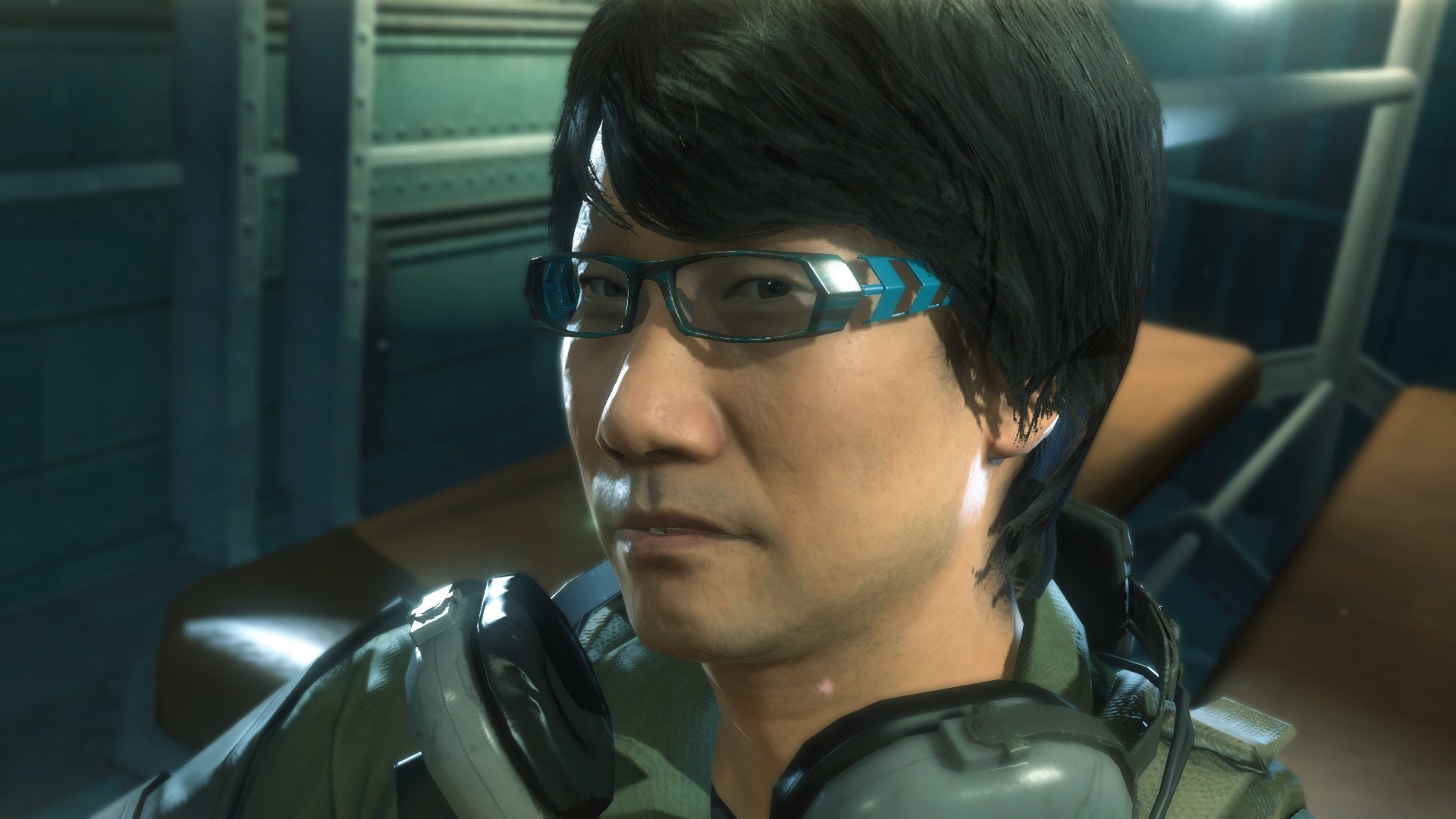
AF and the artifacting/dithering in hair/foliage are the two things really holding back the IQ, otherwise it can be a very good looking game at times (and the 60fps certainly helps). The overall attention to detail in the special effects is quite good (the look of the rain when going into slow motion, the flapping of fabric on tents, the lens flares, etc), which is always impressive in Kojima's games.
Pjsprojects
Member
Forza Horizon 2 - Xbox one


Morrigan Stark
Arrogant Smirk
Not my type of game at all, but damn if those don't look amazing. The first one especially.Forza Horizon 2 - Xbox one
Jimmyfenix
Member
Morrigan Stark
Arrogant Smirk
That pose looks weird. Is he piercing the orc's throat, or slashing at it? If the former, the stance makes sense but it looks off, and there's no blood on the blade. And if the latter, it's kind of a stupid way to go about it, he's holding the sword wrong. xD
Net_Wrecker
Member
ok, this goes to everyone that has posted images for shadow of mordor, i love you
i have the game but the screenshots here still amaze me
Heh, I'm in the same boat. I own the game and could boot it up right now if I wanted, but I enjoy looking at in stills just as much. I think part of it is just marveling at the quality of Talion's model.
What a shame?game looks pretty slick, 'specially for wii u. what a shame.
Why is that a shame?
Jaded Alyx
Member
What a shame?
Why is that a shame?
I figured he meant the lack of any announcement of localisation plans.
Thanks for posting this. Game looks great. Still hoping for a west release.


