-
Hey Guest. Check out your NeoGAF Wrapped 2025 results here!
You are using an out of date browser. It may not display this or other websites correctly.
You should upgrade or use an alternative browser.
You should upgrade or use an alternative browser.
GAF Indie Game Development Thread 2: High Res Work for Low Res Pay
- Thread starter Jacksinthe
- Start date
- Status
- Not open for further replies.
Playing through a whole bunch of games and rating them in the 64 x 64 game jam... Yeah, it seems like the most common and one of the worst issues everyone has (I'm not excluded) is that they made their games too difficult or obtuse because the mechanics and solutions are OBVIOUS to the developer but for a player going in blind you can't really make any assumption. I tried to make my game accessible and still realized after the submission that I didn't explain to people how to get into the store.
And everyone hates to have their hand held, so... It's a tricky balancing act.
Super Mario Maker was an eye-opener for me: even the easiest levels wouldn´t get over 30% completion rate. People would always find ways to die in the most unexpected ways. It really has made me admire even more the Nintendo designers.
The most important thing is to have people test your game without any external help and, rather than hearing their opinions (which are also valuable but might point you away from the real problems), watch them do it.
Given my adventure in to retro graphics, I'm looking for some interesting
color palettes. Does anyone have some or knows a place to get some good or
specific color palettes which may perhaps have some hand-crafted shades in
them regarding a given scenario, ambient, or atmosphere?
From memory, which of the old-school standard computer color palettes you
liked or like the most? I find the Acorn RISC one quite interesting;

Yesterday I discovered this lecture about 8bit and "8bitish" graphics:
http://gdcvault.com/play/1023586/8-Bit-8-Bitish-Graphics
I still haven´t seen most of it, but for what I´ve seen the guy who is giving the speech is a guru in this kind of artstyle, if he can explain some of the techniques he mentions in the intro the video could be priceless.
The C++ in UE4 is also really easy to use and well-documented, you don't have to (probably won't need to) touch the UE4 source code. Maybe just do a few of the C++ tutorials in the docs and see if it works for you. For switching a camera you don't really need to code though, you can do most of the stuff in BP if you want.I've been experimenting on and off with UE4 blueprints and I love how easy it can be (especially the networking. I can't get over how easy it is to make a game work with online multiplayer)
But I've been wondering if I should just jump into Unity. It just seems like I would have more freedom there and some things would be easier to code rather than make a massive collections of BP nodes to do something as easy as switching a camera inside a player controller.
I'm conflicted. I do have some programming experience but not enough to play with the UE4 source code. I think unity probably has the best balance of customization and easy to code.
What do?
I like. Had a similar idea where Gaffers/Mods fall from the sky comming
after you saying some of their favorit sayings. xD
But it drives me away from sleep even more. xD Technical stuff really keeps
me awake for long hours. Not so good. How does an artist sleep?
Hehe, I've been an artist all my life so I wouldn't know. However, besides dabbling in BASIC at around the age of 10, I'm relatively new to programming. So when I'm deep in crunch, my nightmares are all in code.
Given my adventure in to retro graphics, I'm looking for some interesting
color palettes. Does anyone have some or knows a place to get some good or
specific color palettes which may perhaps have some hand-crafted shades in
them regarding a given scenario, ambient, or atmosphere?
From memory, which of the old-school standard computer color palettes you
liked or like the most? I find the Acorn RISC one quite interesting;

Amiga games were well known for their rather unique look(and sky ramps!)
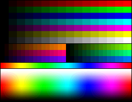
(image from wikipedia, it's meant for comparisons, not an actual palette, the important part is the bottom one)
Choosing colors among 16 millions is really hard, imo the first thing to do is to cut the number of colors to choose from and those 4096 color are a perfect collection, you just have to choose rgb component values that are multiple of 17: 0, 17, 34 etc, doing so you'll have a easier time choosing colors and your palette will be faithful to true 16bit games palettes.
BlazeHedgehog
Member
Given my adventure in to retro graphics, I'm looking for some interesting
color palettes. Does anyone have some or knows a place to get some good or
specific color palettes which may perhaps have some hand-crafted shades in
them regarding a given scenario, ambient, or atmosphere?
From memory, which of the old-school standard computer color palettes you
liked or like the most? I find the Acorn RISC one quite interesting;

For most of my sprite art I use a very old program called MGI Photosuite. It's designed for Windows 95, but I've become rather attached to its 256 color palette:

May be more colors than you're looking for, though.
RelentlessRolento
Member
Hehe, I've been an artist all my life so I wouldn't know. However, besides dabbling in BASIC at around the age of 10, I'm relatively new to programming. So when I'm deep in crunch, my nightmares are all in code.
I come from an art background so this past month has been mostly coding AI which I was greatly dreading. I still have tons of coding to go but the core is there enough to make the art.
Now I'm doing the art, which has been coming out fine but now I'm running into issues of color clashing, etc
Thx for the link! Was quite interesting. He makes some good points for artist... Yesterday I discovered this lecture about 8bit and "8bitish" graphics:
http://gdcvault.com/play/1023586/8-Bit-8-Bitish-Graphics
I still haven´t seen most of it, but for what I´ve seen the guy who is giving the speech is a guru in this kind of artstyle, if he can explain some of the techniques he mentions in the intro the video could be priceless.
wanting to dive into 8-bit. However, programming these things is a different
topic esp. when considering 8-bit shaded 3d graphics.
An interesting comment was made from the link above; 'teaching an artist toHehe, I've been an artist all my life so I wouldn't know. However, besides dabbling in BASIC at around the age of 10, I'm relatively new to programming. So when I'm deep in crunch, my nightmares are all in code.
program is easier than teaching a programmer to do art ... and the EGA palette
is prove of that!'. xD That was funny! So you should be fine!
Amiga, yeah!Amiga games were well known for their rather unique look(and sky ramps!)

(image from wikipedia, it's meant for comparisons, not an actual palette, the important part is the bottom one)
Choosing colors among 16 millions is really hard, imo the first thing to do is to cut the number of colors to choose from and those 4096 color are a perfect collection, you just have to choose rgb component values that are multiple of 17: 0, 17, 34 etc, doing so you'll have a easier time choosing colors and your palette will be faithful to true 16bit games palettes.
Yeah, the classic all-purpose palette. I've build some of those my myself andFor most of my sprite art I use a very old program called MGI Photosuite. It's designed for Windows 95, but I've become rather attached to its 256 color palette:

May be more colors than you're looking for, though.
tinkered around with them for a while. It's very universal and has lots of
advantages yet also some flaws. It will not produce this specific aesthetic
coming out of a limited (index) color palette esp. not for 3d, which must
sound somewhat contradictory to those who may have used this palettes during
the VGA era doing their 24-bit to 8-bit color quantization on the fly.
Anyways, I'm going to use this one as well, as a "true-color modulo 8-bit"
reference. Sounds strange, does it?
neko.works
Member

Decided to implement point and spotlights for night scenes. Need to evaluate performance, it's not a deferred renderer after all
Why not using fake spotlights? Just a bright texture on a quad. The ground seems to be flat in your game, so it should works fine, with zero performance issues.
I did something similar in Super Night Riders, used a realtime spotlight for the player, and fake spotlights for the rivals.
Speaking of SNR, I just passed cert today on Xbox! Didn't expect it to take so much time - around 2 months. I guess consoles are still pretty hard to release on. I really hope it will be easier with the PS4...
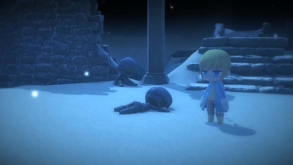
Bonus, here's a recent shot from Light Fairytale, I've implemented a zoom-in feature using the right trigger, so the camera system is very similar to ICO on the PS2 now.
Candescence
Member
So I've been fiddling with kode80's PixelRender and volumetric cloud stuff, and I've noticed that you can't use them both simultaneously, which kinda sucks, but there's no real reason why that'd be the case, maybe it's a problem with rendering to render textures, which is odd. But I guess that can't be helped unless kode does something about it.
Why not using fake spotlights? Just a bright texture on a quad. The ground seems to be flat in your game, so it should works fine, with zero performance issues.
I agree, and I am still evaluating whether to just use textures. The ground is not flat, the map right now only has small bumps, but proper dunes etc. will be in the game for different environments. Plus canyons environment props, rocks boulders etc.
Using just a texture would maybe good enough, players probably won't notice, but I'd still need to create a decal algorithm to make it fit onto the terrain (and update per frame). At the same time I could change the lights to only affect terrain, that would work as well for maybe lower specs.
More recent picture.

neko.works
Member
That looks absolutely adorable
Thanks!
I agree, and I am still evaluating whether to just use textures. The ground is not flat, the map right now only has small bumps, but proper dunes etc. will be in the game for different environments. Plus canyons environment props, rocks boulders etc.
I see. By the way, is this a custom engine you've built or are you using Unity or others?
Today, I've been experimenting with image effects, and don't know if I overdid it...
Quick question: Which one do you prefer, left or right, and why?
Spoiler:
Left is the new one, using the Scion Post Processing effects.

electroflame
Member
Today, I've been experimenting with image effects, and don't know if I overdid it...
Quick question: Which one do you prefer, left or right, and why?
Overall the one on the left looks better, to me. I'm not a fan of the overall blurriness/graininess (depth-of-field is fine, but it seems to affect the foreground character as well?), but other than that it looks much better.
timetokill
Banned
Thanks!
I see. By the way, is this a custom engine you've built or are you using Unity or others?
Today, I've been experimenting with image effects, and don't know if I overdid it...
Quick question: Which one do you prefer, left or right, and why?
Background looks better on the left, foreground looks better on the right
The problem with the left one is there's nowhere for the eye to really focus because it's all a bit too blurry. On the right you at least see the main character (or the foreground one at least) and the green spotlight clearly, which focuses your eye there.
the left one is too blurry, but the lightning looks better imo. I agree with timetokill hereToday, I've been experimenting with image effects, and don't know if I overdid it...
Quick question: Which one do you prefer, left or right, and why?
I agree with everyone else, overall the left one looks better, but the foreground is too blurry.Today, I've been experimenting with image effects, and don't know if I overdid it...
Quick question: Which one do you prefer, left or right, and why?
I see. By the way, is this a custom engine you've built or are you using Unity or others?
Custom with MonoGame Framework. Not very experienced in the whole 3d world though, always happy for feedback and advice
Today, I've been experimenting with image effects, and don't know if I overdid it...
Quick question: Which one do you prefer, left or right, and why?
I like the left one, even if it is a bit blurry. But I think soft images with a touch of Chroma Shift/Chromatic Abberations are good for making the image seem less artificial. On the right you have the corners blurred, but it's almost better without.
RelentlessRolento
Member
Yay! First day I get player animations to work correctly!

I'll be using prootype animations, but replacing all the symbols once I get the characters drawn. It's a blend of frame animation and tweens.

I'll be using prootype animations, but replacing all the symbols once I get the characters drawn. It's a blend of frame animation and tweens.
We're finishing the online battle mode of our arcade game Tankr and we'll need some testing of that mode before the launch. Anyone know reliable group of testing that could recommend me? Any of you would be interested in help us testing the online and telling us his experience?
I´m trying to learn a bit more of GIMP to speed up the spriting process, specially for big backgrounds. I´ve found this book: Grokking the GIMP which seems to cover the software in depth (there´s a website with the book contents for free and it´s awesome). Does anyone have a better recommendation, something that maybe would have a slight focus on pixel art? I´m looking for a book so I can read it while going to work.
neko.works
Member
Overall the one on the left looks better, to me. I'm not a fan of the overall blurriness/graininess (depth-of-field is fine, but it seems to affect the foreground character as well?), but other than that it looks much better.
Background looks better on the left, foreground looks better on the right
The problem with the left one is there's nowhere for the eye to really focus because it's all a bit too blurry. On the right you at least see the main character (or the foreground one at least) and the green spotlight clearly, which focuses your eye there.
the left one is too blurry, but the lightning looks better imo. I agree with timetokill here
I like the left one, even if it is a bit blurry. But I think soft images with a touch of Chroma Shift/Chromatic Abberations are good for making the image seem less artificial. On the right you have the corners blurred, but it's almost better without.
Thanks guys for your feedback.
It seems the main issue currently is the amount of blur on the out of focus parts. I experimented a bit more today and reduced it.
The focus target is actually set to automatic, which works well with the camera system I have, as the player can rotate the camera and choose where to focus.
On a side note, I tweeted a screenshot using this effect today, for the made in Unity Friday, and got RT by Unity for the first time! I guess most people actually like it, me included!
There are 4 quality settings currently in Light Fairytale, ranging from very low to high, conveniently enough, they are defined only by the amount of effects applied to the camera starting from the medium quality and up. I guess I will just add an ultra mode using the Scion Post Processing, as it is the slowest mode anyway!
gingerbeardman
Member
I recently collected some similar palettes.Given my adventure in to retro graphics, I'm looking for some interesting
color palettes. Does anyone have some or knows a place to get some good or
specific color palettes which may perhaps have some hand-crafted shades in
them regarding a given scenario, ambient, or atmosphere?
From memory, which of the old-school standard computer color palettes you
liked or like the most? I find the Acorn RISC one quite interesting;

Outside of that wiki article (which is great) I have:
http://www.lexaloffle.com/pico-8.php
http://pixeljoint.com/forum/forum_posts.asp?TID=18845
http://androidarts.com/palette/Famicube.htm#paldac
these top 3 are worthwhile because it's quite easy to read about their evolution to where they are now.
they were all iterated to include shades that covered a broad range of use cases
the rest are some platform specific palettes I didn't think wiki covered well enough:
http://www.msx.org/wiki/Setting_up_a_palette
http://www.howtogeek.com/howto/3189...s-with-authentic-nes-gameboy-and-sega-colors/
http://www.cpcwiki.eu/index.php/CPC_Palette
Ohh, dude, you're awesome! Thx a lot (esp. for the more technical links)!I recently collected some similar palettes.
Outside of that wiki article (which is great) I have:
http://www.lexaloffle.com/pico-8.php
http://pixeljoint.com/forum/forum_posts.asp?TID=18845
http://androidarts.com/palette/Famicube.htm#paldac
these top 3 are worthwhile because it's quite easy to read about their evolution to where they are now.
they were all iterated to include shades that covered a broad range of use cases
the rest are some platform specific palettes I didn't think wiki covered well enough:
http://www.msx.org/wiki/Setting_up_a_palette
http://www.howtogeek.com/howto/3189...s-with-authentic-nes-gameboy-and-sega-colors/
http://www.cpcwiki.eu/index.php/CPC_Palette
Quite interesting how the guys over at PixelJoint optimized this one specific
palette further and further. Really nice. Lots of cool stuff to go through. :+
Edit:
Holy cow! Someone made a full analysis of the "Alien Breed" color palette.
I always liked the look these colors produce in conjunction with dithering
(Chaos Engine was similar, if I remember correctly):


I'm curious how this extends to 3d shaded graphics....
On the topic of pixel art, what do people here use as editors?
At the moment, I'm looking for something that would allow for an easy way of taking high-resolution images and converting them to pixel art.
What I really have in mind is some kind of tool that supports layers of different resolutions, so that I can have a background layer with an image that is high-res, and a foreground image that is the required size (32by32pixels). Therefore I can 'sketch' over things more easily. Does anything like that exist?
Would also prefer Linux-compatible tools.
RelentlessRolento
Member
So I think I realized I want more style and less realism, so I made some changes
Old
New
The colors arent decided but I'm liking this way more. Also player is placeholder
Old
New
The colors arent decided but I'm liking this way more. Also player is placeholder
Candescence
Member
Ohh, dude, you're awesome! Thx a lot (esp. for the more technical links)!
Quite interesting how the guys over at PixelJoint optimized this one specific
palette further and further. Really nice. Lots of cool stuff to go through. :+
Edit:
Holy cow! Someone made a full analysis of the "Alien Breed" color palette.
I always liked the look these colors produce in conjunction with dithering
(Chaos Engine was similar, if I remember correctly):


I'm curious how this extends to 3d shaded graphics....
There's also Dawnbringer's 32-bit palette:


Fascinating stuff.
Comfort Jones
Banned
I think my general art direction is getting a lot better the more I work on this mod.
Oi, my laptop is out getting repaired so I haven't been able to really work on the things I'd like to be working on. Semester's almost over for me, and I don't have any particular plan over the summer.
I'll be doing my capstone, final project basically, for university next semester and I'm going to be drafting up a visual bible for myself over the summer since I struggle with visual design. I've got an idea down that I'm most likely going to do, though I've had it for a long while. Mulling over trying something new for the capstone rather than an old idea, but it's something close to my heart so I dunno.
Will hopefully get some stuff put up here once my laptop gets back, for now taking a break. Need to play someone else's game for a change
I'll try to be more active here, definitely love seeing what you people are working on. Keep up the great work everyone.
HP_Wuvcraft
Banned
So I finally released Nomad Fleet on Steam.
I decided to make a postmortem with my "raw" experience, that is my technical mistakes, the game's problems, sales numbers, etc.
You can check the postmortem here: http://www.indiedb.com/games/nomad-fleet/news/from-early-access-to-full-release
Congrats!
Very, very good! :+
Ohh, dude, you're awesome! Thx a lot (esp. for the more technical links)!
Quite interesting how the guys over at PixelJoint optimized this one specific
palette further and further. Really nice. Lots of cool stuff to go through. :+
Edit:
Holy cow! Someone made a full analysis of the "Alien Breed" color palette.
I always liked the look these colors produce in conjunction with dithering
(Chaos Engine was similar, if I remember correctly):


I'm curious how this extends to 3d shaded graphics....
Oh i remember those, i saw them long time ago but i didn't remember where, otherwise i would have linked them too.
Amiga 4ever
While we are at it i have never liked the c64 palette, too desaturated for my tastes, but i remember someone somewhere explaining how well thought and flexible it was.

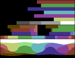
PS:
32 colors, not 32bits
Thanks, this was precisely what I needed, huge thanksUse code
attach to camera
Code:public class movecamera : MonoBehaviour { public GameObject target;//the target object public Vector3 offsetTargetPosition = Vector3.up; public float speed = 10.0f;//a speed modifier public float distanceAway = 2; public Vector3 cameraOffset = Vector3.forward; void Start() { transform.position = target.transform.position + cameraOffset + (Vector3.forward * distanceAway); transform.LookAt(target.transform.position + offsetTargetPosition);//makes the camera look to it } void Update() { transform.RotateAround(target.transform.position + offsetTargetPosition, Vector3.up, Time.deltaTime * speed); } }
Whould be interesting to know why the colors where chosen that way.Oh i remember those, i saw them long time ago but i didn't remember where, otherwise i would have linked them too.
Amiga 4ever
While we are at it i have never liked the c64 palette, too desaturated for my tastes, but i remember someone somewhere explaining how well thought and flexible it was.

...
From a technical point of view, these colors are at least very safe for
broadcasting, i.e. these colors will only produce minor artifacts when
transmitted over RF (Radio Frequency). I also think the RF implementation
could be simplified (simpler filters etc.) when the colors (maximal signal
level, maximal rate of phase change) are known a-priori. But I don't think
the choice was a pure technical one. There must be an artistic reason as well.
Wheee, Power Hover just went past one million downloads! Combined downloads from all the platforms, majority from free Android version. still not too bad for a team of two!

oh man probably made so much bank!
congrats dude
Really coolWheee, Power Hover just went past one million downloads! Combined downloads from all the platforms, majority from free Android version. still not too bad for a team of two!

Wheee, Power Hover just went past one million downloads! Combined downloads from all the platforms, majority from free Android version. still not too bad for a team of two!
Nice job, that's awesome
It's #screenshotsaturday !
Here's a look at a few of the baddies we've been working on for Magnetta.


Voted for you on Greenlight
Voted for you on Greenlight
Thanks! We really appreciate it.
It's #screenshotsaturday !
Here's a look at a few of the baddies we've been working on for Magnetta.


nice. I like the style of your pixel art characters. it's at once unique and memorable, which is hard to do with pixel art since everything's nearly been done
Wheee, Power Hover just went past one million downloads! Combined downloads from all the platforms, majority from free Android version. still not too bad for a team of two!

I'm one of those downloads <3


I got the smoke to receive local light as well
You can see in the background it gets lit by some fire from a wreck and some headlights in front.
The nights were pretty dark though -> here is a gif: http://gfycat.com/BlissfulGoldenHatchetfish
So I decided to make the nights a bit more blue and bright.
Do you like the second one more? Is it too blue/violet?
Apart from that there is some new stuff with unfinished art, like for example the portraits on the right (which every RPG player will know ^^), yeah I am not sure how to make them feel right.
(twitter @kosmonautgames)
For Greenlight and sales in general, how important are the graphics for indie games? A lot of games in this thread look gorgeous, whereas my own tend to be cube-based due to a lack of artists available. As a designer, this doesn't bother me, I do what I can with the tools I have, and the gameplay is of course number 1 regardless of art style. But I wonder if these games are viable to put on sale at all :/
- Status
- Not open for further replies.


