Lucky Forward
Member

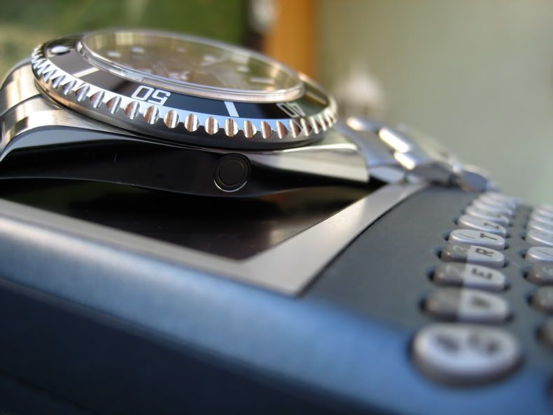
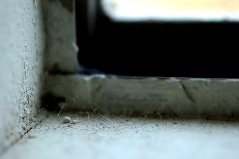
Canon 20D, 85mm f/1.2L, ISO 100, 1/6400 sec, f/1.2
Lucky Forward said:Canon 20D, 85mm f/1.2L, ISO 100, 1/6400 sec, f/1.2
 I recently purchased an 85mm 1.8, and it's a nice lens, but still am ever so envious of the 1.2L. The 1.8 has purple edges that I'm simply not used to getting on my other lenses.
Thanks, I was shooting earlier in the afternoon and even though it was a semi-overcast day, I couldn't open all the way up to f/1.2 without the shutter speed maxing out at 1/8000 second and overexposing. So I was mostly shooting at around f/2.5 for a while, but by late afteroon the light had faded a bit so I was able to open up to f/1.2 and get this one.mrkgoo said:Nice pic!
I find it somewhat amusing you're struggling to expose it correctly at 1.2 outdoors...


")
Jebus said:Non-participants are also welcome to vote. Criticism/comments encouraged.

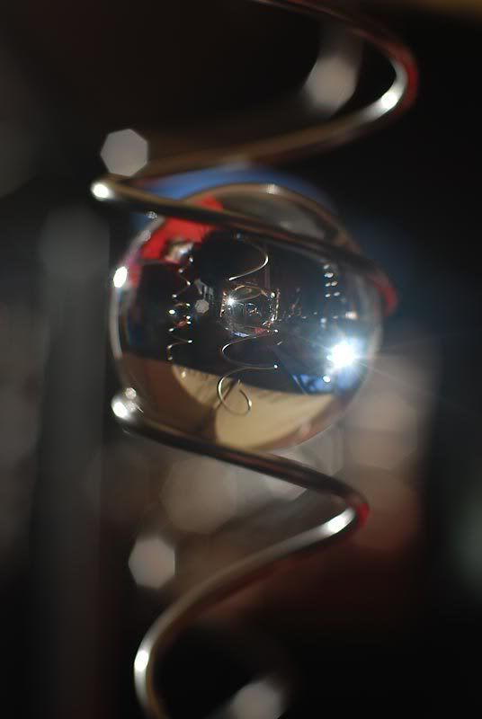
To be perfectly honest I have no idea what it is. I saw 5 of them hanging in a stall at a local craft market. They look like windchimes, yet they make no sound. It's a crystal ball suspended in the air within a silver corkscrew loop, spinning like a top in mid-air and creating brilliant sparkles of light (I think you can make out some motion blur if you look closely at some of the flares that come up in my shot).LuCkymoON said:2)ScientificNinja - I love it! i can see this as the cover to a Scifi movie or book. What is that thing anyway =)?
ScientificNinja said:McSpidey - I wasn't quite sure what to make of this. I would've thought it would be the Queen in focus toppling the King... but then I realised there's a monkey playing in the background... but then I wasn't sure that's what you meant.
The DoF represents the youngsters eyes darting towards the king which is his current focus at that point in time.ScientificNinja said:First:Guess. Beautifully clean, lots of white space, perfect for magazine editorial. What really did it for me is the fact that it was more than just a pic featuring shallow DOF, it forces you to change perspectives to get a clearer picture of what's otherwise out of focus (what I was trying to do with mine, actually)
Honorable Mention: Nitewulf. Reminds me of a Miyazaki film. Very surreal.
Other comments:
BlueTsunami - Beautiful, warm... I love the wafer-thin focus on the ear.
LuckyMoon - the textures are excellent!
Tf53 - the DOF you've achieved looks great; the sepia makes it look extra-special.
McSpidey - I wasn't quite sure what to make of this. I would've thought it would be the Queen in focus toppling the King... but then I realised there's a monkey playing in the background... but then I wasn't sure that's what you meant.
Dkong - I like the colours a lot. I think the pic would've worked better if there was something else in the picture to get a sense of scale.
Livingdeadgirl - did you have a VR lens for this? Bees never sit still for me :\
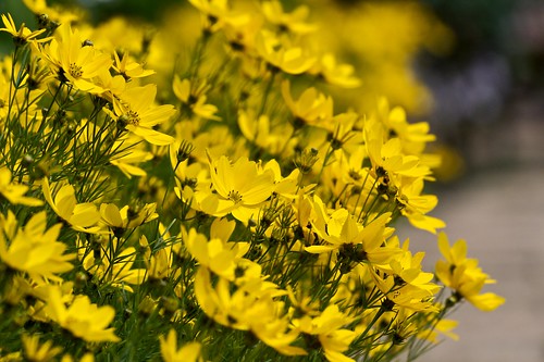
Squirrel Killer - the flowers provide a wonderful contrast, but the blown-out bit at the top of the pic spoils it a little for me.
AirBrian - It looks beautifully subtle; but is it just me or are the edges along the bottom and left especially blurry?
Dementia - I think you've focused on the top of the head, which is why the rest of her looks a little soft. I'd have tried focussing on the eyes instead.
Lucky Forward - there's more goggle than child!
Dskillzhtown - I really like this shot, being a dog lover and all, but the DOF isn't quite shallow enough. A closer crop, perhaps?
Joshschw - this is what the world looks like to me when I'm not wearing my glasses.
aidan - I see what you did there
To be perfectly honest I have no idea what it is. I saw 5 of them hanging in a stall at a local craft market. They look like windchimes, yet they make no sound. It's a crystal ball suspended in the air within a silver corkscrew loop, spinning like a top in mid-air and creating brilliant sparkles of light (I think you can make out some motion blur if you look closely at some of the flares that come up in my shot).
). Nice DOF, but I don't know if I like the amount of contrast. The pic seems a bit cold to me, did you check WB? A lower angle would have probably helped with the DoF though.Thanks!AirBrian said:Squirrel Killer - Oh, very nice! I like the added contrastiness of the picture! (Is that even a word? It is now!)
Thanks. Unfortuantely, there was no way to correctly expose for the headlight without losing everything else, I had already under-exposed by a good stop or so.ScientificNinja said:Squirrel Killer - the flowers provide a wonderful contrast, but the blown-out bit at the top of the pic spoils it a little for me.
And here I was thinking I had over-done flower shots, since this is like my third or fourth.Tf53 said:Squirrel Killer: I wouldn't have guessed that this was your shot based on the previous assignments (due to subject choice and post, not the quality of the image
Thanks. And yes, it was intentional, although I do wish my original shot had a few more pixels on the left to compose more closely with the rule of thirds in mind.BlueTsunami said:Squirrel Killer: Not sure if it was intended but I absolutely love how the flowers, buds and plants in the background all seem to form a line in a similar direction (pointing upper left). It feels like the isolation of the flowers are two fold, with DoF and lighting. Love it.
BlueTsunami said:Aidan: You rock! This is another one of the more creative shots in this thread. I never would have came up with something like this. Love the picture.
Tf53 said:aidan: Lovely idea, but the edges around Mario take the illusion out for me.
Jebus said:2nd - Aidan - You've chosen a nice angle to emphasize your subject, and I like that the background isn't completely out of focus as well, which helps explain the shot. nice work!
Squirrel Killer said:Aidan - Neat idea. Not that it's distracting, but I have to ask if that's a raster scan line I'm seeing in the background.
If nobody else feels the same way I complete understand, just want to put it out there.It's Glare, I was wondering if anyone would notice. I used a CPL for this shot but it would not correct all of the glare I was getting. =SSquirrel Killer said:Other Comments:
LuCkymoON - Very nice shot. There seems to be some... is it lens flare? right at the top of the front foot.
)
LuCkymoON said:It's Glare, I was wondering if anyone would notice. I used a CPL for this shot but it would not correct all of the glare I was getting. =S
(it got most of it tho
