You are using an out of date browser. It may not display this or other websites correctly.
You should upgrade or use an alternative browser.
You should upgrade or use an alternative browser.
Graphical Fidelity I Expect This Gen
- Thread starter ResetEraVetVIP
- Start date
- NSFW

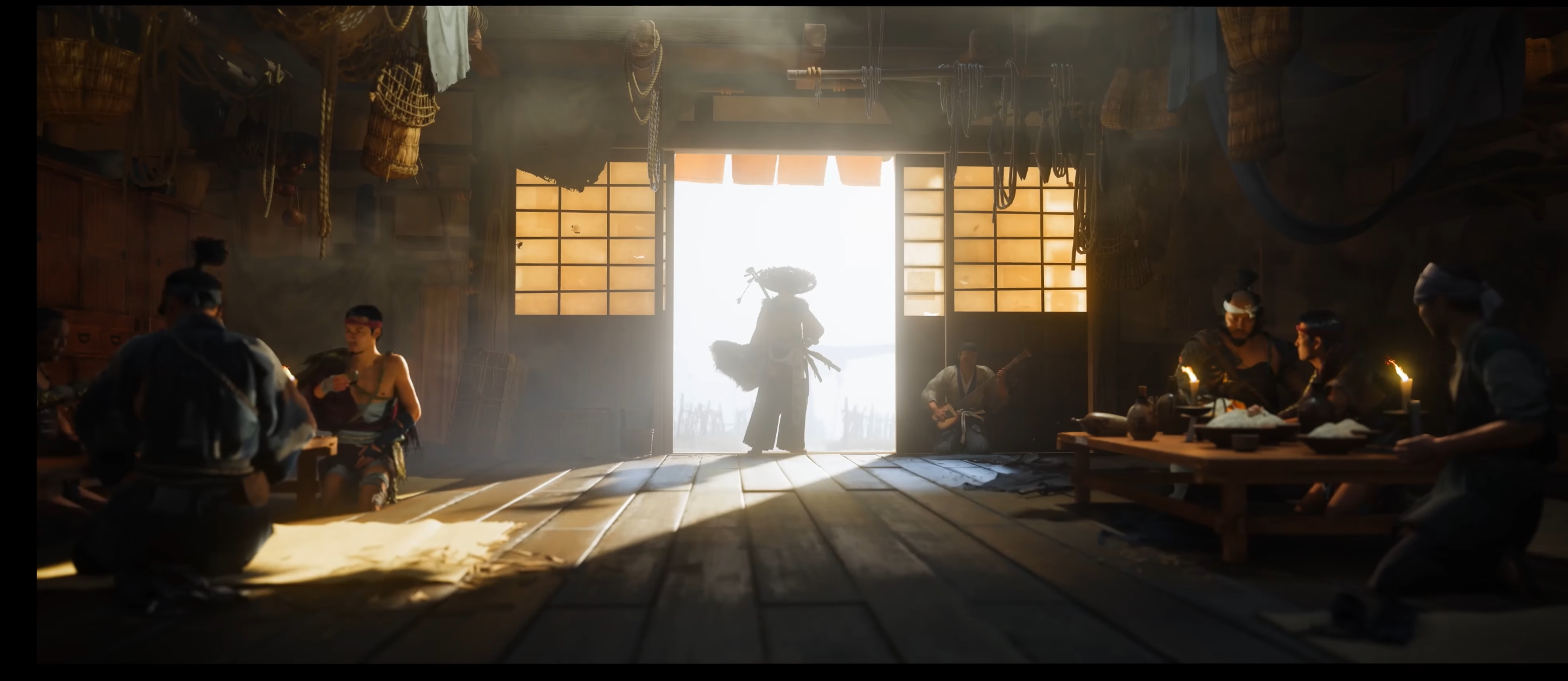
You could fool someone that these are real photos. Nice!I downloaded the demo to have a butchers and tbh the game can look downright incredible. Though the rocks in the cockpit shot may be a little overdetailed forrofif . UE5 doing work as usual


Last edited:
Msamy
Member
Lol on you keeping defend this shitReminder, because not everyone will see the other thread.
THIS is how first got looks. my screenshots from this year playing dc on pro.
Looks great but Yoteil is clearly WAY better looking technically. Only similar in style
and this is ps5 directors cut... now compare yotei to ps4 version...


...


And this is YOTEI


Last edited:
Luipadre
Member
Yotei announcement
Yesterday gameplay
LOL,
Dont be stupid. First shot is daytime, second is night. There is 0 lighting from outside
Gonzito
Gold Member
Yotei announcement
Yesterday gameplay
LOL,
In the announcement trailer is a sunny day, in the gameplay trailer from yesterday is night time.
The comparison makes zero sense buddy
Alex11
Member
There's no comparison between Yotei and AC Shadows, but Yotei shines artistically.
I don't know what you guys expected from Ghost 2, with Ghost 1 being the same deal, the art style carried it also.
It was in the time with TLOU2, Cyberpunk 2077, previous year Death Stranding and Control, I mean in 2018 we had RDR2, so it was inferior to all of these technically.
I don't know what you guys expected from Ghost 2, with Ghost 1 being the same deal, the art style carried it also.
It was in the time with TLOU2, Cyberpunk 2077, previous year Death Stranding and Control, I mean in 2018 we had RDR2, so it was inferior to all of these technically.
rofif
Banned
you attack me and continue to post screenshots of yotei that prove my point by looking way better than got lolLol on you keeping defend this shit
Msamy
Member
I know that, I Ijust think they change lightning settings because they can't handle it now like they faked it on first trailer I can assure you that after game release this scene in sunny day will look worse than announcement trailerIn the announcement trailer is a sunny day, in the gameplay trailer from yesterday is night time.
The comparison makes zero sense buddy
Msamy
Member
Lol, way betteryou attack me and continue to post screenshots of yotei that prove my point by looking way better than got lol

Last edited:
Pharaoh 117
Member
There's no comparison between Yotei and AC Shadows, but Yotei shines artistically.
I don't know what you guys expected from Ghost 2, with Ghost 1 being the same deal, the art style carried it also.
It was in the time with TLOU2, Cyberpunk 2077, previous year Death Stranding and Control, I mean in 2018 we had RDR2, so it was inferior to all of these technically.
The problem is exactly the comparison with the first game. There's barely an evolution for a game that's from a gen ahead.
coachmcguirk91
Member
It's just silly. Ghost of Tsushima has arguably aged better than any last gen AAA game because the art style is fantastic. Looking back now, even games like TLOU2 have started to look dated. I am ok with a studio prioritizing art style over pure graphic fidelity. Very few studios do that nowadays. It's one of the reasons why Nintendo games tend to age like fine wine while pretty much all other games look dated and terrible 5 years after launchThere's no comparison between Yotei and AC Shadows, but Yotei shines artistically.
I don't know what you guys expected from Ghost 2, with Ghost 1 being the same deal, the art style carried it also.
It was in the time with TLOU2, Cyberpunk 2077, previous year Death Stranding and Control, I mean in 2018 we had RDR2, so it was inferior to all of these technically.
Last edited:
analog_future
Resident Crybaby
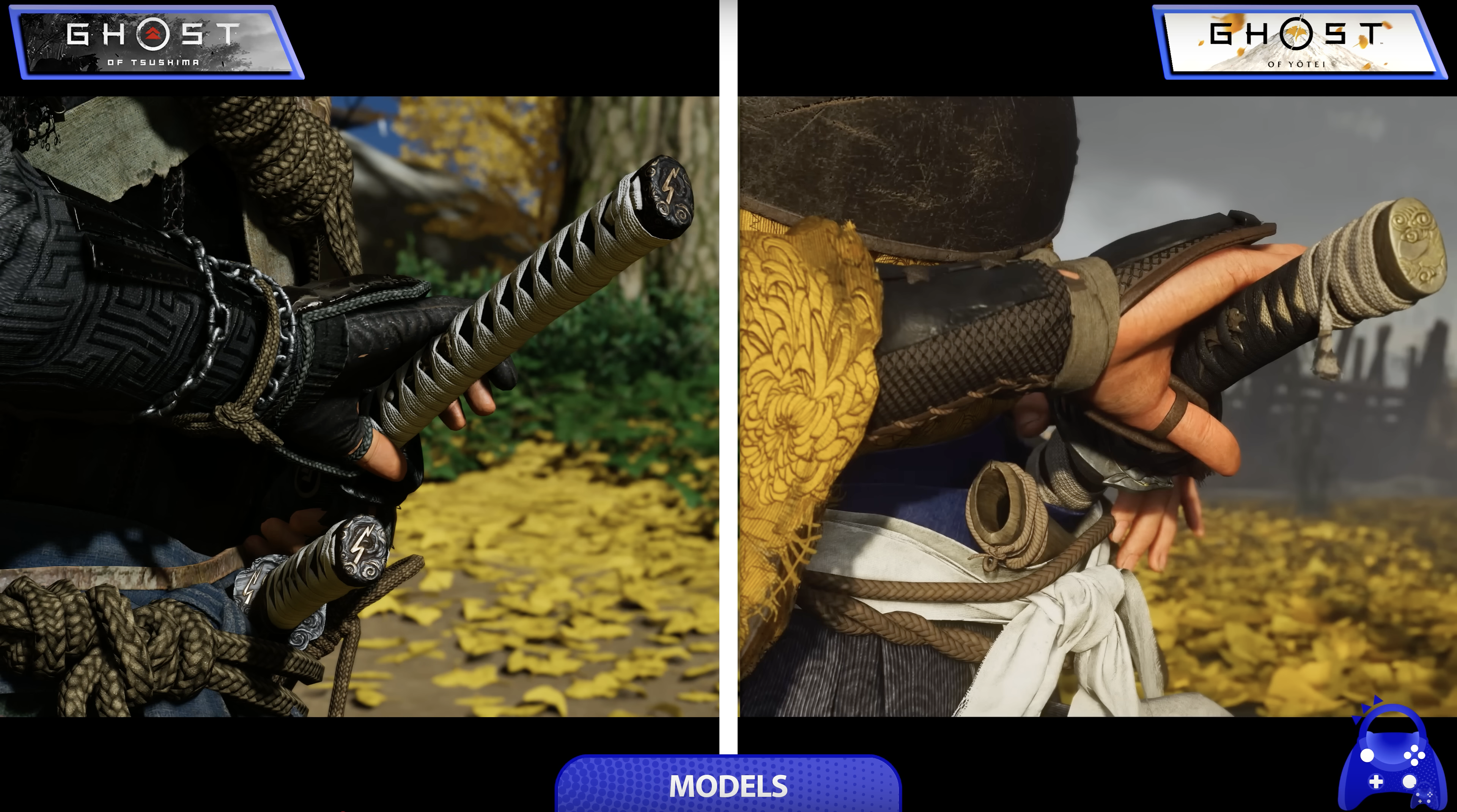
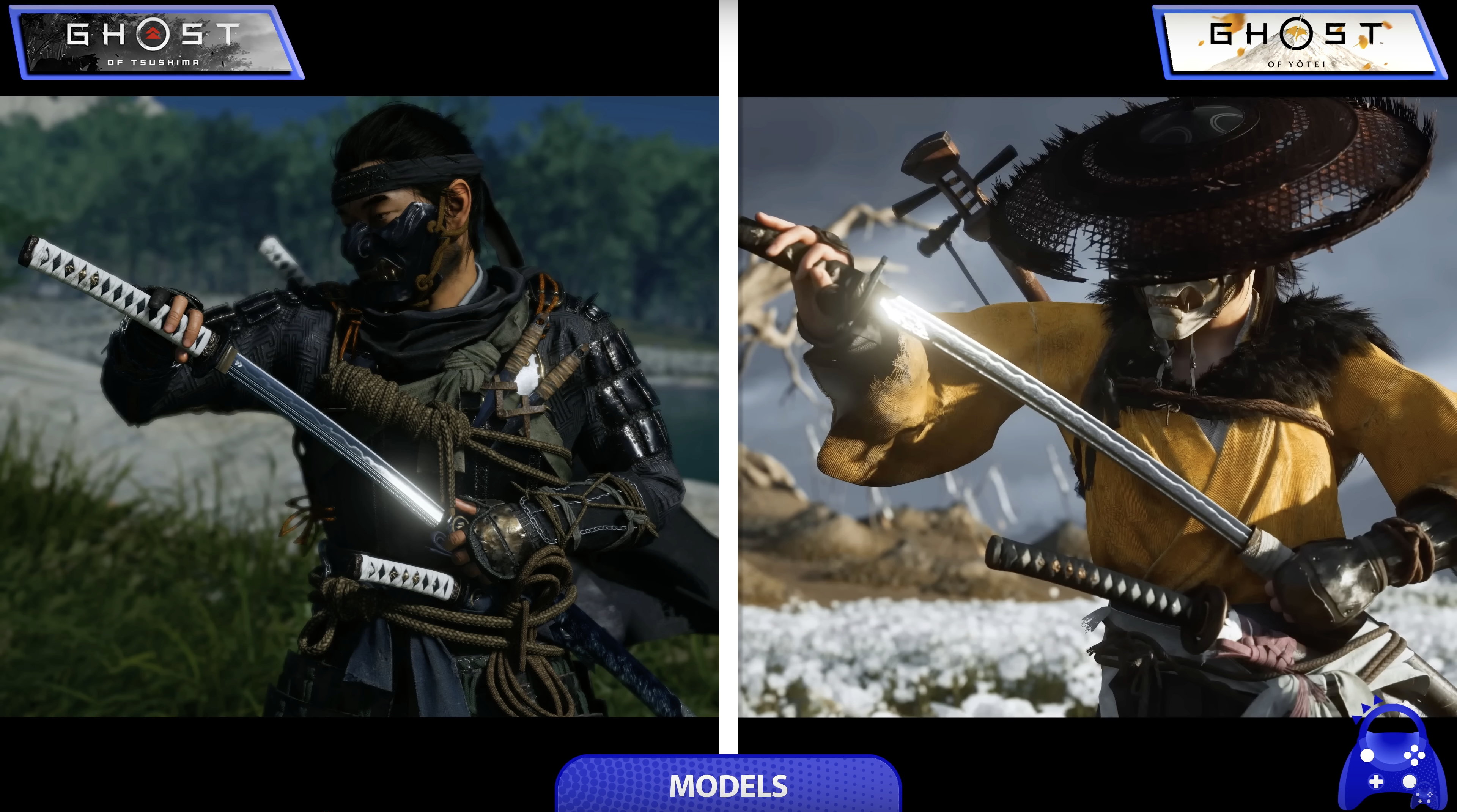
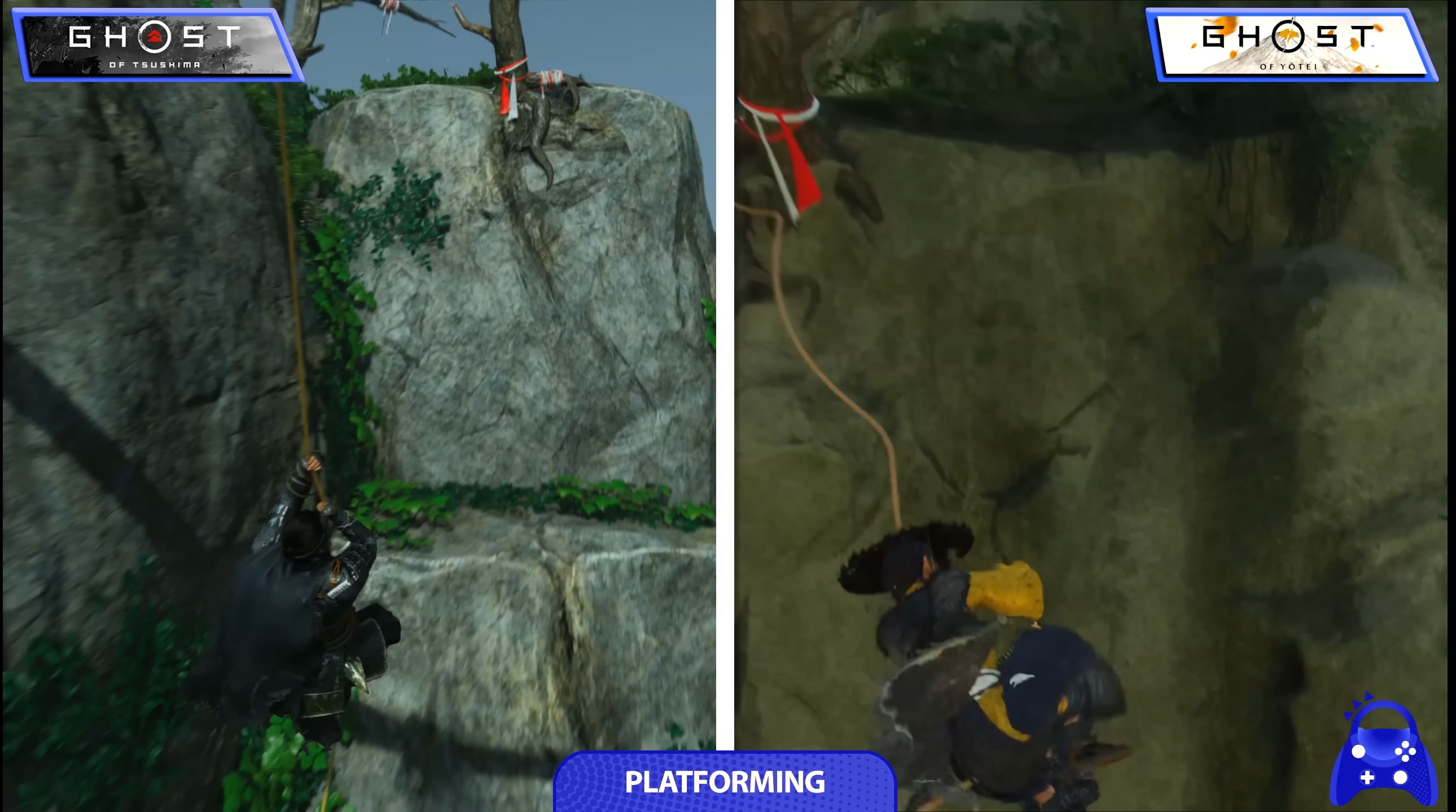
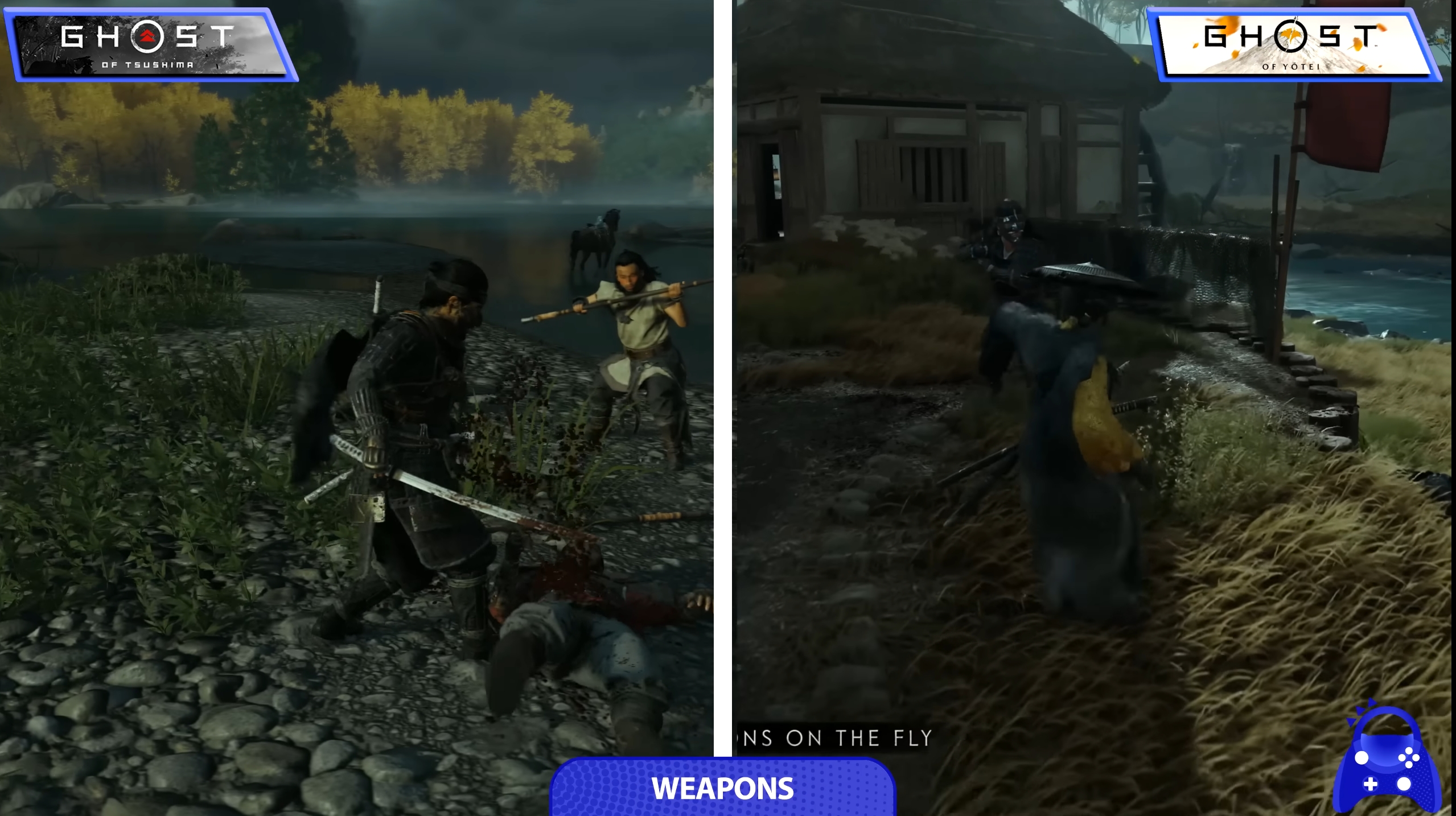
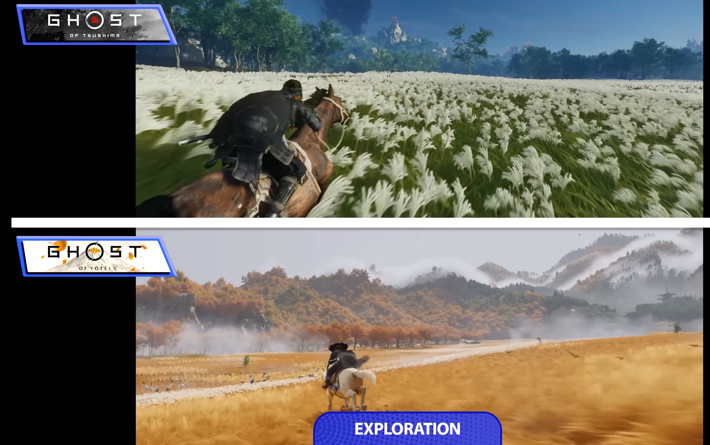
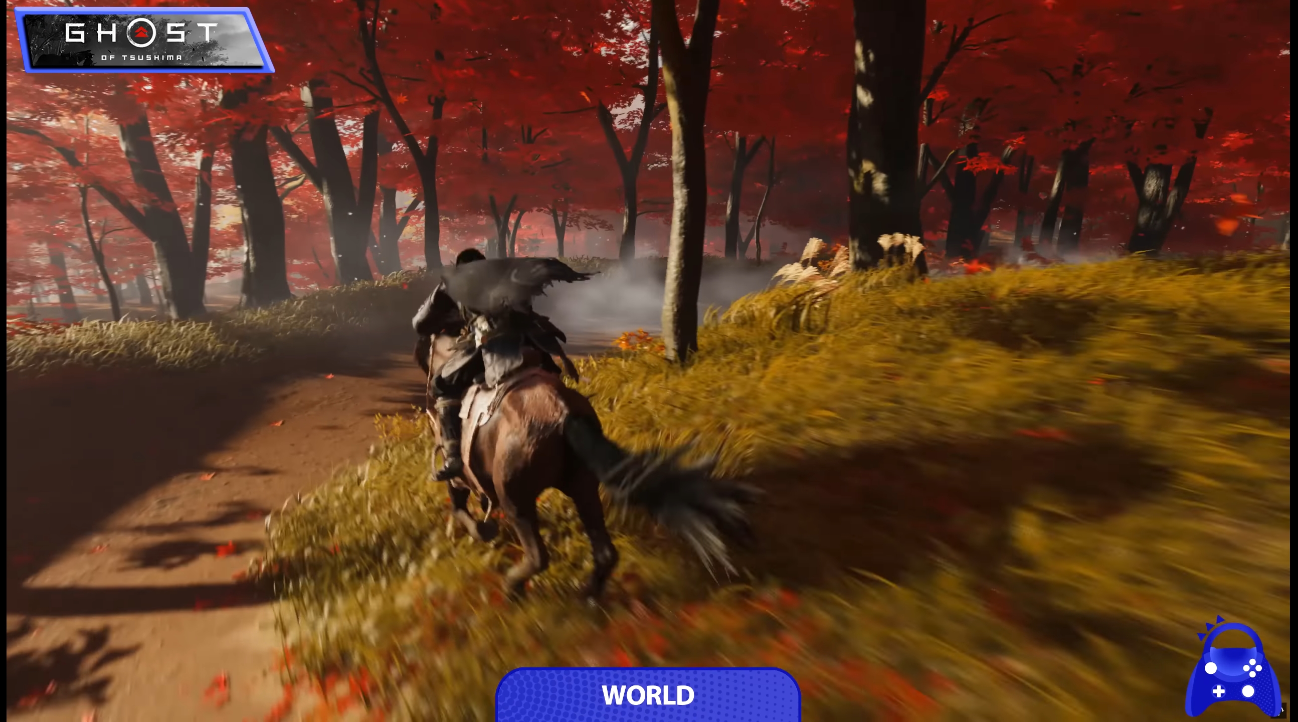
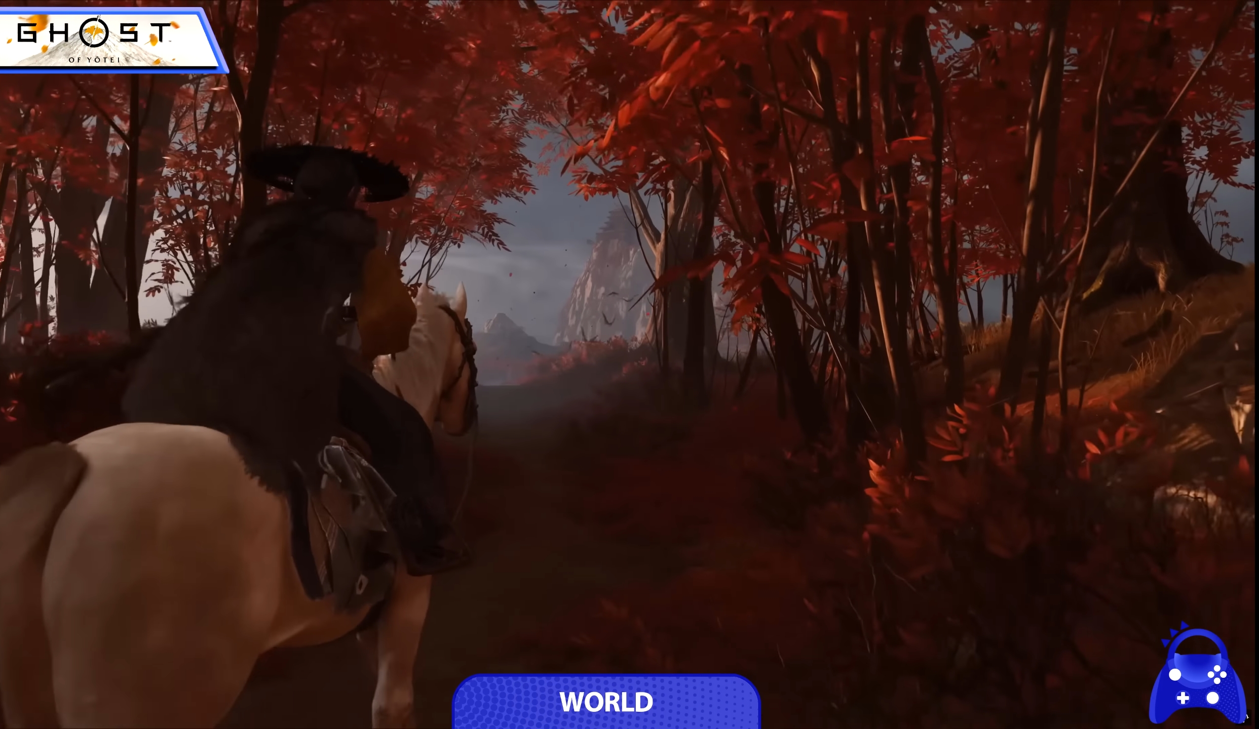
We have a comparison video:
Overall it's does look like Ghost of Tsusima 1.5, BUT the facial detail and draw distances are much improved. Draw distances/large-scale environmental detail in particular look like an actual generational leap.
Not impressed:
More impressed:

Very impressed:
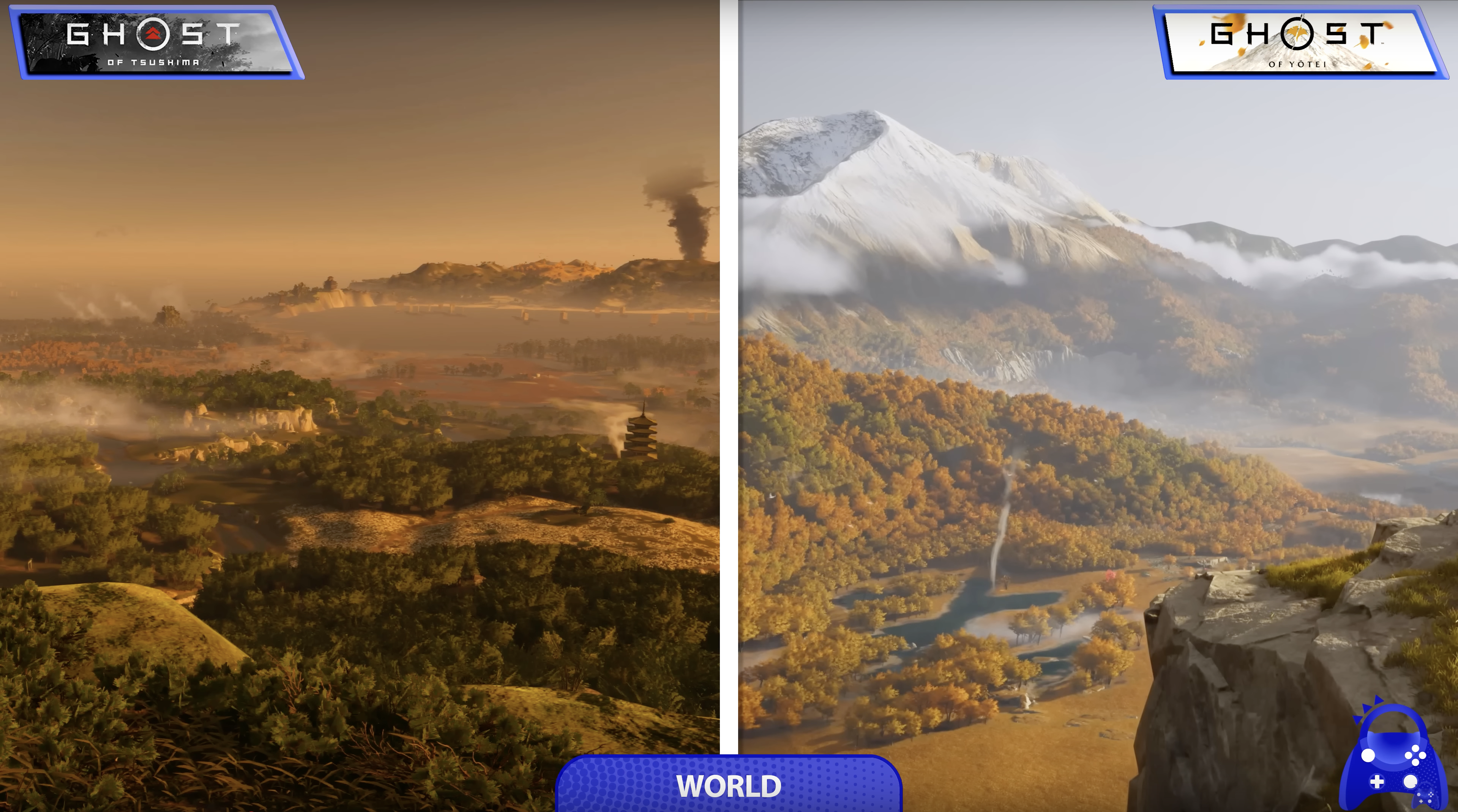
Overall it's does look like Ghost of Tsusima 1.5, BUT the facial detail and draw distances are much improved. Draw distances/large-scale environmental detail in particular look like an actual generational leap.
Not impressed:
More impressed:
Very impressed:
Last edited:
Msamy
Member
We have a comparison video:
Overall it's does look like Ghost of Tsusima 1.5, BUT the facial detail and draw distances are much improved. Draw distances/large-scale environmental detail in particular look like an actual generational leap.
Not impressed:
More impressed:
Very impressed:
Not impressed and disappointed
Last edited:
BbMajor7th
Member
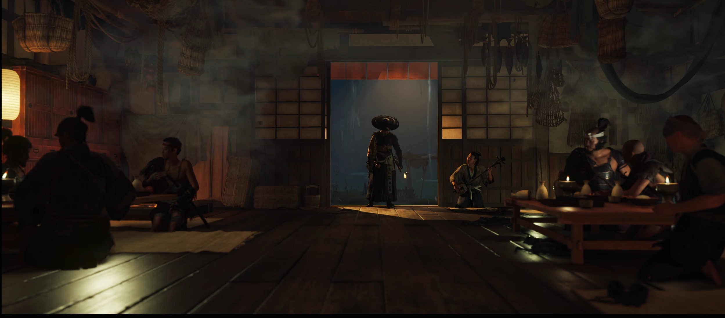
The daytime screenshot is certainly using a much more sophisticated lighting set-up - all that interior lighting is coming from GI bounce and ambient occlusion which gives it a very naturalised looked. You don't get any of that at nighttime - the reflected light on the bottom left looks to be using a simple cube map, as the light source is not interacting with the seated man at all, either lighting him or casting shadows. It's quite a dated looking technique for 2025.I know that, I Ijust think they change lightning settings because they can't handle it now like they faked it on first trailer I can assure you that after game release this scene in sunny day will look worse than announcement trailer
Msamy
Member
I don't argue with you, I also know that first Pic.is easily achievable but I can assure you those lazy ass won't achieve those visuals on final game so they change the lighting settings on yesterday trailer.The daytime screenshot is certainly using a much more sophisticated lighting set-up - all that interior lighting is coming from GI bounce and ambient occlusion which gives it a very naturalised looked. You don't get any of that at nighttime - the reflected light on the bottom left looks to be using a simple cube map, as the light source is not interacting with the seated man at all, either lighting him or casting shadows. It's quite a dated looking technique for 2025.
Last edited:
Bitstream
Member
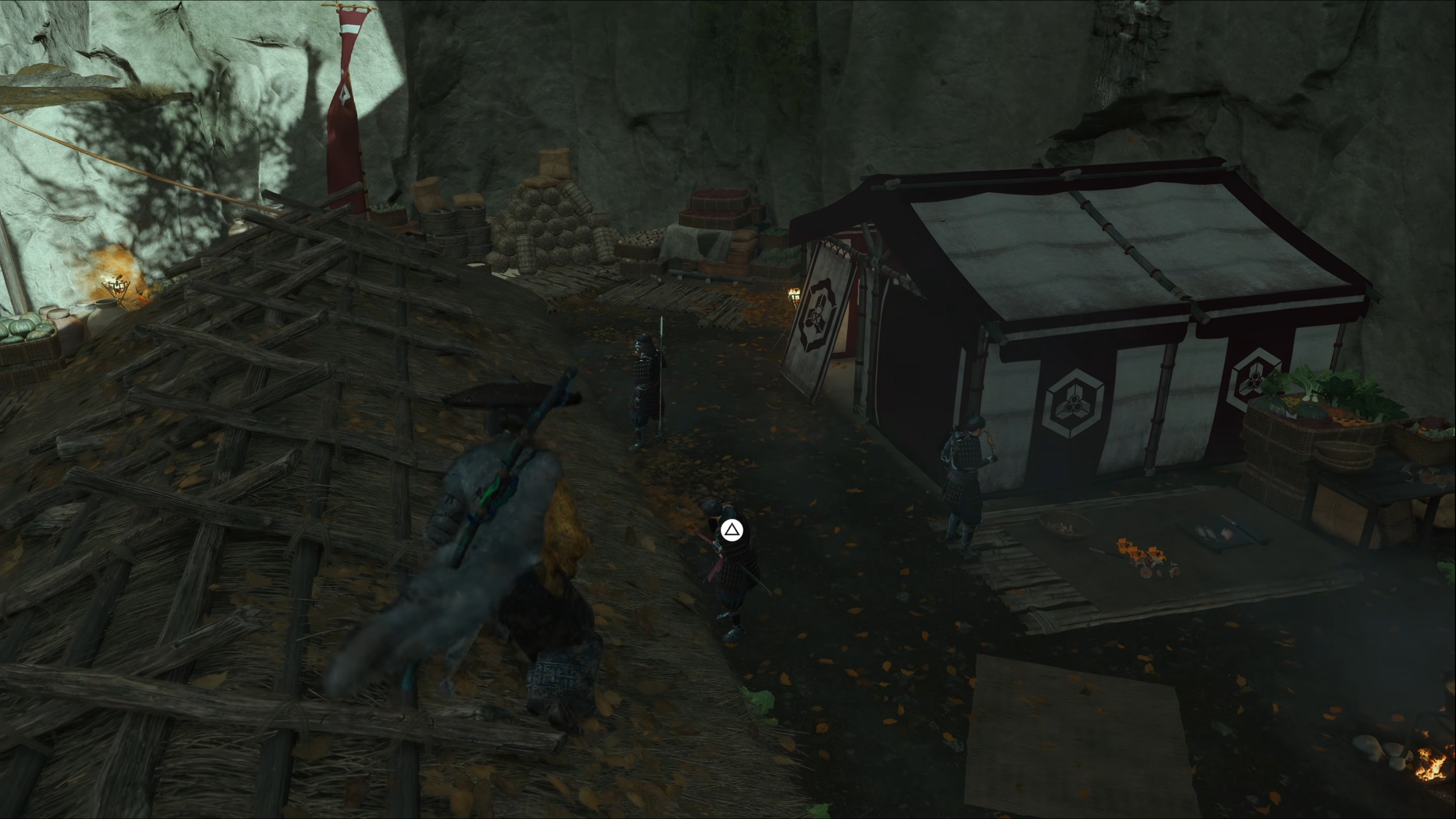
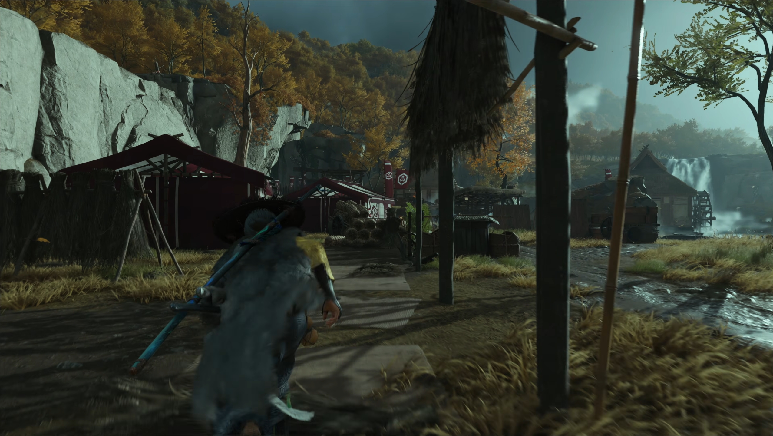
The new screenshots look like they altogether removed RTGI and went back to last gen lighting methods.
Mafia looks downgraded too.
Guess it's time to cross these off the 'great looking upcoming games' list and put them on the 'wait for a sale' list.
Not cracking open my wallet for cobbled together last gen games in 2025 unless they bring any interesting new gameplay mechanics to the table.
Mafia looks downgraded too.
Guess it's time to cross these off the 'great looking upcoming games' list and put them on the 'wait for a sale' list.
Not cracking open my wallet for cobbled together last gen games in 2025 unless they bring any interesting new gameplay mechanics to the table.
Senua
Member
People are too busy arguing about a last gen looking PS5 game to notice lolYou could fool someone that these are real photos. Nice!
Portugeezer
Member
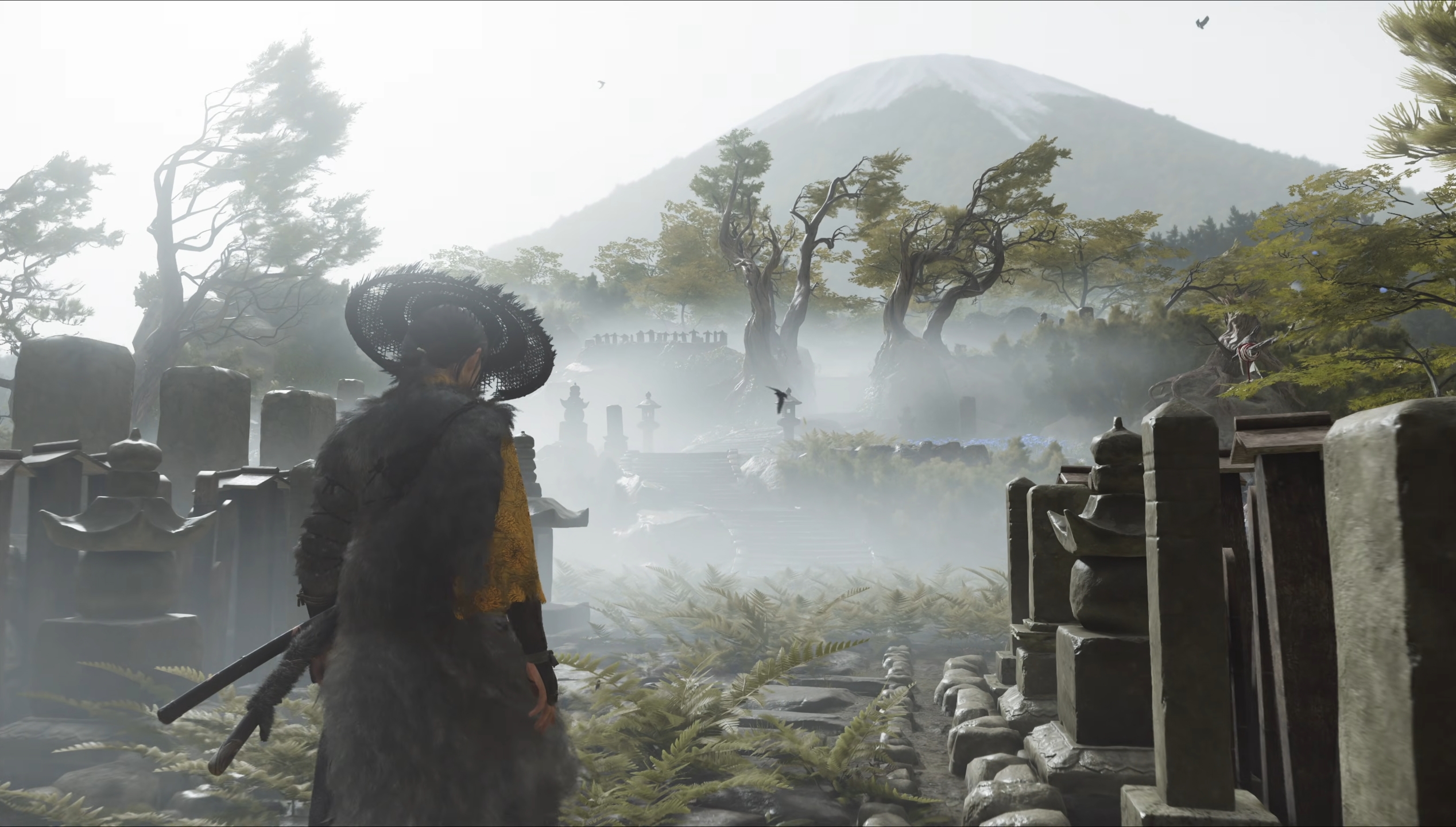
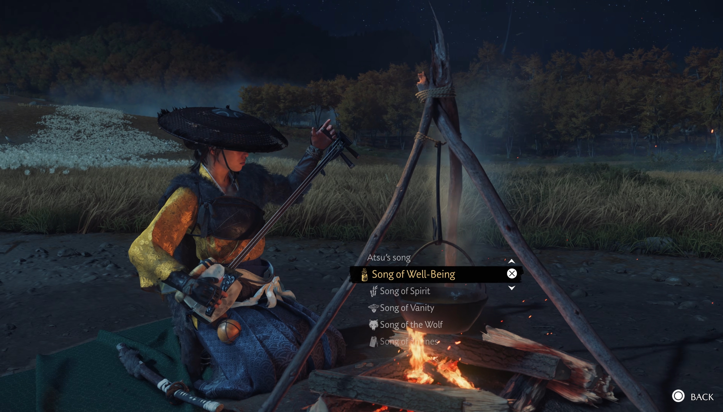
Yotei's art direction will do some heavy lifting.
Technically nothing very impressive.
Technically nothing very impressive.
Msamy
Member
Actually they released direct feed 4k gameplay video on YouTube which used on the comparison video, so both titles subject only to YouTube compressionGuys when comparing screenshots, don't forget that the Yotei ones are very blurry from the stream compression.
I'm sure people will have a lot more to complain about the trees in the distance when they see a 4K screenshot
DanielG165
Member
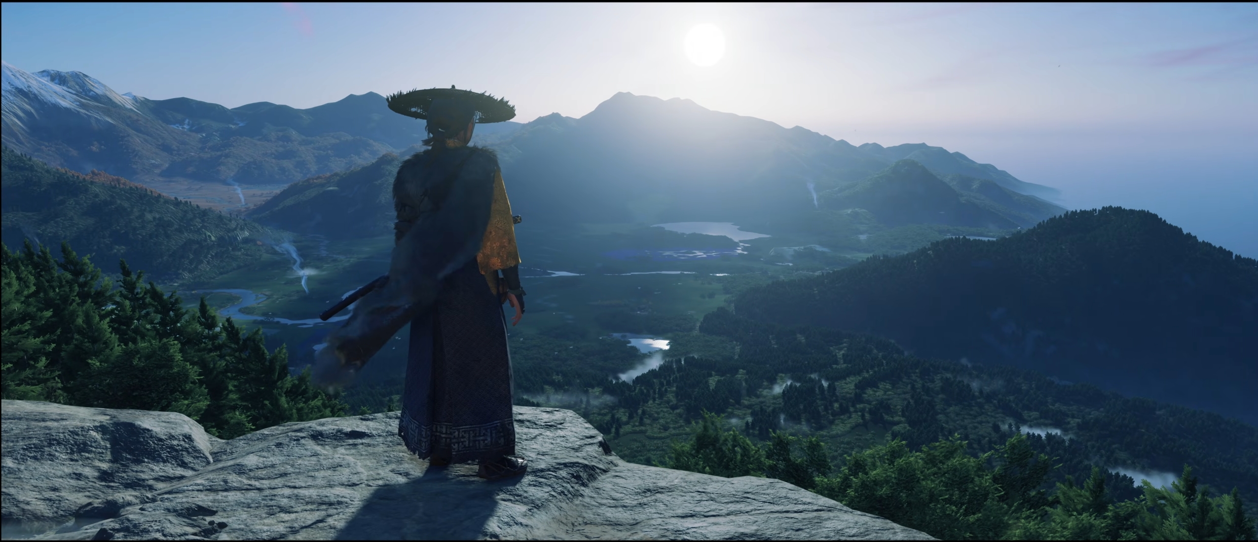
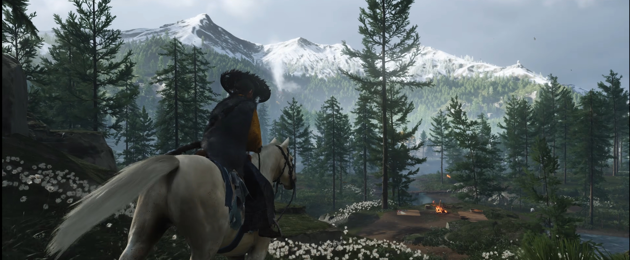
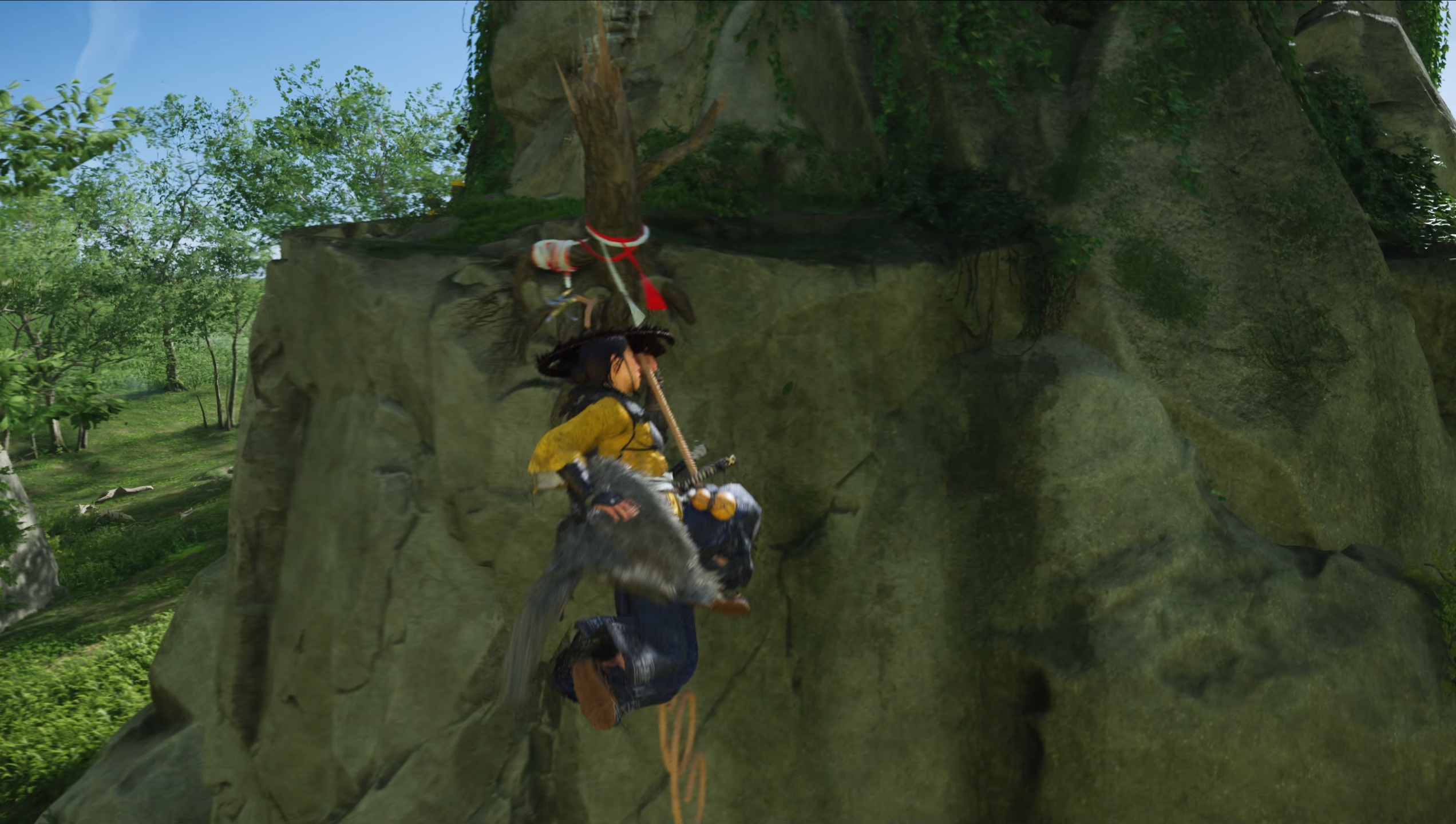
Yeah… It doesn't look like that in motion. A static shot isn't at all representative of how far away forests look in Shadows. I just played it for a few hours yesterday.Fuck me that forest in the distance. Disgusting.
THIS is what the game actually looks like in motion.
Last edited:
SlimySnake
Flashless at the Golden Globes
I dont remember GoT looking that ugly. the color saturation, the last gen lighting and foliage, and that ugly art style. My eyes have suffered enough.People, please stop posting these comparisons, I can't be puking in public.
Going to start posting some AC shadows and Avatar gifs to bring some sanity into this thread. We have standards even if sony studios dont.
SlimySnake
Flashless at the Golden Globes
Those autumn trees do look horrendous even in the game. But yes, any other season, and those same trees get different shaders and look absolutely phenomenal. Someone here thought they were using something like nanite for foliage because there was no pop-in and the trees looked amazing.Yeah… It doesn't look like that in motion. A static shot isn't at all representative of how far away forests look in Shadows. I just played it for a few hours yesterday.
Msamy
Member
Yes far better than ign bullshiThe 4k Mafia footage looks decent, not quite hanging with the best of this gen, but for a smaller lower budget studio, they're punching above their weight.
Represent.
Represent(ative) of bad opinions
Art Direction is allowed to do the heavy lifting.Yotei's art direction will do some heavy lifting.
Technically nothing very impressive.
Whatever makes the game look good counts as graphics. Not everything without RTGI looks bad, we are losing the plot here.
dgrdsv
Member
I don't see anything being "much improved" in these, look very much the same to me aside from some higher LODs for far distance geometry possibly.Overall it's does look like Ghost of Tsusima 1.5, BUT the facial detail and draw distances are much improved. Draw distances/large-scale environmental detail in particular look like an actual generational leap.
metareferential
Member
"Artistically superior", which just means "leaves and flowers on the ground, soooooo japanese". xDI dont remember GoT looking that ugly. the color saturation, the last gen lighting and foliage, and that ugly art style. My eyes have suffered enough.
Going to start posting some AC shadows and Avatar gifs to bring some sanity into this thread. We have standards even if sony studios dont.
The cartoony style of the rendering (don't know how to describe it otherwise) really lets the art down, in my opinion.
Last edited:
SlimySnake
Flashless at the Golden Globes
It's GoT1.1. Literally DLC.I don't see anything being "much improved" in these, look very much the same to me aside from some higher LODs for far distance geometry possibly.
Luipadre
Member
Yes far better than ign bullshi
What a surprise. IGN video was trash as always. What a professional journalist site. Their "4K" videos looks like 1080p at best with awful bitrate
analog_future
Resident Crybaby
I don't see anything being "much improved" in these, look very much the same to me aside from some higher LODs for far distance geometry possibly.
If you don't think that last comparison I shared is much improved, you have your blinders on.
SlimySnake
Flashless at the Golden Globes
I asked Chatgpt why Ghosts looks so graphically underwhelming and it literally answered by quoting us lmao.
why does Ghost of Yotei looks so graphically underwhelming despite being next gen only
Several forums note it feels like a 1.5‑gen upgrade—not a full next-gen showcase:
"Ghost of Yōtei" appears to run on an evolution of the Tsushima engine, without embracing newer rendering technologies:
Sucker Punch seems prioritizing resolution over modern graphical advancements:
The game leans on its strong art direction to mask technical shortcomings:
Sucker Punch isn't a mega-studio. They're building on what they know:
why does Ghost of Yotei looks so graphically underwhelming despite being next gen only
ChatGPT said:
"Ghost of Yōtei" is already raising questions about its visual leap—or lack thereof—despite being next-gen exclusive. Here's what's driving that buzz: 1. Minimal Tech Leap from
Several forums note it feels like a 1.5‑gen upgrade—not a full next-gen showcase:Reddit users agree: while art design remains strong, technical fidelity is falling short of expectations Reddit."It looks like a high resolution PS4 game in a lot of shots… it should be better for a game coming 4 years into the PS5's lifecycle." Diario AS+15NeoGAF+15NeoGAF+15
"Everything looks so sparse and the lighting is just so flat… you could see the individual pixels on the tree from that one vista shot." ResetEra
 2. Engine & Rendering Limitations
"Ghost of Yōtei" appears to run on an evolution of the Tsushima engine, without embracing newer rendering technologies:- No clear signs of real-time global illumination (RTGI), ray tracing, Nanite, or Unreal Engine‑style next-gen features Diario AS+15NeoGAF+15NeoGAF+15.
- As one user observed: "No evidence of RTGI, nanite, or even software lumen… looks last gen like this." NeoGAF
 3. Image Quality vs. Performance Trade-offs
Sucker Punch seems prioritizing resolution over modern graphical advancements:- Base PS5 mode targets native 4K at 30 FPS with only modest enhancements over the older engine NeoGAF+15ResetEra+15Reddit+15ResetEra+12NeoGAF+12ResetEra+12.
- PS5 Pro boosts dynamic resolution (~1800p→4K) and possibly ray tracing, but other assets—textures, draw distance—appear unchanged Reddit.
 4. Artstyle Camouflage
The game leans on its strong art direction to mask technical shortcomings:- Hokkaido's landscapes, anime-tinged character designs, and environmental effects like swaying grass and auroras are visually appealing Reddit+79meters+7The Gamer+7.
- But when peeled back—look at the lighting, AO, materials—the base tech feels dated ResetEra+2ResetEra+2Reddit+2.
 5. Small Studio + Scope Constraints
Sucker Punch isn't a mega-studio. They're building on what they know:So while quality art remains, the engine hasn't undergone a full next-gen overhaul."Sucker Punch is not a huge team, and why wouldn't they do more of the same? … using the same tech but expanding the world." Reddit+2Reddit+2Reddit+2NeoGAF
SlimySnake
Flashless at the Golden Globes
This happens every time. Happened with AC Shadows (even i fell for it and i was cheer leading that game for months), happened with avatar and outlaws. Preview event captures just dont show up well on youtube. Probably because most preview events are now virtual instead of happening in person like they used to.What a surprise. IGN video was trash as always. What a professional journalist site. Their "4K" videos looks like 1080p at best with awful bitrate
Nanite and Lumen will save Mafia. You can already hear devs talk about how they wanted to push the bar and their ambition to push the visual fidelity over and over again. Even if they end up downgrading the game to run on consoles, it wont be because they were targeting native 4k. Or 1440p 60 fps. They wouldve had to downgrade it because their target was 1440p 30 fps and they simply didnt have enough GPU power left. And i can respect that.
Represent.
Represent(ative) of bad opinions
Yeah, I'm joining the
rofif
Yotei defense force. This is not an ugly game. Period.
Lack of technical innovation? Sure. But the art style does some HEAVY lifting - Objectively, it still looks fantastic. That's all I give a shit about.
You're going to put this game on your big OLED screen and eat crow.
Would I like to see some more advanced tech to take it to the next level? Yes. But I'm not sure how you can see these gifs and say it looks like a PS3 game. Lets get a grip here.


This game will be the new Spiderman 2. Everyone (me specifically) was shitting all over the game until release (rightly so, it looked atrocious initially) but when we got around to actually playing the game, on our 65" OLED's, a lot of people in this thread were eating crow. We all admitted the city itself looked next gen as fuck. Not to mention the insanely fast swinging/flying speeds, the RT was the best on console arguably too - the only thing horrible was the character models and we got over it.
I simply can't look at these gifs and call it an ugly game. These are heavily compressed by YouTube. This thing is going to look glorious on a Pro.
Its a game that trades raw tech for sublime art. However, unlike FROM, at least they have some sort of dignity to not COMPLETELY ignore the tech.
Only top tier studios excel at both. Sucker Punch is not a top tier studio. This is a good looking game. Art is allowed to pick up for lack of raw tech.
Lack of technical innovation? Sure. But the art style does some HEAVY lifting - Objectively, it still looks fantastic. That's all I give a shit about.
You're going to put this game on your big OLED screen and eat crow.
Would I like to see some more advanced tech to take it to the next level? Yes. But I'm not sure how you can see these gifs and say it looks like a PS3 game. Lets get a grip here.
This game will be the new Spiderman 2. Everyone (me specifically) was shitting all over the game until release (rightly so, it looked atrocious initially) but when we got around to actually playing the game, on our 65" OLED's, a lot of people in this thread were eating crow. We all admitted the city itself looked next gen as fuck. Not to mention the insanely fast swinging/flying speeds, the RT was the best on console arguably too - the only thing horrible was the character models and we got over it.
I simply can't look at these gifs and call it an ugly game. These are heavily compressed by YouTube. This thing is going to look glorious on a Pro.
Its a game that trades raw tech for sublime art. However, unlike FROM, at least they have some sort of dignity to not COMPLETELY ignore the tech.
Only top tier studios excel at both. Sucker Punch is not a top tier studio. This is a good looking game. Art is allowed to pick up for lack of raw tech.
Last edited:
Represent.
Represent(ative) of bad opinions
do you have any idea what PS3 games look like now
If somebody would have said this is from a PS3 game, I would have believed you.
We're talking Wii level graphics. be serious
Last edited:
metareferential
Member
Yeah, every now and then the ps3 argument keeps popping up, and it's way out of mark.
Saying that it's a ps4-era game seems quite apt, though. At best it looks like a ps4 remaster (higher res, better LOD).
Saying that it's a ps4-era game seems quite apt, though. At best it looks like a ps4 remaster (higher res, better LOD).
mrMUR_96
Member
I'm massively massively critical of visuals on a technical sense, but yes it will look beautiful in motion. It's just such a shame because with proper tech it would look even better and more importantly more consistent. Because of older tech, there are many areas that just look flat or awkward. I'm still excited for the game itself and their art direction is a big part of that. Criticising tech shortcomings doesn't mean we're shitting on the game as a whole, we just expect more from big budget 1st party studios working exclusively on ps5.Yeah, I'm joining the
Lack of technical innovation? Sure. But the art style does some HEAVY lifting - Objectively, it still looks fantastic. That's all I give a shit about.
You're going to put this game on your big OLED screen and eat crow.
Would I like to see some more advanced tech to take it to the next level? Yes. But I'm not sure how you can see these gifs and say it looks like a PS3 game. Lets get a grip here.
This game will be the new Spiderman 2. Everyone (me specifically) was shitting all over the game until release (rightly so, it looked atrocious initially) but when we got around to actually playing the game, on our 65" OLED's, a lot of people in this thread were eating crow. We all admitted the city itself looked next gen as fuck. Not to mention the insanely fast swinging/flying speeds, the RT was the best on console arguably too - the only thing horrible was the character models and we got over it.
I simply can't look at these gifs and call it an ugly game. These are heavily compressed by YouTube. This thing is going to look glorious on a Pro.
Its a game that trades raw tech for sublime art. However, unlike FROM, at least they have some sort of dignity to not COMPLETELY ignore the tech.
Only top tier studios excel at both. Sucker Punch is not a top tier studio. This is a good looking game. Art is allowed to pick up for lack of raw tech.
vpance
Member
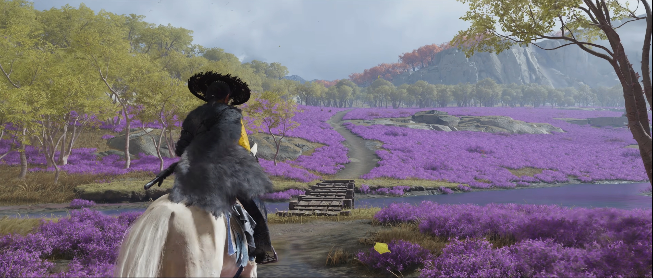
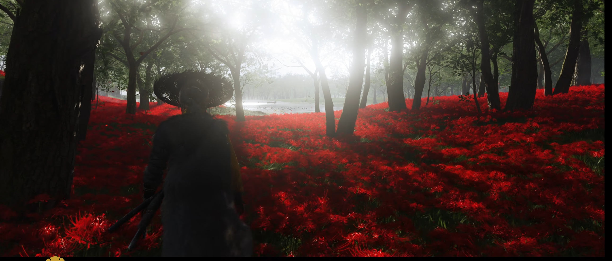
That dark scene in the field of flowers was the one that caught my attention the most. But then you go to the video and pause on that scene and it's like.. oh.
This is the power of shruken down gifs, known since the PS3 days.
Senua
Member
Wii is PS2 leveldo you have any idea what PS3 games look like now
We're talking Wii level graphics. be serious
SlimySnake
Flashless at the Golden Globes
yeah, ive noticed that a lot of these cross gen games look amazing in gifs, but then completely fall apart when you watch them on the big screen whereas the actual next gen games dont look as good shrunken down because the gif compression and size hides all the details that make them next gen. I had to continue making my gifs bigger and bigger to get all that detail to start showing. And even then they dont look half as good as they do on my tv.That dark scene in the field of flowers was the one that caught my attention the most. But then you go to the video and pause on that scene and it's like.. oh.
This is the power of shruken down gifs, known since the PS3 days.
It's a very curious phenomenon that seems to reward devs who put in less effort.
Gonzito
Gold Member
Yeah, I'm joining the
Lack of technical innovation? Sure. But the art style does some HEAVY lifting - Objectively, it still looks fantastic. That's all I give a shit about.
You're going to put this game on your big OLED screen and eat crow.
Would I like to see some more advanced tech to take it to the next level? Yes. But I'm not sure how you can see these gifs and say it looks like a PS3 game. Lets get a grip here.
This game will be the new Spiderman 2. Everyone (me specifically) was shitting all over the game until release (rightly so, it looked atrocious initially) but when we got around to actually playing the game, on our 65" OLED's, a lot of people in this thread were eating crow. We all admitted the city itself looked next gen as fuck. Not to mention the insanely fast swinging/flying speeds, the RT was the best on console arguably too - the only thing horrible was the character models and we got over it.
I simply can't look at these gifs and call it an ugly game. These are heavily compressed by YouTube. This thing is going to look glorious on a Pro.
Its a game that trades raw tech for sublime art. However, unlike FROM, at least they have some sort of dignity to not COMPLETELY ignore the tech.
Only top tier studios excel at both. Sucker Punch is not a top tier studio. This is a good looking game. Art is allowed to pick up for lack of raw tech.
In this GAF thread, most people are unhinged when it comes to graphics expectations. I read crazy stuff here, its funny for entertaining purposes but sometimes its a bit too much. People here often trash games that look amazing for regular people, is the norm here. Ghost of Yotei looks really good even if it doesn't have pathtracing lumen blurry crap from UE5. The game is all about art style over graphics, same as the previous one and I think they have done a good job, it doesn't have to have the best graphics to be a good looking game and worthy of this generation of consoles

vpance
Member
yeah, ive noticed that a lot of these cross gen games look amazing in gifs, but then completely fall apart when you watch them on the big screen whereas the actual next gen games dont look as good shrunken down because the gif compression and size hides all the details that make them next gen. I had to continue making my gifs bigger and bigger to get all that detail to start showing. And even then they dont look half as good as they do on my tv.
It's a very curious phenomenon that seems to reward devs who put in less effort.
You can turn any footage into movie quality CG if you shrink it down enough, lol.
Out of curiosity I went back to my folder of GoT screenshots to see if I was still impressed but I felt a lot less wowed by them. Raised standards is a killer. But I feel like gamers in general should attempt to see why us "nitpickers" are the way we are. We just want good and appropriate value for our hard earned money.
SlimySnake
Flashless at the Golden Globes
?? I just went back and checked and i havent reacted to any of your latest posts. The last one was your UnrealEngineMan joke in the DS2 official thread which i found hilarious.
Gonzito
Gold Member
?? I just went back and checked and i havent reacted to any of your latest posts. The last one was your UnrealEngineMan joke in the DS2 official thread which i found hilarious.
I meant the post I just wrote, the one calling people here unhinged lol
Killer8
Gold Member
Yeah, I'm joining the
Lack of technical innovation? Sure. But the art style does some HEAVY lifting - Objectively, it still looks fantastic. That's all I give a shit about.
You're going to put this game on your big OLED screen and eat crow.
Would I like to see some more advanced tech to take it to the next level? Yes. But I'm not sure how you can see these gifs and say it looks like a PS3 game. Lets get a grip here.
This game will be the new Spiderman 2. Everyone (me specifically) was shitting all over the game until release (rightly so, it looked atrocious initially) but when we got around to actually playing the game, on our 65" OLED's, a lot of people in this thread were eating crow. We all admitted the city itself looked next gen as fuck. Not to mention the insanely fast swinging/flying speeds, the RT was the best on console arguably too - the only thing horrible was the character models and we got over it.
I simply can't look at these gifs and call it an ugly game. These are heavily compressed by YouTube. This thing is going to look glorious on a Pro.
Its a game that trades raw tech for sublime art. However, unlike FROM, at least they have some sort of dignity to not COMPLETELY ignore the tech.
Only top tier studios excel at both. Sucker Punch is not a top tier studio. This is a good looking game. Art is allowed to pick up for lack of raw tech.
Gifs are really not a good representation of game visuals. They cover up a lot of flaws.