-
Hey Guest. Check out your NeoGAF Wrapped 2025 results here!
You are using an out of date browser. It may not display this or other websites correctly.
You should upgrade or use an alternative browser.
You should upgrade or use an alternative browser.
IGN's new logo
- Thread starter Laurent
- Start date
- Status
- Not open for further replies.
Grizzlyjin
Supersonic, idiotic, disconnecting, not respecting, who would really ever wanna go and top that
No...just no.
The fact that the old logo sucked is not an excuse to replace it with something as hideous as this...SyNapSe said:I don't like it, but what did the old logo look like.
Littleberu
Banned
Huh. It's mighty fine.
It's certainly possible. I personally have no problem with iGN, though, and I find that logo to be pretty bad as far as logos go.belgurdo said:That logo looks fine. Or are people just complaining because it's IGN?
The colors... Red and black always looks weird. The line after "ENTERTAINMENT" isn't logic; they add it to balance it with the red dot, but they should have done something with it (an arrow for example).aoi tsuki said:Geez, what's wrong with it? Looks fine to me.
I like the letters being bold, caps and close to each other. Italic is getting standards nowadays (Microsoft, Burger King, etc).
Maybe hideous was a little strong on my part... But they could have added a modified version of their arrowcross, the logo looks empty. Although it NEEDED to change (or go)...
I don't think they will refer to themselves as iGN because of their logo. Everyone wrote IGN even thought their old logo was in small letters...human5892 said:It's certainly possible. I personally have no problem with iGN, though, and I find that logo to be pretty bad as far as logos go.
Heh, yeah, I don't think they will either. It was really just a joke to illustrate that the random lowercase letter irritates me.Laurent said:I don't think they will refer to themselves as iGN because of their logo. Everyone wrote IGN even thought their old logo was in small letters...
i think the red dot of the i is used to enforce that the i is indeed lowercase. A lowercase i, to indicate "internet", "iPod", "i-whatever". Kind of the further procession of their old taglines "We are i" and "For those of the i generation" (or something like that). i agree on the red line. i think it would've been better to just leave it out completely, and maybe balance "iGN" out by right-aligning "entertainment".
Escape Goat
Member
I hate when people say "I could do better" but in this instance I think I really could do better job designing a logo.
Manabanana
Member
aoi tsuki said:i think the red dot of the i is used to enforce that the i is indeed lowercase. A lowercase i, to indicate "internet", "iPod", "i-whatever". Kind of the further procession of their old taglines "We are i" and "For those of the i generation" (or something like that). i agree on the red line. i think it would've been better to just leave it out completely, and maybe balance "iGN" out by right-aligning "entertainment".
"Internet" is a proper noun...
Not if you ask Wired magazine...Manabanana said:"Internet" is a proper noun...
LinesInTheSand
Banned
I like it. Simple and professional.
You and I are in agreement.Guzim said:Needs more McGriddle.
mightynine
Member
Not that bad. I don't like the red stripe on the bottom, though.
Manabanana
Member
Laurent said:Not if you ask Wired magazine...
e-mail to email? Newspeak is born!
And a side note - "iGNorance"
Blackace
if you see me in a fight with a bear, don't help me fool, help the bear!
Manabanana said:"Internet" is a proper noun...
The Internet is a proper noun indeed... it is a name... and should be capped...
Teh Hamburglar said:I hate when people say "I could do better" but in this instance I think I really could do better job designing a logo.
Then make one, post it here and we'll be the judge.
carpal said:What the fuck? Red and black go great together. The logo is an improvement, but it's not great. Who cares either way though.

No, it doesn't go well together since 1919...
I agree. Do it.Hournda said:Then make one, post it here and we'll be the judge.
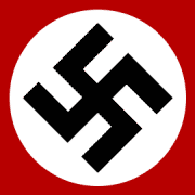
Because people are really going to look at IGN's logo and associate it with the Nazi party?
Also, just look at how effective and impactful the that image is! Just another demonstration of how powerful red and black are when used together.
PPS: Let's not turn this into an argument about hatred and all that shit. Nazis can suck a dick, but they had smart logo design back in the day, just like they had effective propaganda. That's all.
Laurent said:No, it doesn't go well together since 1919...
don't be fucking stupid. that has nothing to do with why red and black don't go together. it has everything to do with you bringing up a completely unrelated negative connotation in order to support your opinion.
Of course it's completely unrelated. I am not saying otherwise... But the fact is that you should watch out for colors that might remind people those kind of things. It's a very basic marketing rule...somnific said:don't be fucking stupid. that has nothing to do with why red and black don't go together. it has everything to do with you bringing up a completely unrelated negative connotation in order to support your opinion.
Fortunately, they seem to use the white IGN on grey background most of the time (which I like best)...
Wolfpack in the house!carpal said:Red and black go great together.
- Status
- Not open for further replies.


