I assume the red lines are there so no one will steal it? Assuming they are, I like the blue color better, but the smaller amount of stroke in the orange version. Combine the two and it'll look ace.
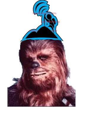
I like everything about the blue one better. The backpack doesn't look like an arm; the mountain looks a lot nicer; I like the wide stroke; and the color for sure.
I like everything about the blue one better. The backpack doesn't look like an arm; the mountain looks a lot nicer; I like the wide stroke; and the color for sure.
This is pretty much the post I was going to make before I read it.
I'll add that the way the transmission waves (or whatever!) are more connected to the guy in the blue one looks more cohesive and, well, nicer. They look like they don't really belong there in the orange one.