I actually like Gardner, I just wouldn't compare him or claim him to be an All-Star caliber player.Windu said:well they were close in production last season, but yeah Crawford is still the better player.
You are using an out of date browser. It may not display this or other websites correctly.
You should upgrade or use an alternative browser.
You should upgrade or use an alternative browser.
MLB 2010-2011 Offseason Thread of Yawn the NL Wins Again, What Else is New?
- Thread starter CygnusXS
- Start date
- Status
- Not open for further replies.
Fuck you.dschalter said:saw his name mentioned, so have to say: fuck porcello and fuck seton hall prep.
I'm an alum.
Shit school but still fuck you!
Y2Kev said:Fuck you.
I'm an alum.
Shit school but still fuck you!
exactly.
i am very proud that i helped trounce them every year
in quiz bowl
i have always liked this logo:Sanjuro Tsubaki said:I'm starting work on something similar to NBA-Age's posters/team/logo chart. I'm doing a mixture of some of the best logos (new and old) if any of you have any input or preferences let me know. Just started not to long ago, here is the AL.
http://i.imgur.com/sj11N.jpg

but of course its never going to be used again, same as Chief Noc-A-Homa, but if the indians get to use their logo, then i want ours back damnit!
Meohsix
Member
Sanjuro Tsubaki said:I'm starting work on something similar to NBA-Age's posters/team/logo chart. I'm doing a mixture of some of the best logos (new and old) if any of you have any input or preferences let me know. Just started not to long ago, here is the AL.


Dmncnby2k9
Banned
This one is nice Windu. They should just bring them back, the Indians one was great 2.Windu said:i have always liked this logo:
but of course its never going to be used again, same as Chief Noc-A-Homa, but if the indians get to use their logo, then i want ours back damnit!
The Frankman
Banned
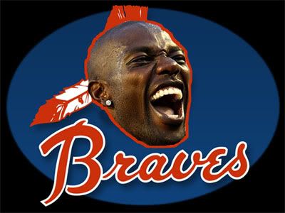
I think this is better for Braves-GAF

Yeah, I like that one too. I'm just amused by how far in advance the Tigers were on the internet trolling bandwagon.Fenix said:For the Tigers I've always preferred the nice D with the tiger in it, not that weird tiger in a uniform.


They are fucking emoticons.
Meohsix
Member

I think it looks great. More put together than their previous one.McNei1y said:Washingtons symbol blows.
Oh and thanks Mock for blowing our 4th game today... asshole.
Sanjuro Tsubaki said:I think it looks great. More put together than their previous one.
Yeah. Definitely the best they've had and it was a necessary fix this past off season. I'm just jelly of all the awesome icons like the brewers, the reds, etc etc. All we have is a circle with a W.
McNei1y said:Yeah. Definitely the best they've had and it was a necessary fix this past off season. I'm just jelly of all the awesome icons like the brewers, the reds, etc etc. All we have is a circle with a W.

Sanjuro Tsubaki said:
lol what the fuck.
Definitely keep the W.
They should just reinvent the icon again and put Strasburg and Harper with arms on eachothers shoulders. I mean that's all we're known for anyway. Maybe underneath it say "Dingers!"

Windu said:thats not the same franchise though
senators = rangers
Oh. Right. :\
Windu said:thats not the same franchise though
senators = rangers
nope. senators=twins. only the fake senators became the rangers, the records and shit are with the twins.
edit: beaten

Fun Fact. Every MLB team started in Washington.Windu said:thats not the same franchise though
senators = rangers
edit: well there was also a senators team that turned into the twins as well. 1901-1960 sentators = twins, 1961-71 sentators = rangers.
and then there was a 1891-99 team.
ToxicAdam said:Seems fair.
Please beferreal Lonnie (The Chiz)!
We traded fodder for fodder. Although Laffey has crazy GO/FO skillz when he is not injured.
Good luck with his rapidly declining FB though.
I wasn't really trying to talk shit. I mean we traded for the statistical second coming of Horacio Ramirez. At least this time we didn't give up an elite player for him.
how so? wasn't the first pro team considered to be the Red Stockings in like 1869 or something?Sanjuro Tsubaki said:Fun Fact. Every MLB team started in Washington.
Duane Cunningham
Member
It's subtle, but the Royals changed their logo in 2001. It was previously a big "R", like this:

It's only been "KC" for the last ten years:

It's only been "KC" for the last ten years:
Kill The Bat
Banned
Sanjuro Tsubaki said:Yeah, I like that one too. I'm just amused by how far in advance the Tigers were on the internet trolling bandwagon.
.
:lol :lol :lol
This cannot be real.
Correct. That's why it's such an excellent baseball city.Sanjuro Tsubaki said:Fun Fact. Every MLB team started in Washington.
I was just joking seeing how more than a couple teams began/ended up there.Windu said:alright what am i missing, this is clearly going over my head.
turnbuckle
Member

The Frankman
Banned
This is almost as creepy as those Detroit Tigers animated gifs that dude on the forum made.
Ninja Scooter
Member
The look on the Tiger's face is probably the same one the cop had when Miguel Cabrera took a swig of scotch in front of him.
Kill The Bat
Banned
turnbuckle said:1927:
1928:

I stand corrected! But to be fair, it doesn't look nearly as ridiculous when placed on the uniform and looked at from a distance.


turnbuckle
Member
Lambtron said:And this is the current version, like the sign at Target Field, with the wonderful Twins wordmark:

Am I the only person that didn't notice this before? I feel like my head is going to explode!
Apparently he was a Looney Toons fan.ToxicAdam said:
I can't believe this was a real logo ...
(1946-1950)
They sad Bill Veeck was a marketing genius. lol
Corran Horn
May the Schwartz be with you
lol dude with a beardSanjuro Tsubaki said:
It'd be a huge undertaking Sanjruo, but if you could get the names in each team's font it might look cool. Likely infeasible since I'd imagine a bunch of the fonts are proprietary, just a thought though.
Also, personal preference, but scripted fonts look like ass.
Edit: Wait wait wait, St. Louis Browns, what the hell is this

Also, personal preference, but scripted fonts look like ass.
Edit: Wait wait wait, St. Louis Browns, what the hell is this
- Status
- Not open for further replies.