Battlefield 1 by
iRAWRasaurus (
September 3rd, 2016
If anyone have any tips or pointers for making OT or would like to help, please let me know

Comments for tips with making an OT for yourself can be found in the wall of text below. lol Some specifics for your OT since you are doing one for an FPS that has MP with it is if you make a section for community members to link up with each other is a good thing.
Here is some examples from past OTs of MP focused games of how folks did their content formatting. Of course you are not required to do anything similar to them esp when it comes to graphical content, but these are more to give you an idea of how formatting is done with the information and what type of content these authors felt relevant for its readers
Battlefield 4 OT (images are broken but you can still view the information listed)
Battlefield 4 OT 2 (more info on updates and content)
Star Wars Battlefront (more info focused)
Overwatch OT (while there is a lot of graphics, very relevant info for readers balances it out
Call of Duty: Black Ops III (example of what we mean by .pdf type of OTs, not to knock it, but give you an example for personal reference)
Call of Duty: Advance Warfare OT (images are broken but info remains)
Destiny OT
As I mentioned below also, how far you want to take it from there is all up to you.
I think he means, just consider the individual users' datacaps more than anything, lol.
I always build an OT in outlook, then when it's time to scrub, I find an old post (that noboby would see) and cut an paste the whole thing there and check how it looks on my phone, then make edits through the preview option. I can cut and paste everything as a back-up there and be ready to post away at launch time.
Its not so much data as its regardless of how you format something from the PC its going to turn into a mess for mobile. That happens with some of my stuff but then again I dont really bother with putting much consideration for the mobile crowd anyways.
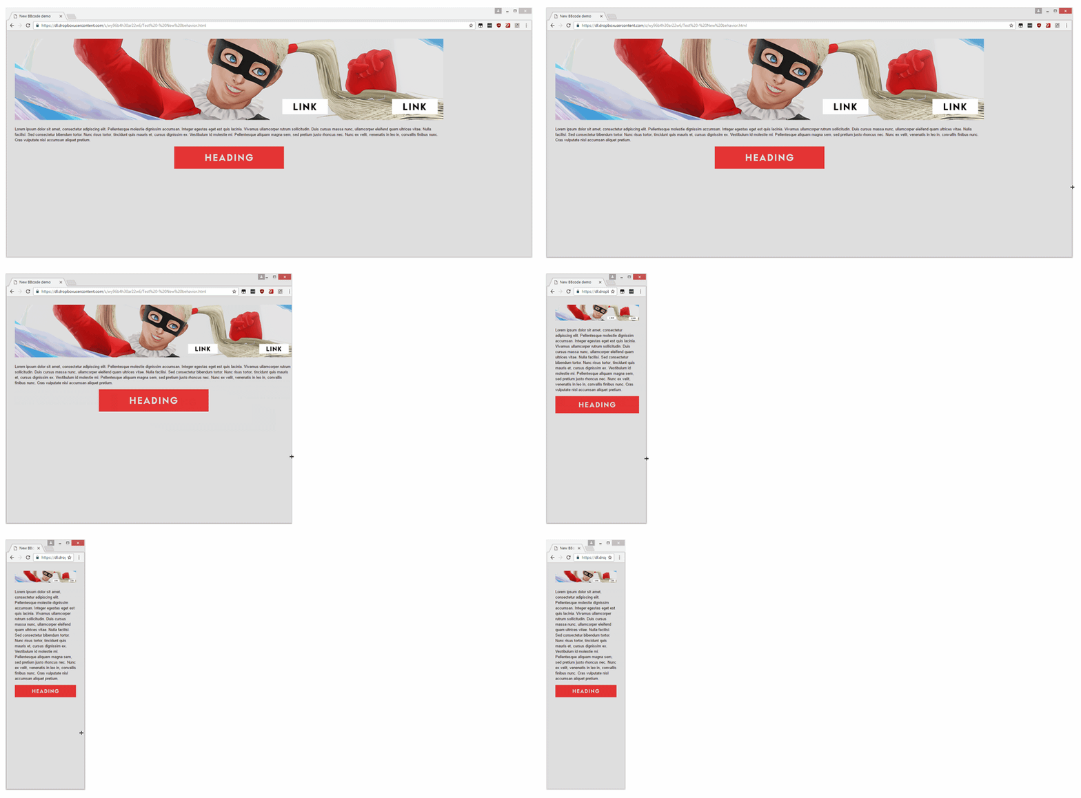
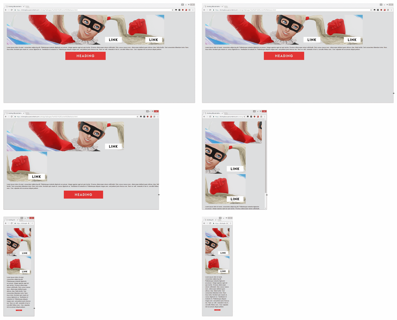
Its like if you have multiple images lined up to form a full image horizontally it will all get broken up vertically on mobile. For the most part people dont usually do that so its not a real issue.
But things like going overboard with screenshots also makes massive sections on mobile that a user has to scroll through.
Nothing worse on PC also when people just put a bunch of screenshots in a row vertically with no consideration for how the formatting looks. Use the horizontal space as thats the whole purpose of viewing on a PC.
Not sure if this works with mobile phones but try it out. While not all of the GAF bb codes work in this, most of the more important ones do and you get a good visual feedback on formatting and such with text or image placing.
http://www.amigabounty.net/index.php?function=bbcodetest
I usually use this to look at before hand.
Also be careful if you are CNPing the OT text back and forth between browser and whatever text editing software you use. Reason being is sometimes the invisible formatting from the program will mess things up when you copy it over. So always be sure to double check formatting and such with a preview post before having it go live.
It also helps when working on your OT text to (comment) yourself as to what all of your sections are. That way it makes it easier to fix errors and whatnots before putting the full version up. Since the text vs what you see will be 2 different things therefore having the OT text commented initially will allow you to quickly find any sections that might have a formatting error. Example below
*Title Image
(image text)
*Product Info
(game box picture link)
(product info text)
*Features
(features text)
Before posting it you just erase all of the self-comments you have once you are satisfied.
Also if you want an example of what OT looks like when its all written out minus the self-comments use this link and quote me, which will show you the original post in text format. Should give you a fairly good idea of why the suggesting about self-comments is something to consider so you dont get lost in your own text.
http://www.neogaf.com/forum/showthread.php?t=1257666
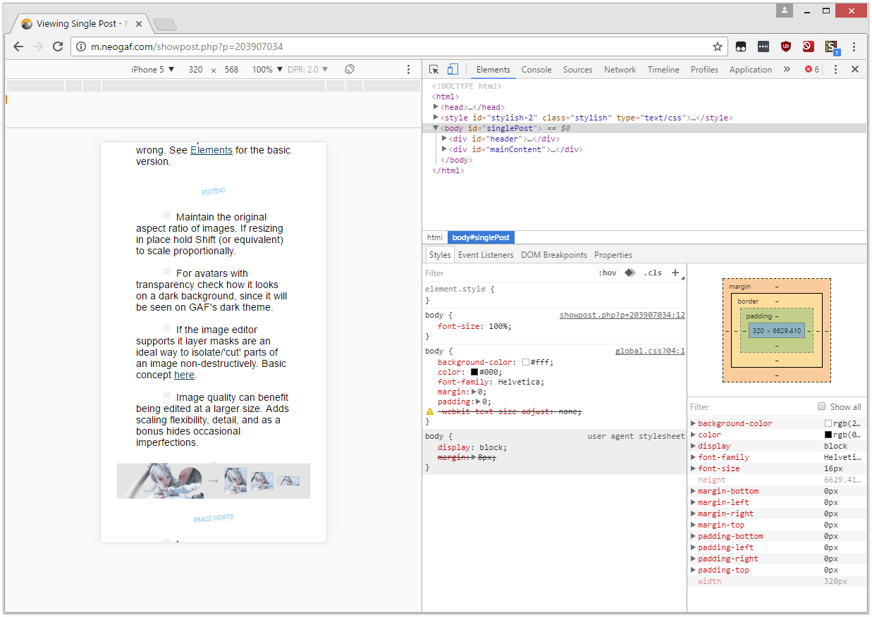
This is also an example of an OT that is done with the PC in mind and not mobile. So if you view the OT on a phone bunch of the formatting stuff changes making it a bit messy with images, the classes section in particular.
---
For the most part the most important thing with OTs is just having relevant general information. The amount of depth you want to put into it is up to you. Though as others said just dont expect folks to actually read anything, so with that being said put in the effort because you want to, otherwise you are honestly wasting your time filling it out with stuff that not many will pay attention to.
All of this info comes from my own fuckups with my history of doing stuff so its basically what works for me in terms of advice. In all honestly only way to learn is by doing what you will and work on an OT yourself, over time you will figure out what does and does not work for yourself and what kind of formatting you like to work with along with generally what type of audience shows up in your OT(s) so you know what sort of info to have present.
One thing though that usually is a big help to any OT and to save yourself from answering the same question multiple times is a general FAQ to help answer the most common questions you can think of for your OT.


