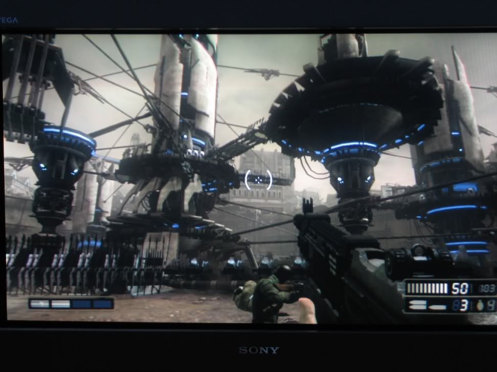
Ok, after the majority of Manchester this game is freaking awesome. The gameplay is just SO FREAKING INTENSE. Mines popping out everywhere, great variety of hard ass enemies running around and hiding everywhere. Tons of stuff going on all the time. Really, really fun game.
I can see why the early stuff seems sorta unimpressive too. Since they wanted a locked 30fps with no drops/slowdown from start to finish they had to make the early non-crazy parts 30fps even though they probably could've had them run at 60fps. I guess it would be jarring if the early parts of the game were 60fps and then when huge battles with a billion things flying everywhere was going on the game dropped to 30fps. I'm fairly impressed by the number of enemies, amount of destruction, amount of bullets going on at any one time.
The little touches are extremely nice as well. I love seeing the birds flying around, the dust blowing by, signs swinging as their hit, concrete exploding into pieces, etc.., etc; the game is just so incredibly polished. Moreso than the majority of launch titles to date.
The weapons are also very enjoyable. firefights through walls are INTENSE (well all battles are). Running through areas with 1 hit until your dead, fearing every corner and new step of ground and hoping to see a yellow container is a very engaging experience. Good stuff.
Now, as a graphic's whore I gotta nitpick a bit on the visuals as I think the game was
this close to being one of the best looking next-gen games, but because of one single thing they completely blew it and that makes me upset
 AF
AF
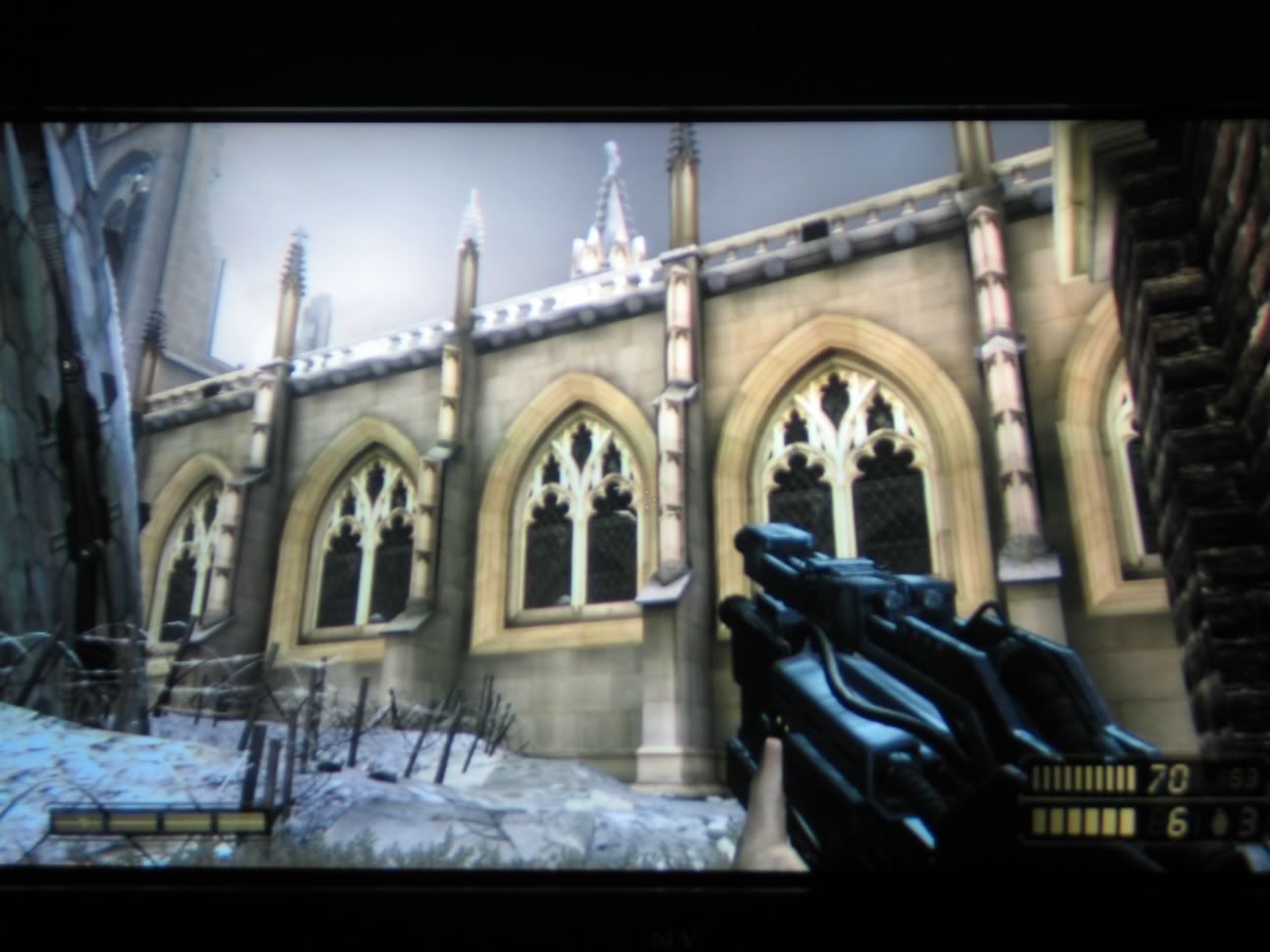
Here is a shot of a building. Why a shot of building? Well because when I was standing at this distance (aka, 15 feet or so away) the building looked like a blurry mess out of a last-gen game.
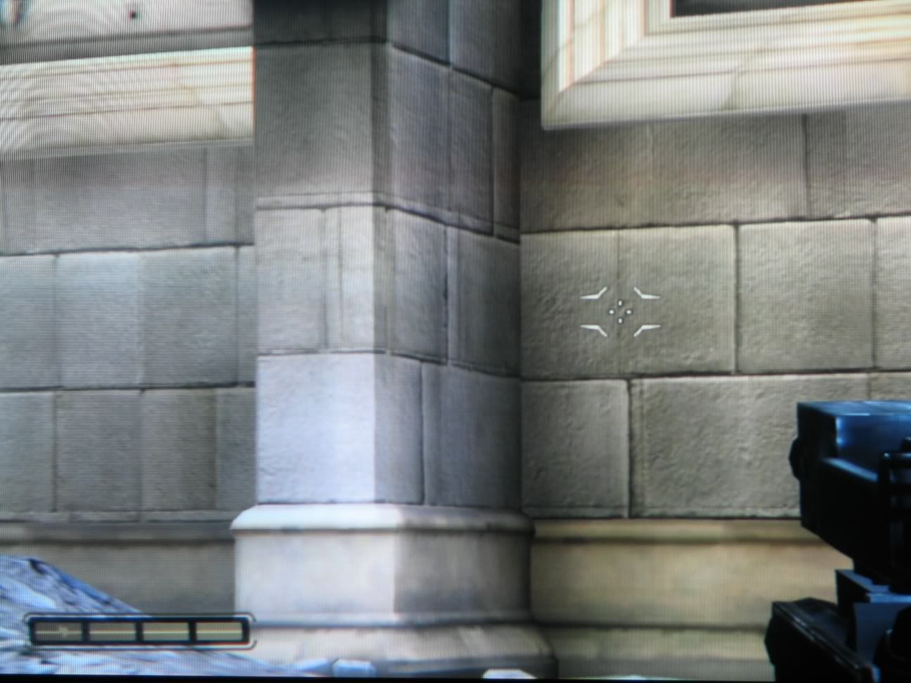
But then when I use the zoom feature on my gun and get close to the textures:
Viola! Nice HD resolution textures. The AF in the game is non-existant and it
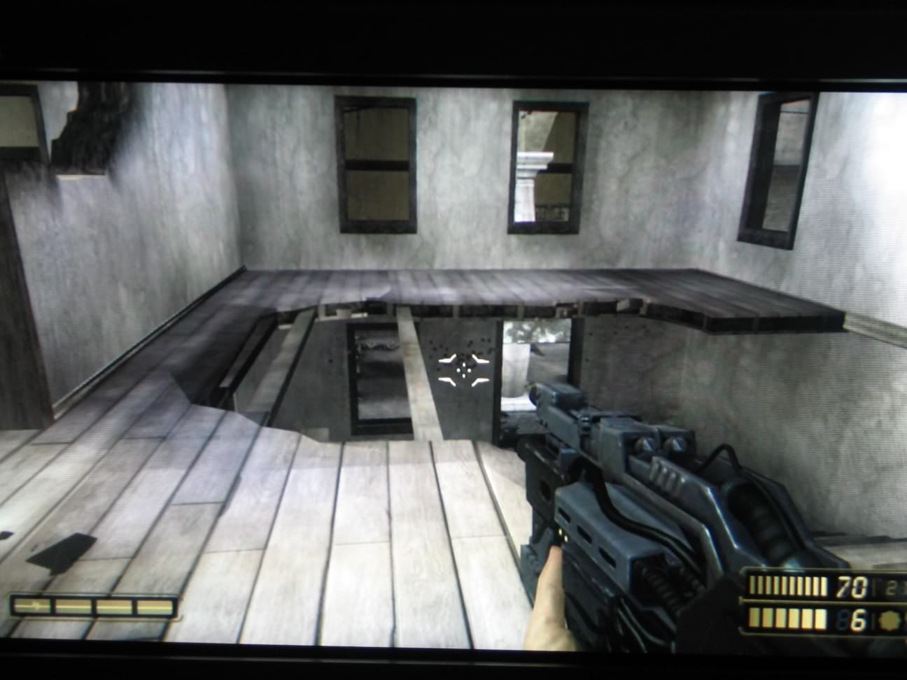
really hurts it. Because of the large scale of the battlefield and environments, you're often staring at beautiful landscapes with tons of buildings and cool things. But since they're all far away and there's no AF...everything at distance looks like an Xbox1 game until you get right next to it. The AF distance is just TERRIBLE. Check out this pic:
While it might be sorta hard to tell from the pic. In this
very tiny room. The planks at my feet are sharp detailed HD textures...but the ones on the other side of the room are blurry last-gen looking textures. It's very disjarring and ugly to not even be able to have an entire room look the same texture-wise at any given point. With AF in and the planks and buildings looking as sharp as what's at your feet, the game would have been drop-dead gorgeous...especially because the art is so amazingly good. But nope, no AF, and just what you see above, which makes me ;_;
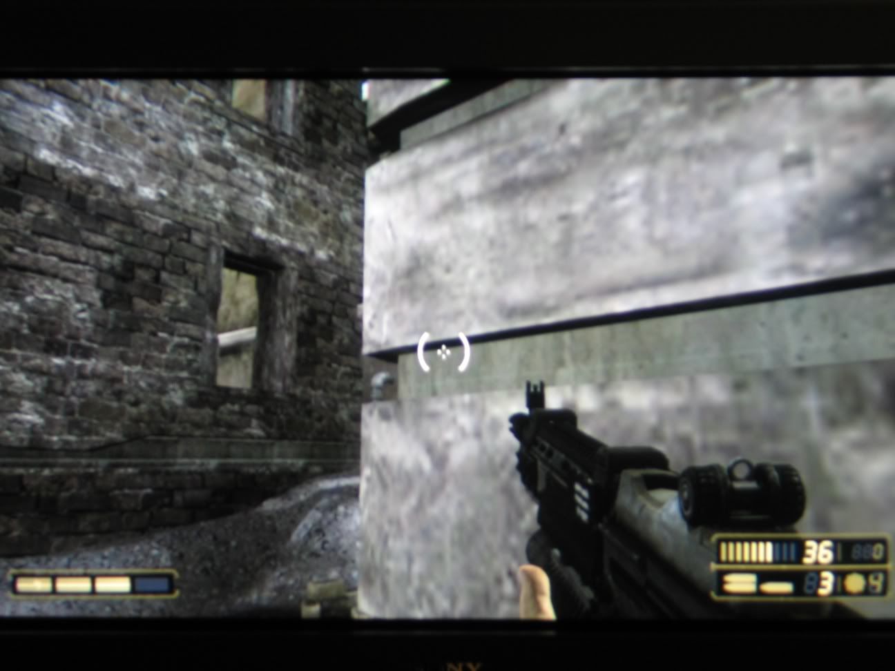
And then there's the low-res textures at random places in levels:
Notice the boards in front of my face are low-res, while the wall across from me is HD. While 90% of the textures are probably HD, it still takes away from the overall picture when certain textures in the viewpoint aren't HD level. Hurts the cohesive feel. This might be a ram issue, and if so I hope it's not something we're going to see in all PS3 games because of the slightly lower ram from the XMB taking up 64mbs and the way the rest of the ram is divided. Hopefully it was more of a time/performance issue. :\
Still a really good looking game...but us graphic whores are picky people. Who knows, maybe they can patch the game later on to allow optional AF at the expense of some slowdown at parts.


