You are using an out of date browser. It may not display this or other websites correctly.
You should upgrade or use an alternative browser.
You should upgrade or use an alternative browser.
Resistance graphics now > E3 demo. (This is the thread of the month. Click this)
- Thread starter Kittonwy
- Start date
- Status
- Not open for further replies.
2 more, besides the two you posted here? If so, could you link to the other two?geek said:There were a couple more posted on Friday, but I hadn't seen them on GAF yet.
teiresias said:Wow, I love that first pic! I'd like the second one better if I liked the design of that kind of chimera, definately the weakest of the creature designs in the game, IMO.
Yes, they remind me of something from Duke 3d... I don't like it.
Geek said:New? Old? Better?


There were a couple more posted on Friday, but I hadn't seen them on GAF yet.
Quoted so we don't have to go back to previous page.
in the light darkness
Banned
some fubar textures here and there but looks great otherwise
in the light darkness
Banned
Geek said:
sam fisher, is that you?
BenjaminBirdie
Banned
Amir0x said:Man the texture on that first tank thing is terrible. This is what Resistance most needs to work on...
I've seen it on a lot of PS3 stuff, but I'm assuming that's all Final Phase stuff that'll be cleaned up by launch. The real underlying problem is the terrible tech design. There a was a lot of potential to design something stunning in contrast to the nice looking Eastern European village stuff, but they seem to have decided to go for a kind of Lost In Space movie aesthetic.
Bo-ring.
Funky Papa
FUNK-Y-PPA-4
I don't think it looks bad at all, although I'll reserve my judgement until I see some frame buffer captures. This game needs AF more than any other with that colour scheme.
teiresias said:Low draw distance and close quarters. It's obvious they were going for large-scale, sprawling combat and failed.
Was that a Doom Bringer joke?
teiresias said:Low draw distance and close quarters. It's obvious they were going for large-scale, sprawling combat and failed.
It puzzles me how you can know that after seeing just that screen. I demand a video.
BenjaminBirdie said:I've seen it on a lot of PS3 stuff, but I'm assuming that's all Final Phase stuff that'll be cleaned up by launch. The real underlying problem is the terrible tech design. There a was a lot of potential to design something stunning in contrast to the nice looking Eastern European village stuff, but they seem to have decided to go for a kind of Lost In Space movie aesthetic.
Bo-ring.
I love the tech design, none of this bothers me. The concept, etc - I love this. And I love the innovative weapons they have for the game. But, the graphical side of things is very weak. Again, though, these are PSM shots most of it.. before they supposedly entered the beta stage.
SolidSnakex
Member
quetz67 said:these shots dont look like they have improved lighting
These are from the PSM batch of screens so they wouldn't fall into the lighting upgrade the Insomniac guy mentioned.
teiresias said:Low draw distance and close quarters. It's obvious they were going for large-scale, sprawling combat and failed.
Doom_bringer, right?
meltpotato
Member
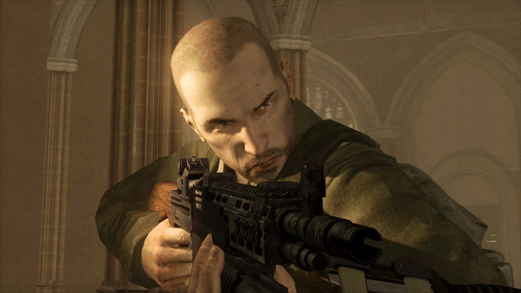
lollerskates bald earth marines!
really impressive faces on the human characters, point-headed chimera... not so much
really impressive faces on the human characters, point-headed chimera... not so much
Lord Error
Insane For Sony
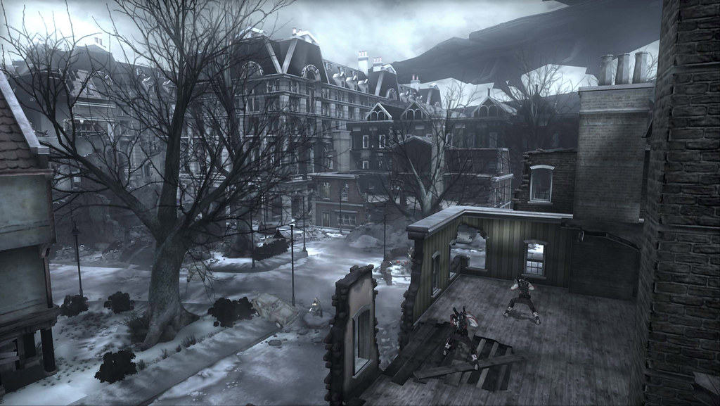
What tank thing?Amir0x said:Man the texture on that first tank thing is terrible.
That metal block in the distance on the 2nd screen? Unless they use some good AF, the textures on something so distant would become blurry no matter how high res they are upclose.
artful_dodger
Member
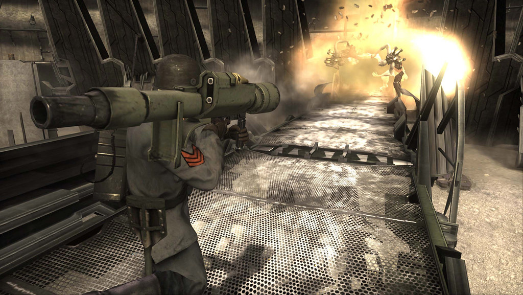
The top shot with the rocket launcher appears to be from multiplayer.
I was thinking the same thing lolWollan said:Was that a Doom Bringer joke?
supermackem
Banned
hehe i have a feeling some on here would say impressed to any screen shot if they thought it was a ps3 shot. It looks average in those screen shots but ive seen it in motion and it looks ok.
artful_dodger said:The top shot with the rocket launcher appears to be from multiplayer.
its not even a gameplay shot.
artful_dodger
Member
And you know this how? Just because the hud isn't onscreen doesn't mean its not in gameplay.
artful_dodger said:The top shot with the rocket launcher appears to be from multiplayer.
Looks like it. 'Generic no name' soldier with clear colored symbol on arm which they don't have in singleplayer.
Marconelly said:What tank thing?
That metal block in the distance on the 2nd screen? Unless they use some good AF, the textures on something so distant would become blurry no matter how high res they are upclose.
supermackem said:hehe i have a feeling some on here would say impressed to any screen shot if they thought it was a ps3 shot. It looks average in those screen shots but ive seen it in motion and it looks ok.
There are I am sure, but at the same time there are people would would do the opposite and say it looks bad just because it is a PS3 shot.
As far as the screens I think they look pretty on par with what is "average/ slightly above average" as far as next gen goes. Hopefully since all they are doing now is basically working on the graphics it will move solidly into the above average range.
antiloop said:Wait, why is the resolution of the pics 1024*577?
Because I uploaded them to Flickr. Original size is 2556 x 1440.
Wollan said:I think those two soldiers infront gets 'eaten'. Leads to the next pic where Nathan raises his gun. We have seen a scene in the trailer where you fight of a couple of Chimera brutes in a church.
Nathan is the only one without a helmet too. That's how u no hes hardcore :lol
Geek, what's the source of the originals? I ask because they look like they were blown up to begin with. They don't look like framebuffer shots.Geek said:Because I uploaded them to Flickr. Original size is 2556 x 1440.
- Status
- Not open for further replies.


