• Hey, guest user. Hope you're enjoying NeoGAF! Have you considered registering for an account? Come join us and add your take to the daily discourse.

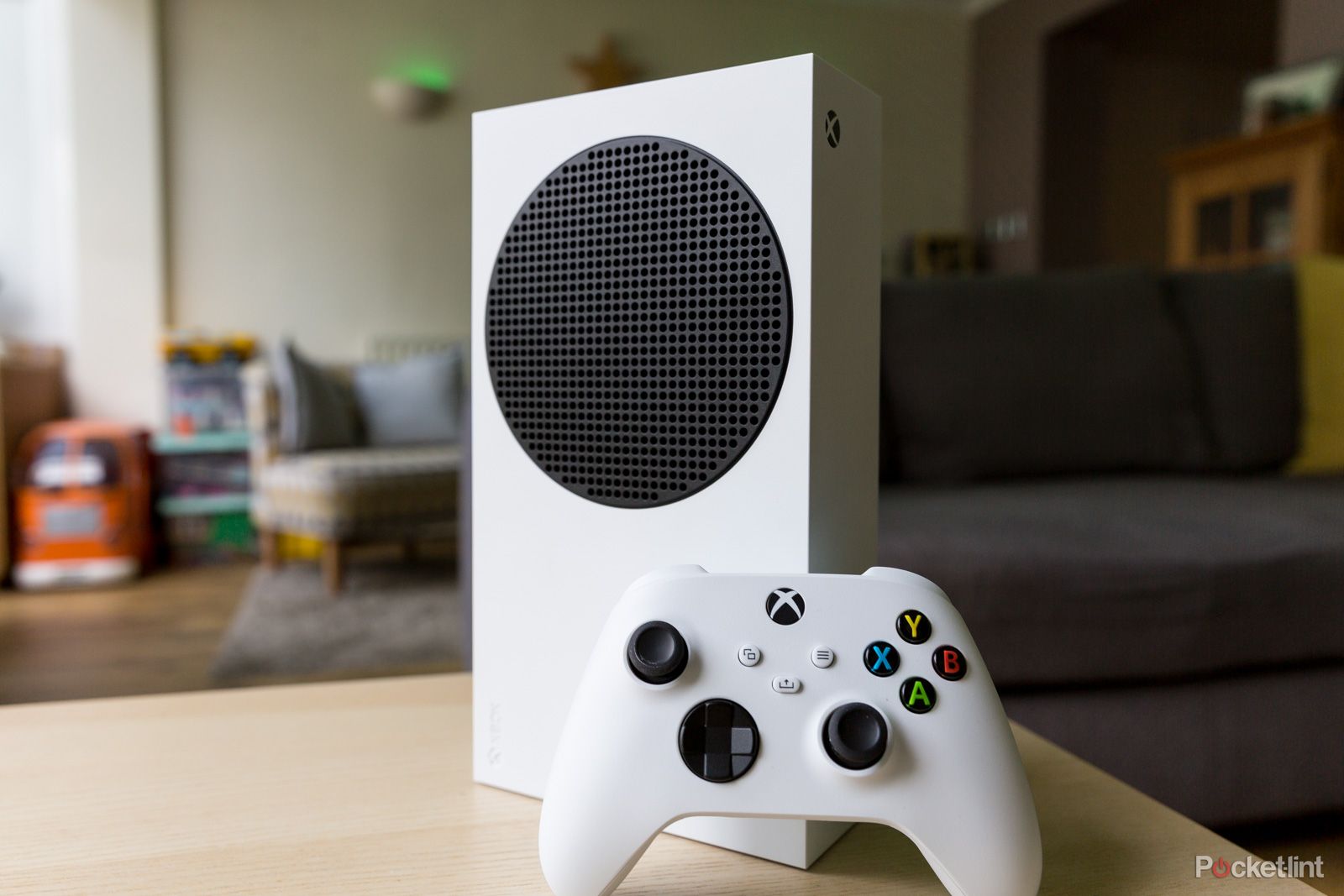
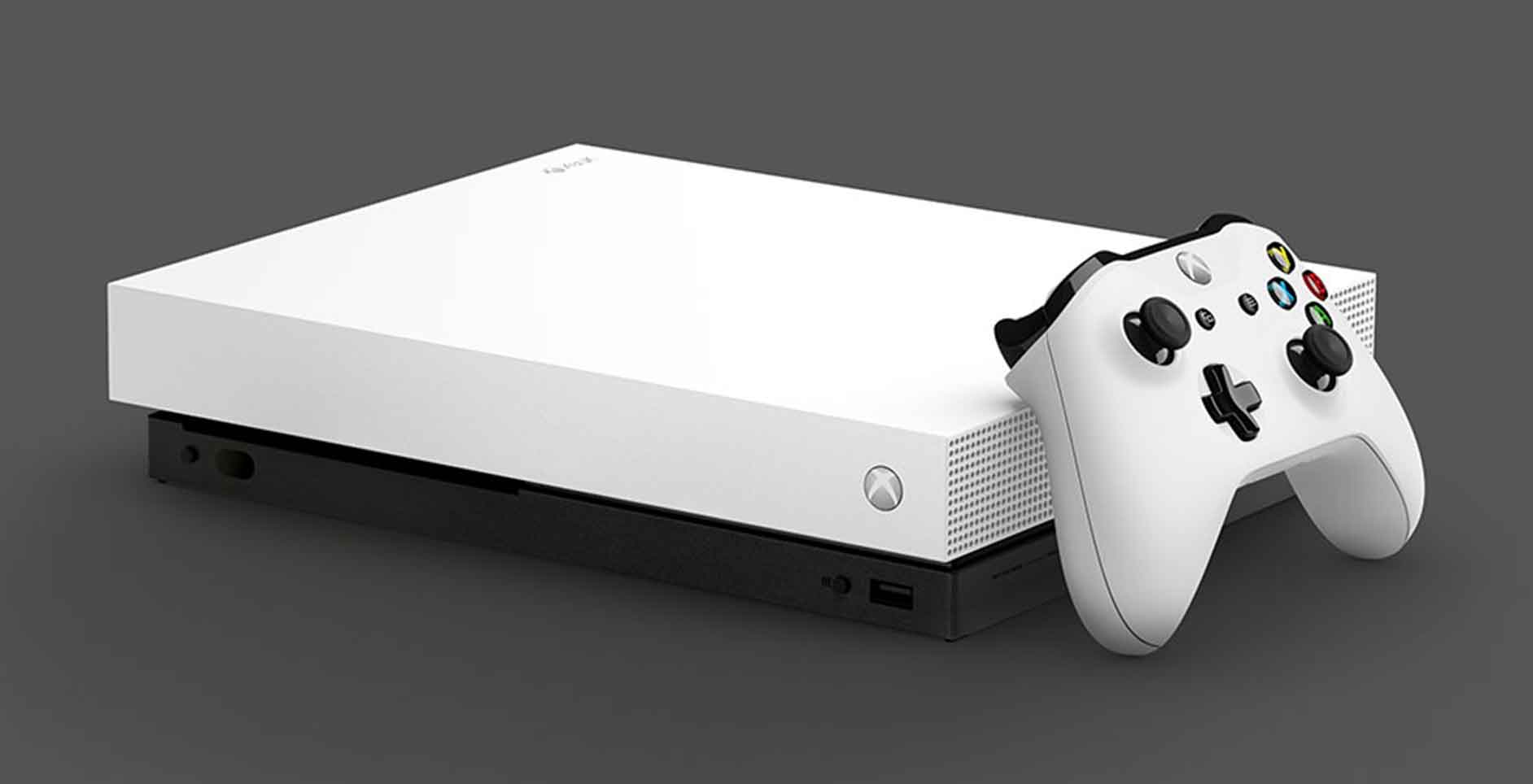
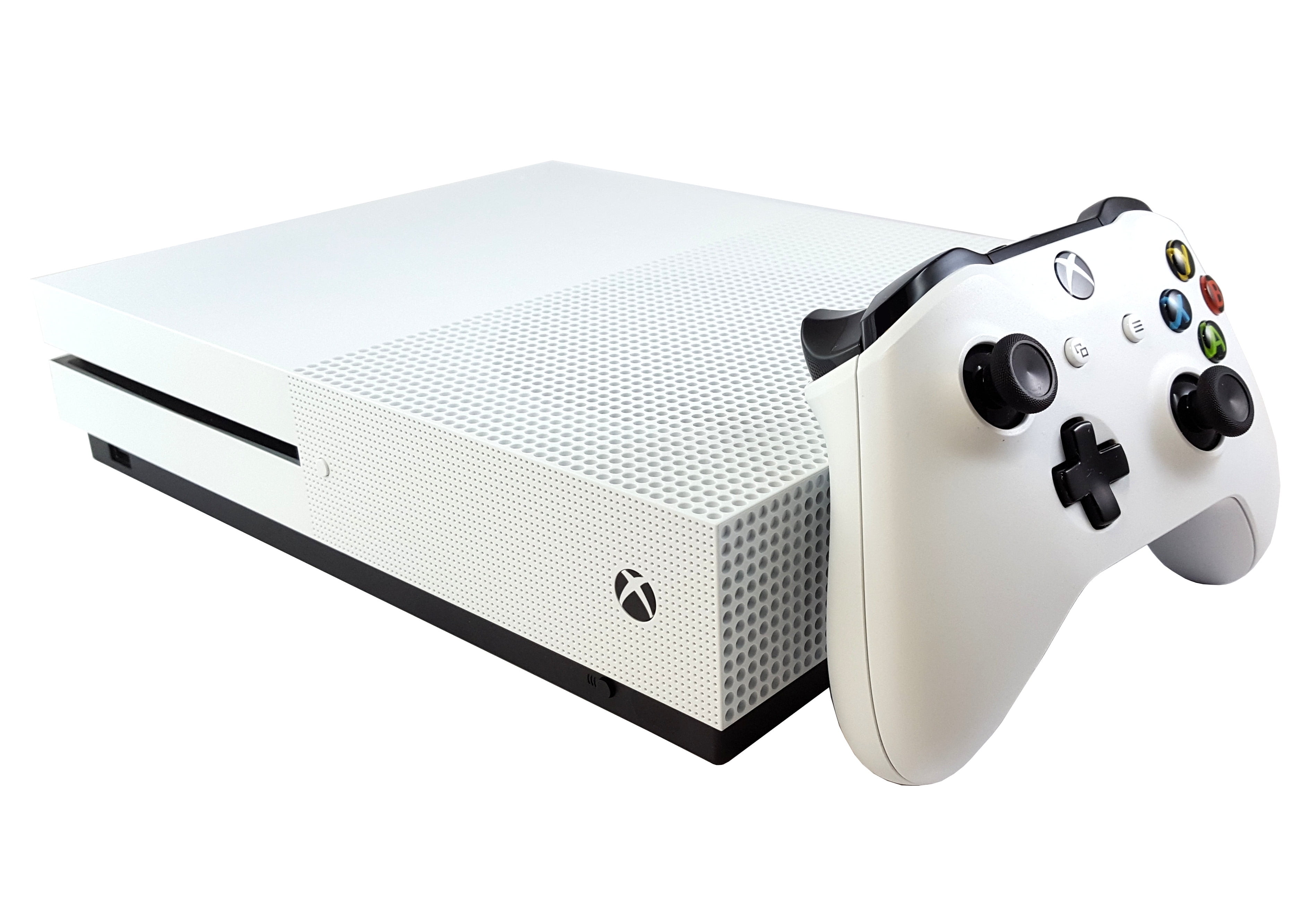
White Digital Xbox Series X is a very clean looking console

GoldenEye98

posts news as their odd job
Seems like some guy bought it at Walmart before release date.

I know Xbox + discless consoles are two unpopular things on here but this thing is very aesthetically clean. Probably my favorite looking conole of this gen now...


g0u5a7h58ytd1.jpeg
 

Katatonic

Member
The most uninspired, aimed to offend no one (but me), flavorless design of all time imo (next to the Series S). To make it worse, that green piece of plastic on top looks toyish as hell.
 
Last edited:

GoldenEye98

posts news as their odd job
Sorry, I just see that there’s a huge void inside where the disc drive no longer exists and MS couldn’t be bothered to redesign the console to reflect this.

The Series S in black is the nicest console they’ve ever made. Shame about the ram.

True but I'm guessing the cooling might be slightly better if there is more space in there with the disc drive removed. The person who posted this on reddit said it seemed to be but of course that is pretty anecdotal...
 

Fess

Member
It reflects the lazy internal changes, same thing + 1TB, meh

Could’ve redesigned it, now they’ve just removed the disc slot and painted a Series X white.
 

Alan Wake

Member
I like white but this just looks very dull. You know there's a void in there because there's no disc drive. Why not try a redesign? I still think the white One S is their best looking console. I bought the white One X and that looks great too.
 
Last edited:

Kvally

Member
Seems like some guy bought it at Walmart before release date.

I know Xbox + discless consoles are two unpopular things on here but this thing is very aesthetically clean. Probably my favorite looking conole of this gen now...


g0u5a7h58ytd1.jpeg

Looks great but not enough change to get me to swap it for my launch Series X.
 
I had a One S that I thought looked pretty good, but I don't think this looks good - probably the lack of a black trim.

This console is hideous. At least you have the option of making the ps5 not-hideous by getting the disc less one.

Being able to easily slide out the side panels for new ones also helps with that. Replaced mine with collarless black ones and the PS5 looks pretty slick now
 

BlackTron

Gold Member
Sorry, I just see that there’s a huge void inside where the disc drive no longer exists and MS couldn’t be bothered to redesign the console to reflect this.

The Series S in black is the nicest console they’ve ever made. Shame about the ram.

Yea, I kinda wish I had the black Series S, but as far as white consoles go, I'm surprised how much I like it (best since DC). As for Series X, since it's so imposing I think the better color depends on its environment to minimize how garishly it pops from its surroundings. Against a white wall on a white table this is a good idea, in the shadows of an entertainment center I'd prefer black.
 

Woody337

Member
Sorry, I just see that there’s a huge void inside where the disc drive no longer exists and MS couldn’t be bothered to redesign the console to reflect this.

The Series S in black is the nicest console they’ve ever made. Shame about the ram.
Although the series s looks clean, I prefer the all black one x. That was a nice looking box
 

fbnaulin

Neo Member
I prefer black consoles or a solid fun color, not into white.
But, I'm very inclined to minimalist, straight lines, so I have loved Xbox designs since One X/S.
PS4 Slim/Pro is amazing as well, and I have been horrified with PS5.
 
Top Bottom