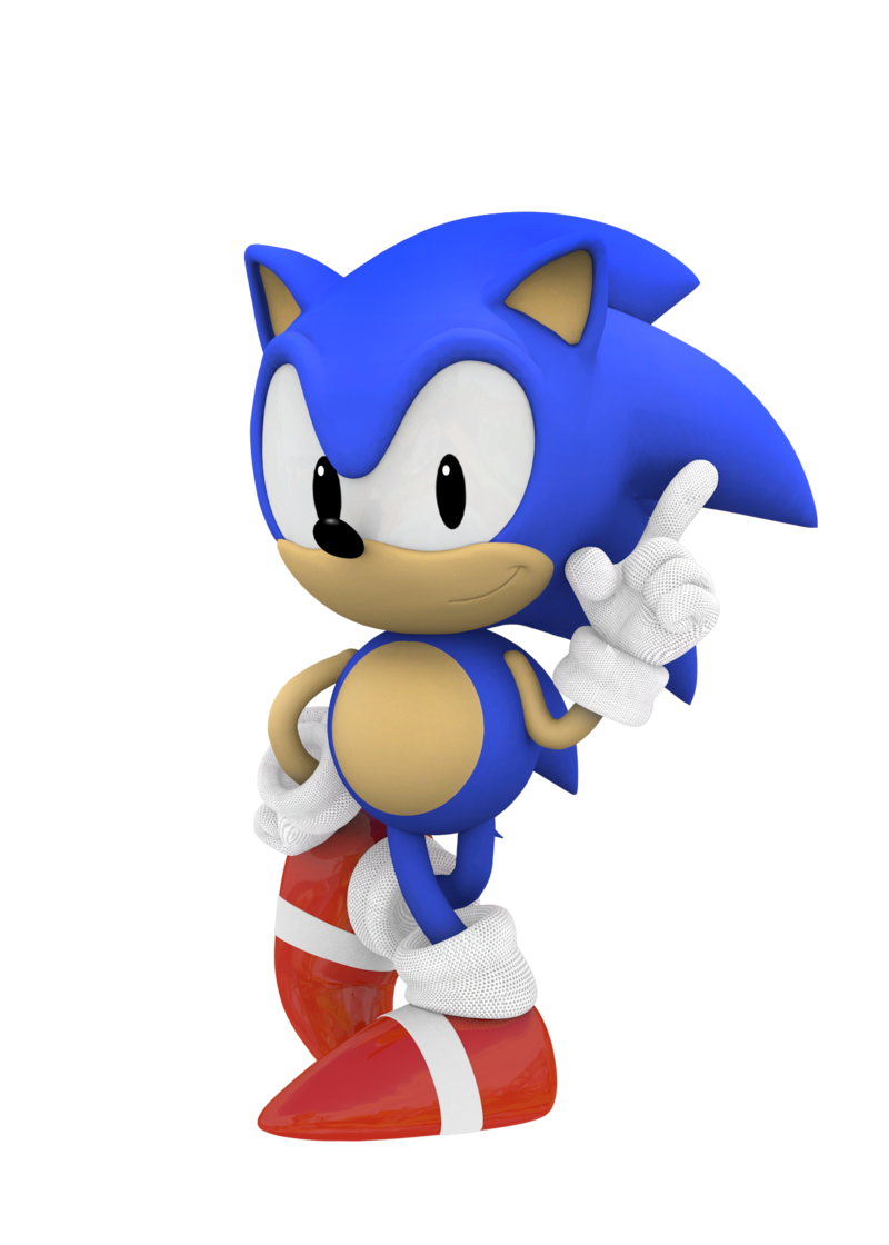
Why Sonic Boom's new style is the way to go.

It is the way to go, just not to the audience from the first games.

Kids today wouldn't even look to the past Sonic designs, these new ones will surely work best with kids that are new to Sonic, especially here in the west. Also, the characters now simply give off more personality based only on their design and kids enjoy that.

Instead of writing again the same stuff I'll just quote my opinion on this:

Because something has to change. Sonic is a 20 something year old franchise and the games quality throughout those years have been very questionable. I can't really blame SEGA to try and get more young western kids into a "new" Sonic. Sonic games are going nowhere in terms of popularity, they need change. The only thing that they need more than change is a good game to go with it, let's see how this one does.

Edit: Just so people know, I'm not saying I like this, but it is more than understandable and I am surely not their target audience here. What they are doing is a way to try and keep Sonic alive, something kids from the 90's won't do forever (as they've been doing).
The quote was also pointing why the game is bringing some changes to what a Sonic game usually is (not just the character design).
 
The way modern Sonic developed this/last generation was fine.
zTSY5Gd.gif

Not as good as the originals, but good enough. The new designs are pretty much fanfiction level.
That gif alone tries to make him look cooler than he is.
 
Sonic may or may not need a redesign. but that fact remains that it needs some effort put into it - it;s a franchise that sells regardless and sega don't care it seems.

Such is modern game development.
If other games were held to the same standard by gaming journalists that Sonic is they'd be getting 6s across the board with rare exceptions.

That's not to say Sonic is unappreciated brilliance, I'd only call Colors and Generations thoroughly good games while Lost World and Sonic Boom look like ass, but Sonic is an easy target while "AAA" projects are mollycoddled.
 
Hey look Amy is wearing clothing. Now I can respect her in the game as much as I do in the comic series (Amy is pretty menacing in the comic books)
Hey look Knuckles actually looks tough like he did in Sonic 3.
Hey look Tails is the exact same thing but with gadgets, like he should have.
Hey look Sonic is okay, he actually has knees now and the scarf is fitting.

People who aren't invested in sports have no idea why the bandages across the shoes are important, and yet they don't need to be invested in sports. Apply some common sense. It's sport tape for a reason. Sonic's a runner. It helps prevent any injury on the shoes that might harm the feet. Come on; it's common sense.

The designs are fine. I've yet to see an argument that explains why the designs are fundamentally wrong other than the "HE ALREADY HAD A REDESIGN" shtick. Explain yourself. Why exactly are these designs wrong, and how will they effect the future of Sonic games when;

It's a subseries.
It's not the main face of Sonic in general.

I feel this is the same case with that one demon hunter guy with the black hair who originally had white hair, or Pac-Man. Just a bunch of hyperbolic drive by 'eww!' hooey.

But I'm waiting to see who can step up and explain why this design is 'wrong.'
 
The best part is that it looks like Amy isn't going to be some shitty kawaii desu fangirl with annoying screams anymore.

I'm willing to put down money this is going to be one of the better sonic games from the last 15+ years.
 
this seems like radically overthinking the actual reason why this is the way to go: their target audience is kids (with the tv series and with the game) and kids seem to like the try-hard badass posturing of these designs.
 
Xtreme Sonic was way better than Hipster Sonic.

Even if Xtreme Sonic tried a little too hard to be cool, he didn't listen to Bon Iver.
 
The best part is that it looks like Amy isn't going to be some shitty kawaii desu fangirl with annoying screams anymore.

I'm willing to put down money this is going to be one of the better sonic games from the last 15+ years.

Cosigned.

Xtreme Sonic was way better than Hipster Sonic.

Even if Xtreme Sonic tried a little too hard to be cool, he didn't listen to Bon Iver.

Explain the 'hipster' influences of Sonic's design. The scarf is literally 'there' (assuming you mean the scarf) because of the Adventurer influences that Rafei made for the design. He's thinking more Indiana Jones/Nathan Drake (heavily) than some teeny bopping gauged out teenager.
 
Man first you post that ugly ass American style version of classic Sonic, then you top it off, with those ugly ass cg style versions of DC- Era Sonic.

No Japanese Classic design or Yuji Uekawa or even modern day CG Sonic? You fuckin up. Whole argument became laughable to me.

Also Sonic Boom looks like the next level of ass.
 
The best part is that it looks like Amy isn't going to be some shitty kawaii desu fangirl with annoying screams anymore.

I'm willing to put down money this is going to be one of the better sonic games from the last 15+ years.

I'd like to think something is wrong with me for actually being legitimately excited about seeing Sonic's friends in action.

Knuckles not once being described as "stupid" in his profile, which is what Sega likes to degrade him into being these days, and the interest to turn Amy into an actual character who stands on her own and isn't just a stalker with a crush, is kind of a big deal to me.

I seriously hope they can do some good stuff with them.
 
Sorry OP, but no. Boom's designs are way more obnoxiously lanky than Adventure 1 was. Also, what they did to knuckles alone is a total deal breaker.
 
I need to become a kid again and tell the other kids that this is not cool at all. I must be the hero kids both need and deserve.

The defense force for these designs is hurting me deep inside.
 
Honestly, if they got rid of the stupid bandages on his arms/hands, I could really get behind this new design of Sonic.

sonicinternal1.jpg


Eggman on the other hand looks amazing

url


I know these are from the show, but since they both have the same designs, he'll probably look like that in the game.
 
Sonic's new design in terms of how his face animates (in the show, at least), has grown on me. It looks FAR better than the current "canon" design, and a lot less creepy. Had he been given shorter legs/arms, and a red scarf, I'd be all over it. My main issue with these redesigns (like everyone else's) is Knuckles's. It's just awful. His flattened snout and extremely large chest, yet twig ass legs is just disgusting.

The other two are completely fine by my standards.
 
These are pretty bad redesigns, adding the techy stuff to the smart character is a pretty cliched way to go about it, and the beauty of the original Sonic designs was how simple they were, just adding "stuff" doesnt make things better, it just gets in the way.

Character design fundamentals rely on the fact that you must keep things as simple as possible, anything you add must have an actual reason for it. If the answer is "because it looks cool" then its bad design, thats whats so wrong with all the bandages. They work for ninjas, they work for somebody who gets in fights or was just at the hospital ... but here they are obviously "because they look cool" and drag the whole thing down.

Would be surprised if the next game from Sonic Team used these designs. This is basically a not terrible version of Bomberman Zero.
 
Sonic's new design in terms of how his face animates (in the show, at least), has grown on me. It looks FAR better than the current "canon" design, and a lot less creepy. Had he been given shorter legs/arms, and a red scarf, I'd be all over it. My main issue with these redesigns (like everyone else's) is Knuckles's. It's just awful. His flattened snout and extremely large chest, yet twig ass legs is just disgusting.

The other two are completely fine by my standards.

s3-bginfo-storylineimg2full.jpg


The obvious influence for Knuckles design is his Sonic 3 appearance. Large chest, twig legs = Sonic 3.

Also, I'm not down with Mid mouth Sonic. He looks extra stupid.

Sonic's mouth being anywhere it wants is stupid if you ask me. Have some consistency.
 
post Adventure Sonic is equally terrible tbh. We're just used to him

Yep. I'm just saying they didn't make the design any less terrible.

Well I mean it's 'easier' to tweak and change a few mm here and there. Shrink the arms a tiny bit. Make him a tiny bit shorter. It still takes effort with the photo editing software and all that but let's be honest changing a beloved character that's well known and an important mascot for not only Sega but video games in general isn't really that easy task for Sega at least from their pov. A lot of give and take and agreements and specifications have to be met. You'd be surprised at the restrictions put in place and things to keep in mind. Like how it translates to toys and the TV show and other merchandise. Has to be new but recognisable. Sega will want something. The Sonic team will want something. It's tedious stuff.

The Sonic Boom character designers have also just tweaked the Adventure designs. I'd say they've done as much work to the designs from the Adventure ones as GAF has done, with worse results.
 
There is only one good Sonic design.

sonic-adventure.png


I always imagine Sonic's doing the Dreamcast Swirl dance thing

DreamcastLogo_1.jpg


These are pretty bad redesigns, adding the techy stuff to the smart character is a pretty cliched way to go about it, and the beauty of the original Sonic designs was how simple they were, just adding "stuff" doesnt make things better, it just gets in the way.

Character design fundamentals rely on the fact that you must keep things as simple as possible, anything you add must have an actual reason for it. If the answer is "because it looks cool" then its bad design, thats whats so wrong with all the bandages. They work for ninjas, they work for somebody who gets in fights or was just at the hospital ... but here they are obviously "because they look cool" and drag the whole thing down.

Would be surprised if the next game from Sonic Team used these designs. This is basically a not terrible version of Bomberman Zero.

But there is an actual reason as to why Sonic and the Gang has that additional attire.

Tails is an inventor. Near genius. He has all of that stuff because he uses it for his tools. I'd bet that Tails is the one who has the Enerbeam.

The sports tape? Well, they're all athletic and do a lot of hand/leg work. Wouldn't it make sense that they had some sort of protection on their hands/feet? That's the point of athletic tape.

The only thing that the "looks cool" argument works for, is for Sonic's scarf. Otherwise the extra shit is fair game.
 
Whats throwing me off with the new sonic is his arms. I don't like how they are blue. Needs to be flesh colored.
 
Explain the 'hipster' influences of Sonic's design. The scarf is literally 'there' (assuming you mean the scarf) because of the Adventurer influences that Rafei made for the design. He's thinking more Indiana Jones/Nathan Drake (heavily) than some teeny bopping gauged out teenager.

The scarf, coupled with the longer legs that make Sonic look like he's wearing skin-tight jeans. The pose with his hands on his hips along with the smug look doesn't help, either, as it makes him look like he has an undeserved sense of accomplishment. All are classic hipster.

And while the character designer might've been thinking Indiana Jones, he clearly missed the mark. Even at his worst, Indy was a hell of a lot more masculine than this.
 
Sonic may or may not need a redesign. but that fact remains that it needs some effort put into it - it;s a franchise that sells regardless and sega don't care it seems.

Such is modern game development.
it's disingenuous to say that there is no effort put into sonic games, the only one where a total lack of care could be applied is 06

the problem is that for the longest time sonic team had to play to a number of audiences, distilled down to what amounts to new fans, and old ones, and as a result became somewhat directionless for a time, having to balance nostalgia while at the same time creating something for newer, younger fans

splitting sonic into 'branches' of east and west allows sharing the load, and sonic boom is obviously geared to new and young fans

what that means for the efforts of sonic team? i don't know. if anything i'd suggest they take a break from sonic for a time. create a new ip, revive an old one, anything. just recharge the batteries, give the development team a refresh and a new outlook, and then start figuring out how to approach sonic.
 
I hate how people decide that the Sonic redesign when he went 3D is factually bad. Almost every single person I have ever encountered in person prefers Sonic in his SA (2d art) style over classic. Most people think classic is 'cuter' but not superior from what I can see. Calling one an abomination is idiotic, Sonic isn't meant to evoke 'dawwww cuuuute!' reactions and that's exactly how people see his old school art.

The redesign is bad because it looks literally out of proportion in all ways, like someone just slapped Sonic in photoshop and used the stretch option in various spots and called it a day, it doesn't look like a reimagined concept so much as a poorly edited version.
 
Could not disagree with OP more. The redesigns are just laughably bad.

The only thing that'd make it worse would be if they did a live action movie and got Ben Affleck to play Sonic.
 
I think its better for Knuckles to actually look different instead of just being a red Sonic, he does look funny though.

I really really don't understand the complaints about the other characters, they look fine.
 
The scarf, coupled with the longer legs that make Sonic look like he's wearing skin-tight jeans. The pose with his hands on his hips along with the smug look doesn't help, either, as it makes him look like he has an undeserved sense of accomplishment. All are classic hipster.

And while the character designer might've been thinking Indiana Jones, he clearly missed the mark. Even at his worst, Indy was a hell of a lot more masculine than this.

Are you telling me that Sonic doesn't look smug in every piece of art he's associated in when it comes to his Adventure-era design? Sonic Battle, Riders, hell the Adventure art quoted above--none of that screams 'smug jerk' to you?

For god's sake he was marketed in the 90's as a 'speed hungry hedgehog with attitude.' Have you seen Sonic commercials in the 90's? Sonic is the epitome of what makes an 'edgy' character, well, edgy.

It's a Wii U game. So unfortunately it's irrelevant in the grand scheme of things.

You know I wonder what a TV show, toy lineup, and a game would do for Sonic Boom/Wii-U if it's marketed heavily. I mean the Adventure Time games and merch sell like hotcakes. The CN audience is pretty fucking huge too.
 
not sure about the character designs, they're growing on me slowly- but knuckles makes it hard.

as far as the game goes, we'll see. but i like the approach they're taking.
 
I hate how people decide that the Sonic redesign when he went 3D is factually bad. Almost every single person I have ever encountered in person prefers Sonic in his SA (2d art) style over classic. Most people think classic is 'cuter' but not superior from what I can see. Calling one an abomination is idiotic, Sonic isn't meant to evoke 'dawwww cuuuute!' reactions and that's exactly how people see his old school art.

The redesign is bad because it looks literally out of proportion in all ways, like someone just slapped Sonic in photoshop and used the stretch option in various spots and called it a day, it doesn't look like a reimagined concept so much as a poorly edited version.

I think this is a good point too. Sonic was always the mascot with 'tude.

It's a Wii U game. So unfortunately it's irrelevant in the grand scheme of things.

Isn't there also a 3DS game?
 
Top Bottom