Are you happy with Smash Bros 4's graphics?

Warning: I know I might used compressed pictures but I don't want to post 1080 because it might lagging up other people's computers.

I wonder if the opinion that it looks like an uprezed Brawl still floats around.

You should replace that since that stage's visual designs got updated very recently. Yeah, my opinion might not meant much since I'm hardcore smash fan but I'm pleased with the graphic. I'm going to point out many things so be patience with a lot of pictures here.

1. Here is a updated version of Punch Out Stage. (It may not be picture but that's all I can find)

ibcRNr9hm1xkQE.gif


2. The cartoony color vibe that they chose to went with have been working very well. I really enjoy the pop out cartoony colors that I have seen for awhile. It does help the casts to blended together very well since they wouldn't look out of the world when you put them next to other characters as well.

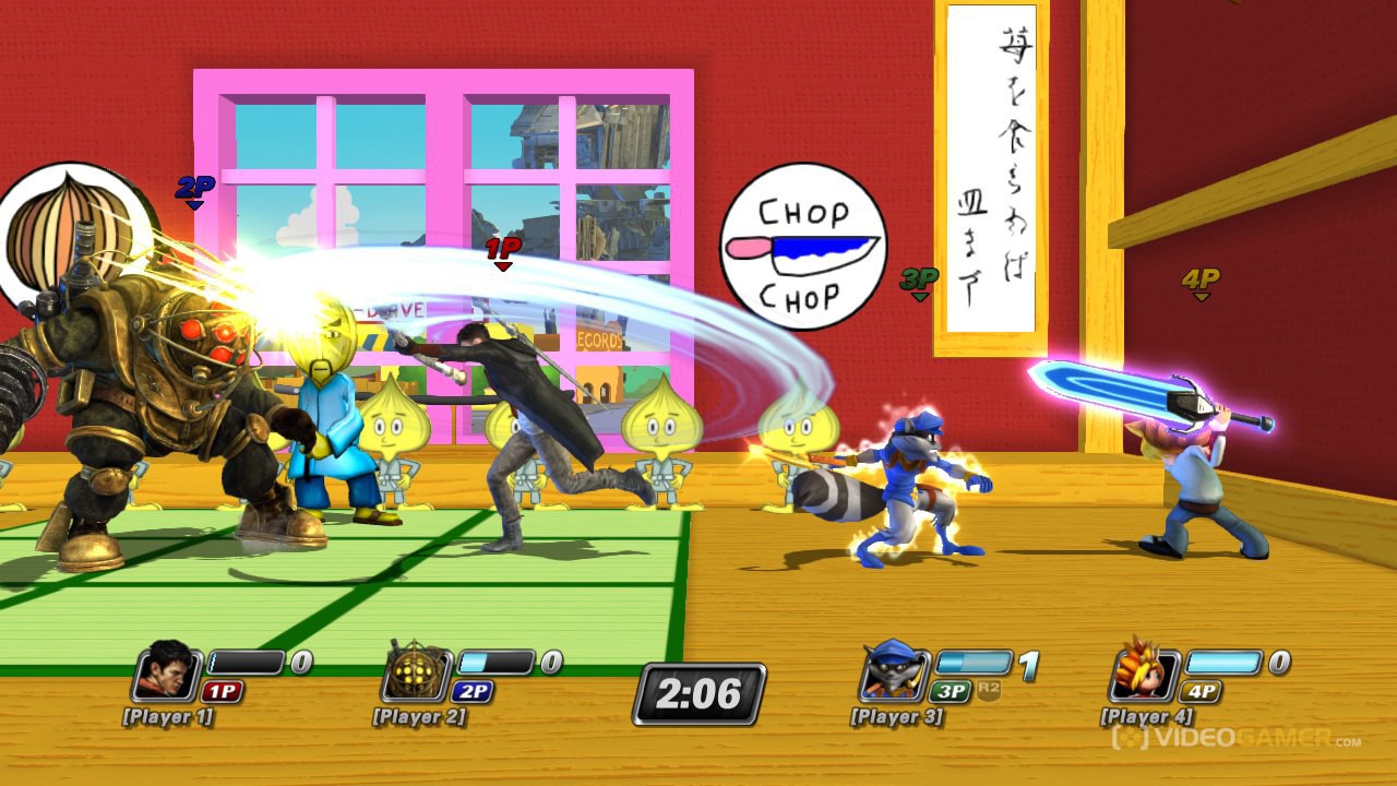
Look at unfair comparison between Playstation All Stars Battle Royal Casts and Super Smash Bros 4 Roster.

playstation_all_stars_battle_royale_wallpaper_by_cepillo16-d57vm0f.jpg


super_smash_bros__wii_u_3ds_wallpaper__v_1_9__by_marcos_inu-d6ev9lv.png


3. I really enjoy how they adjusted the battle mechanism, along with colors for it.


4. Look at Characters' attacks or taunts effects since it seem to be much better in Smash 4.


5. Sakurai and his teams did fantastic job with characters' facial expressions. Look at Brawl's facial expressions for some of characters, they might look bland comparing to Smash 4 edition. I can't find other characters comparison but I will use Dedede one since it's in this thread. Look at their face, and you can see the difference.

jvuoWb7.png


He actually sweated when trying to held charged hammer in Smash 4, and I can't tell what he's thinking in Brawl.

Other pictures of expressions that I really enjoyed to look at.


6. CHARACTER MODELS! Look how much they improved their models. They look fantastic in Smash 4.


7. Also they updated items' visuals as well.


Also I would like to point out that Pokeball Pokemon and Assist Trophies look fantastic as well.


8. Don't forget all about our handheld Smash. They went with fantastic art filter and outline system for Smash 3DS to make it pop out very well. I really love how they done for 3DS even it don't get much attention as Wii U did.

lucario-screen-9.jpg

zelda-screen-10.jpg

peach-screen-9.jpg

pit-screen-10.jpg

zelda-screen-34.jpg


9. Oopsy, I forget to mention STAGES! I will let you judge for yourself.


Overall: I'm definitely hyped with the visual graphic that I have been seeing in the game, along with fantastic choices of newcomers (along with their innovation and diverse move sets) and candy eyes stages. I'm glad that they move way from realistic but grainy arts that they went with brawl and go with cartoony vibe style for both system. They look fantastic once again!
 
No, Nintendo is famous for releasing 1080p shots of games that arent. Go and see SM3DW, MK8, DKCTF, and Pikmin 3

Really? All I've seen of those are 720.

Just checked the press site and nearly all that are there are 720. All Mario Kart ones are 1280x720. All Super Mario 3D World ones are 1280x720. All Pikmin 3 ones are 1280x720. Almost all DKC ones are too. The ones that aren't, you can see that they have been upressed. These, however, do not.

Do we have a direct quote for this? It appears this is an assumption as nobody can bring up proof or quote when asked to.

If you could provide a quote or evidence, then I'm happy and people should be able to move on.

http://www.eurogamer.net/articles/2013-06-11-super-smash-bros-for-wii-u-and-3ds-due-2014

UPDATE: Nintendo has revealed a couple of new Super Smash Bros. details this evening, firstly that the game will run in 1080p.
Was at the showcase in the E3 booth
 
I'm really happy with the art style they went with. I disliked the increasingly realistic style they went for in Melee and Brawl, it's great that they've returned to the more cartoony look from Smash 64.
 
the texturing, colour palette and modelling is done in pretty much the same style across those 4 pictures, nothing to do with the engine but a conscious effort from Nintendo to consolidate a specific, coherent look across the board.

And yet I can still distinguish every single title by how texturing is applied (see DK's Blizzard style of cartoon textures), lighting (see MK8) and use of color and shapes (see SM3DW).

Pixar also makes an effort to create a signature look across all of their movies, but they do all have their own style. Brave looks nothing like Toy Story or Cars.
 
I like the looks of the 3DS version. I like the looks of the Wii U version. It all looks better than Brawl and its gritty washed out look or whatever you call it. That's all that matters to me.
 
People could just place it down to "bullshots!!" or up-rezd shots.

An actual confirmation will stop this long running debate.

It's just that Sakurai said that all the screenshots he posts are captured from their build of Super Smash Bros for Wii U. In addition to that, every one of the screenshots he posts are on the press site at 1920x1080 with zero signs of them being up-ressed. That was good enough for me :)
 
It looks absolutely amazing.

I'm actually very excited for the actual hd console gen to get going. More than I thought I would be. A lot of that is Smash hype tho :)
 
Yes, it looks quite good. Love the style it has.

Really I'm more worried about the gameplay, especially after Brawl.

And damn PSABR is one ugly-ass looking game.
 
the texturing, colour palette and modelling is done in pretty much the same style across those 4 pictures, nothing to do with the engine but a conscious effort from Nintendo to consolidate a specific, coherent look across the board.


yes.
Ok, sure, they look more similar to each other than to call of duty or something, but come on. You mustn't have played many colourful games if you think they all look the same. By your logic The Wind Waker, Mario Galaxy and Pikmin all use the same art style...
 
The biggest leap was from SSB64 to melee. This feels like a leap from brawl, not a huge one but enough that I feel satisfied.
 
It is 1080p. I posted direct feed screenshots of resolution 1920x1080 which clearly are not upressed. Sakurai said at E3 that it was 1080. What more do people need?

Yeah the screens you posted are 1080p. Quite jaggied though in comparison to the texture res of say Injustice 1080p still. I wonder why there's no AA or anything like that. I guess as a 4player brawler it's going to be more intensive on performance though.
 
Ok, sure, they look more similar to each other than to call of duty or something, but come on. You mustn't have played many colourful games if you think they all look the same. By your logic The Wind Waker, Mario Galaxy and Pikmin all use the same art style...

?

i'll go with "yes".
 
Donkey Kong and NSMBU are 720p60, that is the only reason I don't believe Smash Bros will be 1080p60 with 4 characters and crazy shit going on.

Graphics are good though.

Yep, the only games that are 1080p60 to my knowledge is rayman legends, a 2D game made of sprites and Monster Hunter 3 Ultimate (with heavy frame drops, averages around 38fps).

Isn't it possible they could bring it back down to 720 at release? Though I'd love it, It's hard for me to believe it will be 1080p60 and I don't see them bringing it down the frame-rate to 30 for a fast paced fighter like this.

Edit: Apparently It's been confirmed. I will gladly feast on crow with a smile on my face if true.

 
The biggest leap was from SSB64 to melee. This feels like a leap from brawl, not a huge one but enough that I feel satisfied.

I don't think we need to have a huge leaps since people were expecting more shaders, etc. I'm not well-knowledge about engines, etc but if we are adding more complex hairs program, shaders, etc then we might have to sacrificed 60fps right? Since there are plenty of other things that would consume the battles in fast paced, such as items, character models, stage, etc.
 
Who cares about screenshots?

Judging by the gameplay videos it looks ok, just the kind of quality you'd expect from a Wii U game. It's nothing to be excited about but also not disappointing.
 
I would say MK9 and Injustice look better but it comes down to preference really and the games are very different in many ways . Pretty sure these are all 360 screens below.

I agree it's a matter of preference, I for once consider MK and Injustice ugly as sin in comparison. Realistic gritty look does nothing for me, I could just look outside the window if I wanted that, they don't ooze as much artistic style as Smash.

...Why is this comparison still being used? He changes his face the further you charge man.

RSBE01-1.png


It's still a huge improvement though yeah.

Because it's not about the faces. Look at the effects, the lighting, the background, the textures, the colours, the 3D models. Everything is way better.
 
Holy shit.

I didn't realise it looked that bad.

It doesn't, everybody who posts about how bad PSAS looks always posts one of the beta pictures from E3, with the gross vaseline smear all over the screen. The UI in that pic isn't even in the final game.
 
It doesn't, everybody who posts about how bad PSAS looks always posts one of the beta pictures from E3, with the gross vaseline smear all over the sreen. The UI in that pic isn't even in the final game.

Fair enough. Is this the final game on PS3?

PlayStationAllStarsBattleRoyale_0003.jpg


PlayStationAllStarsBattleRoyale_0014.jpg


PlayStationAllStarsBattleRoyale_0009.jpg
 
I agree it's a matter of preference, I for once consider MK and Injustice ugly as sin in comparison. Realistic gritty look does nothing for me, I could just look outside the window if I wanted that, they don't ooze as much artistic style as Smash.


Because it's not about the faces. Look at the effects, the lighting, the background, the textures, the colours, the 3D models. Everything is way better.

Textures? Lol, no. These are looking awfully low res. Especially Skyloft stage, which are the same textures from the Wii game.
 
Because it's not about the faces. Look at the effects, the lighting, the background, the textures, the colours, the 3D models. Everything is way better.

What? That picture was made to be a direct comparison with Dedede's B+Down attack and all the aforementioned picture makes me look at at first off is his absolutely derp looking face.

It's still a huuge improvement but not as massive as that picture leads people to believe.
 
Wow, PSABR did look like shit, lol.

Smash on Wii U trumps that and I think it's fair to say, even does Smash on 3DS.

What I like most about Smash 3DS is that it seems to be using a lot of the 3DS power, for example, I imagine the screen in the Punch Out arena being fairly intensive to copy everything that happens in-game, and it's now made it into the 3DS game. Thus, technically rendering the fight 4x if in 3D.

It's looking pretty sweet.
 
What? That picture was made to be a direct comparison with Dedede's B+Down attack and all the aforementioned picture makes me look at at first off is his absolutely derp looking face.

It's still a huuge improvement but not as massive as that picture leads people to believe.

Of course the face comparison is there as well, but what I was saying is, it's not just that, EVERYTHING is better. For the record the faces and expressions are better as well, even if we forget this single Dedede pic.

Textures? Lol, no. These are looking awfully low res. Especially Skyloft stage, which are the same textures from the Wii game.

I don't even... where's Skyloft in the pic I posted? It was a comparison between two Dedede...

Though I agree on Skyloft being the worst looking stage.
 
Top Bottom