HUELEN10
Member
Hint:
Luigi
Hint:
Hint:Luigi
Is it just me, or does the Resident Evil 6 boxart look like a giraffe getting favors from some poor soul?
Hint:Luigi
Hint:Luigi
Had to stare at that one for a bit to see it.It's the letter on his hat.
It's a fighting game.What's bad about this?
What photoshop flops have you seen in game covers/posters ?!
I just saw this image on another thread, and holy s*hit....what is wrong with his face ?! Also is he holding an M4 shotgun ?! And those ears /neck...

This was always my (least) favorite PS1 era cover.

Yep, poor lil system got right fucked in the cover art dept so often....


It is like they are saying "Fuck you for not buying this game at full price"

It's a fighting game.
I don't see how it's a fail. They wanted something way different as a cover to a shoot em up game, something that would stand out.
And it stood out for years so much people don't even know what the hell the actual game looks like.
So it's more of a success if you post it here like so many have posted in many similar threads in the past.
It doesn't feature the game's logo, nor the main character.It's still nice art.
And time to tell you you're wrong.Time to roll out this chestnut again:

The logo is there, it's just near impossible to see because it's brown and blurs into the background.It doesn't feature the game's logo, nor the main character.
Btw it was made by a Gaffer.
Is it just me, or does the Resident Evil 6 boxart look like a giraffe getting favors from some poor soul?
Time to roll out this chestnut again:
And time to tell you you're wrong.
I remember seeing this in '92 and being like "what the hell?!" and then laughing at how stupid it was. It's a ridiculous cover but that doesn't make it good. What possible qualities does it have outside of being notoriously bad?Again: i think this is a fantastic cover.
I remember seeing this in '92 and being like "what the hell?!" and then laughing at how stupid it was. It's a ridiculous cover but that doesn't make it good. What possible qualities does it have outside of being notoriously bad?
what the story behind Phalanx anyway?
does the banjo playing old man have any significance?
what the story behind Phalanx anyway?
does the banjo playing old man have any significance?
what the story behind Phalanx anyway?
does the banjo playing old man have any significance?
I've asked this before too! We want answers!
This is an old man playing banjo on the cover of an "hyperspace" shmup. What could possibly not be awesome about it?
Nope. Not the slightest. In a recent (?) interview the publisher said they wanted something original in the ocean of shmups at the time. They happened to see this photo of an old man playing banjo and...here it is. So random.
It believe it is purely a form of shock marketing to get you to look at the cover because no other space shooter would include such bizarrely, unrelated image on the box.
What were they even thinking?
I've asked this before too! We want answers!

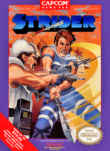
Hint:Luigi

Now i can't get that damn tune outta my head.
These types of threads can never be complete without North American Ico.
I will never know why they decided to transform Ico into a bratty, blank-staring doofus and Yorda into a giant purple-eyed, dark-haired ghost head. Especially when the game's own director painted this, which was used as the cover art everywhere else.
Photoshop fail:

Pet Vet thread? Pet Vet thread.


I still wonder if THQ originally stole a random nude shot off the net, considering they clearly attempted to Photoshop those purple clothes on her.
Phoenix Games had balls of steel when it came to completely ripping off Disney stuff. I think that's what eventually killed them after pumping out close to 100 PS2 games in the space of two years.

What am I supposed to be seeing here?
What photoshop flops have you seen in game covers/posters ?!
I just saw this image on another thread, and holy s*hit....what is wrong with his face ?! Also is he holding an M4 shotgun ?! And those ears /neck...
What's bad about this?
Ugh Ryu's face. Every time I see this box art, I make the face Chris is making.