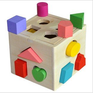
The concept of Michiko Sakurai menus is a easy to read visual language. The first time you go through the menu, you read the labels on shapes to navigate yourself through the menu. But after that you can really easy gasp, which shape you wanna hit to progress into your chosen direction. Press the big red circle to play Online or the green trapeze to go into Smash Run. There is almost no need to ever red the labels again. It basically represent the simplicity of this:
Other than that the menu looks completely original, is easy to recognize and is kind of an trademark of the Sakruai couple.
 Functionality over "zazz"