Apple announces Apple Watch

Status
Not open for further replies.
Here's the thing. A 350$ watch will last you many years, a 1k$ watch? Possibly a lifetime. The apple watch on the other hand will be obsolete after 2 years. So in that sense paying 350$ for it is quite expensive , especially since you need an iPhone for it to even work.
Well requiring the iPhone is irrelevant to me, as I have one, and don't foresee not having one in the future.

The upgrade thing though, that is a stinger. Just personally I would have had no problem spending a lot on the watch in theory, but seeing how 'gen 1' it seems, I'm going to limit myself because I'm likely to replace it after a year, two at the most, but I imagine that slowing over time actually, and upgrade cycles for individuals to be larger than with the phones. Although even then, with the expensive watches comparison, I was getting my Speedmaster serviced every couple of years, that wasn't cheap, and it meant being without the watch for a time.

It's far from cheap, but if it's as nice as I hope, I have no problem with that.
 
What I am really worried is the battery drain the watch does to the iPhone though.
It's not remotely rendering and streaming a video to the watch, it's just little bits of data, shouldn't be an issue. Obviously something like the remote camera viewfinder option will be far more demanding, but normal use shouldn't be impactful at all.
 
Bluetooth, especially BT 4.0, really has a negligible impact on the battery life of your phone.

In my experience using bluetooth headsets with iPhones, the impact on battery life is about 10%. On the other hand, when using a bluetooth smartwatch I do not turn on the iPhone screen as often just to check notifications, so I find that my iPhone battery life actually lasts longer than without the smartwatch.
 
In my experience using bluetooth headsets with iPhones, the impact on battery life is about 10%. On the other hand, when using a bluetooth smartwatch I do not turn on the iPhone screen as often just to check notifications, so I find that my iPhone battery life actually lasts longer than without the smartwatch.

headset probably isn't using LE. 4.0 is designed to use less power for connections like these for smartwatches/fitness monitors etc.
 
I'm coming around to it, the black stainless with link bracelet does look nice. Needs to be thinner and smaller though.

The renders of the Moto360 do look better, but seeing actual pictures of it on someone's wrist it looks cheap and like something Flavor Flav would wear.
 
I'm coming around to it, the black stainless with link bracelet does look nice. Needs to be thinner and smaller though.

The renders of the Moto360 do look better, but seeing actual pictures of it on someone's wrist it looks cheap and like something Flavor Flav would wear.
Yeah, the 360 looks awful, and when it's running, that black beam along the bottom is beyond offensive. Not that the iWatch is some aesthetic wonder, it's far from it, but it's still the best looking smartwatch so far.
 
Tell me this wouldn't be incredibly nicer:


http://alcion-uxui.tumblr.com/

Now that...I would be annoyed that I can't get it on my phone. That's a good looking watch. My distaste for this has nothing to do with my investment into android. I've actually really started to come around for this thing. The customizability is something all smart watches need. And the design of the hardware is great. But I personally don't like square watches, and I think the Apple Watch UI is way too inconsistent. Sometimes it looks good and sometimes it's just horrible.
 
my mind is full of fuck if these aren't a joke.

If i took those screenshots two weeks ago and labeled them Samsung, they would get laughed out of every website around. They are ugly as sin and straight up piss poor from the icons, to the font to the information density.

Seriously, its a tiny screen that you aren't going to hold an inch from your face, there needs to be a happy medium, there is dead space in google watch that could be used sure, but thats just ridiculous.

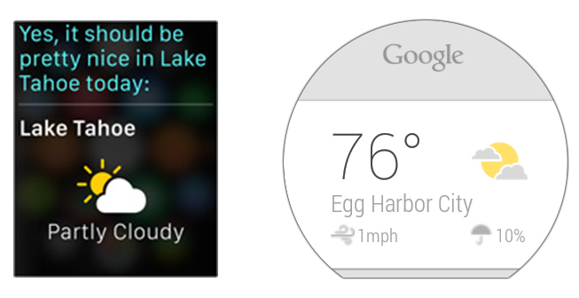
weather-query.jpg


terrible

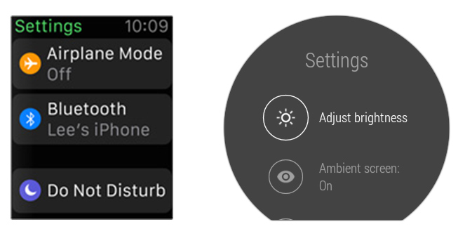
settings.jpg


if you told me this was fan made by a 7 year old blind kid with WordArt, i'd believe you more then i would believe this is an actual shipping screenshot from an Apple device.

ffs ... it has a GALLERY app. A gallery app... on a watch...

As an iPhone owner, I completely agree with this. The UI looks like absolute shit. Almost Samsung level bad and to the point that I'm seriously wondering how the opinions would completely flip around if this came from any other company.
 
While that Google UI is far prettier, that specific comparison of the partly cloudy is a funny one to choose, because the light yellow/grey/white combination, as small as it is, is terrible design.
 
Depends on the watch of course. Some people keep their high end fashion watches in jewelry boxes, only wearing them on fancy nights out, even though many of these watches are explicitly designed to be used underwater. On the other hand I know people who wear their cheap swatch watches all the time. Have you ever missed an important call while in the shower? A waterproof smartwatch would help with that. Do you listen to music in the shower or while taking a long bath? A waterproof smartwatch would be great for changing tracks...


I'm not a watch wearing man (I have little interest in jewelry) but I have an appreciation for beautiful gadgets. I just can't reconcile the idea that a site which recommends watches like these:

Browse through the publication and tell me how many square face watches you can find there...

Are the AppleWatch straps very nice? Well yeah — many are after all based on classic watch straps as Jony Ive pointed out. Is the AppleWatch extremely well engineered? Of course, Apple as always has great industrial designers. Does sapphire/stainless steel/leather/gold plating make it beautiful? No:


That said, if the Apple logo somehow convinces the elite that smartwatches are now cool and fashionable I won't be complaining

Some of the watch designs are outstanding on that website. I didn't realise there were so many independent watch makers that were making beautiful hand crafted watches better than the big watchmakers in the premium space. I was more of a pocketwatch guy, but seeing some of these, I never could have thought you could have some of these designs in a normal watch. Less like jewellery, more like a crafted heart. Incredible engineering.

To convince me to purchase a smartwatch, it has to look good first. That is the reason people purchase watches predominately today. The Apple Watch fails spectacularly against these kinds of watches, although 1 or 2 wristbands do look nice. The UI is inconsistent. I still am not convinced that I would use the smartwatch to improve marginal productivity or utility. There are so many factors that illustrate smartchwatches have a long way to go until it can become useful in terms of charging, UI, independent features like GPS from the phone, etc. Not to mention how frustrating it must be to interact with a 1-2 inch piece of screen with your fingers, and constantly use the crown on your wrists. I feel like Apple should have waited a year or two until it came back with a better design. I suppose Android Wear pulled them out a bit earlier to market. It's just not for me.
 
Not gonna lie the square face is really bugging me. That aside though, I just don't see myself spending $350 for this. Probably $250 though
 
Apple PR also invites to their events journos that review android phones as better than iPhones. The premise that Apple's PR only invites those who're gonna glowingly praise their products is flawed.

And someone who is aware of horological history and tradition wouldn't give a rats ass wether a watch is round or square. Only fanboys picking sides in a war tho. I think it is very telling that you believe his opinion to be tainted because he helds the iPhone in high regard. "Oh, someone likes the iPhone... he must be an indoctrinated sheeple or a for-sale celebrity!"

The agenda-driven posting in this thread is disgusting.

I would if it impacted a watch's certain design, since if I bought a watch, it would be primarily for looks. Not that I would disregard either shape, just if the shape looked particularly odd on a bespoke design.
 
Maybe the next version will have a lighting port on it so i can plug headphones into it. Since some headphones are doing that

I want to jog, listen to spoify without my phone. Gimmie that reality apple :P
 
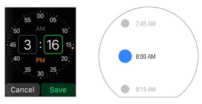
There's a cool screenshot analysis from ArsTechnica comparing Apple Watch's OS and Android Wear. It truly shows the difference in main focuses between the systems.

Ugh, Wear. It's already a small screen, negative space here is wasted space.

Maybe the next version will have a lighting port on it so i can plug headphones into it. Since some headphones are doing that

I want to jog, listen to spoify without my phone. Gimmie that reality apple :P

It's gonna have Bluetooth.
 
Ugh, Wear. It's already a small screen, negative space here is wasted space.


It's gonna have Bluetooth.

Honestly, the negative space is hugely appreciated on a small device for me. A quick glance is all you should need for a watch, not play a freaking word search game.
 
Square shape allows you to use space more wisely. It also looks a lot more futuristic.

The photo gallery is a head scratcher but I like seeing the circles in the square frame. Its a cool contrast.

Tell me this wouldn't be incredibly nicer:


http://alcion-uxui.tumblr.com/

While these concepts look gorgeous, they probably ignore all sorts of engineering requirements. If Apple was able to make it that thin right now, I'm sure they would. It also looks really basic and doesnt stand out too much.
 
In terms of functionality, this is basically a remote control and remote display for your phone, right?

It's like those controllers with a tiny screen they used to make for MP3 players.

Edit: feeling someone else's pulse does sound interesting though. They could also use it to synchronize dancers or musicians.
 

Awesome article with some gorgeous photos. Thanks!

I agree. I think it's one of those things that you aren't going to realize how cool and no brainer it is until you start using it for a while. It is probably the only feature I'm jealous of when comparing to the Android watches at the moment. Hopefully someone comes up with a similar app.

I can see this feature integrated in WhatsApp or a stand alone Facebook Poke app. Lots of fun ideas there.

I think this could be cool too. I thought the minute or so they spent talking about customising emoji (and that it has its own button in the communication apps) was weird though.

I think the way you tap longer on the screen to bring up a few buttons specific to the app will be standard in all smart watches a year from now. It just seems so obvious (and I mean that in a "good design should be invisible sort of way.").

Overall, I was disappointed with the reveal though. I was more interested in a wearable (something like the Moment smart watch) than the typical smart watches other companies have been doing and Apple seems to be following the latter. The digital crown seems a weird piece of skeuomorphism that I thought we'd been moving away from these last two years. I can only assume they thought this was necessary because this is a new product category (for the general public) and this would make it easier.

It just seems to really lack focus. I wanted something that did just a few things well. Seeing photos on there was bizarre. I can't see the justification for it being there other than "it's possible." My understanding of how Android Wear works is you swipe down for more info on the notification or you swipe right to respond to it (I might be way off on that though.). This just seemed like shrinking a smart phone onto your wrist. The thing everyone has been criticising Android Wear for and what Tim Cook said they wouldn't be doing.

The emoji one was definitely weird. The screen is way too small to make any serious adjustments. I'm probably gonna be sending squashed faces to everyone.
 
Honestly, the negative space is hugely appreciated on a small device for me. A quick glance is all you should need for a watch, not play a freaking word search game.

Having no dead space makes the screen look cluttered as fuck.

Clutter isn't a problem I noticed, straight up word search to read the actual information is. You're left to search for characters made extra tiny for the sake of preserving design aesthetic made for smartphones. I'm on a 23" widescreen display and this is a noticeable problem. I have excellent vision, so that's no issue.
 
Thinking about watch shapes, I wish that if they had to go square-ish, if they had used this case shape

uRnqKRQ.jpg


instead of the straight edges with the rounds at the corners, to curve the entire side edges. i think it's a nicer look.

'm hoping in a couple revisions, they'l look at changing the edges shape and, naturally, make it thinner. hopefully get it down to 10 or 12mm.

I would wear something like that
 
The sheer number of apps on this thing takes me a couple steps closer to the "apples lost it" bandwagon. I'd be stunned if the gallery app exists in the Steve Didn't Die alternate universe.
 
"Basically, Google has built a voice command and notification platform, while Apple is building a mini smartphone."

- Ron Amadeo, ArsTechnica

Home:
home.jpg


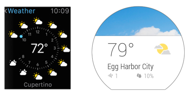
Weather:
weather.jpg


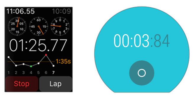
Stopwatch:
stopwatch.jpg


Alarm:
alarm.jpg

My initial reaction is holy shit those Apple fonts are terrible.

And while I would still prefer a more narrow (Google/MS) look, much of the ugs comes from the fact Apple hasn't released high res shots. Those pics were blown up from really small source material, and look blurry as hell.

I look forward to an accurate comparison to get a better feel. Obviously a main concern is they may prove a bit too information dense given the size. Though if they are functional, sometimes you have to take use over aesthetics. I prefer a cleaner look, but if it means less usability, I'll suck it up and take a denser presentation.
 
I agree. I think it's one of those things that you aren't going to realize how cool and no brainer it is until you start using it for a while. It is probably the only feature I'm jealous of when comparing to the Android watches at the moment. Hopefully someone comes up with a similar app.

I'm with you guys. Having the little tap communication thing built in is awesome. If there's one thing the benefits a lot from removing the small barriers, it's communication. That's why SnapChat and whatsapp are killing Facebook messages and SMS.

"Basically, Google has built a voice command and notification platform, while Apple is building a mini smartphone."

- Ron Amadeo, ArsTechnica

Weather:
weather.jpg

Alright, I like what they did with the weather here. Putting it by the hour. Very nice touch.
 
The screenshots of the Apple Watch OS definitely show what's changing without Steve Jobs.


No way in hell Jobs greenlights that cluttered, ugly ass mess.
 
My initial reaction is holy shit those Apple fonts are terrible.

And while I would still prefer a more narrow (Google/MS) look, much of the ugs comes from the fact Apple hasn't released high res shots. Those pics were blown up from really small source material, and look blurry as hell.

I look forward to an accurate comparison to get a better feel. Obviously a main concern is they may prove a bit too information dense given the size. Though if they are functional, sometimes you have to take use over aesthetics. I prefer a cleaner look, but if it means less usability, I'll suck it up and take a denser presentation.
Alright, I like what they did with the weather here. Putting it by the hour. Very nice touch.

Just think about the situations where you can't use your phone or an access to your watch is just easier and quicker.
You're in the subway or in a bus full of people, you're driving, you have one hand that is occupied with a bag, or you just really need to know what time it is... which one comes in handier?
The one you can summon with your voice and that shows a bold and front-and-center picture of the core information... or the one you will have to manually activate in order to get a smartphone-sized information package shrunk into a 1.5" display?
What's quick and at a glance in that? If for whatever reason you need a specific forecast for a specific period of time, all you have to do is ask (what will the weather be tonight/tomorrow morning/this afternoon/etc.).

And as far as interface beauty goes, well...
 
Ugh, Wear. It's already a small screen, negative space here is wasted space.

Lol, that is terrible design advice. More isn't always better, especially on a small screen held so far from your eyes. People seem think information density is the end-all-be-all of good design, but it isn't. The negative space is just as important as the information and striking the right balance between the two takes a skilled designer. The negative space helps create contrast between the pieces of information.

On a tiny screen like a watch this balance is even more important because you don't want your content (text/buttons) to get too small to read/touch. A lot of the Apple Watch stuff is way too small/dense. Some of the Wear stuff is too spread out, but in general does a much better job. The weather widget for example is just fine on information density. The problem there is the lack of color contrast for something that will be viewed in direct sunlight often.
 
The screenshots of the Apple Watch OS definitely show what's changing without Steve Jobs.


No way in hell Jobs greenlights that cluttered, ugly ass mess.

Watching the video, I thought it all looked pretty intuitive. There were some exceptions, like the home screen icons being so small and cluttered and the gallery app looking ridiculous. I wonder how many people watched the video?

One nice thing out of all this is that there should be a decent amount of options for alternate weather apps, messaging apps etc if you don't like what Apple has offered. I'll be interested to see what people come up with in the next few years to add to the use cases for this thing because out of the box it looks like a fun toy.

Lol, that is terrible design advice. More isn't always better, especially on a small screen held so far from your eyes. People seem think information density is the end-all-be-all of good design, but it isn't. The negative space is just as important as the information and striking the right balance between the two takes a skilled designer. The negative space helps create contrast between the pieces of information.

On a tiny screen like a watch this balance is even more important because you don't want your content (text/buttons) to get too small to read/touch. A lot of the Apple Watch stuff is way too small/dense. Some of the Wear stuff is too spread out, but in general does a much better job. The weather widget for example is just fine on information density. The problem there is the lack of color contrast for something that will be viewed in direct sunlight often.

Ehh, that Android weather screen with the tiny grey text on the white background looks like a damn nightmare to read outside in the sun. I really don't see that being very usable.
 
It looks a lot less cluttered on the watch itself. Its pretty clever how the glass wraps around the watch so you dont really know where the screen ends. This lets designers use all the space available in the screen without having to worry about padding. Of course, it looks the best if the background is black.

Like look at the shots of the UI on the watch. Looks far less cluttered and a lot prettier. Hell, the thick black border makes it look really spacious and airy.

If you take the screenshot by itself, then yeah it looks cluttered. But its a disservice to show the literal screen itself without taking the watch face into account for such a small device.

ED3gnMA.png
e96cwsZ.png
7wSDYfQ.png
PLMfxUF.png
9HgSWxg.png
0agKiNC.png
Ic5e336.png
 
Apple Watch is too smart. Where is a "smartwatch" that can interface with any bluetooth device I own to skip songs when driving? That has a companion app for every phone, shows me who's calling, and a week+long battery. I will take simple features I use often over trying to cram as much as possible to a day of battery life. Calendar notifications. Voice activation that hooks to Siri, Google Now and Cortana. Apple might never build a smartwatch with equal third party support, but that's what I want to see it succeed. Having to buy a new watch if I want to buy a different phone crosses the line. Priced at $99-$149.
 
Just think about the situations where you can't use your phone or an access to your watch is just easier and quicker.
You're in the subway or in a bus full of people, you're driving, you have one hand that is occupied with a bag, or you just really need to know what time it is... which one comes in handier?
The one you can summon with your voice and that shows a bold and front-and-center picture of the core information... or the one you will have to manually activate in order to get a smartphone-sized information package shrunk into a 1.5" display?
What's quick and at a glance in that? If for whatever reason you need a specific forecast for a specific period of time, all you have to do is ask (what will the weather be tonight/tomorrow morning/this afternoon/etc.).

And as far as interface beauty goes, well...


Exactly. I mean it's cool that there is a time-wise breakdown of the weather, but why the hell is it on a 1.5 inch screen? That's a great feature to have on your phone, and a cluttered mess on the watch.


Zooming out to see 50 apps jumbled together you can't click on or distinguish between is stupid. Going into a photo album with hundreds of pictures that are so small they can't be distinguished is stupid too.


Jobs famously took the CD out of the iMac because "fuck what people think they want, it's stupid and clutters the feel" and now we have a photo album on a watch to appease some people's vanity enough so they can see pictures on a 1.5 inch screen?
 
Ehh, that Android weather screen with the tiny grey text on the white background looks like a damn nightmare to read outside in the sun. I really don't see that being very usable.

Read my comment again, that is exactly what I said. Not enough color contrast on Wear.
 
Lol, that is terrible design advice. More isn't always better, especially on a small screen held so far from your eyes.
so make it even smaller because??

On a tiny screen like a watch this balance is even more important because you don't want your content (text/buttons) to get too small to read/touch. A lot of the Apple Watch stuff is way too small/dense.
Not where you need to touch, and when it appears that way, they demo'd how that's handled. In each case that appear cluttered, the most important information is dead center, glance-able (wtf is that word i just used). If you want more info, it's also there.

Some of the Wear stuff is too spread out, but in general does a much better job. The weather widget for example is just fine on information density. The problem there is the lack of color contrast for something that will be viewed in direct sunlight often.

It's too spread out because it's an aesthetic that is not tailored to the device, the same with the color contrast problem. They didn't think it through.
 
so make it even smaller because??

No, make the Apple stuff larger with less on the screen. That stop watch is ridiculous.


Not where you need to touch, and when it appears that way, they demo'd how that's handled. In each case that appear cluttered, the most important information is dead center, glance-able (wtf is that word i just used). If you want more info, it's also there.

The music player on the watch is a perfect example of the density being too high on a touch interface.


It's too spread out because it's an aesthetic that is not tailored to the device, the same with the color contrast problem. They didn't think it through.

I agree. Some of that Wear stuff needs to be a bit more dense and definitely needs more color contrast.
 
It looks a lot less cluttered on the watch itself. Its pretty clever how the glass wraps around the watch so you dont really know where the screen ends. This lets designers use all the space available in the screen without having to worry about padding. Of course, it looks the best if the background is black.

Like look at the shots of the UI on the watch. Looks far less cluttered and a lot prettier. Hell, the thick black border makes it look really spacious and airy.

If you take the screenshot by itself, then yeah it looks cluttered. But its a disservice to show the literal screen itself without taking the watch face into account for such a small device.

ED3gnMA.png
e96cwsZ.png
7wSDYfQ.png
PLMfxUF.png
9HgSWxg.png
0agKiNC.png
Ic5e336.png

Looks great to me. I do look forward to OS revisions between now and 2015. I have a feeling a lot of UI/font concerns being mentioned here aren't lost on Apple and will be changed/improved between now and launch.

Looking forward to my Apple Watch.
 
Will be swapping out my pebble for one of these. Being able to respond to text should be well worth it. Hope I can make custom watch faces.
 
The music player on the watch is a perfect example of the density being too high on a touch interface.

We'll have to see how that works in the real world, I don't think it'll be a problem; they have a set pixel/point size determined for fingers already. Wear's solution makes entirely separate screens for skipping. Total waste and an extra gesture to boot.
 
Maybe the next version will have a lighting port on it so i can plug headphones into it. Since some headphones are doing that

I want to jog, listen to spoify without my phone. Gimmie that reality apple :P

This is the one reason I want one of these things.
Being able to run without needing to strap a phone to my arm is a very appealing thought.
 
While I'm a bit sceptical of the entire category, Apple's brought their typical thoughtful approach to the problem. The construction, the design of the bands, etc. all looks pretty strong. I think it's thicker than is ideal, but given that technical requirements probably forced a minimum total volume, it was probably the right trade-off to make it a little thick, rather than have the face be too large.

It'll likely be really nice in a couple generations, when they can make it thinner, and any hardware/software kinks have been worked out. (I still don't know if that will make me want a smartwatch of any kind, though.)

Some random thoughts:

  • Ive's comments about taking inspiration from traditional timepieces don't strike me as empty -- it seems apparent in both the hardware and software. I actually like that they're going for a high information density on a lot of screens. It may seem "cluttered" to some, but traditional watches (chronographs, etc.) have often been about rendering a lot of information in a small space, and some of the software seems inspired by that.
  • It seems pretty clear they'll use an OLED screen, making the predominantly black app backgrounds the most power-efficient choice. (Though maybe this isn't that significant; I don't know.) The hardware encourages app developers to make this same choice, as the way the screen bleeds into the bezel means black backgrounds will look best.
  • A frequent criticism of Apple products is that they sometimes choose form over function, so it's funny to see them criticized for the opposite in this case. It's fairly clear the shape of the face and the design of some of the software is about function over form, to some degree.
  • Some of the screenshots posted probably look significantly worse than they will on the device, as they look fuzzy, and don't incorporate the negative space that will be provided by the bezel.
 
Why is it that Apple haven't moved to OLED for their other product lines yet? They're thinner, give off less heat and actually use less power, right?
 
Status
Not open for further replies.
Top Bottom