-
Hey Guest. Check out your NeoGAF Wrapped 2025 results here!
You are using an out of date browser. It may not display this or other websites correctly.
You should upgrade or use an alternative browser.
You should upgrade or use an alternative browser.
Resident Evil HD Remaster confirmed for PS3/PS4/360/XB1/PC
- Thread starter Mpl90
- Start date
Dusk Golem
A 21st Century Rockefeller
If I get to play REmake as Hunk I'll be pretty happy.
I'll start my own canon where Hunk is the star of every game. He'd fit into the opening of RE3 with his RE4 jump out of window animation. Sorted.
You'll likely get your wish, considering HUNK is a fairly popular RE character and that he's been in three MT Framework games (Resident Evil 4, Resident Evil Revelations, Lost Planet 2), so it should be a bit easier to port him, just needs rigging and replacing.
Wait, does RE4 UHD really run on MT Framework? Its folder structure doesn't look like the one used in RE5, 6 and Revelations and unlike REC:V HD and REmake HD, it's lighting and special effects weren't improvement - they look exactly the same as in GameCube version (moreover, some effects - like depth of field - were removed in the HD version).
Daffy Duck
Member
So do we have any idea when the ps4 version will be out?
If I get to play REmake as Hunk I'll be pretty happy.
I'll start my own canon where Hunk is the star of every game. He'd fit into the opening of RE3 with his RE4 jump out of window animation. Sorted.
If this indeed runs on MTFramework (based on what sectus discovered) then modding will be trivial.
Can already see Leon & co modded in.
Wait, does RE4 UHD really run on MT Framework? Its folder structure doesn't look like the one used in RE5, 6 and Revelations and unlike REC:V HD and REmake HD, it's lighting and special effects weren't improvement - they look exactly the same as in GameCube version (moreover, some effects - like depth of field - were removed in the HD version).
RE4 UHD doesn't run on MTF. It's a port of the X360 version, which was a port of the Wii version, which was a port of the GC version.
MetalSlug
Member
That's what they did with RE4 HD and Code CV HD as well. Which is why it seems likely that Code CV HD will eventually show up on PC as well.
I really do hope that happens. It's my favourite one.
BIONIC-ARRRMMM!!
Member
On that note, I predict that Code Veronica will make its way to PC eventually when Capcom has less RE pet projects in the work, if REmaster does well the first thing we're probably getting is not a REmake of 2, but a REmaster of Zero. I think further down the line, eventually the rail-shooters Umbrella & Darkside Chronicles will come to Steam (this was heavily hinted as well in RE4, as the Steam Trading Cards mentioned characters who had other Steam Trading Cards were specifically from RE4, like Leon was "Leon (RE4)". Krauser also had this, but the only other game hes appeared in is Darkside Chronicles, so they probably marked Krauser as such since they've been considering bringing those games to PC, and if they did they'd probably have another Krauser trading card).
I really hope they don't waste resources on remastering 0. What a terribly boring game. Can't even bring myself to finish it. Dreadful inventory system as well.
Don't worry, it's probably going to be much worse with current gen versions.Got my game today and omfg... It looks really weird on ps3... The blur in everything is horrible... My gamecube version for Dolphin is much much better =(
Try to play it in 4:3, it will look much better.
Wait, does RE4 UHD really run on MT Framework? Its folder structure doesn't look like the one used in RE5, 6 and Revelations and unlike REC:V HD and REmake HD, it's lighting and special effects weren't improvement - they look exactly the same as in GameCube version (moreover, some effects - like depth of field - were removed in the HD version).
RE4 UHD doesn't run on MTF. It's a port of the X360 version, which was a port of the Wii version, which was a port of the GC version.
Are you sure? Maybe it's just CVX HD then. I distinctly remember at least one of the 360 HD ports having the MT Framework logo on game boot.
Diablohead
Member
1080p versions are going to look like a filtered mess, I just know it.Got my game today and omfg... It looks really weird on ps3... The blur in everything is horrible... My gamecube version for Dolphin is much much better =(
Are you sure? Maybe it's just Code CV HD then. I distinctly remember at least one of the 360 HD ports having the MT Framework logo on game boot.
It was CVX HD.
It was CVX HD.
Memory's failing me at my old age then, dang.
Chance Hale
Member
Did anyone in Japan get the collector's edition? How's the art book that comes with it? Surprisingly there are no videos on youtube for it.
Did anyone in Japan get the collector's edition? How's the art book that comes with it? Surprisingly there are no videos on youtube for it.
because japanese people don't use youtube.
Chance Hale
Member
There are lots of people in Japan who upload videos of various games to youtube, be they native or expats. Although it's always targeted to people outside Japan from what I've seen. Doesn't really matter of course, mine will be here soon enough.because japanese people don't use youtube.
Boo this awful opinion. BOOOOO I say!I really hope they don't waste resources on remastering 0. What a terribly boring game. Can't even bring myself to finish it. Dreadful inventory system as well.
SolarPowered
Member
+1 BooBoo this awful opinion. BOOOOO I say!
I loved RE0. At the time I had never fully played an RE game and I was mostly a Nintendo kid so REMake was my first complete RE experience. Maybe it was just my lower expectations, but everything about RE0 besides the story was top notch to me even after playing the greatest survival horror game of all time. Hell, I even preferred RE0's two partner system to RE5 and RE6's forced coop for the most part. RE5 was fun as an arcade style coop experience, though.
Too bad we never got more of Billy or Rebecca. I'd definitely pay for an RE0 PC port.
Sammy Samusu
Member


In before nude Chris.
ubersticky
Member
In before nude Chris.
Don't get cocky.
In before nude Jill.
fixed.
Also there should be a wetsuit costume from Revelations in this game, if not they should make it unlockable from re.net
How many of the backgrounds have been touched up and how do the filtered ones look?
Lastly how many are in true widescreen?
Basically all of them are filtered and touched up in some way.
None are in true widescreen, everything is cropped and panned as the player moves in 16:9 mode, and normal in the 4:3 mode.
PumpkinSpice
Banned
REmake:
REmaster:
Looks stretched out.
Maybe I'll stick with my Wii version. Lower resolution doesn't bother me and neither does 4:3. Horizontally stretching stuff reaaaaally bothers me.
Looks stretched out.
Maybe I'll stick with my Wii version. Lower resolution doesn't bother me and neither does 4:3. Horizontally stretching stuff reaaaaally bothers me.
Those are textures, not screenshots. The aspect ratio is correct ingame.
PumpkinSpice
Banned
Those are textures, not screenshots. The aspect ratio is correct ingame.
Edit: nevermind, I'll have to look at some screenshots then.
Oh cool. I still can't understand why anyone would want to throw away their work.Basically all of them are filtered and touched up in some way.
None are in true widescreen, everything is cropped and panned as the player moves in 16:9 mode, and normal in the 4:3 mode.
Oh cool. I still can't understand why anyone would want to throw away their work.
We don't really know that the work was lost. There areso many possibilities for why the port came out the way it did, we can't conclude on one particular thing without confirmation from Capcom.
Jawmuncher
Member
Watching Sectus videos alone has quelled any fears I could have had about the game.
The 360 version looks good, sure the PC, X1, and PS4 will be great as well.
The 360 version looks good, sure the PC, X1, and PS4 will be great as well.
Charlouie Jonesman
Banned
This is a really minor gripe, but what's with the horrible font being used? Normally I wouldn't even mention this, but set the text language to japanese and notice how suddenly they use a different, much better font for all the english text (In the options menu, the main menu, "Enter the Survival Horror", etc...) why couldn't they keep that for the full english option?
Big Chungus
Member
Are there any biohazard hd remaster avatars on the jpn sen store?
ThePeoplesBureau
Member
My CE turned up yesterday, took some pics and thought they should probably go in this thread. The big box was a surprise!
Biohazard/Resident Evil HD Remaster CE (PS3)


Biohazard/Resident Evil HD Remaster CE (PS3)
ubersticky
Member
The comparison pic of the 360 and PS4 made me decide to wait for PS4.
The Praiseworthy
Member
My CE turned up yesterday, took some pics and thought they should probably go in this thread. The big box was a surprise!
Biohazard/Resident Evil HD Remaster CE (PS3)
Does Capcom really hates money?
Why the hell they wouldn't release the same CE for the PS4 version US release?
I feel so upset now -.-"
My CE turned up yesterday, took some pics and thought they should probably go in this thread. The big box was a surprise!
Can you make a video of the art book?
That's what they did with RE4 HD and Code CV HD as well. Which is why it seems likely that Code CV HD will eventually show up on PC as well.
the fuck is Code CV HD?
and that japanesse version looks great.

that is Code: Veronica or just CV but not Code CV.
I grabbed the 360 version and I've played up to right before the labs, and this whole remaster is a really mixed bag. I'll try and lay out my feelings, but this will mostly be technical stuff as the core game is largely untouched from what I've seen so far.
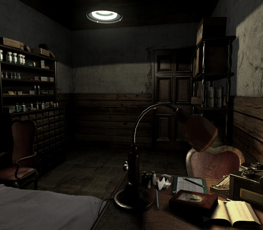
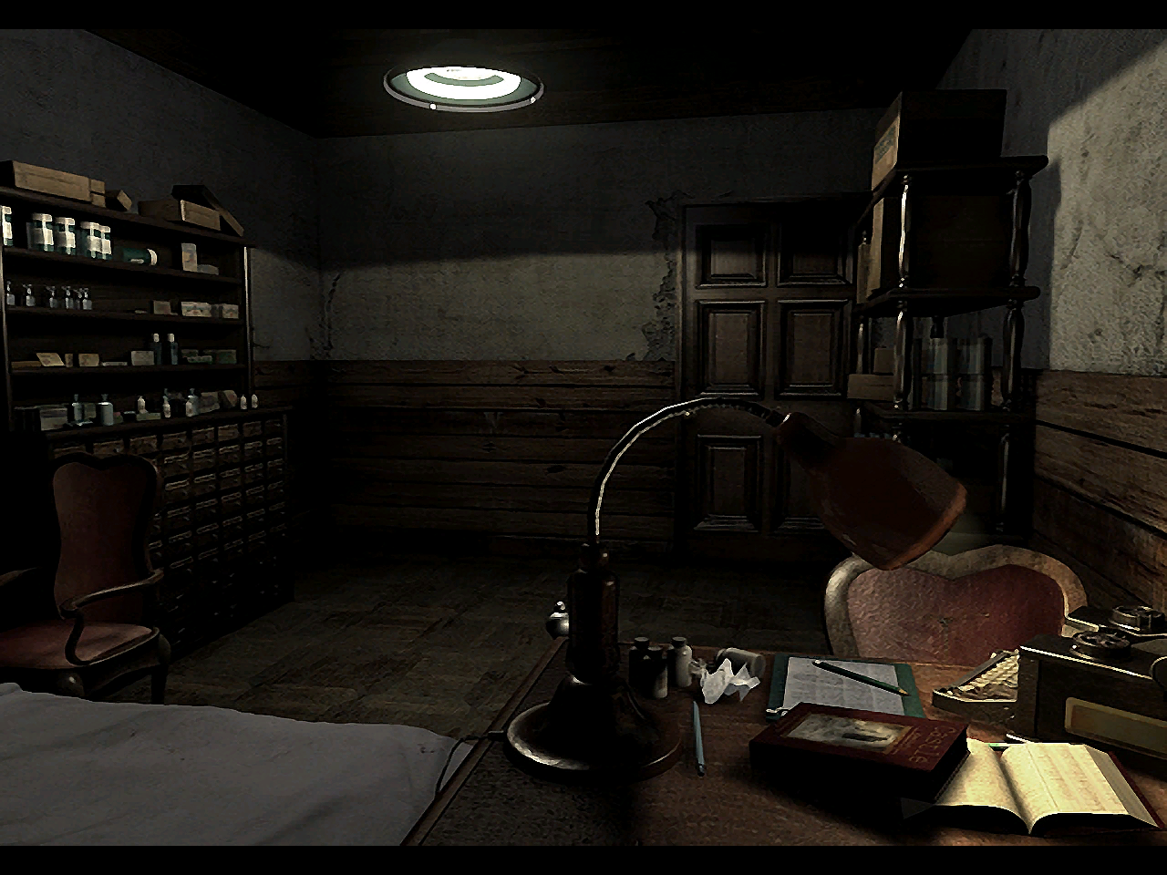
Firstly, the backgrounds. I don't pretend to know what process was used to upscale/upres these, but it's very inconsistent. The majority of the areas look like they've been upscaled with a filter with some slight touch ups here and there. This really works for some rooms such as the mansion dining room and main hall. Others look like the source may have been of a lower quality for whatever reason, for example, the entire basement of the guardhouse looks really bad, especially the aqua ring control room which looks honestly horrendous. I wish I had capture gear to post screens, but it's by far the worst area I've seen so far, and it really stands out against the high quality models of the character and the shark in the background. The touch ups I mentioned mainly seem to try and help hide blemishes in the upscale, so added bloom or shadows and such.
Some areas seem to have had a lot more work than others, seemingly backgrounds with more dynamic lighting or effects. An example of this is the birdcage hallway beside Kenneth which seems to have been either entirely remade or almost entirely retextured. While it certainly looks sharper than other rooms, it seems like half of the shadows and little details of the room have been lost, leaving it feeling almost sterile in comparison to the Gamecube version. Where the added or reworked stuff works the best is in outdoor areas, where a lot of foliage has been added around the scenes. Again, I have a feeling this is to hide some of the worse looking areas in the upres but it really fits with these areas. The path from the mansion to Lisa's cabin in particular looks incredible now, with the weird depth of field effect beyond the path looking much nicer and giving a much clearer image of that background.
The other big thing with the backgrounds is their choice to pan up and down the backgrounds so they can make them widescreen. For the first few areas, this seemed like a nice choice, but the more I've played, the less I like it. Let me just say that I think it's a nice idea and with some more work, it could have been really great, but it's how they've implemented it that really bothers me. Essentially, as you move through a screen, the camera will pan up or down depending on what it needs to show. However, this seems to be tied to both player movement and animations, so you will have moments where the camera keeps panning up and down as you're jumping up and down from boxes or picking up items, or running back and forth in a scene to solve a puzzle. That might not sound like a big deal, but it looks needlessly silly at several points. At other times, they will needlessly pan in a room where it isn't needed, which causes the framing of the scene to look terrible, with an item flashing off screen or showing more of the character's body than their head and such. I think the better option would have been for them to look at each scene individually and decide which needed to pan and if it was unnecessary, lock it to a frame that conveys the background best. As for the pan itself, it would have been much better to have it trigger in a required background of the player hit an area in the environment so it would pan automatically (which I believe Zero did in several scenes) so that the scene wouldn't keep slightly moving up and down constantly.
The character and enemy skins are another weirdly inconsistent area, with Chris, Jill and Rebecca (of the characters I've seen so far) having a nice upgrade while Richard doesn't look great. Richard's injured arm in particular looks really bad now, just a muddy texture that, when the game decides to zoom in on it, you wonder why they didn't put any effort into upgrading this. The same goes for several zombie skins; I noticed one looked really bad when it jumps out of the bath in the mansion, the skin just looks low res now, which is strange when some of the zombie skins (such as the first zombie) have been updated. I know this one is a more unrealistic wish for the upgrade, but it does noticeably stand out at times.
The only other issue I've noticed is that, on two occasions, the wrong instrument was used for background music. The two occasions have been when Chris and Rebecca take Richard to the sick room and "Sigh of Relief" plays, and the other is the main guardhouse music "Ivies' Domain", both of the main tracks are using the wrong instrument which, I guess, is just an odd bug but really stands out. I've noticed in other places that the mixing of the music's instruments are really odd, so when Neptune attacks, for example, the frantic part of that track is mixed more evenly with the other tracks and doesn't sound as good as the original. This has happened with a couple of tracks, but that was the most noticeable one for me so far.
The only other thing I haven't talked about are the controls. One really great addition is that they've introduced tactical reloading, where you can reload while aiming by pressing the run button. I loved this in Resident Evil Deadly Silence and I love that they brought it across for this. As for the new style controls, I hate them but I understand that I'm biased, being an old style Resident Evil fan and I've hated this control type since Devil May Cry. Tank controls always worked for prerendered games because they did away with the need for situational awareness so to speak; if you push forward, you will walk forward, if you push left, you will turn left, if you push back, you will back up. The new controls work for one screen, but then in the next screen if you take your thumb off and that direction and hit it again, you could be going in the opposite direction, meaning you always have to be concious of the angle and the character. It just feels like a needless hassle when tank controls work perfectly for this type of game and it makes the animations look terrible. But again, I understand that that's probably just me.
But yeah, that's my impressions so far. At the end of the day, it's REmake on more systems, and in my eyes it's probably the greatest pure survival horror game that was ever released. But it's such a mixed bag technically that I just don't know what to think of it overall.
Thanks for this.I grabbed the 360 version and I've played up to right before the labs, and this whole remaster is a really mixed bag. I'll try and lay out my feelings, but this will mostly be technical stuff as the core game is largely untouched from what I've seen so far.
Firstly, the backgrounds. I don't pretend to know what process was used to upscale/upres these, but it's very inconsistent. The majority of the areas look like they've been upscaled with a filter with some slight touch ups here and there. This really works for some rooms such as the mansion dining room and main hall. Others look like the source may have been of a lower quality for whatever reason, for example, the entire basement of the guardhouse looks really bad, especially the aqua ring control room which looks honestly horrendous. I wish I had capture gear to post screens, but it's by far the worst area I've seen so far, and it really stands out against the high quality models of the character and the shark in the background. The touch ups I mentioned mainly seem to try and help hide blemishes in the upscale, so added bloom or shadows and such.
Some areas seem to have had a lot more work than others, seemingly backgrounds with more dynamic lighting or effects. An example of this is the birdcage hallway beside Kenneth which seems to have been either entirely remade or almost entirely retextured. While it certainly looks sharper than other rooms, it seems like half of the shadows and little details of the room have been lost, leaving it feeling almost sterile in comparison to the Gamecube version. Where the added or reworked stuff works the best is in outdoor areas, where a lot of foliage has been added around the scenes. Again, I have a feeling this is to hide some of the worse looking areas in the upres but it really fits with these areas. The path from the mansion to Lisa's cabin in particular looks incredible now, with the weird depth of field effect beyond the path looking much nicer and giving a much clearer image of that background.
The other big thing with the backgrounds is their choice to pan up and down the backgrounds so they can make them widescreen. For the first few areas, this seemed like a nice choice, but the more I've played, the less I like it. Let me just say that I think it's a nice idea and with some more work, it could have been really great, but it's how they've implemented it that really bothers me. Essentially, as you move through a screen, the camera will pan up or down depending on what it needs to show. However, this seems to be tied to both player movement and animations, so you will have moments where the camera keeps panning up and down as you're jumping up and down from boxes or picking up items, or running back and forth in a scene to solve a puzzle. That might not sound like a big deal, but it looks needlessly silly at several points. At other times, they will needlessly pan in a room where it isn't needed, which causes the framing of the scene to look terrible, with an item flashing off screen or showing more of the character's body than their head and such. I think the better option would have been for them to look at each scene individually and decide which needed to pan and if it was unnecessary, lock it to a frame that conveys the background best. As for the pan itself, it would have been much better to have it trigger in a required background of the player hit an area in the environment so it would pan automatically (which I believe Zero did in several scenes) so that the scene wouldn't keep slightly moving up and down constantly.
The character and enemy skins are another weirdly inconsistent area, with Chris, Jill and Rebecca (of the characters I've seen so far) having a nice upgrade while Richard doesn't look great. Richard's injured arm in particular looks really bad now, just a muddy texture that, when the game decides to zoom in on it, you wonder why they didn't put any effort into upgrading this. The same goes for several zombie skins; I noticed one looked really bad when it jumps out of the bath in the mansion, the skin just looks low res now, which is strange when some of the zombie skins (such as the first zombie) have been updated. I know this one is a more unrealistic wish for the upgrade, but it does noticeably stand out at times.
The only other issue I've noticed is that, on two occasions, the wrong instrument was used for background music. The two occasions have been when Chris and Rebecca take Richard to the sick room and "Sigh of Relief" plays, and the other is the main guardhouse music "Ivies' Domain", both of the main tracks are using the wrong instrument which, I guess, is just an odd bug but really stands out. I've noticed in other places that the mixing of the music's instruments are really odd, so when Neptune attacks, for example, the frantic part of that track is mixed more evenly with the other tracks and doesn't sound as good as the original. This has happened with a couple of tracks, but that was the most noticeable one for me so far.
The only other thing I haven't talked about are the controls. One really great addition is that they've introduced tactical reloading, where you can reload while aiming by pressing the run button. I loved this in Resident Evil Deadly Silence and I love that they brought it across for this. As for the new style controls, I hate them but I understand that I'm biased, being an old style Resident Evil fan and I've hated this control type since Devil May Cry. Tank controls always worked for prerendered games because they did away with the need for situational awareness so to speak; if you push forward, you will walk forward, if you push left, you will turn left, if you push back, you will back up. The new controls work for one screen, but then in the next screen if you take your thumb off and that direction and hit it again, you could be going in the opposite direction, meaning you always have to be concious of the angle and the character. It just feels like a needless hassle when tank controls work perfectly for this type of game and it makes the animations look terrible. But again, I understand that that's probably just me.
But yeah, that's my impressions so far. At the end of the day, it's REmake on more systems, and in my eyes it's probably the greatest pure survival horror game that was ever released. But it's such a mixed bag technically that I just don't know what to think of it overall.
It feels like a bare minimum port but at least more people get to play this.
the fuck is Code CV HD?
It's a game I call "posting on the internet forums while being high on pain meds."Code CV = Code Code Veronica
Also sometimes called "posting on the internet forums while being very very tired."
I noticed what I wrote afterwards but since cvxfreak had already quoted one of the posts, I didn't bother to edit them. Until now.
Jawmuncher
Member
YO theres a wesker report with this?
We need that translated or will it be part of the American additions as well?
Even being wrong the CVX wesker report was fun.
We need that translated or will it be part of the American additions as well?
Even being wrong the CVX wesker report was fun.
Neff
Member
Thanks for this.
It feels like a bare minimum port but at least more people get to play this.
It's far from a bare minimum port but there are obvious limits, and like randomwab says, some particularly notable compromises. The original game's impeccably effective atmosphere suffers as a result at times. Overall I prefer the GC/Wii version's FMV backgrounds significantly more, lower res and all, but some areas in the HD do look really damn good now.
Still plays as great as ever, too.
Dusk Golem
A 21st Century Rockefeller
I hear the RE0 had far better looking backgrounds, I wonder how they'll hold up for the inevitable port.
Zero was done after REmake and was done by mostly the same team. One of the best things about Zero honestly is how it looks. I think it'd be harder overall than REmake though, as a lot of the backgrounds in Zero are animated, more-so than REmake.
I'm trying to imagine how they'd handle areas such as the train (which has a lot of details such as objects rattling and lights going by), the waterfall passage, the underground sacrifice room, etc.
The Praiseworthy
Member
I hear the RE0 had far better looking backgrounds, I wonder how they'll hold up for the inevitable port.
Hmmm, personaly I find REmake better looking than 0.
YO theres a wesker report with this?
We need that translated or will it be part of the American additions as well?
Even being wrong the CVX wesker report was fun.
The original report is actually correct, it's the video that's wrong (because it was rushed).