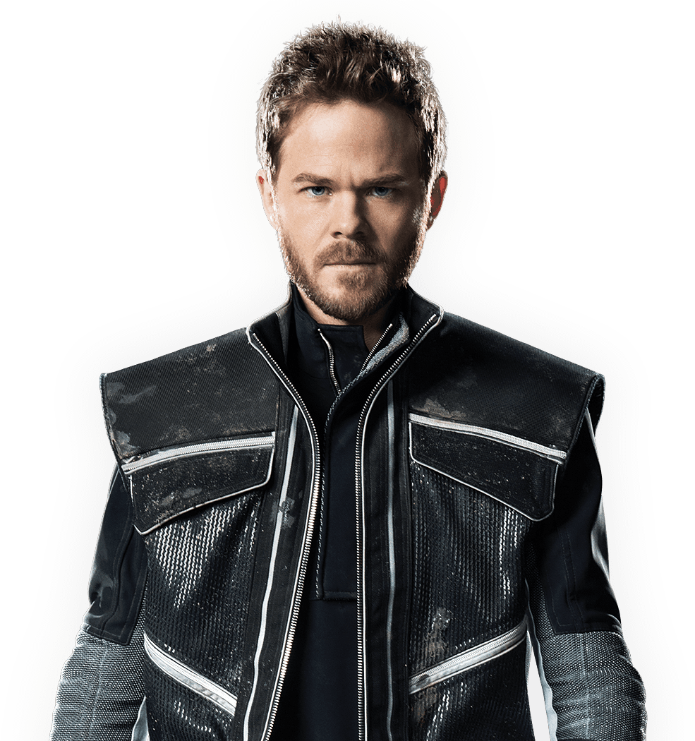
Quantum Break final cover revealed by Amazon Germany?

Yep it's official. It was revealed during Gamescom together with the Scalebound and Crackdown ones: http://news.xbox.com/media/?Category=gamescom-2015-press-kit&AssetType=box-shots


So, both Quantum Break and Scalebound have the ''Xbox One Exclusive'' tag. Crackdown does not. PC version coming??

crackdown3_boxart001.ashx
 
Nothing about that conveys any of the interesting parts of the game.

There has to be a way to portray the frozen time aspect. I'd go with having the main character leaning on a car door suspended in the air, from an exploding car in the background, while wearing sunglasses with a speech bubble of him saying "I got all the time in the world" whilst he shrugs.
 
At least the original box art has some personality. Why not just put new dude's face in that? The new art makes it look as absolutely bland and generic as every other shooter ever.
 
Not a modern console title without that orange and blue!

Both covers look pretty bad to me though. Both feel very bland and need a little more oomph.
 
I don't understand his outfit. Is this the future?
I don't understand covers. When I used to use game discs I looked at the cover only verify the name of the game. I would quickly open it and never really look at the cover. The back actually gave more info. I always thought a cover with just the name is perfect. Since I only need the content.

Even when I bought records in the 70s and CDs in the 80s, I thought the cover just needed a name. I was more interested in the music than what was put on a cover.
And the same applied to tapes in the 80s, dvds in the 90s, and with BDs now.
 
Holy shit thats bad. They really must want people to know its the guy from xmen since they show his ice powers.
 
2485156-6128498736-65447.gif


Getting hell of tired of the teal/orange and "man walking with purpose with gun" stuff. Considering how neat some of the effects looked in the demo, they could have done some cool treatment.
 
His head looks way too big for his body in the old one. I prefer the new one just because of that.

Both pretty boring, though.
 
Old cover was generic.

New cover was generic.

If these are the two options, I don't care either way.

edit: at least with the new one they ditched the hilarious "girl's body facing away from us so we can subtly creep on her ass" cliché.
 
At least the old one wasn't bland and boring.

It kinda is though. It's just not as bland as the current one.

Looks like the Witcher 3 cover ... and i dont see anyone complaining about that one

Fine. That one was boring, too.

In the end, as long as the gameplay is fine, then it's not a huge deal. But yeah, as great as Quantum Break looks, its cover doesn't really reflect it IMO.
 
They tried to find the most generic possible cover and they suceeded, congrats MS.

On the other hand, Max Payne 1/2 had amazing cover.

Looks like the Witcher 3 cover ... and i dont see anyone complaining about that one

You must have missed that party, plenty people complained. I still have no idea what CDP was thinking with that generic cover for such masterpiece.

At least the steelbooks looked beautiful
 
Which looking at the gameplay they've released so far seems like an accurate representation of the overall experience.

I have to say I wasn't impressed. I hate that they slowed time down every few seconds. And I am starting to lean towards getting an Xbone.
 
Neither one of those boxes in the OP are good, but the bottom one is better.

Top one reminds me of Bloodborne, in a bad way. Bloodborne could have had fucking awesome box art, but they ruined it.
 
Neither one of those boxes in the OP are good, but the bottom one is better.

Top one reminds me of Bloodborne, in a bad way. Bloodborne could have had fucking awesome box art, but they ruined it.

Bloodborne's cover is reversible with the original art.
 
He's got a really huge head in the old design, and his shoes don't go with the jacket in the new one. #FashionGAF
 
I still prefer the old character design.

Shawn Ashmore is a cool cat, but the old design looked leagues better. Looked more weathered, more experienced, it told a story.

Ashmore's character looks like a rookie, I don't like it.
 
Top Bottom