SEGAAAAAA
And your verdict on the trailer is? Good, Bad or Indifferent?
SEGAAAAAA
Yup. I always call him Nagoshit. This guy is the worst thing that happened to SEGA after they quit making hardware.Nagoshi under Suzuki was a blessing...
Nagoshi under Nagoshi was a waist of ressources for Sega... (mostly Yakuza)
He did seem like he wanted to have his legacy overtake everything even though all his big games were so heavily based on Yu Suzuki's. Yakuza for all its differences (and initial simplicity in comparison, more of a beat 'em up with story than anything) owes a lot to Shenmue as Spikeout does to VF.Yup. I always call him Nagoshit. This guy is the worst thing that happened to SEGA after they quit making hardware.
Could you do it better?my god... these guys should ask an artist to take a look at the results and take some feedback first before showing stuff like this... those assets used in the DC version are ugly as hell
Could you do it better?

my god... these guys should ask an artist to take a look at the results and take some feedback first before showing stuff like this... those assets used in the DC version are ugly as hell
These are just experiments, it's in the title. He's showing progress as he develops something.
I know, but still... it just looks bad. just keep the original assets and keep the initial improvements to increased draw distance and higher framerates/resolution.
Exactly! There are already builds with original assets, so it´s awesome to go further and take advantage of DC capabilities, which is the whole point of this ports.But we already have that, so he is trying to go further.
Imagine being as retarded to ask someone to stop, while he´s making stuff not even Nintendo had done on, for example Super Mario 3D All Stars, and improve the Mario 64 assets, just because they don´t fit on your particulat taste. Work on your own version, then.yes... I'd just keep the original assets.. and I wouldn't add a retarded ass specular sheen on Toad's head
Imagine being as retarded to ask someone to stop, while he´s making stuff not even Nintendo had done on, for example Super Mario 3D All Stars, and improve the Mario 64 assets, just because they don´t fit on your particulat taste. Work on your own version, then.
Spot onNagoshi under Suzuki was a blessing...
Nagoshi under Nagoshi was a waist of ressources for Sega... (mostly Yakuza)
I'm glad he left because now we have Virtua Fighter, Golden Axe, Crazy Taxi, Jet Set Radio...)
Nonetheless, Sega's best COO ever is back to revive the company. Already a dozen of revivals in the work...Spot on
Making Nagoshi-san head of SEGA creative control killed SEGA's creativity for years and it's clear to see. I'm so glad he's gone, just gutted he took Hosokawa-san with him.

For me Hayao Nakayama was the best.Nonetheless, Sega's best COO ever is back to revive the company. Already a dozen of revivals in the work...
That's promising and far more than other publishers.
Shuji Utsumi
my god... these guys should ask an artist to take a look at the results and take some feedback first before showing stuff like this... those assets used in the DC version are ugly as hell
No, there is nothing from the DS version there.Is that Chomp model from the Mario 64 DS version or am i seeing things? Also some textures too.
And yeah, doing more complex, higher poly models is one thing but art direction is another.
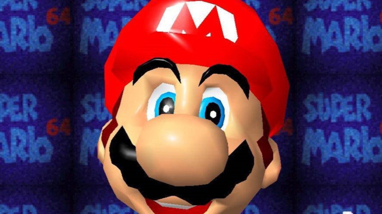
Random people comments shouldn´t affect your project! Keep going please! We need this enhanced DC Mario 64 in our consoles!1 - the port does not support skinning
2- His eyes are as wrong as the Mario Wonder model since it is basically that model.
3-You don't like the "oil" effect it was there from the very beginning.
.....
4- the textures can't surpass the 4kb limit in this port so there is not much that can be done.
I know the internet likes to criticise from the comfort of their couch what others try to do while doing nothing to help.
But again this are experiments to see what can be done with the port , comments like yours and others is what make some developers stop their projects or never release them...
It's the same face, yes, but that model was made to be seen with various different expressions during play, not just with his "t-pose" empty expression.His eyes are as wrong as the Mario Wonder model since it is basically that model.
Fur fighters also have some great lookin water effects on certain bodies of waters, like small pools on the tutorial level and a waterfall on the forest in which you pick which level go to.Random thoughts but I was playing Soulcalibur a bit and it has some pretty nice water effects, which aren't so common on Dreamcast, so once again a rather low end launch window Dreamcast game showcases some good techniques more developers could and should have used but didn't. I particularly like it in Kilik's stage where they use a variety of them, from the old duplicated geometry for reflections in some spots to just seeing the environment continue under the surface for a clearer transparent water look elsewhere and all topped with a particularly nice texture that gives it a good impression of a flowing and shiny surface. Xianghua's stage's water is nice too, as is Mitsurugi's. Maxi's with the stormy weather isn't as successful, the surface texture just doesn't look very watery at all and it goes up and down a bit too artificially showing it's just one huge flat plane for the whole area bobbing up and down. All in all some very nice art in this game's every facet though. Crazy they made it so fast. Combining art like in Kilik's stage with the actual polygonal dynamic ripples in Code Veronica or early DreamOn demos or Sports Jam would have resulted in some pretty nice water effects where needed but most games didn't bother. Special mention to that Skies of Arcadia scene where the dungeon collapses and causes the water in the area to ripple with full displacement all over, not as limited as that one little bit of water in Code Veronica (well I guess it ripples more when you call up the submarine but again the surface texture there is just eh in comparison, it doesn't look very convincing at all, even Sonic Adventure's or Ecco's water surface textures are way nicer if a bit too repeating, though it has some nice distortions just past that part, going underwater).
Side-by-side Comparison of Gran Turismo 2 between PlayStation (PS1) and Dreamcast with Bleemcast.
Cool commercial, don't think I've seen it before. And some nice driving next.
I read an article recently about that and yes, it was insane what they were doing before Dreamcast. It was as if the leaders at Sega had some severe untreated ADHD.Dreamcast never stood a chance. With how quickly Sega moved from Genesis to Sega CD to 32X to Saturn to Dreamcast, customers had very little faith in the investment.
But Tesseract, you were a king!i grew up poor, owning a dc made me feel like a king
especially with all the wonderful online games, jacking into various dial-up services was damn fun