• Hey Guest. Check out your NeoGAF Wrapped 2025 results here!

Should Apple change the home screen for their iOS devices?

Status
Not open for further replies.

Joel Was Right

If you smell burning, it's probably the generators acting up. Report it anyway.
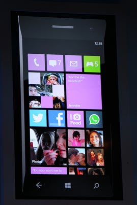
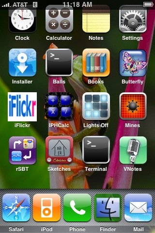
On one hand we have this

2925609514fd64da11a3ce983301212_640x390.jpg


Yet on the other hand, we have this (and this isn't even showing the red push notifications)

homescreen.png


I am a massive fan of the Metro tiles; minimalistic and flip showing live data without having to open the tile (app).

2110.WP_5F00_LiveTiles_5F00_Animation_5F00_screen_5F00_50262F74.gif


I was disappointed Apple ignored this for iOS6, but with such a heavy focus on design and user experience at the company, with their products known to be beautiful, why is there so little talk/criticism of this outdated home screen? Is it a design choice to remain with it or are there hurdles preventing them from updating it?
 
I find the lack of live tiles/widgets to be my biggest problem with ios, especially on the ipad. It has gotten to the point where I am considering jumping over to another platform.
 
I think the point I'm making is obvious. App icons fill the entire screen in a grid design, and with customised backgrounds and the red bubble notification system, the screen is filled with a mess of images
 
only if you choose for it to be that way. you can make your android homescreen or your windows desktop look cluttered as shit, too. that comes with all the customization people are clamoring for. (see: myspace)

I updated the OP with the other example, but to me, it doesn't look much better. Surely there is a better way to present apps than what iOS and Android are doing?
 
Eh, I quite like it. I can't post mine because it's NSFW but it is possible to make the home screen look attractive. I just have the top row of icons on my home screen with a wallpaper that compliments them and then a shit load of folders on page 2. I don't mind if they keep it as it is.
 
Would be nice if they opened it to customization. I have never understood how people flip out because some other person has the option to customize their home screens.

"OMG That guys home screen looks like a MySpace page pulled through time from 8 years ago!"

And this effects you how? The best home screen is the one you personally like the most. Anyways, as for Apple, the answer is really no. It would take time for them to code and design it, and build the options for customization into the OS. And they have no reason to bother since everything is doing well.

I would love if they did it. But the effort to payoff ratio is heavily weighed towards them not bothering.
 
That is the weirdest picture of iOS I have ever seen, wtf :lol

Anyone have pics of the new metro from the event yesterday? Shit looks hideous. I wasn't a fan of metro to begin with but I can appreciate it, and that's what happens when you go messing with someone that isn't broken. Apple will never change the basic premise of iOS unless it has to do with some revolutionary new hardware.

Everyone using an iPod (nano or touch), iPhone (from 07 to now) or iPads knows the UI by heart, and it would be idiotic to do a total revamp now.
 
Eh, I quite like it. I can't post mine because it's NSFW but it is possible to make the home screen look attractive. I just have the top row of icons on my home screen with a wallpaper that compliments them and then a shit load of folders on page 2. I don't mind if they keep it as it is.

This is pretty much how mine is set up, two rows of icons on the first page and then organized folders on the second page with a nice background. I'm fine with how iOS works for now, but I wouldn't mind a change. I'm not too interested in big weather widgets or pictures of my contacts but some kind of elegant widget system could be interesting.
 
How does one not have their iod end up a wall of icons?

Smart use of folders, page layouts, and complimentary backgrounds.


So less icons on more walls?
In essence, yes, but that doesn't stop it looking good and alleviating the wall of icons 'issue'.


This is pretty much how mine is set up, two rows of icons on the first page and then organized folders on the second page with a nice background. I'm fine with how iOS works for now, but I wouldn't mind a change. I'm not too interested in big weather widgets or pictures of my contacts but some kind of elegant widget system could be interesting.
The main thing I'd like is the ability to have one row of vertical icons, rather than horizontal.
 
Even at its most basic, I get annoyed how I can't have a few icons at the top and a few at the bottom - you can't build space, everything is auto-arranged for you. I don't understand why apple lets you have some things on the lock screen or notification pane, but not others. And the notification pane is really to hold an archive of recently arrived notifications, its not great for glancing at information because its hidden.

I really want the android widget system - just bring that over as-is (with apple polish of course). You can have an entirely empty first screen, a list of icons, or a variety of widgets to suit your preferences.

Widgets belong to apps, so you install an app - eg weatherbug - and that can publish 1 or more widgets. You can then place those widgets anywhere on a screen, and they can be any size, using a grid system based on the icons - so on the iphone you'd have a 4x4 grid (or 4x5 if they got rid of the 'dock' and let me use all the space how I like)

so you could eg have a 4x1 widget showing the weather, a 4x2 showing your facebook feed, and 4 app icons underneath. You can arrange them how you like.

If you like the current system you just have app icons, but it gives you the choice of more information which surely is a good thing? Doesn't need to be battery draining either - just use the existing notification system but allow apps to show custom graphics/text in the widgets instead of badges/alerts


- that goes triple for ipad - coffee table device is perfect for glancable information

Smart use of folders, page layouts, and complimentary backgrounds.

you can't even have a row of icons at the top, and a row at the bottom. At minimum they should let you put icons where you want
 
Definitely. While it is arguably okay for iPhones and other small screened devices the good ol' grid of icons is just stupid on a large device as the iPad. So much wasted potential there.


The main thing I'd like is the ability to have one row of vertical icons, rather than horizontal.

Why not the ability to put icons wherever you like?
 
I think they should. I think they have to. It will be damn difficult to deal with how legacy Apps work, though.
 
There are legitimate concerns about iOS' design one could levvy, but the homescreen is the least of its problems, and so far, iOS6 is improving on a lot of them, while at the same time, fucking the design paradigm up in new ways:

phone.png


safari.png


ipod.png


There is no consistency and some things even look downright bad (phone).

So yeah, there's still a lot of work to be done on iOS. The homescreen is the last of *my* problems as it works really well and I think mine's really pretty.

(btw. most of my criticism also applies to OS X)
 
so now I have to click even more icons, swipe to more pages, and spend more time to get to the information that other platforms allow me to see without even opening an application.

Great.

Live tiles and such are great, but you're making it sound like the biggest of burdens to access information in iOS.
 
I hope you mean the one before the OP edited mine in! ;)
Of course. :p

I think one reason metro doesn't jive with me is the asymmetry of it. That and the lack of visual flare. Just text and small plain icons in simple colored boxes. I feel like I need something with more visual pop. Though to be fare, iOS isn't that visually pleasing either, just not as plain. And of course, that's just me and i'm sure many people have no problem with the uber-simplicity of metro's design.
 
I hate it. One of the main reasons I went with Android.

widgets + the ability to fully customize my homescreen really make a big difference.


edit: should also add that this is coming from a guy who barely has any flare on his homescreen

ibopb7BClzT414.png
 
I have so many folders... organizing my apps is such a chore. Give me more pages to put apps on Apple, WTF.... my iPhone is just a bunch of black boxes with microscopic icons in them.
 
Of course. :p

I think one reason metro doesn't jive with me is the asymmetry of it. That and the lack of visual flare. Just text and small plain icons in simple colored boxes. I feel like I need something with more visual pop. Though to be fare, iOS isn't that visually pleasing either, just not as plain. And of course, that's just me and i'm sure many people have no problem with the uber-simplicity of metro's design.

Just like I predicted a couple of months ago, Metro has simply gone out of style, exactly the same as ICS has, only I expected Metro to last a bit longer.

Metro is a culmination of overt trendiness with a lack of design-talent and foresight.
 
Live tiles and such are great, but you're making it sound like the biggest of burdens to access information in iOS.

It would be nice to be able to see more information by simply glancing at my home screen. They have not changed the basic design of the os in five years now.

I don't see why they couldn't develop widgets/live tiles. People who still want their phone to look like it did in 2007 could still do so, but those of us who want more control over the layout of our screen could have it as well.
 
so now I have to click even more icons, swipe to more pages, and spend more time to get to the information that other platforms allow me to see without even opening an application.

Great.

Well, you could always have swift and direct access by leaving them as a wall of shortcuts.


Why not the ability to put icons wherever you like?
Yeah, sure, that'd be cool too.

To be honest though, it really doesn't bother me. I like the way that iOS works. I never look at my Windows Desktop and think "how can I make these shortcuts harder to access?".
 
As an iPhone user... it's actually Windows Phone that is making me drool. Very similar "pretty" design philosophy going on there, with an larger interface, and great innovations like live tiles. I want stuff like that.
 
Just like I predicted a couple of months ago, Metro has simply gone out of style, exactly the same as ICS has, only I expected Metro to last a bit longer.

Metro is a culmination of overt trendiness with a lack of design-talent and foresight.

And how would you describe the iOS home screen?
 
Just like I predicted a couple of months ago, Metro has simply gone out of style, exactly the same as ICS has, only I expected Metro to last a bit longer.

Metro is a culmination of overt trendiness with a lack of design-talent and foresight.

Teehee. You must be a prophet.
 
I have no issue with the home screen. At least for the iPhone, it's suitable. There is a bothersome amount of unused space on the iPad though; definitive room for improvements there.

What I do wish is that they add even more to the lock screen. Weather data in particular would be nice.
 
Should be updated with new Windows Phone 8 (and Windows Phone 7.8) start screen announced yesterday. They removed the empty space on the right and added option for smaller tiles etc:

startscreen-2.jpg
 
I don't really have a problem with how it looks.
Sure I would like more customization but there is a good chance that them changing it could mean for the worse.
I do prefer it to the Windows tiles though.
 
And how would you describe the iOS home screen?

Design wise? It can go anywhere from a total trainwreck to an evergreen, depending on what you put on it.
Looking at OS X, I can tell you that the homescreen will never look better. They might change things around in the future (like they have the dock in the past) but it will also never look a whole lot worse.
However, you can always make it look appealing if you put some effort into it. (Stock looks fucking ridiculous, especially the default iOS5 wallpaper)


Functionality wise? If its purpose is getting me into apps as fast as possible I find it does that very, very well, especially coupled with Spotlight and some semblance of organization.
It is not a place to absorb information, so it's sorely lacking in that area, that's for sure.


It's always looked horrendous on the ipad.


This I can largely get behind.


Teehee. You must be a prophet.

It is my job. Kinda like how Pachter (thinks he) can tell you a lot of the future of gaming.
 
There are legitimate concerns about iOS' design one could levvy, but the homescreen is the least of its problems, and so far, iOS6 is improving on a lot of them, while at the same time, fucking the design paradigm up in new ways:

There is no consistency and some things even look downright bad (phone).

So yeah, there's still a lot of work to be done on iOS. The homescreen is the last of *my* problems as it works really well and I think mine's really pretty.

(btw. most of my criticism also applies to OS X)
Definitely agree with that but the only real inconsistency there is the status bar. There are different types menu bars, simple apps such as the phone where there isn't a viewing window (such as safari or music) can have a 'merged' menu and status bar. But it is jarring nonetheless. What they need to do now is get rid of the glossy black nab bar entirely and replace it with the iOS 6 App Store style version. You have that and the white counterpart (in the music app) which is fine. Less gloss and more matte to the UI is welcomed imo.

It would be nice to be able to see more information by simply glancing at my home screen. They have not changed the basic design of the os in five years now.
They have not changed the basic design Windows or OS X in a decade (or longer) and you don't see people complaining. There's always the risk that drastic forced change will drive consumers away. The lock screen will continue to evolve (such as the camera grabber, etc) but I don't think they'll stray from the wall of apps home page style anytime soon. It can still be improved without doing that.
 
Sure I would like more customization but there is a good chance that them changing it could mean for the worse.

not really

just allow customization, dont force it

it's really easy to add the option to go back to the default iOS thing if they wanted to add it

it's just that it would mess with their whole "iconic recognizability" and whatnot, wich at this point I think is a bit silly
 
The interface was one of the reasons I left for Android.

I like a clean homescreen. Frequently used apps are in folders, regular phone functions are in the dock and everything else is in the app draw.

 
it's just that it would mess with their whole "iconic recognizability" and whatnot, wich at this point I think is a bit silly

brand recognition is never silly, especially if it is working so god-damn well.


The interface was one of the reasons I left for Android.

I like a clean homescreen. Frequently used apps are in folders, regular phone functions are in the dock and everything else is in the app draw.


congratulations. your homescreen looks like ass and your wallpaper is ugly. nothing about that is clean.
 
Should be updated with new Windows Phone 8 (and Windows Phone 7.8) start screen announced yesterday. They removed the empty space on the right and added option for smaller tiles etc:

http://www.blogcdn.com/www.engadget.com/media/2012/06/startscreen-2.jpg[IMG][/QUOTE]
A fucking tragedy;

[IMG]http://zapp5.staticworld.net/images/article/2012/06/windows_phone_8_start_screen-11375939.jpg

newstartscreen.jpg


They realized there needed to be more access from a single place without having to scroll, (i.e. iOS's 19 single access points on a single page) and that was their solution. It's even worse in action imo.
 
as much as I love the venture brothers... that's pretty damn messy

but hey, at least you have the option to have it like that if you want to :p


brand recognition is never silly, especially if it is working so god-damn well.

there are many ways for they to achieve brand recognition without having to force a whole homescreen layout on the device. That's what I mean by silly.
 
One of the reasons why I will probably stick with Android, the ability to customize your home screen means too much to me. Looks a shitton better, and also more functional, and I guess as cliche as it sounds, more catered to your needs.

I'd love to have a widget like this on my homescreen:

aix-weather-320-100.jpg

What app or widget is that?
 
It would be nice to be able to see more information by simply glancing at my home screen. They have not changed the basic design of the os in five years now.

I don't see why they couldn't develop widgets/live tiles. People who still want their phone to look like it did in 2007 could still do so, but those of us who want more control over the layout of our screen could have it as well.

It's not quite what you want, but you can get most of that exact same information with a simple swipe down from the top of the screen to show notification center. There's a weather and stocks widget, can get a preview of your recent emails, text messages, see calendar stuff, etc..

Notification%20Center2.JPG
 
It's always looked horrendous on the ipad.

Oddly enough, I think the iOS design philosophy makes more sense on the iPad than it does on the iPhone where being able to quickly glance at your phone and seeing useful information would be quite helpful.
 
I hate Apple UI design. I just hate it. It's like it was designed as a joint venture between a 2004 Web 2.0 web designer and Fisher-Price. This is true for all their OSs.
On subject, iOS looked great when it first launched, now it looks like someone barfed every app in existence on your screen. It's a mess of of shine effects and gradients.

At least they gave up on that horribly tacky faux-brushed metal look they had going on some years ago.


I also feel that Windows Phone 8 sort of turned the beautiful Metro UI into a clusterfuck. It's not that bad, because you can just not use the tiny icons, but almost every picture of it look way too crowded...
 
Status
Not open for further replies.
Top Bottom